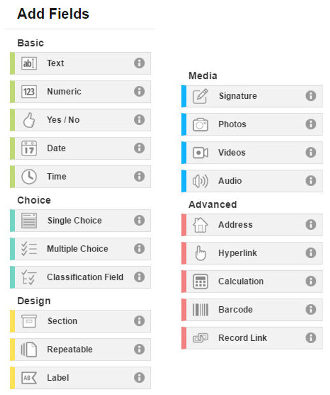
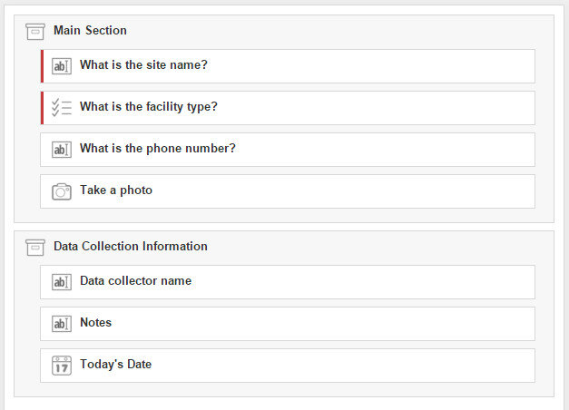
We introduced Fulcrum in a recent post and are very impressed with this tool. Recently Fulcrum updated their App Designer. Fields are now divided into categories from the most common and basic fields, to the most advanced. The groups of fields have also been color coded from green to red to make this arrangement more intuitive. The five categories are: Basic, Choice, Design, Media and Advanced. At the top are Basic fields which include Text, Numbers, Date etc. This reorganization makes finding fields and developing a form even faster. One category of interest is Design. These are fields that can be used to organize your data collection form. Sections allow you to divide your form into parts. For example, you could separate your main survey questions from your data collector metadata questions. The example App below has two sections: Main section and Data Collection Information.
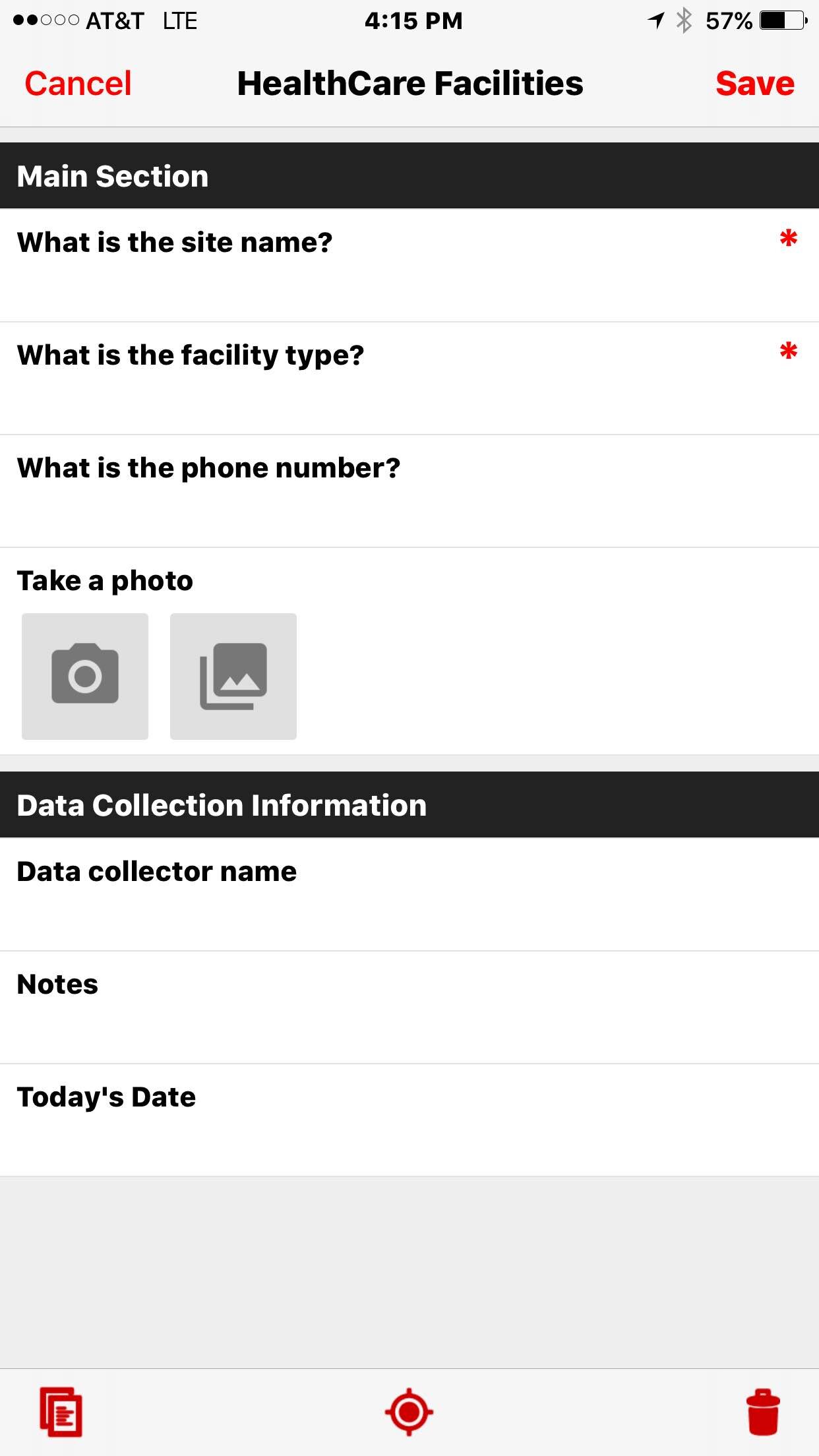
 Organizing your questions like this can help data collectors complete the form, especially for form with a lot of questions. The screenshot below shows how the above form is rendered on a smartphone.
 In future posts we will give some helpful hints to working with Fulcrum including sharing forms, managing data and downloading data. Stay tuned!