QGIS

Visualizing an Intervention for Tobacco Control

Submitted by Jennifer Rewolinski

Dr. Heckman, an assistant professor of psychiatry and behavioral sciences at the Medical University of South Carolina (MUSC) in Charleston, used Community Health Maps (CHM) tools in his research on tobacco control. Smoking is the leading preventable cause of death worldwide and costs the US $130 billion in direct medical costs annually. Smoking is still a major public health issue that influences mortality, morbidity, healthcare costs, the environment, and quality of life.

Dr. Bryan Heckman

Dr. Bryan Heckman

The outcome of Dr. Heckman’s precision medicine project will be a mobile app that aids smokers who recently quit by alerting them of proximity to stores which sell cigarettes or alternative nicotine products. Studies show that greater tobacco retailer density is associated with greater incidence of relapse; Dr. Heckman believes that mapping provides a new approach to visualizing environmental factors. A CHM training event at MUSC spurred his decision to integrate mapping into his own work using the CHM labs as a guide. These labs provide step-by-step instructions for implementing the CHM workflow. He used the data collection app Fulcrum on an iPhone to collect information on retailers: GPS coordinates, type, type of tobacco products sold, e-cigarette advertising, and photos. His team also used a high-powered Trimble GPS device to test accuracy of phone GPS, and the accuracy of phone GPS was adequate and more cost effective than more expensive GPS devices.

Figure 1. Dr. Heckman’s in progress map shows higher numbers of tobacco retailers are associated with  Census Tracts that have both higher poverty and a higher percentage of minority populations.

Figure 1. Dr. Heckman’s in progress map shows higher numbers of tobacco retailers are associated with  Census Tracts that have both higher poverty and a higher percentage of minority populations.

Dr. Heckman integrated his Fulcrum data into QGIS software. He added national datasets from the American Community Survey and Behavior Risk Factor Surveillance System for Census tract data, and Synar for retailer data to check the validity of the Fulcrum data; field data collection with Fulcrum revealed a more accurate list of current retailers than the national secondary datasets provided. Dr. Heckman believes QGIS is a powerful tool with many features; he was not only able to use QGIS to monitor and visualize his research questions but also to guide his project decisions and hypotheses. His results will guide policy recommendations, improve access to care, and deliver novel interventions.

Figure 2. Dr. Heckman’s in progress map shows higher numbers of tobacco retailers are associated with Census Tracts with higher percentages of minority populations

Figure 2. Dr. Heckman’s in progress map shows higher numbers of tobacco retailers are associated with Census Tracts with higher percentages of minority populations

For those attempting to undertake a health GIS project on their own, Dr. Heckman emphasized that all the tools needed are provided on the CHM blog; only time and patience are required. He also recommends asking for help and reaching out to other CHM users who have experience. Dr. Heckman’s project has the potential to affect behavior change and reduce health disparities via a mobile intervention app which identifies nearby tobacco retailers and prompts and provides an intervention and awareness of a health issue. Dr. Heckman’s experience is an example of how the CHM blog and tools might be used.

Dr. Heckman would like to thank Kurt Menke and the CHM team, Dr. Williamson from MUSC, and his mentors for inspiration and growth. He would also like to acknowledge the Hollings Cancer Center and American Cancer Society Institutional Research Grant that helps support his work, and Alex Hirsch for his help coordinating the project.

The CHM team would like to extend their own gratitude to Dr. Heckman as they sincerely appreciate his time and his support of the CHM blog.

Community Health Mapping: A New Year Review

To start the New Year I thought I’d begin with a review of Community Health Mapping (CHM). There are a lot of new project partners, and I thought it would be a good time to give a project overview. CHM is a collaborative effort between the National Library of MedicineCenter for Public Service Communications and Bird’s Eye View. The National Library of Medicine is funding the initiative.The overall goal is to empower community organizations serving vulnerable or underserved populations with low cost, intuitive mapping technology. Therefore we’ve been working with programs organizations who:

  • Focus on vulnerable populations
  • Frequently use and collect data
  • Need effective, scalable & easy to use mapping tools
  • Lack resources (i.e., for proprietary GIS training & software)

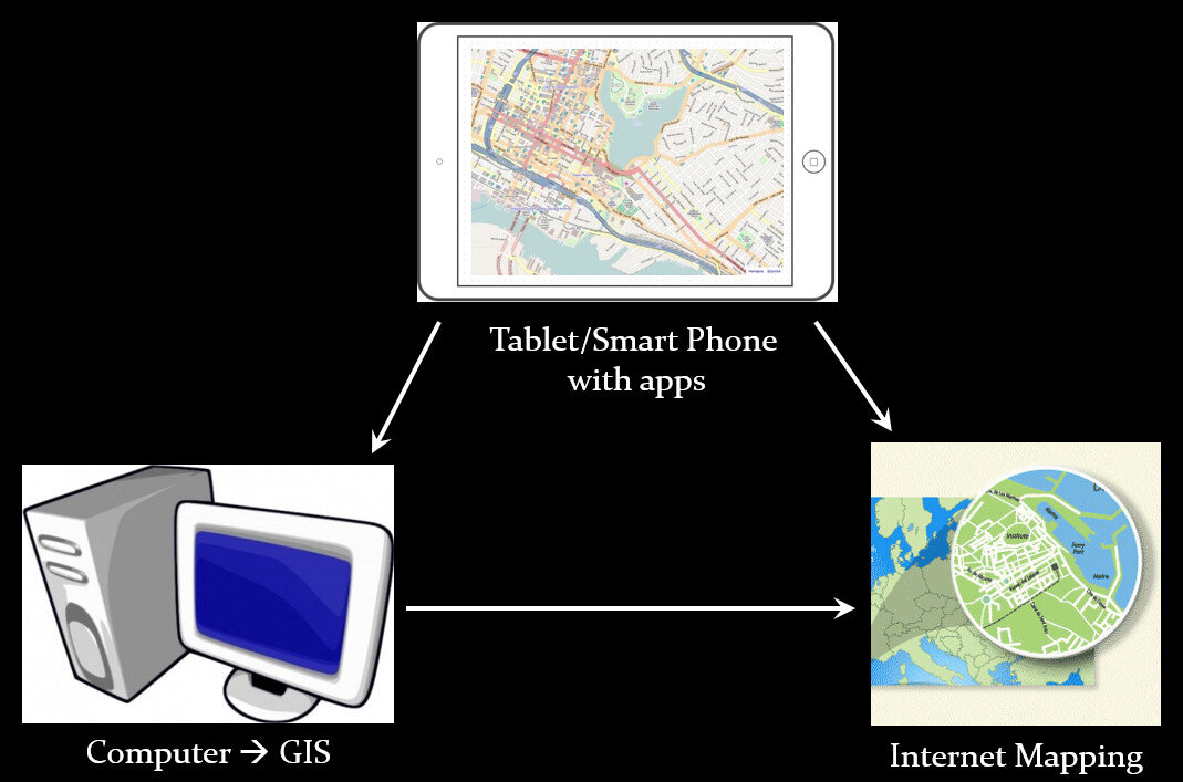
We have identified a suite of tools that allow you to collect custom field data, analyze that data, combine it with other spatial datasets, and generate both static maps and/or dynamic maps on the internet. This allows organizations to collect and work with their own data, and if appropriate, share it with others. CHM involves three components that meet all basic mapping needs:

  • Field Data Collection
  • Desktop Analysis and Cartography
  • Internet Mapping

Community Health Mapping WorkflowA given project may not require all three, however, collectively these components address the basic needs of all mapping projects.Field Data Collection:Rather than focusing on the use of expensive GPS receivers, we recommend the use of smart phones and tablets for these reasons:

  • Most community-based organizations already have them!
  • Many know how to use them
  • They're intuitive
  • They're portable
  • They come with an on board GPS receiver (iPhone 5 uses GPS + GLONASS)
  • Have on board cameras
  • Can connect to wireless networks
  • Access to the internet
  • Email is available
  • “There's an app for that!”

SmartPhones and Tablets vs. Traditional GPS ReceiversOf course an important consideration is horizontal accuracy. You can read our blog post on that topic to see if mobile smart devices meet your project needs.When collecting data you need to be able to develop your own custom data collection form. The top three mobile apps we have found are:

Desktop Analysis and Cartography:After community field data collection, the next step typically involves bringing the data into a desktop GIS. This is the middle step in the workflow. Here the data can be viewed against basemaps such as Google or OpenStreetMap, and combined with other organizational data. This is also where analyses (proximity, density etc.) can be conducted. Presentation quality maps can also be generated in this step.The software we found to be the best fit is QGIS. This is an open source desktop GIS software. It has many strengths:

  • It can consume many kinds of data, including all the data that would come out of the field data collection apps.
  • It is both intuitive and robust.
  • It has a large suite of geoprocessing tools for analyzing data.
  • It will run on Windows, Mac, or Linux.
  • It is free to download and install.
  • It is well documented.
  • There is a large user community.
  • New functionality is being continuously added. New stable versions are being released every 4 months!

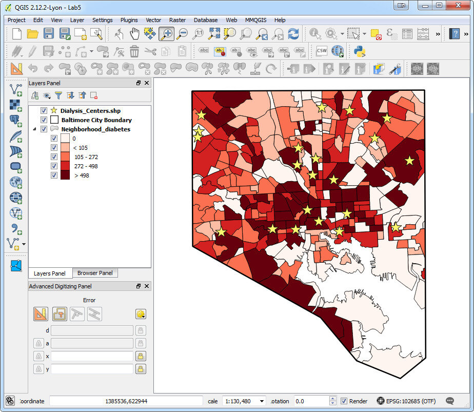
Baltimore Diabetes Data in QGIS DesktopWeb PresentationOften you may want to present an interactive map of your results. Interactive means the map reader can zoom in/out, pan the map and turn layers off and on. For this we recommend CartoDB.You can sign up for a free account, which gives you 50Mb of storage space. Data can be collected with a smart phone or tablet and brought directly into CartoDB.  It is a very intuitive platform. You can literally drag and drop a spreadsheet onto the CartoDB page and have the data upload to your account.  It will accept the most common geospatial file formats including: spreadsheets and comma delimited text files with addresses or coordinates, KML/KMZ, GPX, and shapefiles.CartoDB also has great documentation including:

Baltimore Diabetes Data in CartoDBIn ConclusionThis blog has a lot of resources including reviews of mapping technology and case studies. You might begin by clicking on some of the links in this entry. We are also working on a 6 lab CHM curriculum that interested parties will be able to use to hone their skills. Stay tuned for that!We are always looking for new partners and continuously work to support current project partners. If you are interested, or have questions please don't hesitate to contact John Scott (jscott at cpsc.com) or Kurt Menke (kurt at birdseyeviewgis.com). Most importantly get out and do some mapping in 2016!