Case Study

Mapping South Florida's King Tides

By John C. Scott - Center for Public Service Communications

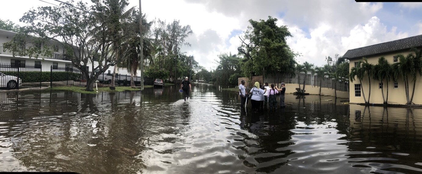
Community Health Maps (CHM) recently joined forces with community based organizations and residents in North Miami, and Florida International University faculty to map health risks associated with the 2017 King Tides, September 19th and 20th and again on October 7th , the time of the highest of the inundations.

Several communities in Miami experienced predictable tidal flooding during the highest tides of the year. The Shorecrest community is among them. Sampling of the flood waters during previous King Tides has established that they contain elevated concentrations of bacteria. The aim of this project was to prepare residents of the community to record and map data that will help them plan their daily activities to protect their health, and give them tools to communicate with the city and county about their environmental health risks.

King Tides flood the streets of the Shorecrest neighborhood while community members collect data.

King Tides flood the streets of the Shorecrest neighborhood while community members collect data.

Complicating the task of collecting data in the community was Hurricane Irma which hit South Florida only a week before the September measurements, causing dislocation of residents, power outages and other disruptions that resulted in the decision not to tax neighborhood residents by expecting them to learn the CHM workflow and map hazards in the community.

For the CHM/King Tides mapping project, community members were trained on the CHM workflow before collecting and mapping environmental health data during the King Tides in the Shorecrest community of Miami. A physical tool box containing needed technology, sampling equipment, key contact information, and protocols for community engagement in data collection during King Tides was created by Jan Booher of Unitarian Universalist Justice Florida and Drs. Tiffany Troxler and Susan Jacobson of Florida International University Wetland Ecosystems Research Lab and School of Communications, respectively. Based on the initial data collection and mapping effort with the Fall 2017 tides, a community report will be generated in collaboration with community leaders to be shared with residents and decision-makers in the community and with appropriate members of City of Miami and Miami-Dade County staffs.

For those of you who are new to Community Health Maps, the initiative was founded on the premise that community-based organizations, environmental health advocacy groups, public health agencies are in a better position to serve their constituents when they can collect and maintain their own data, rather than relying solely on national, state or city agencies, or majority-institution partners to provide data to them.

The CHM approach involves using relatively low cost tablets and smartphone platforms, combined with a selection of low/no-cost applications that run on them, to collect data in order to better understand health status or health risks to the community and support decision-making leading to appropriate allocation of resources to improve health conditions and prevent or mitigate risk. Using the CHM workflow, those data can then be analyzed, shared and presented using low cost/open source software. These tools allow expert and novice users, with little budget resource, to implement mapping workflows.

A common way in which prospective users have learned the CHM workflow is through our CHM Training Workshops. The CHM workshop presents an opportunity to learn and discuss new ideas and methodologies, which will empower community organizations, teachers, and students serving vulnerable or underserved populations with low cost, intuitive mapping technology. During the workshops, we also share experiences where the CHM workflow has helped MPH programs and other academic health centers and community-focused organizations visualize their data and better understand and portray their significance to the community.

The Florida King Tides was a more ambitious project than usual for CHM. While most of the work of the CHM team consists of training and building capacity of communities to map and better-understand their health risk to environmental factors, this was our first opportunity to work in the field with users of the workflow. Together with the core CHM team of NLM, Center for Public Service Communications and Bird’s Eye View, CHM teamed with Unitarian Universalist Justice Florida (UUJF) and it’s The Rising Together project, which works residents in vulnerable communities in coastal Florida about how to prepare for and react to the public health effects of climate change. Through its association with UUJF, the Community Health Maps team also trained and worked with Quaker Earthcare Witness, New Florida Majority, and Florida International University’s Wetland Ecosystems Research Lab and School of Communication and Journalism.

Map made in QGIS of the September King tide data collection showing flood water salinity levels.

Map made in QGIS of the September King tide data collection showing flood water salinity levels.

It is our vision that data collected by neighborhood residents about conditions affecting environmental health can be visualized via CHM, together with databases available from city, county, state and federal governments to, as one example, identify potential predictable impact of future king tides so that public transportation and school walking routes can be modified to avoid health risks.

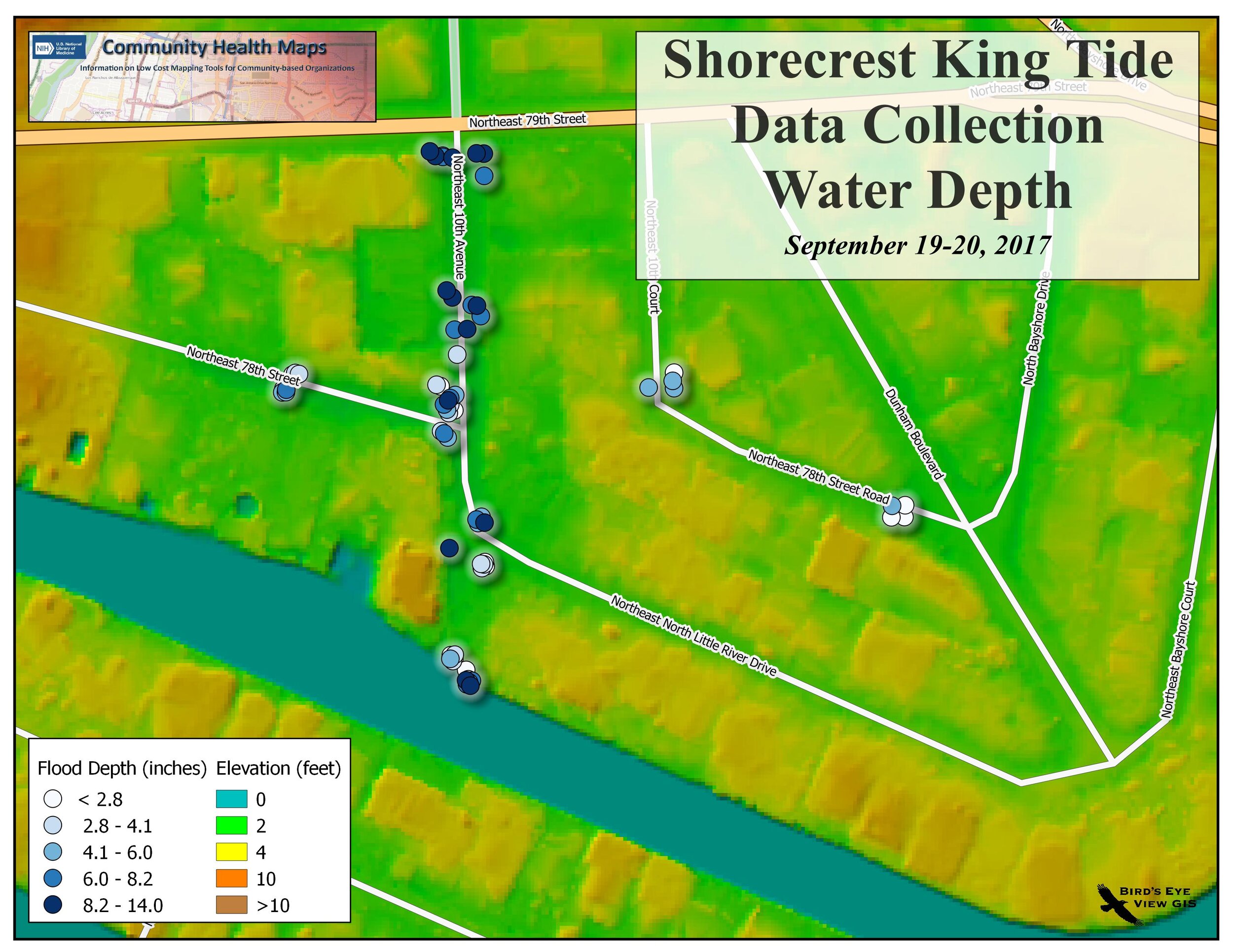
Map showing water depth in comparison to elevation above sea level

Map showing water depth in comparison to elevation above sea level

While collecting data for risk maps a Miami Herald reporter stopped by the Shorecrest neighborhood where we were working. Here's his story about our initiative.

GIS as an Educational Tool at MUSC

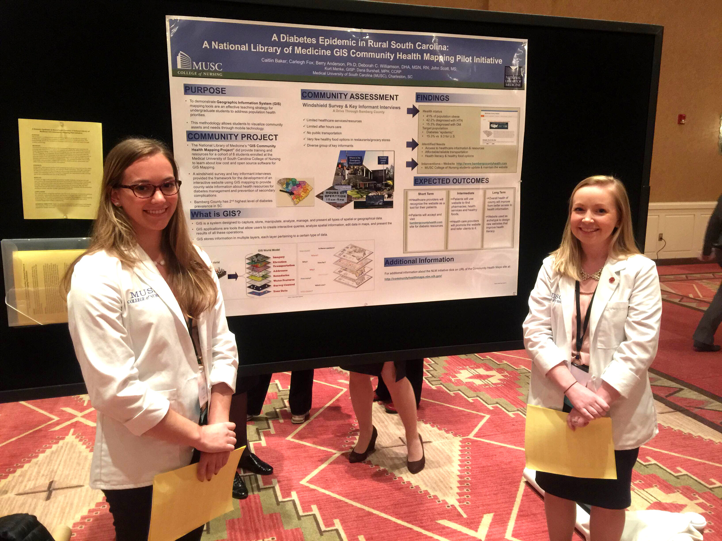
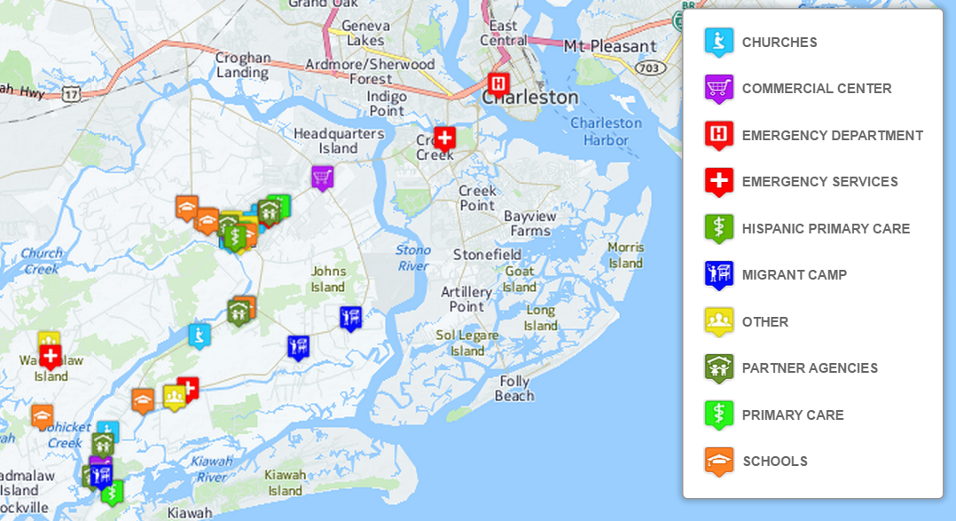
Submitted by Jennifer RewolinskiDr. Deborah Williamson is an Associate Professor in the College of Nursing at the Medical University of South Carolina (MUSC), Charleston. Dr. Williamson, Community Health Maps (CHM) and MUSC have partnered in providing training that integrates GIS and CHM tools for a high school Teen Health Leadership Program. Dr. Williamson has worked with both community members and students.wilmsndDr. Williamson believes that, “GIS has the potential to substantially increase community engagement and is truly a concept of the neighborhood taking control of their data.” She notes that while researchers might study a community, that a community’s input is essential to understanding the cultural and environmental context surrounding health issues: “GIS mapping puts the community members on more of a level playing field with their research partners.” GIS can empower and educate community members to identify their key issues, to become a part of an analysis, and to provide solutions. When communities are given the opportunity to map their own health, discovery, and awareness, positive changes can result.  When a community feels it has more of a say through engagement with GIS, or communication with a map, intervention is more likely to be effective.For the past three semesters, Dr. Williamson has used GIS in her own classroom as a capstone project for population health students.  They, “find it fun and can take it with them into other settings, it fits into the world of new technology, and it takes people to the next step of looking at health issues.” Mapping offers a different way to help students visualize Social Determinants of Health and to make the connection between what population health is, and the factors that promote or deter it.IMG_9585_v2Finally, Dr. Williamson sees GIS as bi-directional: it supports visualizing gaps and assets while also providing the ability to disseminate and build on information via intervention programs to improve health outcomes and strengthen communities. GIS is also broadly applicable to almost any discipline and easily used by those with little expertise. “Presenting raw data to a community or students doesn’t mean a lot,” Dr. Williamson comments, “but when that same data is aggregated visually it instantly communicates a message to any audience.” GIS is clearly suitable as an effective educational tool in the classroom and in communities.CHM thanks Dr. Williamson for her continued collaboration and time spent advancing the CHM program through use of the CHM tools at MUSC. CHM values our partnership with MUSC and hope that the future is as mutually beneficial as the past few years.Field data collection for the CHM workflow bridges the divide between learning in a classroom and experiencing conditions in a community. For the capstone project, students use CHM labs and parts of the CHM workflow, including phone data collection with iForm or Fulcrum, integration of the data into QGIS, and presenting the data with Carto or Google Maps. Dr. Williamson’s students often upload their data from iForm to Google Maps because of its familiarity and easy access.One student project involved identifying migrant camps as a community in need, and assessing the community through surveys and key informant interviews.  When the data showed that migrant workers often lack knowledge of health information and access to healthcare services, students mapped locations of migrant camps near Charleston, SC in relation to urgent care facilities and shared the data with the migrant outreach workers from a local community health center. Later, an intervention was developed to provide hands on CPR and first aid instruction to 60 workers. This project displays successful application of CHM tools in an educational and community context resulting in an intervention that may offer real change.CharlestonMigrantMap.png
Visualizing an Intervention for Tobacco Control

Submitted by Jennifer Rewolinski

Dr. Heckman, an assistant professor of psychiatry and behavioral sciences at the Medical University of South Carolina (MUSC) in Charleston, used Community Health Maps (CHM) tools in his research on tobacco control. Smoking is the leading preventable cause of death worldwide and costs the US $130 billion in direct medical costs annually. Smoking is still a major public health issue that influences mortality, morbidity, healthcare costs, the environment, and quality of life.

Dr. Bryan Heckman

Dr. Bryan Heckman

The outcome of Dr. Heckman’s precision medicine project will be a mobile app that aids smokers who recently quit by alerting them of proximity to stores which sell cigarettes or alternative nicotine products. Studies show that greater tobacco retailer density is associated with greater incidence of relapse; Dr. Heckman believes that mapping provides a new approach to visualizing environmental factors. A CHM training event at MUSC spurred his decision to integrate mapping into his own work using the CHM labs as a guide. These labs provide step-by-step instructions for implementing the CHM workflow. He used the data collection app Fulcrum on an iPhone to collect information on retailers: GPS coordinates, type, type of tobacco products sold, e-cigarette advertising, and photos. His team also used a high-powered Trimble GPS device to test accuracy of phone GPS, and the accuracy of phone GPS was adequate and more cost effective than more expensive GPS devices.

Figure 1. Dr. Heckman’s in progress map shows higher numbers of tobacco retailers are associated with  Census Tracts that have both higher poverty and a higher percentage of minority populations.

Figure 1. Dr. Heckman’s in progress map shows higher numbers of tobacco retailers are associated with  Census Tracts that have both higher poverty and a higher percentage of minority populations.

Dr. Heckman integrated his Fulcrum data into QGIS software. He added national datasets from the American Community Survey and Behavior Risk Factor Surveillance System for Census tract data, and Synar for retailer data to check the validity of the Fulcrum data; field data collection with Fulcrum revealed a more accurate list of current retailers than the national secondary datasets provided. Dr. Heckman believes QGIS is a powerful tool with many features; he was not only able to use QGIS to monitor and visualize his research questions but also to guide his project decisions and hypotheses. His results will guide policy recommendations, improve access to care, and deliver novel interventions.

Figure 2. Dr. Heckman’s in progress map shows higher numbers of tobacco retailers are associated with Census Tracts with higher percentages of minority populations

Figure 2. Dr. Heckman’s in progress map shows higher numbers of tobacco retailers are associated with Census Tracts with higher percentages of minority populations

For those attempting to undertake a health GIS project on their own, Dr. Heckman emphasized that all the tools needed are provided on the CHM blog; only time and patience are required. He also recommends asking for help and reaching out to other CHM users who have experience. Dr. Heckman’s project has the potential to affect behavior change and reduce health disparities via a mobile intervention app which identifies nearby tobacco retailers and prompts and provides an intervention and awareness of a health issue. Dr. Heckman’s experience is an example of how the CHM blog and tools might be used.

Dr. Heckman would like to thank Kurt Menke and the CHM team, Dr. Williamson from MUSC, and his mentors for inspiration and growth. He would also like to acknowledge the Hollings Cancer Center and American Cancer Society Institutional Research Grant that helps support his work, and Alex Hirsch for his help coordinating the project.

The CHM team would like to extend their own gratitude to Dr. Heckman as they sincerely appreciate his time and his support of the CHM blog.

Mapping Curb Ramp Accessibility around a Silver Spring, MD Assisted Living Facility

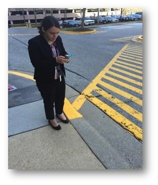
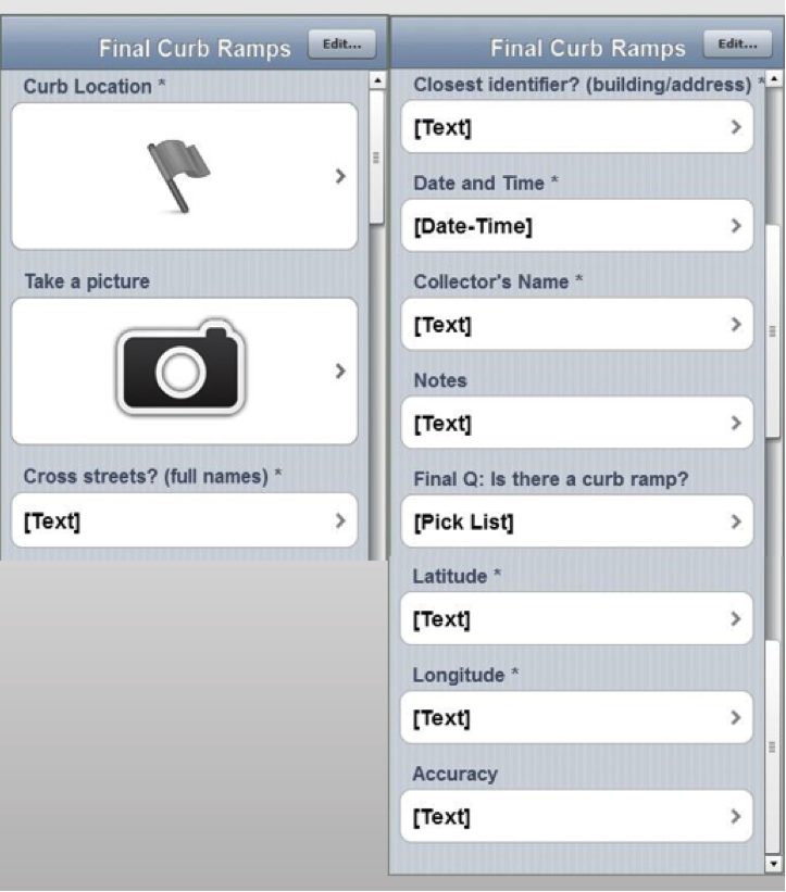
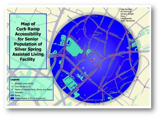
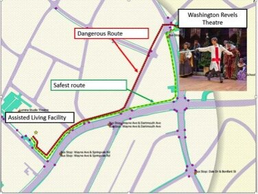
Submitted by Jenny Rewolinski, University of Maryland, B.S. Community Health 2016I just completed a spring internship with the National Library of Medicine (NLM). My goal was to demonstrate what a typical user of the Community Health Maps (CHM) blog might experience, while using the low cost resources it reviews to develop a mapping project with a public health focus. I read through the case studies on the CHM blog and used its labs to develop my project plan and to guide my related decisions.Because of my experience with elderly relatives and my background in public health, I centered my project on how the senior population of a nearby Assisted Living Facility might safely navigate local sidewalks. According to the 2014 American Community Survey, 23% of people over 65 have some sort ambulatory disability. With this in mind, I decided to map local curb ramps --sloped transitions between sidewalks and streets which function as accessibility enhancements to help those with mobility issues to cross streets safely.JennyDataCollectionI used CHM Lab 1: Field Data Collection to learn how to design my own data collection form using iForm. My Curb Ramp form captured curb ramp location, conditions, and other observations such as seniors using the curb ramps, steep or damaged curb ramps, and a lack of sidewalks in the area. As discussed in a prior blog post, How Accurate is the GPS on my Smart Phone?, phone geolocation is usually accurate up to 8 meters. This was not precise enough for my curb ramp data, so I corrected for this on my form.  Over the course of 8 hours spanning 2 days, and with 2 other interns I collected 103 existing curb ramps and locations where curb ramps might aid accessibility.iFormCurbRampFormNext, I brought my iForm curb ramp data from my phone into the QGIS software by using instructions from CHM Lab 2: Bringing Field Data into QGIS.  I also used CHM Labs 3: Combining Field Data with Other Organizational Data and CHM Lab 4: Basic Spatial Analysis  to add data layers and to perform spatial analysis to finalize my map.MapThis is my project map! I completed construction of my map using CHM Lab 5: Cartography with QGIS. In addition to my curb ramp data points, I added data layers for sidewalks, roads, places of interest (such as grocery stores, restaurants, bus stops,  theaters), and my Assisted Living Facility. My goal was to raise awareness of how accessibility can impact seniors’ sense of autonomy and empowerment, and their ability to exercise and to lead a healthier lifestyle. This map also provides recommendations for where more curb ramps should be placed based on observations during data collection. I plan to discuss this map and curb ramp recommendations with the city of Silver Spring and to create “safest route” guides for popular local destinations.SafestRouteGIS has a huge potential to help us analyze health issues. When I began my project at NLM, I thought I would simply be mapping the location of curb ramps near a local Assisted Living Facility; however I discovered the significant need for more curb ramps as well as sidewalks around my project area.I believe the conclusions I was able to reach by using the low cost CHM resources CHM are accurate and workable. I came to NLM with little to no GIS knowledge yet I learned from the CHM GIS labs, collected curb ramp data points and created a map that may bring awareness to a public health issue. In doing so I believe my experience is typical of many CHM users.
If I can do it, you can too!

Announcement: Extreme Heat & Health Webinar

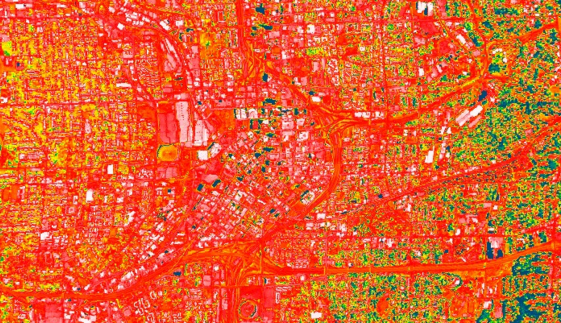
There will be a webinar next week entitled: Extreme Heat and Health: Creating Environmental Intelligence Through Science, Predictions, and Engagement. The specific date and time are: April 28th, 2016 from 4 - 5:30pm EDT. This will likely be an interesting webinar for many Community Health Mappers! Click this link to learn more.2016-04-22_101608

Tableau Public for Data Visualizations

Tableau Public is free software that can help users publish interactive data visualizations to the internet. This software is another great option for data visualization along with GIS Cloud or CartoDB. It has powerful charting and graphing tools, and also allows you to map data and display that data against several online datasets and basemaps.No plug-ins or programming skills are required, just a browser with JavaScript enabled. Tableau Public uses a simple drag and drop process that anyone can learn. You can work with either the free Tableau Desktop app, or Tableau Online the free cloud based server. Either way you can save your work to the Tableau Public Web servers, which are accessible by everyone on the Internet. One important note about this is that any data you publish is accessible to everyone on the internet.People see and understand data, reports and dashboards faster with visual analytics technology, which can help uncover key trends, relationships, patterns, and outliers that might otherwise be a challenge to find. Tableau Public can be used to pare down information to its simplest form by stripping away the less important data.The software can connect to Microsoft Excel, Microsoft Access, and multiple text file formats. It has a limit of 1,000,000 rows of data allowed in any single file. Your organization may use up to 50 megabytes of space.Tableau Public projects can be shared by emailing a link or by embedding the work in a blog, wiki, or website. Clicking on an emailed link will open a browser page with the view loaded. If embedded onto a page, anyone who visits the page will see the live interactive view.  The following shows the use of Tableau Public in two health related studies.Public Health Case StudiesTo visualize the specific social problem of teen pregnancy over time, Tableau Public was used by the Wisconsin Council on Children and Families to show the decline in births to teen mothers in Wisconsin over recent years. The data depicts racial disparities in teen births in Wisconsin as well as differences in birth rates between older and younger teens. The online link to the data visualizations created with Tableau Public for this study can be found here: http://tblsft.com/public/gallery/teen-pregnancy-declinesThe figure below is a screenshot of one of the data visualizations from this study. Data visualizations are interactive. Here the white popup window is showing data from a specific place on the line graph.Teen Pregnancy Data VisualizationSuch visualizations may help communities address and manage such issues as health problems associated with prematurity and poor academic performance of children of teen parents.Data can also be mapped by geographic coordinates, city, state, county, and zip code. The visualization below deals with Medicare Costs and combines a map with a chart showing trends in the data.Tableau Public Desktop - Medicare Cost Data VisualizationOther data visualization examples created with Tableau Public can be found in the Gallery:http://www.tableausoftware.com/public/galleryOther Tableau Public Resources can be found here:https://public.tableau.com/s/resources  

Teens Map Environmental Health of Their Community (Sea Islands, South Carolina)

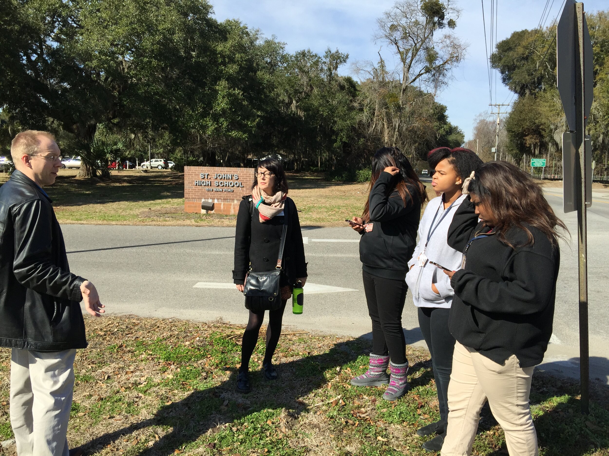
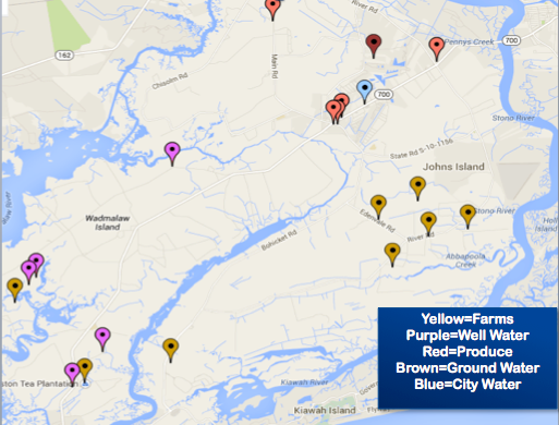
By Guest Blogger: Derek Toth - Communities in Schools CharlestonThe Teen Health Leadership Program (THLP) is in their eight year of existence at St. John’s High School on Johns Island. The program gathers leaders of the school together and focuses on a health topic they feel is affecting their community and assists the community in understanding this topic through the use of media dissemination.  In the past, topics included Autism, Cancer, Stress, Obesity and Alcohol and Drugs and This year, the students wanted to look at their community as a whole with a topic of Environmental Health.The THLP students wanted to see what makes their Sea Island community different.  The Sea Islands are composed of John’s Island, Wadmalaw Island, Seabrook Island and Kiawah Island outside of Charleston, South Carolina.  Students primarily come from John’s and Wadmalaw Islands. These islands are extremely different for many reasons. The students wanted to be able to translate these differences in a new form for the Teen Health Leadership Program. The students were presented with an opportunity to use the Community Health Mapping tools discussed on this blog, and some training made available from the National Library of Medicine. With GIS, the students can pin point differences within the islands for their community to see.(This January Kurt Menke conducted a Community Health Map training at the Medical University of South Carolina College of Nursing.  Two teachers with Communities in Schools Charleston attended and the next afternoon Kurt Menke went to St. John's High School and showed the students how to map their campus with their iPhones.) Derek Toth teaching his students to map their campusThe students used smart phones, along with an app named iForm, to map points of interest with GPS. They collected well water locations, ground and city water sources, as well as, places in the community to purchase food. The food resources they mapped included farmers markets, produce stands, grocery stores and local farms. The students were able to indicate these points on a map. Google maps was used to create the final map.With the final map they were able to determine that people on Wadmalaw Island have less access to food and water than those on St. John's Island. For example, Wadmalaw Island is limited in places to buy produce or groceries, and has limited access to the farms that John’s Island has. Residents of Wadmalaw Island are on well water, and obtain their produce at the local grocery store on Johns Island, as opposed to driving to one of the many local farms.Teen Health Leadership Program Seal Islands Access to Food and WaterThe final  map was inserted into the Environmental Health project for the community to have a unique perspective of their Sea Island Community. Overall, the students felt that using their smart phones to map their community was easy to learn and fun. They were able to grasp the information quickly and seemed pleased with their results. The group feels it reached it’s goal of accomplishing a fresh look at the Sea Islands and felt it added to their presentation on Environmental Health.

Technology + Youth = Change

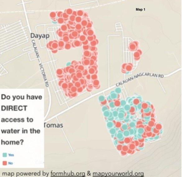
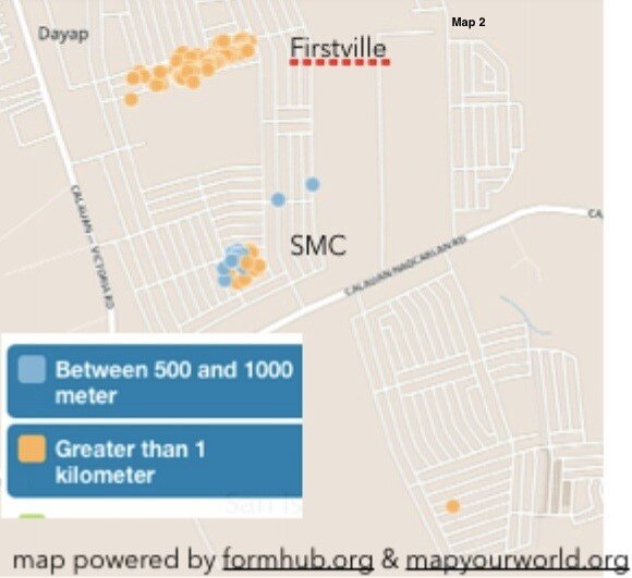
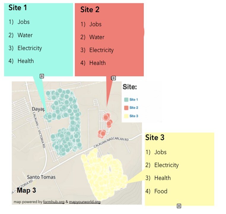
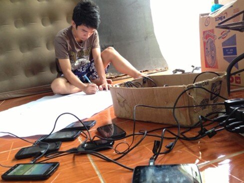
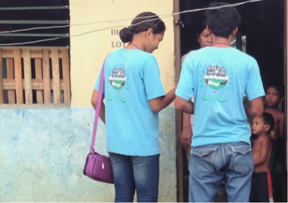
by Chad Noble-TabioloIt all started in May 2013 when I watched the documentary entitled Revolutionary Optimists on PBS’s Independent Lens. It showed how young people from a slum in Kolkata, India were able to map the deficient and unsafe water taps in their community, in order to plea with the government for more and safe drinking water lines. The film highlighted technology in an unconventional way. It showed GIS-technology as an innovative tool to mobilize youth for social change.This heralded the beginning of a partnership with Map Your World to develop a mapping project in the Philippines in the summer of 2013. Through coordination with domestic and international partners, the youth mapping program was implemented in Southville 7 — an impoverished and neglected slum community, about three-hours south of metro Manila. The issues faced in Southville 7 ranged from lack of access to jobs, water and electricity to food insecurity and child and maternity health; and because of a lack of response from both the government and non-governmental sectors, the project was aimed to raise awareness and demand change.In just a few weeks, a dozen phones were donated. Youth, ranging from 15 to 23 years old, were trained to go house-to-house to collect data. By the end of three months, 3000 families were surveyed and the needs of the community were mapped. Depicted below is Map 1, which shows the families who have direct access to water in their homes.Families who have direct access to water in their homes.Because of the unequal distribution of resources, it was evident who had direct access to water and who did not. Map 2 shows those families who did not have direct access to water. These families had to walk more than 1 kilometer to a communal water tap.Families who had to walk more than 1 kilometer  to water.Lastly, Map 3, represents the top four needs according to the three different subdivisions or sites in Southville 7.  Collectively these maps and data provide an opportunity for proper and adequate planning for public health infrastructure and needs.The top four needs according to the three different subdivisions or sites in Southville 7: Jobs, Water, Electricity and Healthcare.The Android mobile phones used by the youth were powered by open-source applications for GPS-mapping and data collection. ODK Collect or Open Data Kit was the data collection tool utilized in the project. It can be found on the Android market. (NOTE: This tool is also described in the Community Health Mapping blog post on Field Data Collection). This tool is functional only after uploading a survey form that is created in Microsoft Excel and uploaded to the companion site www.formhub.org. The maps were created online with Map Your World, an online community mapping tool inspired by the Revolutionary Optimists documentary.Map Your World BannerIn the end, the 30 youth involved in the mapping project were able to accomplish an endeavor that many people in their community had not expected. They were able to successfully map who in their community had access to water, electricity, jobs and vaccination for children under five years old, among others. They became leaders who are now equipped with leadership and technological skills that many in their community lack. They were empowered to raise awareness about the social injustices and health inequalities existing among them.One of the community mappers with an array of Android phones.The Southville 7’s mapping work was primarily a vehicle for instilling hope, and the use of GPS/mapping-technology offered an opportunity for the youth to be the voice for their community. According to one youth, “For me, mapping is like knowing. Knowing the problems, and how people are coping with them. Through the work we can open the eyes of the people, not only the things that can help them, but things that can help us all.Youth mapping their community

Noise Pollution and Health in the Urban Environment: A Pilot Project

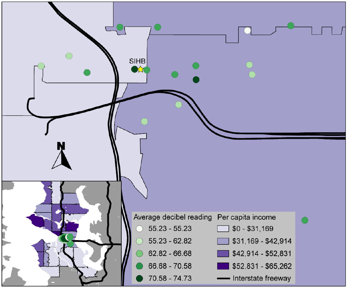
In October 2013, the Seattle Indian Health Board’s (SIHB’s) Urban Indian Health Institute (UIHI) completed a noise pollution pilot study. The goals of this project were: 1) to evaluate the feasibility of community data collection and analysis via a low cost GPS/GIS workflow, and 2) to offer recommendations on the feasibility and next steps for scalability to the larger Urban Indian Health Organization (UIHO) network. The collected data could additionally illustrate community health needs when merged with health or other contextual data for analysis, but these analyses were not the primary focus of this pilot. We chose to look at noise pollution because it is an environmental health concern that has been linked to a variety of health conditions in both occupational and community studies and it is easy to measure with portable devices.For field data collection, we used an iPad Mini with the GISPro and Decibel 10th apps. For mapping and spatial analysis, we used the open source desktop GIS software QGIS (www.qgis.org). While GISPro is a paid iPad app, the other programs are free. Data collection participants were staff recruited from the SIHB’s administrative, clinical and UIHI departments. We selected participants from this pool because they are representative of the staff at UIHOs who likely have limited experience with data collection and GIS. UIHI project staff trained seven participants in the iPad workflow and data collection process. This workflow consisted of five steps: 1) collect noise data with Decibel 10th, 2) export noise data via email, 3) take a site picture, 4) collect GIS data with GISPro and 5) export that GIS data.Select pictures of data collection sites, taken by study participants using an iPad Mini; Seattle, WAWhen the volunteer participants were finished with data collection, project staff compiled and analyzed the data using QGIS and Stata. Data were merged with socioeconomic indicators from the American Community Survey by zip code. Participating staff were asked for their feedback about their experience and the usability of the tools.Average decibel reading at the 17 data collection sites and per capita income of zip codes, location of the Seattle Indian Health Board indicated by yellow star; Seattle, WA; October 2013That feedback, combined with the experience of project staff, suggested that the GIS software tools were user-friendly and highly effective. Thus, they are likely to be attractive to organizations with limited technology budgets. However, some of the other resources necessary for this project (i.e. the GISPro mapping app, the iPad and general GIS software expertise) are expensive and may be limitations for many UIHOs. In the future, the UIHI would like to use these tools to better understand the health of the community, as well as assist UIHOs in conducting similar projects in their service area.For more information about this project, view the project brief at http://www.uihi.org/wp-content/uploads/2014/08/GIS-Project-Brief_20140604.pdf.The UIHI is a division of the SIHB and is one of 12 Indian Health Service tribal epidemiology centers (TECs). Unlike the other TECs that focus on geography-specific tribal populations, the UIHI is national in scope, focusing on American Indians and Alaska Natives (AI/ANs) living in urban areas. The UIHI supports the efforts of Urban Indian Health Organizations (UIHOs) nationally, as they serve the health and social support needs of their urban AI/AN communities.The Center for Public Service Communications and the National Library of Medicine provided funding for the UIHI to complete this project.