Web mapping

The Basics of Using MapBox Studio for Web Mapping

MapBox is a very popular web mapping platform used by many social networking apps and news outlets. It includes a very powerful set of tools and comes with a modest pricing scheme.  The amount you pay depends on the web traffic your site receives, for many this will be next to free. As such this can be a great alternative way to publish interactive maps.

Uploading Data

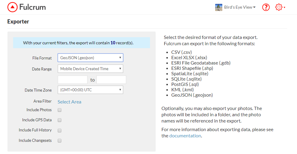
If you have collected data using Fulcrum you will want to export that as a GeoJSON file.geoJSONexportTo start you can create a free account at https://www.mapbox.com/.  Once logged in click on the Products menu, choose Studio. From there click the Get started link.  From your Studio dashboard click on Datasets.
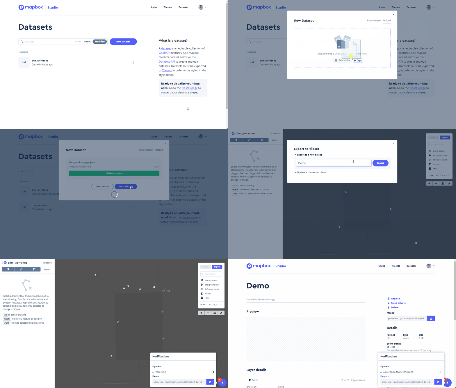
  • Click the New Dataset button
  • Select Upload  
  • Drag your GeoJSON file onto the form and click Confirm and Create
  • After it has finished uploading click Start editing. The data editor will open and your points will be displayed on a dark basemap. Next you will export your data to something called a tileset. Web maps are composed of tiles for each zoom level. During this next step MapBox will generate all the map tiles for your dataset.
  • Click the Export button and select Export to a new tileset.
  • Name your tileset and click Export.
  • It will process your data. When it has finished click on the dataset name to return to your Datasets on your Studio dashboard.
MBUploadDataset

Creating a Style

Now that you have uploaded your data you will learn about map Styles. Click on the Styles link on the top row of your dashboard.

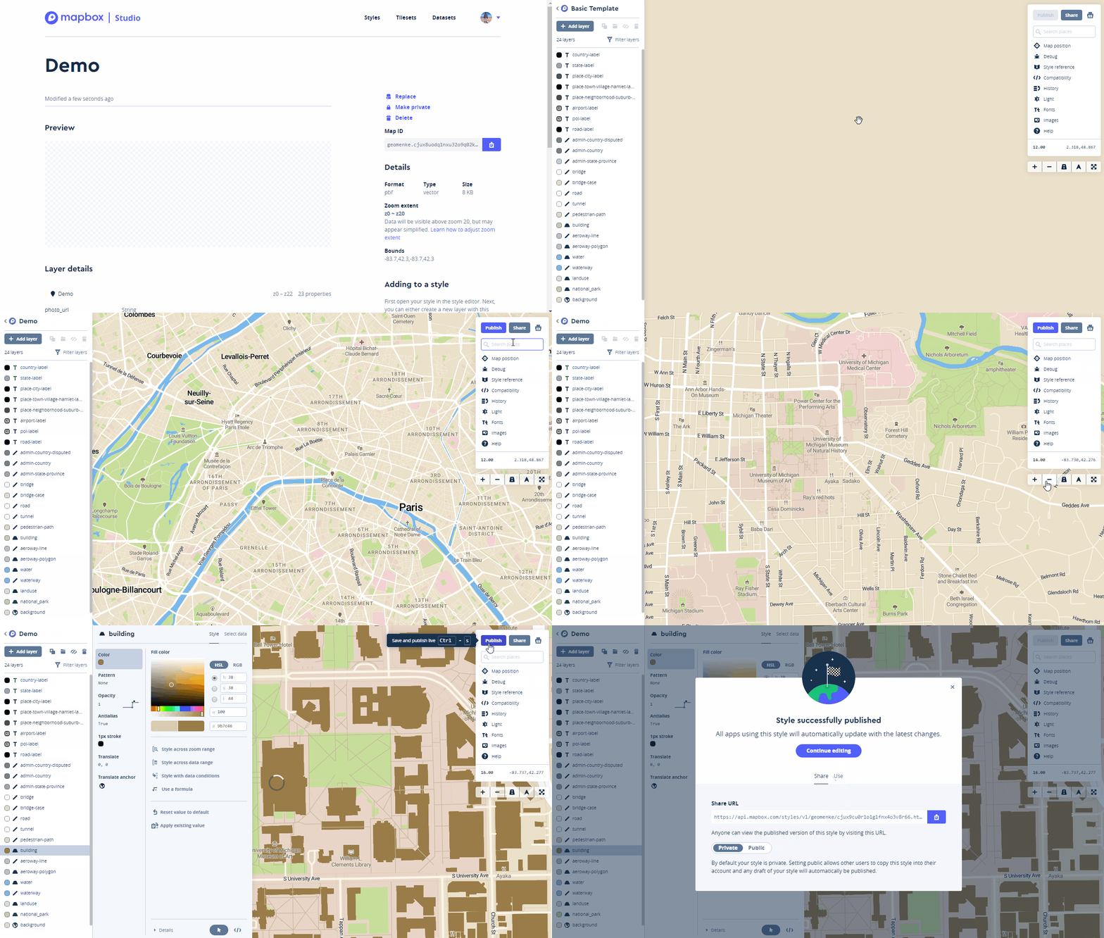
  • Click the New style button
  • Choose an existing style such as Basic Template and click the Create button.
  • The style template will open. You can rename it from Basic Template to something more meaningful. Here the style has been renamed to Demo.
  • Next search for your area of interest in the white box to the right. In the example below I have searched for Ann Arbor, Michigan and then zoomed in a little closer to the data collection area.
  • You can customize the styling for any and all of the layers that make up this template. Here I am darkening the brown used for buildings a bit. To do this I clicked on Buildings and changed the color with the color widget.
  • Once you have made the changes you desire click the Publish button. Click Publish again and you have created your own basemap style.
MBCreateNewStyle

Adding a Layer to Your Map

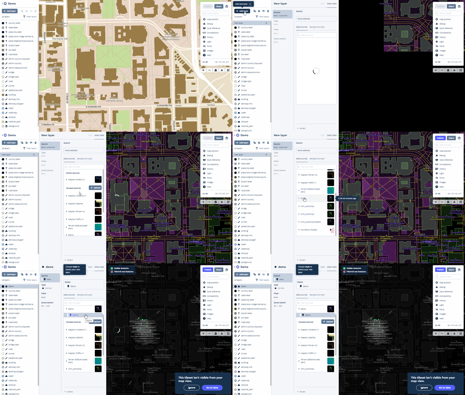
Now you can add your tileset to your map style. Click the Add Layer button and choose the tileset you created. MBAddLayer
Styling Points

Once the layer has been added click on the Style tab of the layer. Next you will learn to give each type of Infrastructure it's own point color.

  • Select the Color component
  • Click on Style with data conditions
  • The popup box for Choose a data field window opens. In this case the field is named Infrastructure so I begin typing Inf to more quickly locate the field. When you have found the field containing the categories for mapping, select it.
  • A Set values for box window opens. Select the first value e.g., Bench. The Data field will now read: Data field Infrastructure is Bench. Select the color for that item.
  • In the Set values for box window select the next item e.g., Sign and assign a color.
  • Continue until you have assigned colors to each value.

MBpointsdifferentcolorsCreating pop up windows takes a little more work. You can read the MapBox tutorial for that here.

Publishing a Map

  • When you are ready to share your map click the Publish button.
  • In the window that opens click Publish again and you Style will be published again and a url to your map will be provided.
  • You can also change the permissions here, and if you do you will receive a Success message.
  • When finished close the window.
  • Then click the Share button. You are given a url on the Share tab and a code snippet on the Use tab. The code snippet can be copied and pasted into a website to embed your map.
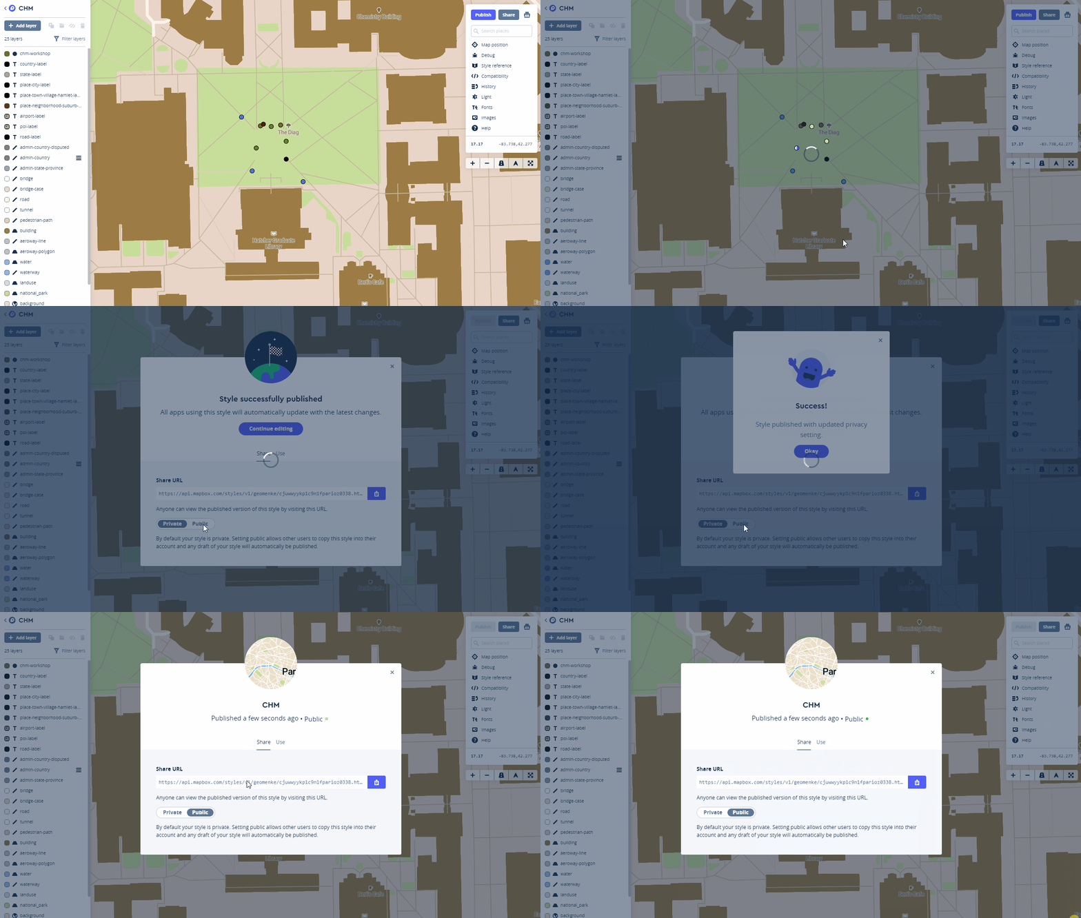
MBPublishThis is just a basic primer for getting started with MapBox Studio. There is a lot you can do with this platform. You can find more tutorials here.

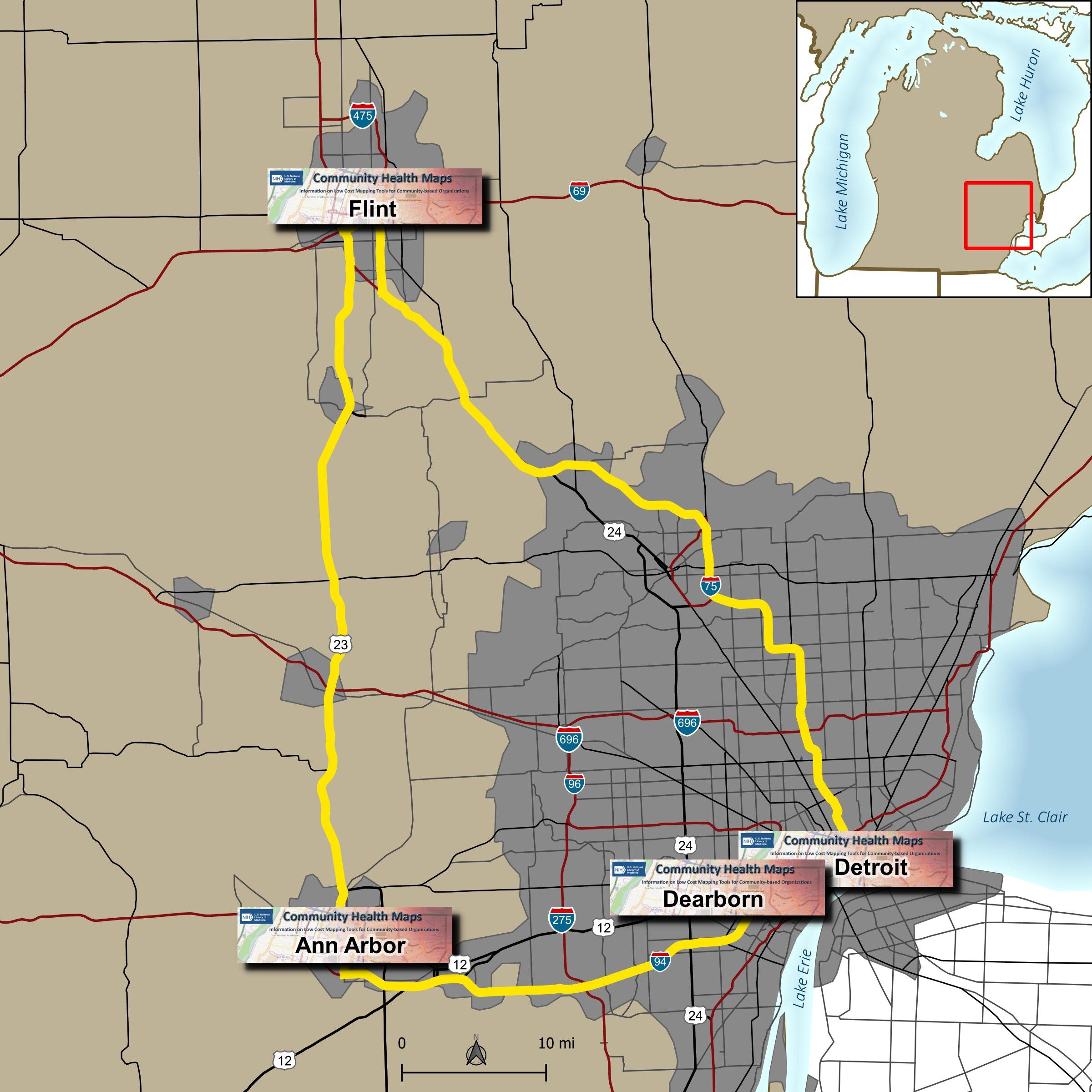
Community Health Maps in Michigan: Four Workshops in Four Days in Four Cities!

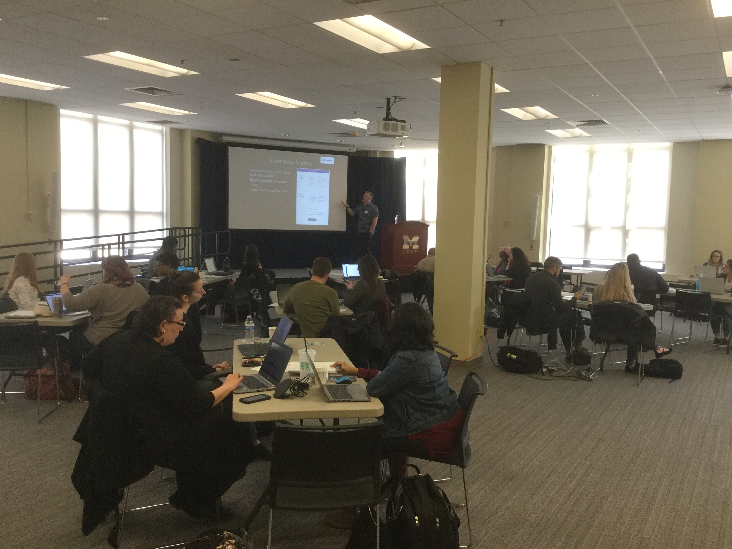
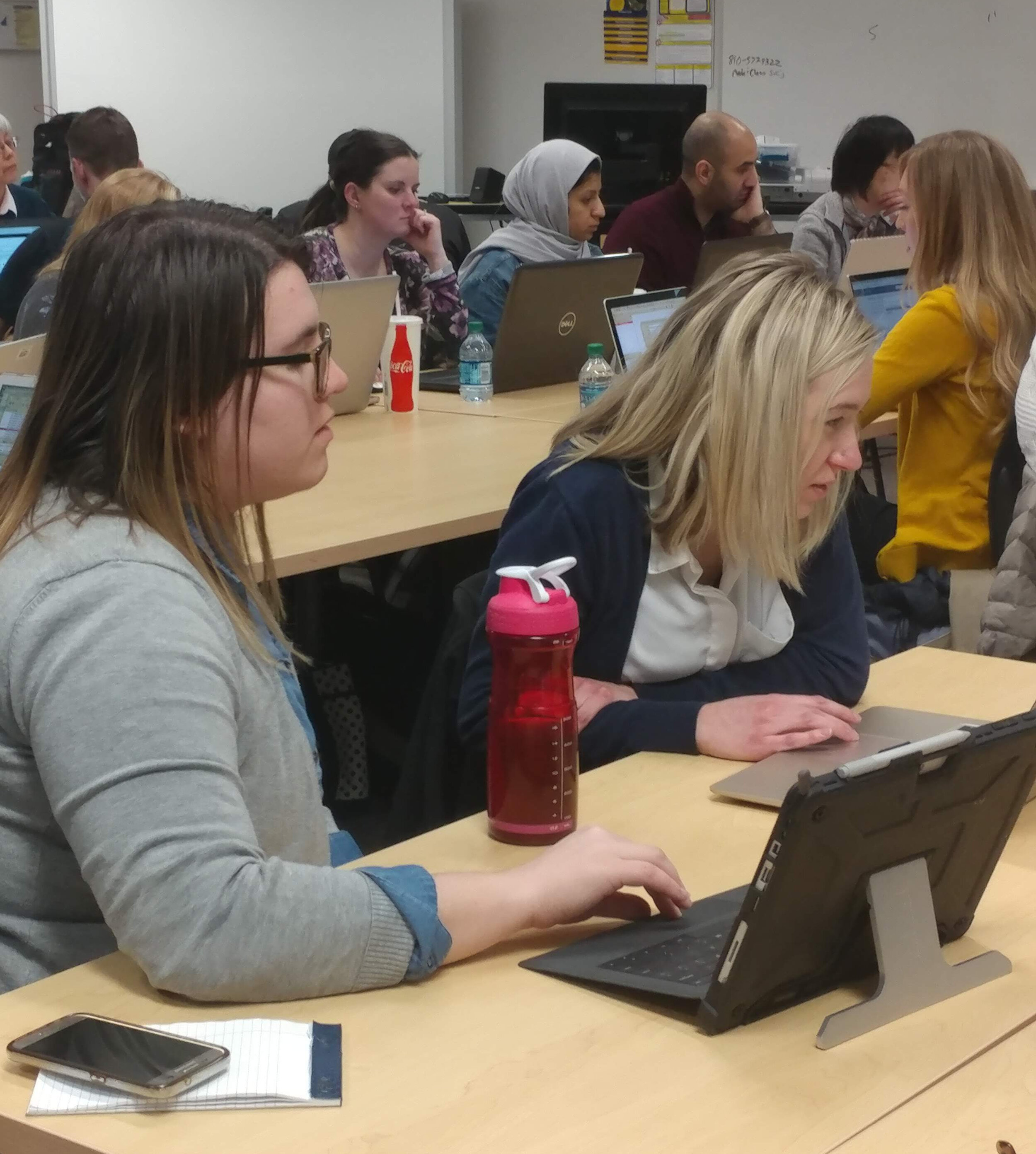
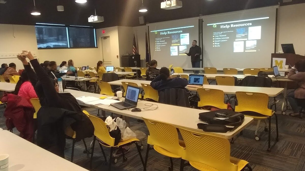
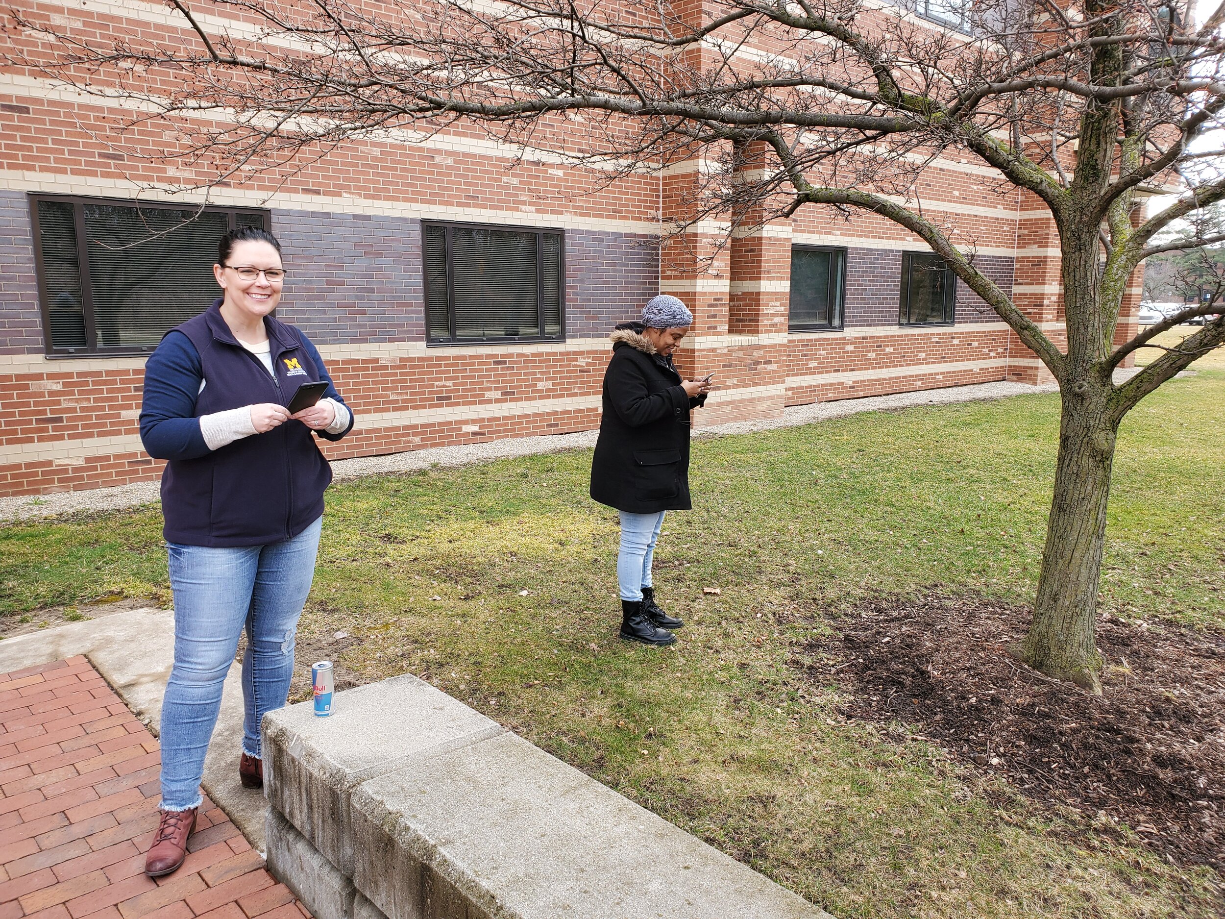
This past week Kurt Menke traveled to Michigan and taught four Community Health Maps workshops for the University of Michigan. These were organized by the University of Michigan Libraries and were done in four days on four different campuses: Ann Arbor, Flint, Detroit Center and Dearborn. These workshops were part of the Community Health Maps project and were funded by the National Library of Medicine (funding for the workshops was provided under a sub-award from the National Library of Medicine to ICF International).BlogDue to great outreach by the University of Michigan team of - Tyler Nix, Marisa Conte, Alexa Rivera, Justin Schell, Sara McDonnell, Troy Rosencrants, Kui-Bin Im and Claudia Walters - the workshops had great attendance and ran like clockwork.The first was held at the University of Michigan - Ann Arbor at the Hatcher Graduate Library.  Twenty eight people attended. The audience was mainly a mix of faculty and representatives of local public health/community organizations with a few students. The final hour was reserved for group discussion and Justin Schell did a fantastic job moderating. Ideas for mapping park safety and identifying underserved populations were discussed as projects where mapping could help.IMG_0204The second was held the following day at the UM Flint. We started in the University Center Happenings Room and moved to Thompson Library for the afternoon QGIS session. Forty five people came out for this second training, quite a bit more than we expected. This included some walk-ins and late registrants. In addition to faculty and students there were quite a few representatives from local county health departments and non-profits.20190403_134426The third was held at the UM Detroit Center on April 4th. Thirty people registered for this workshop. This was probably the most diverse group including some UM faculty, plus Wayne State faculty, county public health staff (including some as far away as Saginaw County) and non-profit public health workers.20190404_142046The fourth was held at UM Dearborn on April 5th. This was the smallest of the four with 20 registrants. However, this allowed us to get a little farther into the capabilities of QGIS.20190405_103209One of the most helpful components was a web page Marisa Conte set up for the workshops. It initially had all the important details for each workshop, including driving directions, links to the slides and workshop data. This alone set a new standard for workshop outreach and organization. During the discussion on the first day she began adding url's for sites containing useful data and other resources identified during the afternoon discussion. During the week this  evolved into what is now a fantastic resource for everyone who attended. This will be helpful to anyone implementing CHM related projects or those who weren't able to attend.For the week  123 people were trained in Community Health Maps! This is a record that may never be broken. However what came out of the week more than the numbers, is the incredible potential for projects that can make a real difference in these communities. I'm looking forward to working more with everyone I met. Thanks again to UM Michigan for organizing such a successful series of workshops.
The Carto Grant Program

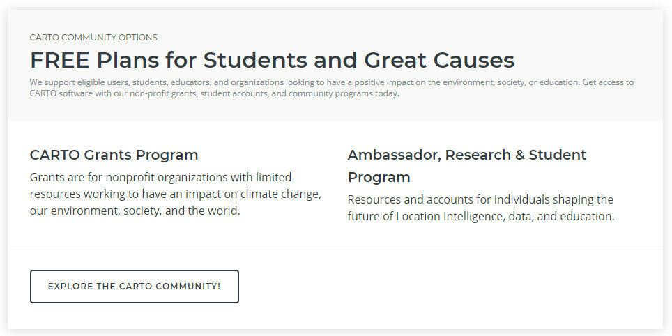
Carto, the platform for making online maps, recently abandoned it's free license option. The reason they gave was that many users were creating accounts, sometimes several accounts, and simply not using them. This became expensive overhead for them to manage. As a result they now offer a Professional or Enterprise plan once your free trial expires. This new pricing scheme is shown below:2018-07-11_115705Note that non-profit organizations receive a 20% discount off this Professional license. This license also affords you many more benefits than the previous free license.  For example, the free license gave you 50Mb of cloud storage space while the Professional plan gives you 500Mb. It also allows you to set permissions on your datasets to make them private. It also gives you email and online support.If that price is beyond your organizations budget you will notice that directly below the pricing plan is a section covering FREE Plans for Students and Great Causes! 2018-07-11_120555.jpgCarto has a grant program. You can read about this program here. All it takes to apply is filling out an application form!
CartoDB Rebranded as Carto

Community Health Maps has long recommended the use of CartoDB for those interested in low cost online mapping and data visualization. In fact, CHM caught the beginning of this wave because CartoDB wasn't even launched until 2012!CartoDBEarly last month (July 2016) CartoDB was rebranded as Carto, which includes a new logo. However, once you get beyond the new logo your current account page including your data and maps remains unchanged.  You can still build maps the way you always have in what is now known as Carto Editor.CartoThe main difference is that Carto now offers up a new interface named Carto Builder. The good news for Community Health Mappers is that their goal with Carto Builder is to introduce an updated interface. One that still does not require complex geospatial skills and programming. With Carto Builder they aim to make Location Intelligence (LI) more accessible to more people.  This means it will give you point and click access to deeper analysis of your data. Builder will have all the functionality currently found in Editor along with the new tools.Eventually Carto Editor will be phased out and Carto Builder will be the interface everyone uses. You can request early access to Carto Builder here: http://go.carto.com/request-beta-access. New users of Carto will be given access the the Carto Builder in phases, over the next several months. All existing maps and data will be seamlessly migrated to the new interface. The following page answers Frequently Asked Questions about the migration from Editor to Builder: https://carto.com/docs/carto-builder/faqs/Once the migration is complete I will post about the new functionality. Stay tuned! 

White House Announces the Opportunity Project

This week the White House announced the Opportunity Project. It is an open data initiative geared towards empowering communities with data and tools to improve economic mobility. Open data is the data equivalent of open source software. It is licensed so that it is freely available to use by anyone.The main page for the project can be found here: http://opportunity.census.gov/.Opportunity Project WebsiteIt includes links to sources of open data and online tools built on open data, ,many of them map based. This looks to be a great resource for Community Health Mappers! 

Community Health Mapping: A New Year Review

To start the New Year I thought I’d begin with a review of Community Health Mapping (CHM). There are a lot of new project partners, and I thought it would be a good time to give a project overview. CHM is a collaborative effort between the National Library of MedicineCenter for Public Service Communications and Bird’s Eye View. The National Library of Medicine is funding the initiative.The overall goal is to empower community organizations serving vulnerable or underserved populations with low cost, intuitive mapping technology. Therefore we’ve been working with programs organizations who:

  • Focus on vulnerable populations
  • Frequently use and collect data
  • Need effective, scalable & easy to use mapping tools
  • Lack resources (i.e., for proprietary GIS training & software)

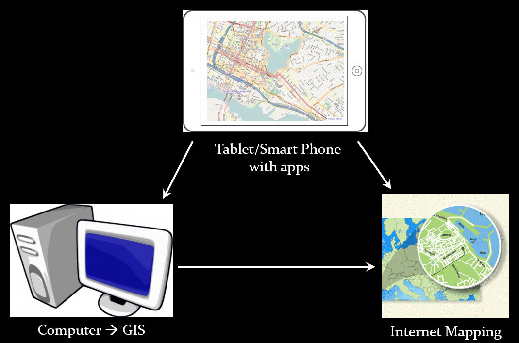
We have identified a suite of tools that allow you to collect custom field data, analyze that data, combine it with other spatial datasets, and generate both static maps and/or dynamic maps on the internet. This allows organizations to collect and work with their own data, and if appropriate, share it with others. CHM involves three components that meet all basic mapping needs:

  • Field Data Collection
  • Desktop Analysis and Cartography
  • Internet Mapping

Community Health Mapping WorkflowA given project may not require all three, however, collectively these components address the basic needs of all mapping projects.Field Data Collection:Rather than focusing on the use of expensive GPS receivers, we recommend the use of smart phones and tablets for these reasons:

  • Most community-based organizations already have them!
  • Many know how to use them
  • They're intuitive
  • They're portable
  • They come with an on board GPS receiver (iPhone 5 uses GPS + GLONASS)
  • Have on board cameras
  • Can connect to wireless networks
  • Access to the internet
  • Email is available
  • “There's an app for that!”

SmartPhones and Tablets vs. Traditional GPS ReceiversOf course an important consideration is horizontal accuracy. You can read our blog post on that topic to see if mobile smart devices meet your project needs.When collecting data you need to be able to develop your own custom data collection form. The top three mobile apps we have found are:

Desktop Analysis and Cartography:After community field data collection, the next step typically involves bringing the data into a desktop GIS. This is the middle step in the workflow. Here the data can be viewed against basemaps such as Google or OpenStreetMap, and combined with other organizational data. This is also where analyses (proximity, density etc.) can be conducted. Presentation quality maps can also be generated in this step.The software we found to be the best fit is QGIS. This is an open source desktop GIS software. It has many strengths:

  • It can consume many kinds of data, including all the data that would come out of the field data collection apps.
  • It is both intuitive and robust.
  • It has a large suite of geoprocessing tools for analyzing data.
  • It will run on Windows, Mac, or Linux.
  • It is free to download and install.
  • It is well documented.
  • There is a large user community.
  • New functionality is being continuously added. New stable versions are being released every 4 months!

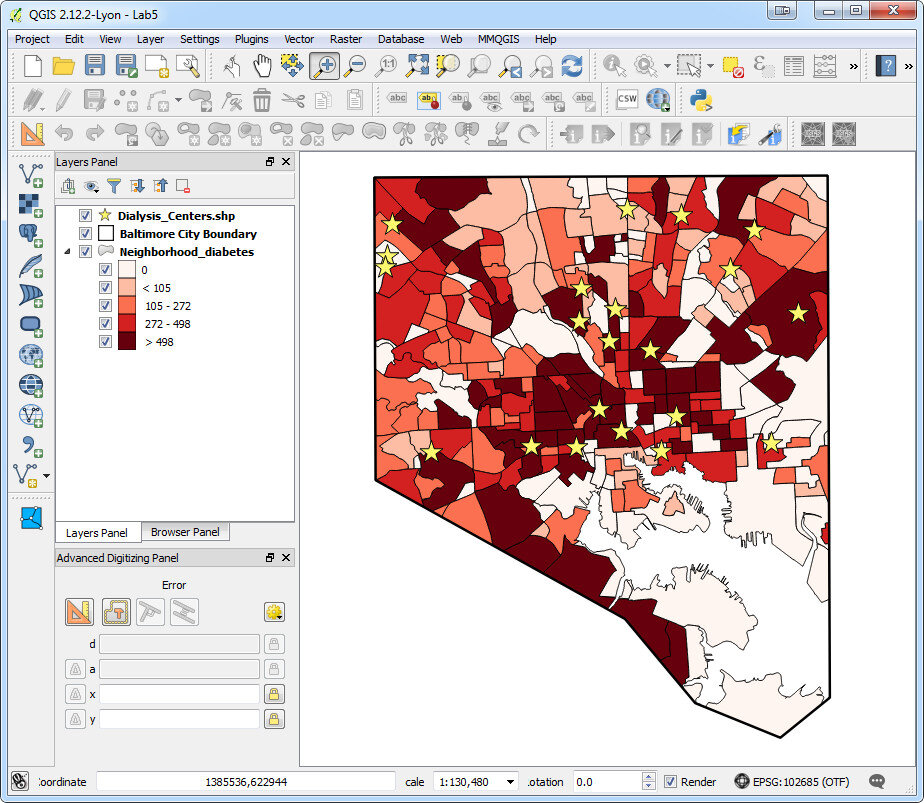
Baltimore Diabetes Data in QGIS DesktopWeb PresentationOften you may want to present an interactive map of your results. Interactive means the map reader can zoom in/out, pan the map and turn layers off and on. For this we recommend CartoDB.You can sign up for a free account, which gives you 50Mb of storage space. Data can be collected with a smart phone or tablet and brought directly into CartoDB.  It is a very intuitive platform. You can literally drag and drop a spreadsheet onto the CartoDB page and have the data upload to your account.  It will accept the most common geospatial file formats including: spreadsheets and comma delimited text files with addresses or coordinates, KML/KMZ, GPX, and shapefiles.CartoDB also has great documentation including:

Baltimore Diabetes Data in CartoDBIn ConclusionThis blog has a lot of resources including reviews of mapping technology and case studies. You might begin by clicking on some of the links in this entry. We are also working on a 6 lab CHM curriculum that interested parties will be able to use to hone their skills. Stay tuned for that!We are always looking for new partners and continuously work to support current project partners. If you are interested, or have questions please don't hesitate to contact John Scott (jscott at cpsc.com) or Kurt Menke (kurt at birdseyeviewgis.com). Most importantly get out and do some mapping in 2016!   

Using CartoDB for Beautiful Online Maps

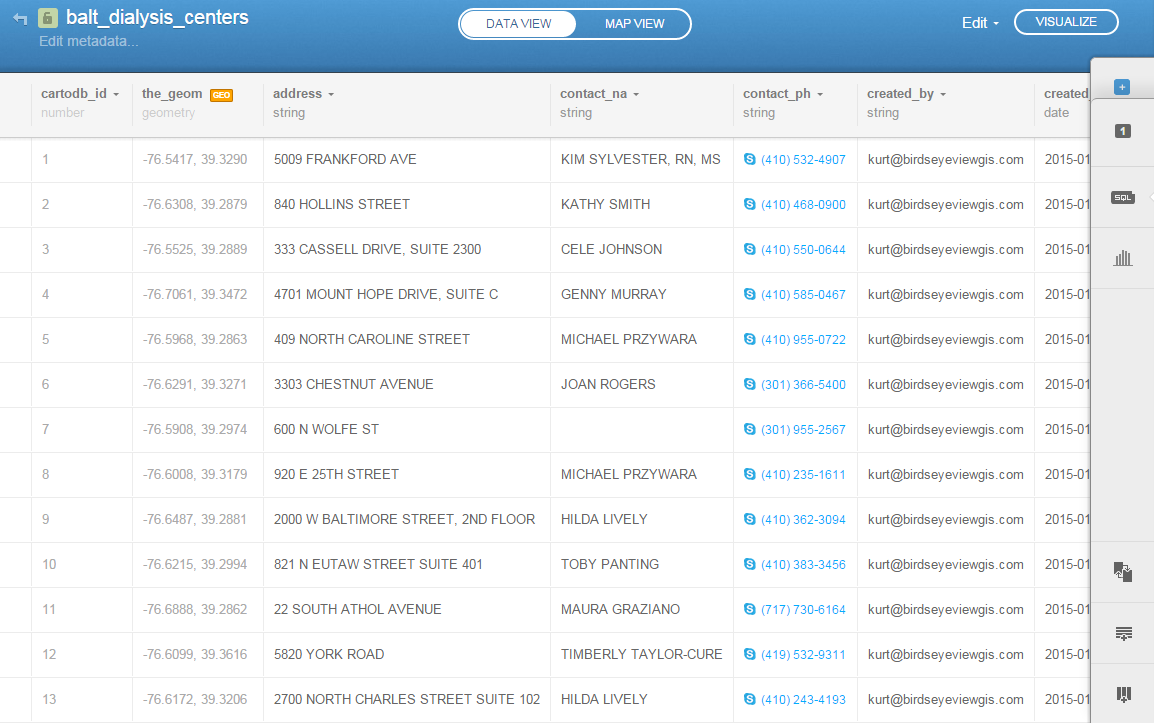
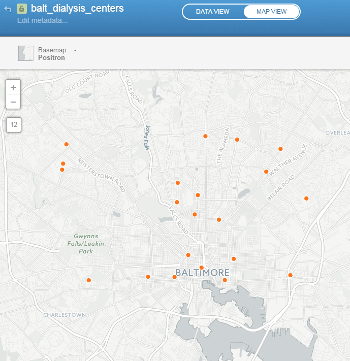
CartoDB is an online cloud based platform for storing and visualizing spatial data. It is the perfect tool for the third part of the workflow (outlined in the Introduction). You can sign up for a free account, which gives you 50Mb of storage space. Data can be collected with a smart phone or tablet with iForm, and brought directly into CartoDB.  It is a very intuitive platform. You can literally drag and drop a spreadsheet onto the CartoDB page and have the data upload to your account.  It will accept the most common geospatial file formats including: spreadsheets and comma delimited text files with addresses or coordinates, KML/KMZ, GPX, and shapefiles. Below is an example of a spreadsheet of Baltimore Dialysis Centers in CartoDB. This shows the spreadsheet in Data View .CartoDB Data ViewAfter telling CartoDB which columns contain the latitude and longitude values, the data can be viewed in Map View (below). Here the default Positron basemap is being used. There are a variety of basemaps to choose from including imagery, Stamen maps and Nokia maps.CartoDB Map ViewOnce multiple data layers have been uploaded you can create a visualization. Below is a map focusing on Balitmore Diabetes. It includes Baltimore neighborhoods classified by the number of diabetics, food deserts and dialysis centers.  CartoDB provides wizards and other tools for styling your data. The dynamic map can be accessed here: http://cdb.io/1G4xP7jCartoDB VisualizationVisualizations can be shared via hyperlinks and embedded into webpages.  CartoDB also has great documentation including:

Sign up for a free account and take it for a spin. On a related note Community Health Maps is almost done with a complete curriculum for community health mapping. It consists of six labs. The final lab shows you how to work with CartoDB from setting up an account to sharing a visualization. Stay tuned!

Technology + Youth = Change

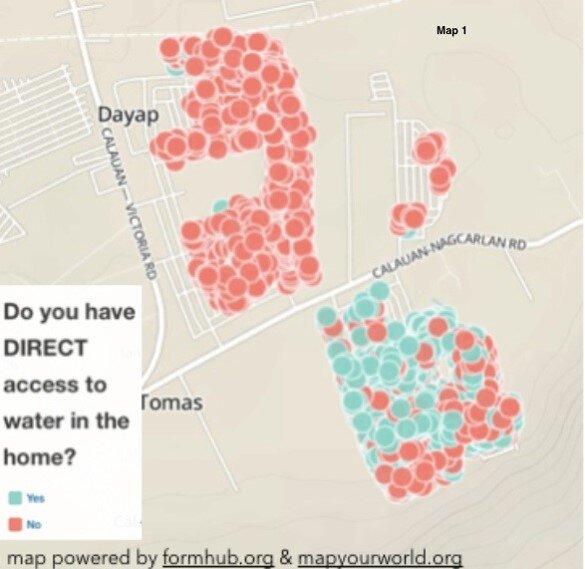
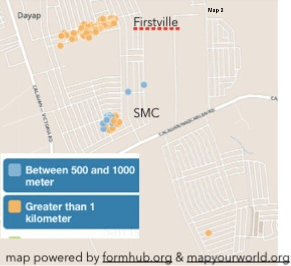
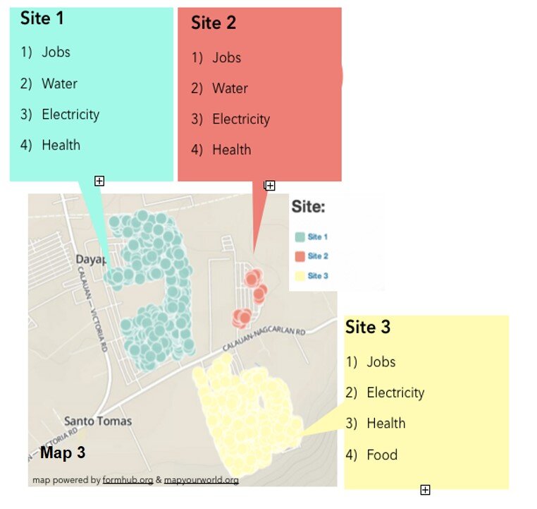
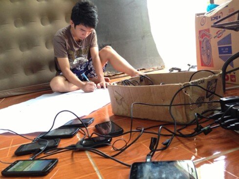
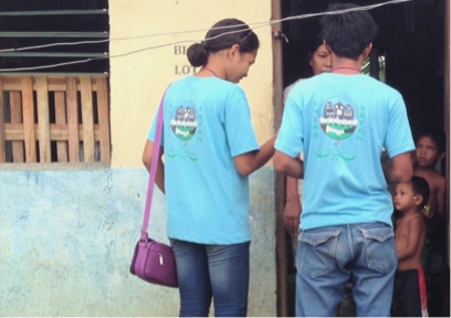
by Chad Noble-TabioloIt all started in May 2013 when I watched the documentary entitled Revolutionary Optimists on PBS’s Independent Lens. It showed how young people from a slum in Kolkata, India were able to map the deficient and unsafe water taps in their community, in order to plea with the government for more and safe drinking water lines. The film highlighted technology in an unconventional way. It showed GIS-technology as an innovative tool to mobilize youth for social change.This heralded the beginning of a partnership with Map Your World to develop a mapping project in the Philippines in the summer of 2013. Through coordination with domestic and international partners, the youth mapping program was implemented in Southville 7 — an impoverished and neglected slum community, about three-hours south of metro Manila. The issues faced in Southville 7 ranged from lack of access to jobs, water and electricity to food insecurity and child and maternity health; and because of a lack of response from both the government and non-governmental sectors, the project was aimed to raise awareness and demand change.In just a few weeks, a dozen phones were donated. Youth, ranging from 15 to 23 years old, were trained to go house-to-house to collect data. By the end of three months, 3000 families were surveyed and the needs of the community were mapped. Depicted below is Map 1, which shows the families who have direct access to water in their homes.Families who have direct access to water in their homes.Because of the unequal distribution of resources, it was evident who had direct access to water and who did not. Map 2 shows those families who did not have direct access to water. These families had to walk more than 1 kilometer to a communal water tap.Families who had to walk more than 1 kilometer  to water.Lastly, Map 3, represents the top four needs according to the three different subdivisions or sites in Southville 7.  Collectively these maps and data provide an opportunity for proper and adequate planning for public health infrastructure and needs.The top four needs according to the three different subdivisions or sites in Southville 7: Jobs, Water, Electricity and Healthcare.The Android mobile phones used by the youth were powered by open-source applications for GPS-mapping and data collection. ODK Collect or Open Data Kit was the data collection tool utilized in the project. It can be found on the Android market. (NOTE: This tool is also described in the Community Health Mapping blog post on Field Data Collection). This tool is functional only after uploading a survey form that is created in Microsoft Excel and uploaded to the companion site www.formhub.org. The maps were created online with Map Your World, an online community mapping tool inspired by the Revolutionary Optimists documentary.Map Your World BannerIn the end, the 30 youth involved in the mapping project were able to accomplish an endeavor that many people in their community had not expected. They were able to successfully map who in their community had access to water, electricity, jobs and vaccination for children under five years old, among others. They became leaders who are now equipped with leadership and technological skills that many in their community lack. They were empowered to raise awareness about the social injustices and health inequalities existing among them.One of the community mappers with an array of Android phones.The Southville 7’s mapping work was primarily a vehicle for instilling hope, and the use of GPS/mapping-technology offered an opportunity for the youth to be the voice for their community. According to one youth, “For me, mapping is like knowing. Knowing the problems, and how people are coping with them. Through the work we can open the eyes of the people, not only the things that can help them, but things that can help us all.Youth mapping their community

Display and Share Your Maps Online via GIS Cloud  

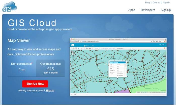
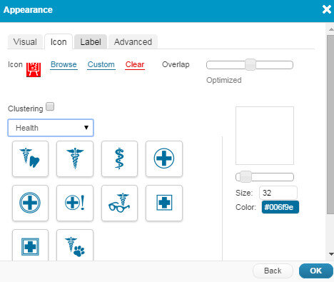
The third step in the workflow (outlined in the Introduction) is to share your maps online via GIS Cloud.  This is an online mapping platform. You can sign up for a free account, upload your data, and share your maps with others. The maps will be dynamic, meaning you can do things like pan and zoom, turn layers on and off and identify features.GIS Cloud HomepagePricingYour free account comes with a Map Viewer and Map Editor and gives you 100Mb of space in your cloud account. If you require more space you can upgrade to Premium subscription which offers 1 Gb of space. Premium accounts cost $55/month.Data UploadGIS Cloud accepts all common GIS file formats and the data upload section is very intuitive. You can zip all your data and just upload the zip file and GIS Cloud will take care of the rest. You can even drag and drop files anywhere in the browser and they will upload to your account. Once uploaded it offers a nice range of options for symbolizing your data.GIS Cloud Symbology OptionsMap EditorHere you have a variety of tools available including those for data editing, feature selection, basic analysis, table joins, geocoding addresses. It even has a database manager. You can create new layers in your cloud account and edit them here. With the analysis tools you can compute areas, measure proximity of one feature to another, buffer a layer by a certain distance, and create density maps.GIS Cloud Map Editor ToolbarsMap ViewerHere your data can be viewed against basemaps such as Google and OpenStreetMap. Your map can also be shared and published. There are several ways to share your maps. The two easiest methods are to provide the link to your map, or embed the dynamic map in a web page. Clicking the Share and Publish button opens the window below. Here you are provided the url to your map viewer and the javascript for embedding the map into a webpage. I would have embedded a dynamic map here,  however, WordPress does not allow bloggers to post JavaScript on WordPress.org blogs. You can also share your map with other GIS Cloud users by Publishing the map. Click on the image below to open up the ENHIP Schools in a GIS Cloud Map Viewer window.GIS Cloud Map ViewerResourcesOur Resources page has a GIS Cloud document that covers uploading data, styling data and sharing a map.There are additional online mapping platforms such as CartoDB and MangoMaps. We found GIS Cloud to be the best combination of being intuitive yet powerful. However, all three options have free licensing levels. So you can try them yourself and decide which works best for you. These other options will be covered in future posts. Happy mapping!