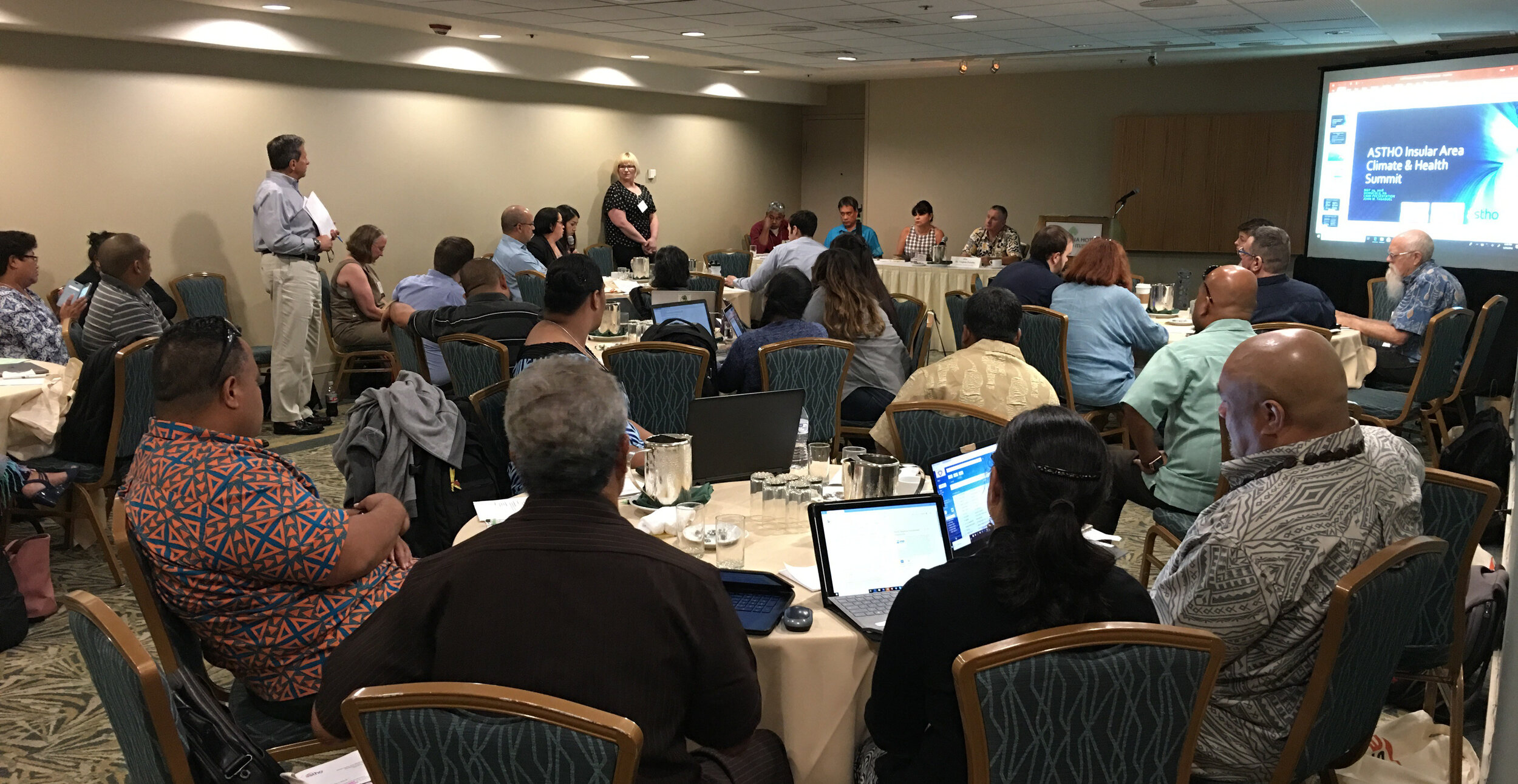
During the last week of May the Community Health Maps team (Janice Kelly, John Scott and Kurt Menke) traveled to Honolulu to participate in the Association of State and Territorial Health Officials (ASTHO) Insular Area Climate and Health Summit. There were representatives from:
- American Samoa
- Commonwealth of the Northern Mariana Islands
- Federated States of Micronesia
- Guam
- Palau
- Puerto Rico
- Marshall Islands
- U.S. Virgin Islands
- Hawaii Department of Health
- Pacific Island Health Officers Association (PIHOA)
- ASTHO
- CDC
- NOAA
 The first afternoon was focused on the impacts of climate change, preparedness and building resilience. There were great presentations on climate change (Capt. Barry Choy - NOAA), an overview of the tools and programs available from the CDC (Paul Schramm), and issues with vector-borne diseases and mosquitoes (Janet McAllister). The ASTHO grantees then gave some some sobering presentations on current issues people are dealing with in the Mariana Islands, Micronesia and the U.S. Virgin Islands.
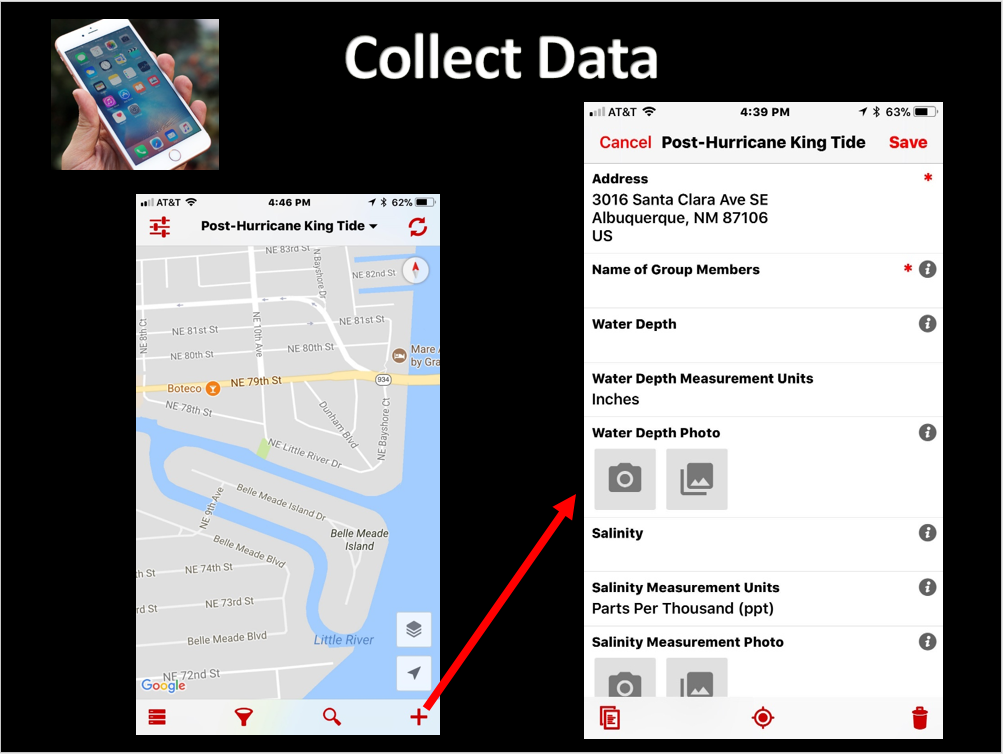
 The second day focused more on tools and resources. There were more detailed talks given by the CDC on Technical Assistance for Vector Control and Tools and Resources for Climate and Water Safety. That afternoon we taught a 3.5 hour Community Health Maps Train-the-Trainers workshop to a group of health officials from each territory. We went through the entire CHM workflow: A) how to design a data collection form, B) how to collect data, C) how to make a map in Carto and D) how to bring the data into QGIS.
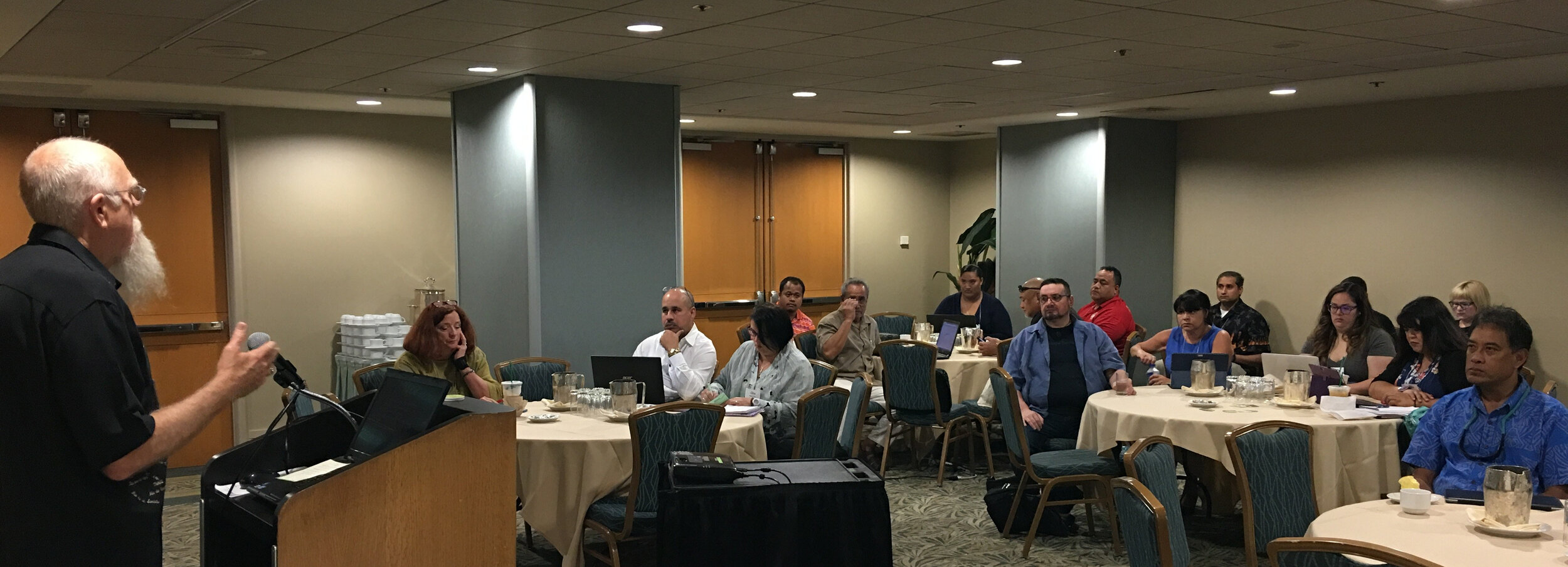 Most of the trainees had little to no GIS training yet instantly knew how mapping could apply to their work and lives. They want to map everything related to hurricane relief, salt water resistant taro farms, infrastructure related to mosquito outbreaks etc. A benefit of having the community do this is that they can be in charge of their own data and it helps build community relationships.Over the three days I heard a lot of side discussions about the usefulness of the free/low cost/open source CHM approach. The cost of proprietary solutions is often a significant barrier to entry into the world of community data collection and mapping. We were gratified to hear some very positive feedback on the workshops and CHM overall during the closing session. There seems to be a lot of potential in CHM helping both U.S. Territories and ASTHO deal with the immediate and long-term health issues related to climate.

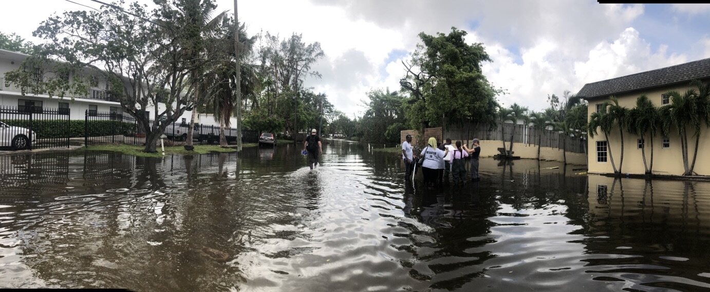
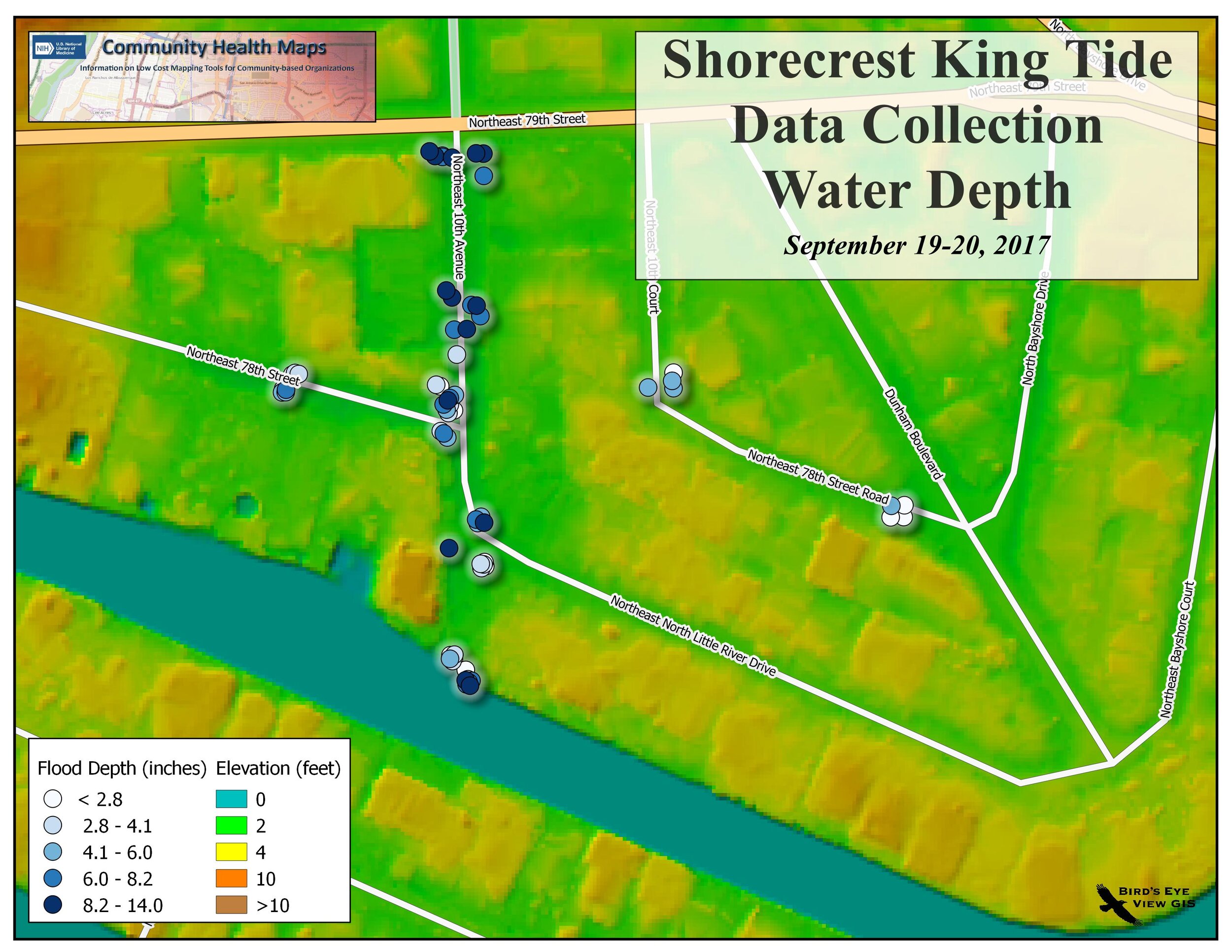
 We used this last fall during
  One caveat is that the data collected falls into the public domain and can be downloaded freely by anyone. This is possible because the data are anonymized, meaning any private information is scrubbed. The data remain available for viewing and download after the event ends.
 It won't be appropriate unless there is some sort of disaster relief or environmental issue that demands it, but it is another tool to keep in your Community Health Maps toolkit!
 DIMRC provides access to health information resources and technology for disaster preparedness, response, and recovery; CHM provides users with information and training on low-cost mapping tools that can be used to collect data related to health hazards in communities, including during disasters. Many community-based organizations can better serve their constituents when they are able to collect and maintain their own data; CHM seeks to provide them with the training and tools needed to carry out cost effective and scalable mapping.After the basic premise of CHM was explained to webinar attendees, several case studies illustrating the different applications of CHM were detailed.

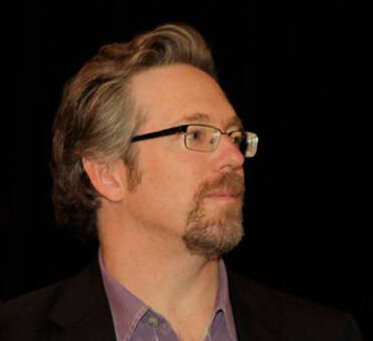 The following is a question and answer interview with the moderator of the with Community Health Maps (CHM) blog,
 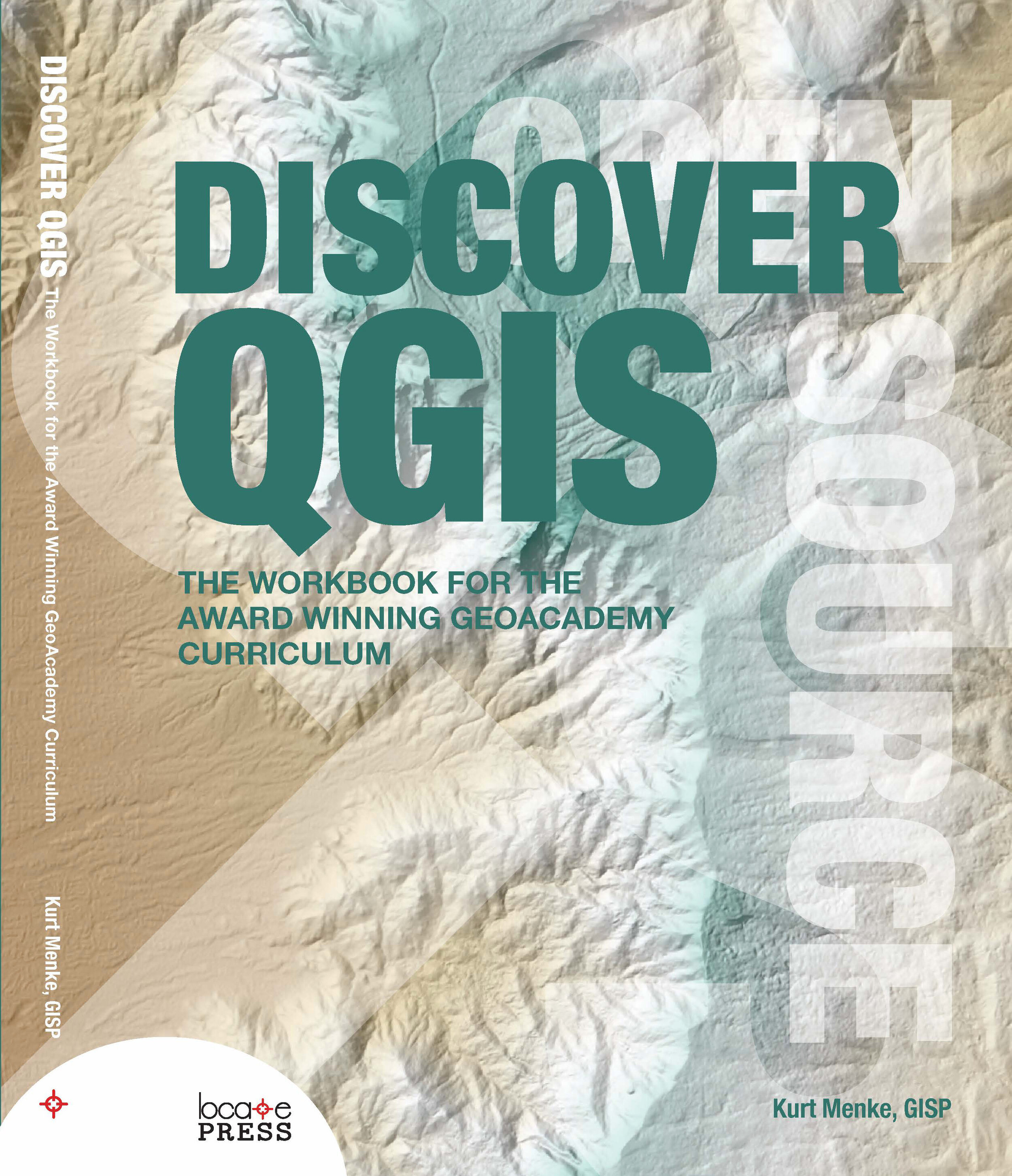 a listserv. At first it was very limited, being little more than a data viewer. But I was really curious to see how it might evolve, so I started following it. It really started becoming a useful alternative in 2010. I gradually migrated to it with my business. I also started teaching GIS classes with it. I used to keep a list of things you could do with ArcGIS that you couldn't in QGIS. Now it's come so far that I have a list of things you can do in QGIS that you can't in ArcGIS!How has CHM evolved?Kurt: Once we realized we had something that would be useful to people, we began looking for partner organizations. These are organizations who work with data and can benefit from mapping, but lack the resources to get started. We conduct workshops and webinars to get people started down the mapping path.Along the way I thought a blog would be a really helpful tool to keep people up to date with new technology. These tools are constantly improving and I thought this would be a way to share these enhancements with everyone. Later we realized we needed additional resources for people to continue to build their skills after the initial workshops. I developed a series of
  Our primary goal for CHM has always been to provide tools that are helpful to users. After years of trying to build something from scratch, we are now finally gaining some traction with CHM. It feels like a snowball, rolling downhill and gaining speed. I believe it is both because the tools are powerful and intuitive, plus we are getting better at identifying potential users.Would you recount one experience with CHM that felt especially influential for CHM’s progress so far? Kurt: Yes the first thing that comes to mind is the work with the
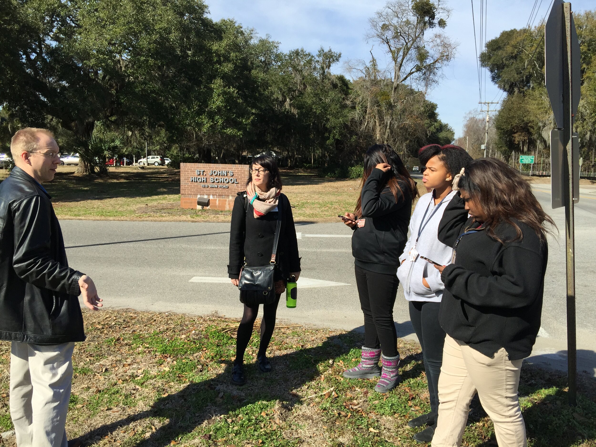
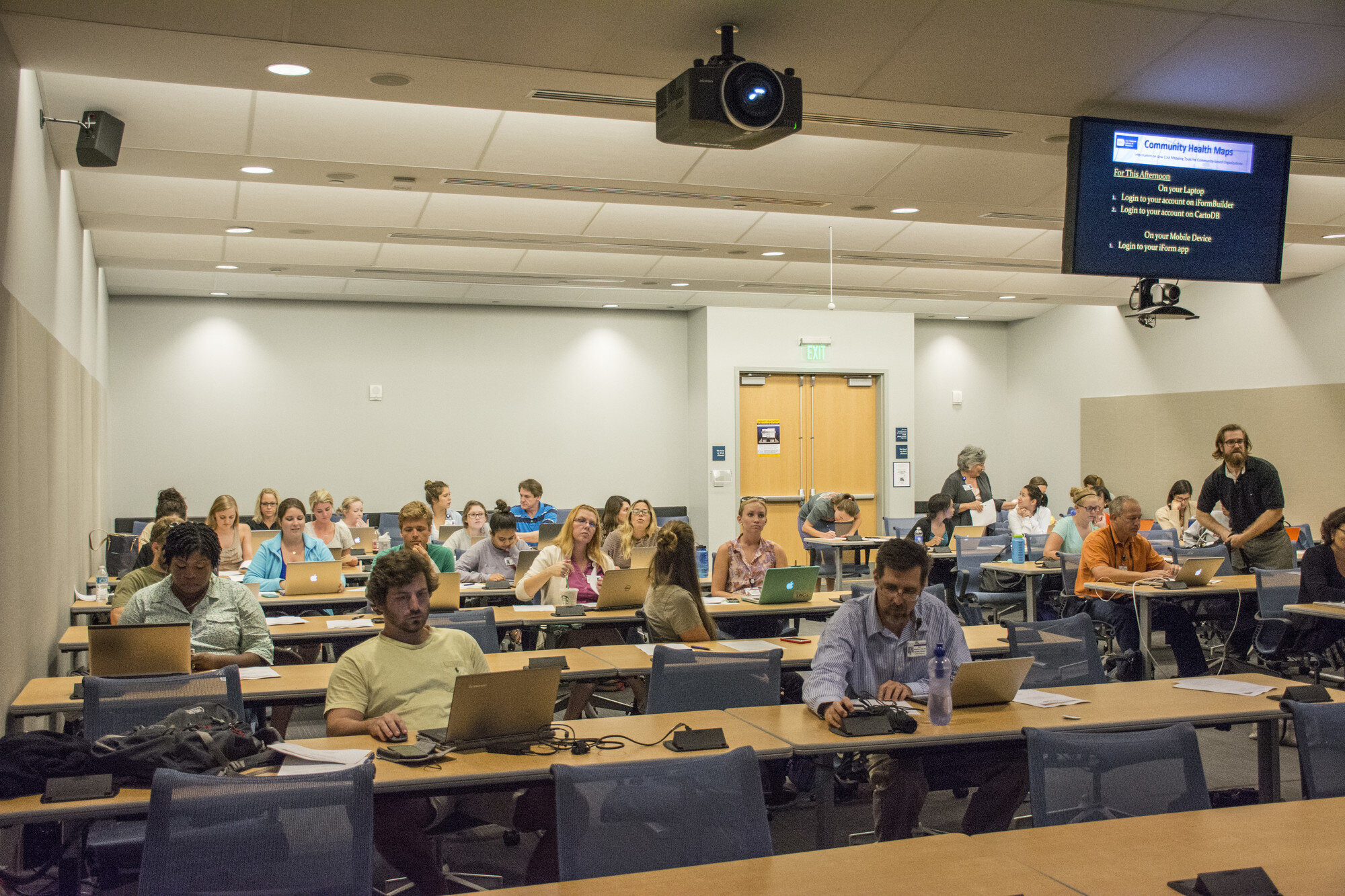 Several projects were inspired these MUSC workshops. Of particular note is Dr. Bryan Heckman’s
 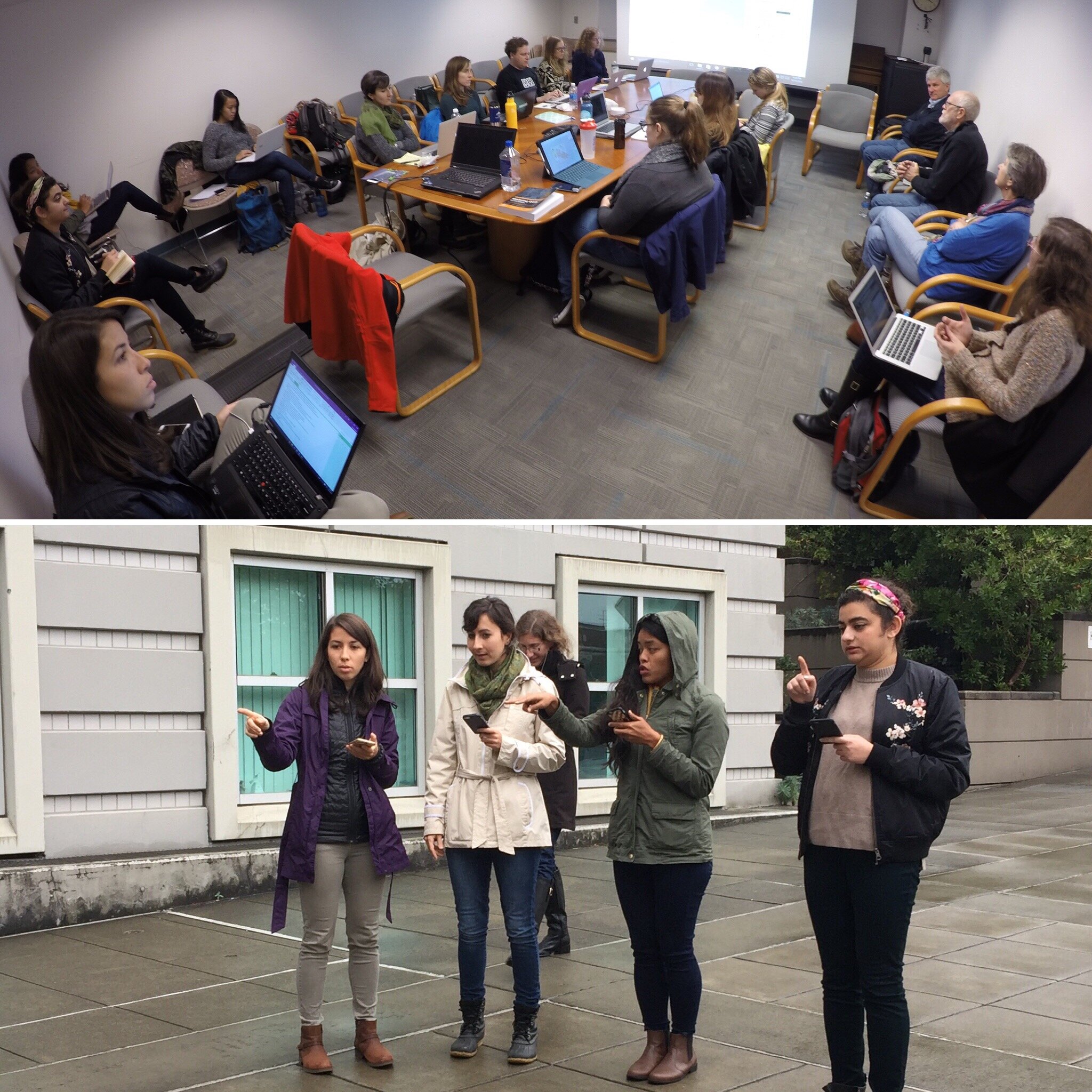 The most gratifying aspect of these workshops was seeing people shed their technological insecurities. It’s common for people to show up and admit they’re scared of the technology. To then see in a few short hours, they are getting it all to work, and actually getting excited about the possibilities, is a beautiful thing. What are your plans for the future of CHM? Kurt: The work that people are doing right now with CHM barely scratches the surface in terms of the potential. I would like to get more community members involved. I envision a scenario where there is an organization can really engage with citizens to map the community. The data could be managed by a central data manager in the organization. It would be such a great way to involve the community in a project directly related to their healthcare.I’d also like to see someone get past the initial data gathering and map making phase. QGIS has a lot of spatial analysis capabilities. I’d like to see someone push beyond the CHM labs and do some interesting analyses in QGIS or use some of the cool data visualization techniques in Carto.What advice you would give to new CHM users?Kurt: Don’t be afraid to dive in and use the tools. Be adventurous and creative with your projects. Don’t be afraid to mess up. That’s how you learn. There is no limit to the kinds of things you can accomplish with mapping and spatial analysis tools. If you can imagine it, it can be done.
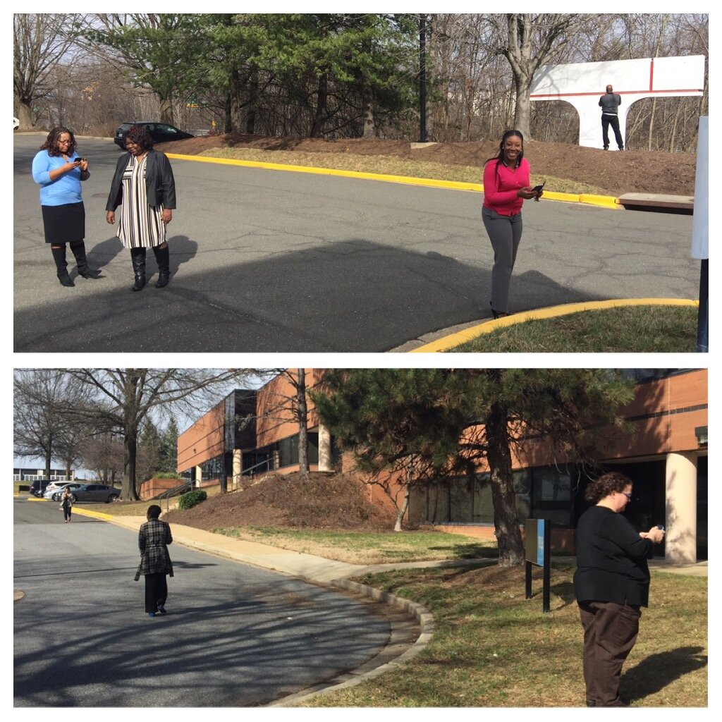 The attendees represented a variety of organizations including many working with
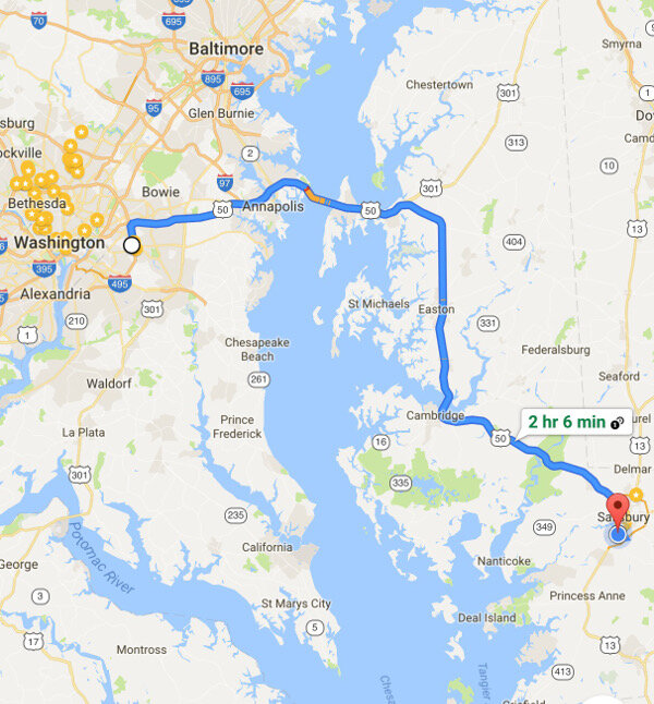
 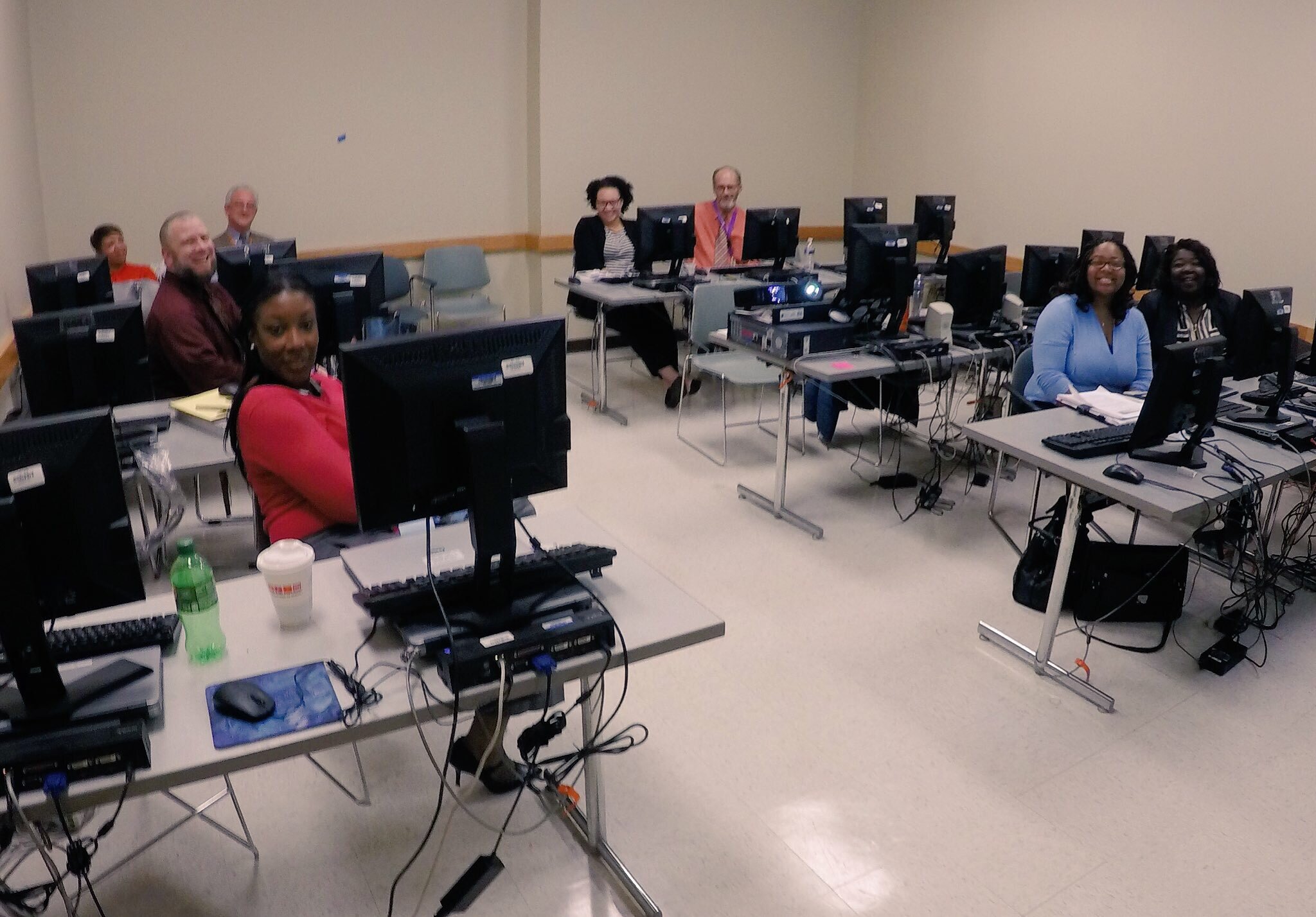 After the two PG County workshops, CHM traveled across the Chesapeake Bay bridge to Salisbury University on the eastern shore.
 The following morning we held a workshop geared towards social work students at Salisbury University. Attendees went through the CHM workflow and were introduced to
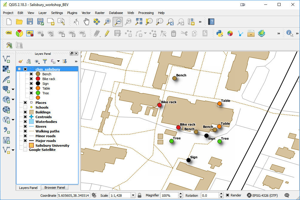
 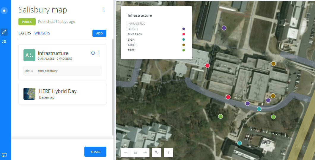 Salisbury University Data Collection in CartoThe workshop concluded with a short introduction to working with data in QGIS.
 The next scheduled workshop for the Community Health Maps team will be at the


