Uncategorized

QGIS 3.0 To Be Released in February!

logo_evolution.png

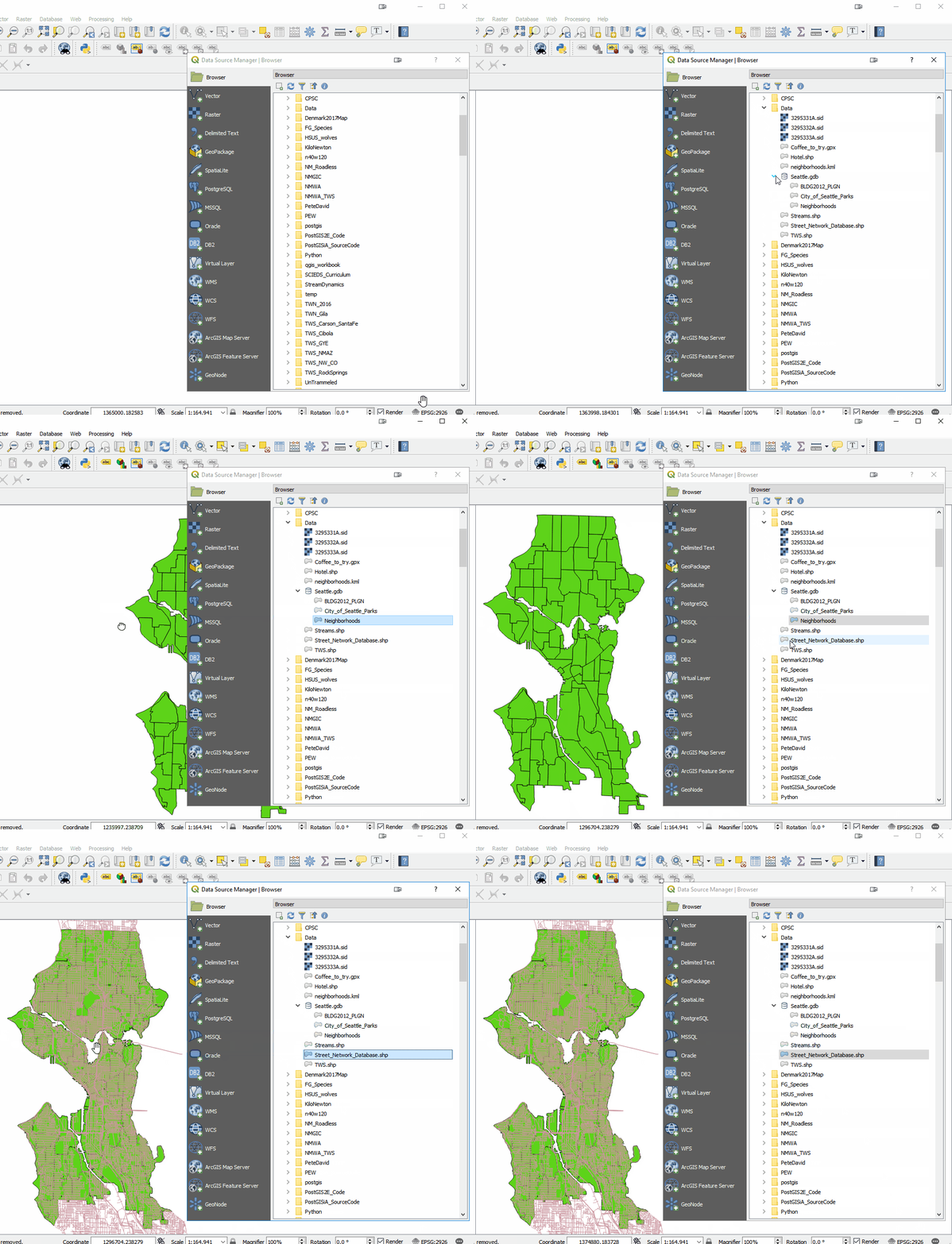
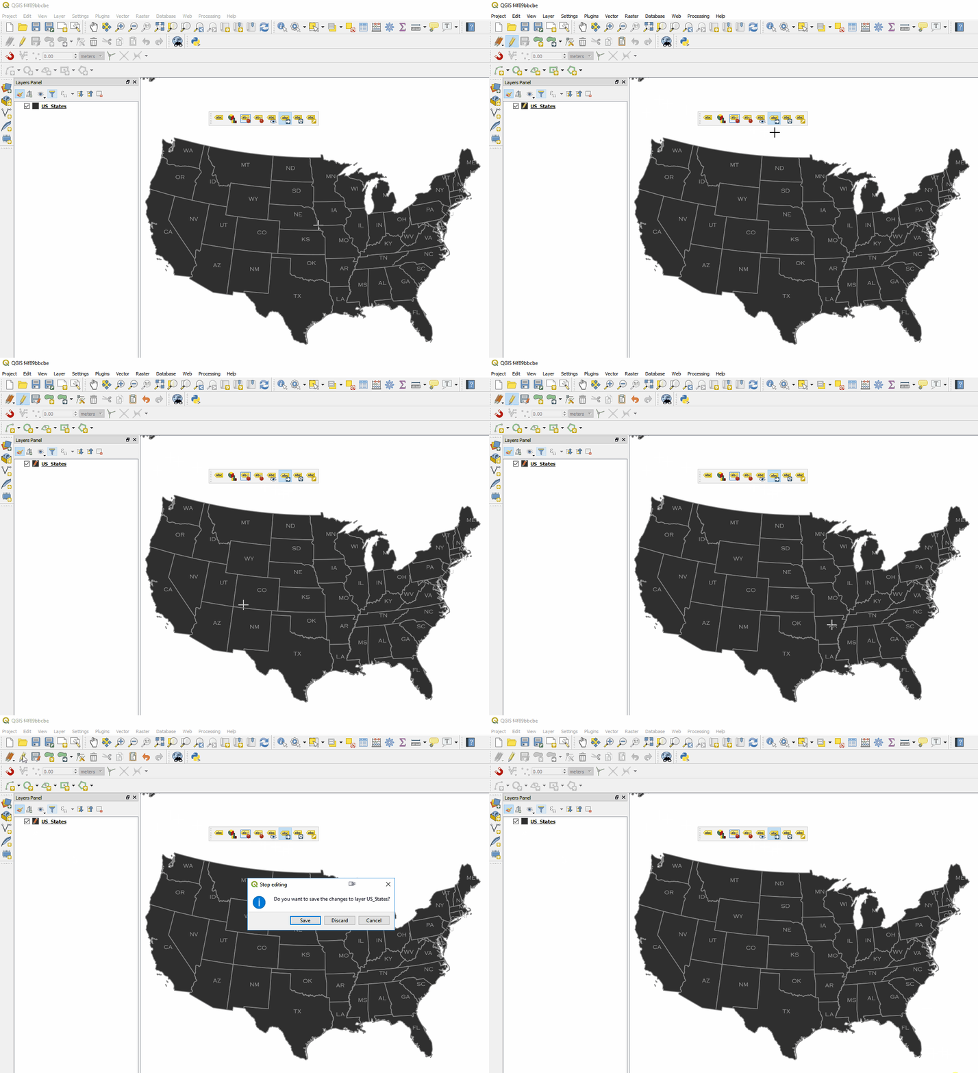
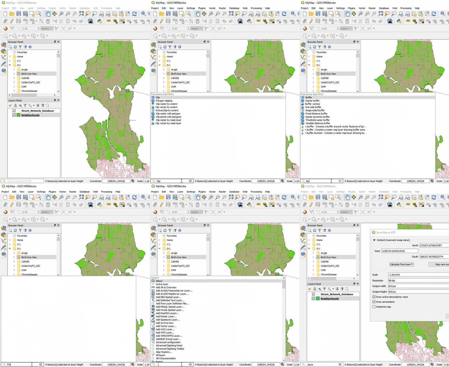
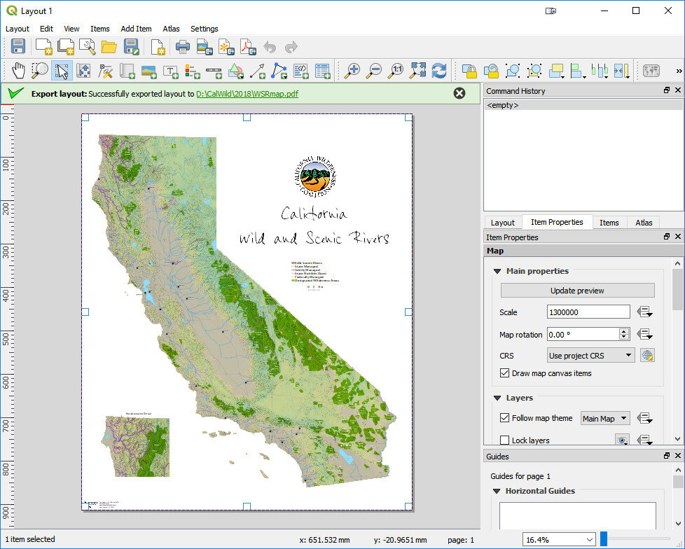
It's an exciting month for QGIS. On February 23rd there will be a major new release of QGIS: QGIS 3.0. We haven't had a major new release since 2013 when 2.0 came out. The development team has been working on this for a solid year. This version will be faster and have a lot of new features. Kurt Menke has been closely following the development of QGIS3. Over the last few months he has been experimenting with the pre-release version (v2.99). This post will cover some of the highlights that will be useful to Community Health Mappers. In general QGIS is going to be faster, more powerful and more efficient to work with. First off QGIS 3.0 comes with a new logo!qgis-logo_anita02Overall the look of QGIS is very similar.  There are  the Layers and Browser panels to the left, a Map Canvas and lots of buttons and menus above. However, upon closer inspection there are a lot of very useful changes. For example, instead of there being a row of add data buttons down the left side, there is now a Unified Data Source Manager button which opens up a browser.QGIS3red.jpgThe Unified Data Source Manager can be used to access the myriad of data formats QGIS supports and add them to QGIS. This includes vector, raster, database, web services etc. You can even browse within Esri File Geodatabases. Any GIS layer you are interested in, can then be added to QGIS by dragging and dropping it onto the map. DataSourceManager.gif The Processing toolbox was completely redesigned and many tools were rewritten. This means many are now faster, more flexible and stable. There are also many new tools that didn't exist in QGIS v2.x. Additionally processing tasks also now run in the background. This means  you don't have to stop working while a tool runs! Yet another new processing feature is that layers in different projections will automatically be reprojected, so there is no need to reproject beforehand.ProcessingToolbox.gif Map Labels: It now much easier to edit labels. Previously you had to set up attribute columns and set those as data defined overrides. If you don't know what all that means, it's OK. Now all you have to do is simply put the layer into edit mode and edit labels with tools on the Label toolbar. Maps also now redraw more quickly due to cached label renderers.labels.gif There is now a Search bar in the lower left corner that can be used to search for map layers, features and processing tools. This makes finding things in QGIS quick and easy.SearchBar.gif The QGIS print composer was completely redesigned. They are now referred to as Layouts. Map insets can now be in a different map projection than the main map. There is a new and improved system of guides which include settings in any unit of measurement you could want (mm, cm, m, in, ft, pt, pica, pix). There are new controls for choosing fonts which include recently used fonts. When you export a map, a link to the folder shows up making it easy to track down the exported map.2018-01-31_163437.jpg Other notable enhancements include:
  • A fully integrated 3D environment
  • Editing improvements including: a) widgets for layer attributes, b) CAD style digitizing tools that allow you to create perfect rectangles, circles, ellipses etc. and c) a new node editing tool with a lot of behavior improvements
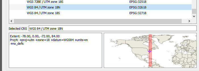
  • Previews of where each map projection can be used. This will be a big help for beginners!2018-01-31_170602.jpg
  • User profiles that allow you to set up QGIS with different panels, plugins and toolbars for different projects or uses.
  • Improved hidpi/retina support

 Where do you go from here?

  • 2.18 will be considered the supported long-term release (LTR) through June.
  • When 3.0 is released in a few weeks it will be considered the latest stable version.
  • 3.2 will become the LTR in June when it is released.
  • Starting on February 23rd you will be able to download and install it. Remember you can have multiple versions installed with no conflicts. I encourage  you to install it in a few weeks and begin to explore it! You won't want to go back.

NOTE: QGIS 3 projects won't be entirely backwards compatible with QGIS 2.x. So if you are going to open an existing project in QGIS 3, be sure to click Project -->Save As and save a new verion of the project for use in QGIS3.

CHM Conducts Three Workshops in Maryland

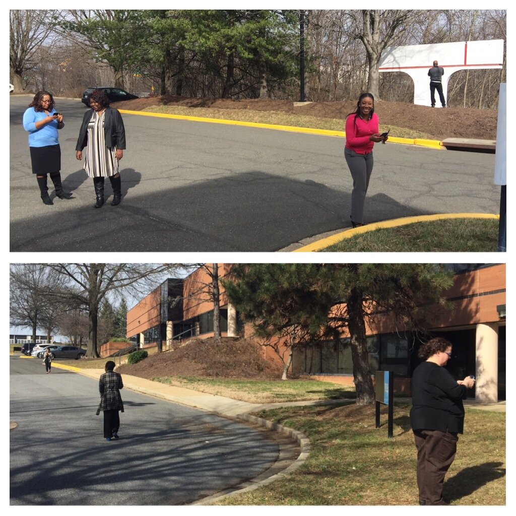
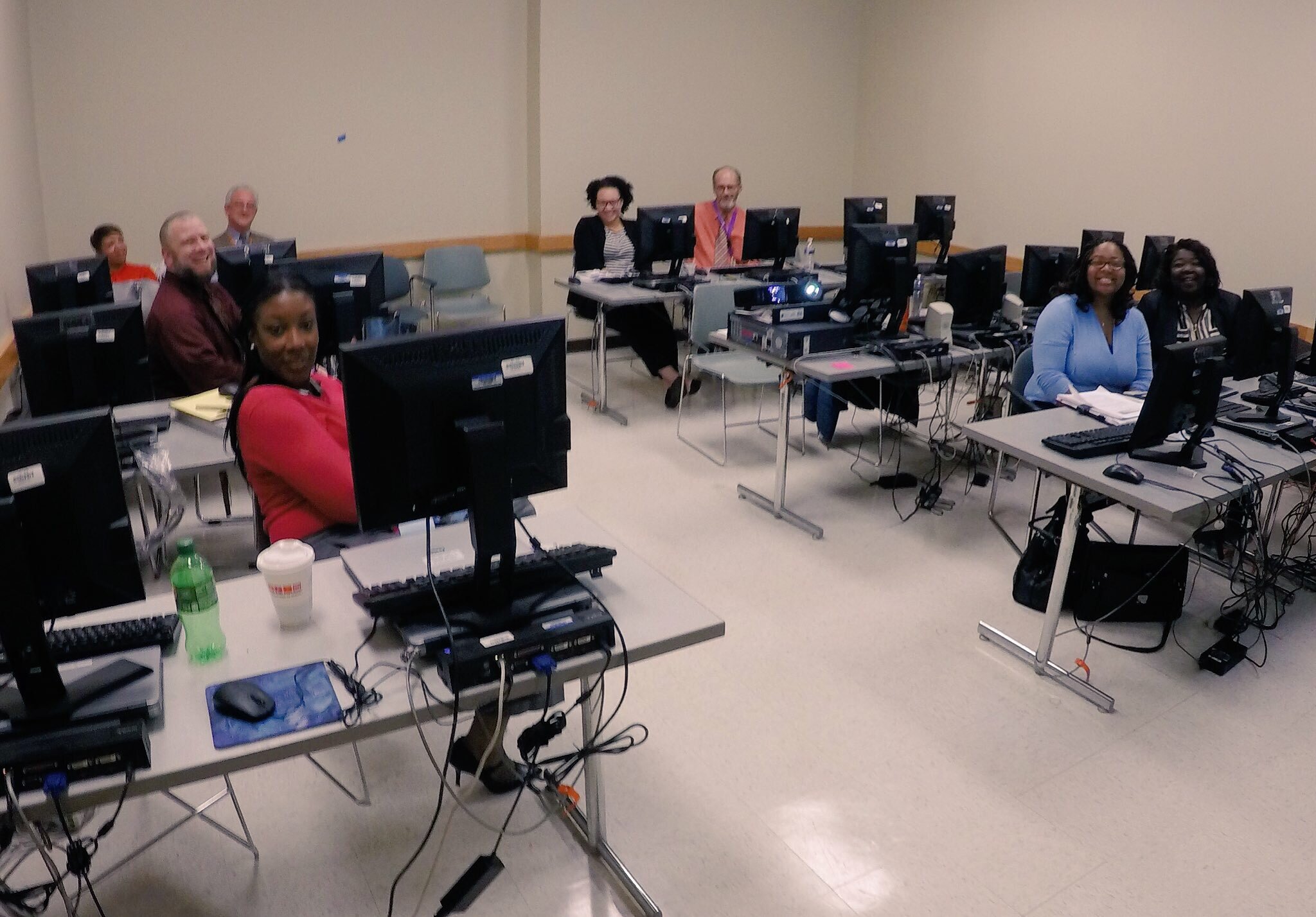
Last week Kurt Menke traveled to Maryland. Two workshops were held at the Prince Georges County Department of Social Services for people working on homeless issues. All attendees were novices to mapping technology. However, in the first hour they all built a data collection form in Fulcrum and went outside to collect some data around the building.file-mar-02-9-35-57-amThe attendees represented a variety of organizations including many working with YouthREACH Maryland. REACH is an acronym standing for Reach out, Engage, Assist, & Count to end Homelessness. It is an effort to obtain accurate, detailed information on the number, characteristics, and needs of unaccompanied homeless youth in Maryland. Other organizations represented at these workshops included:
  • Maryland's Commitment to Veterans
  • Maryland Department of Planning
  • Prince Georges Community College
  • St Ann's Center for Children, Youth, and Familes
  • Maryland Multicultural Youth Center
  • So Others Can Keep Striving (S.O.C.K.S)
  • Sasha Bruce Youthwork
  • Lifestyles of Maryland.

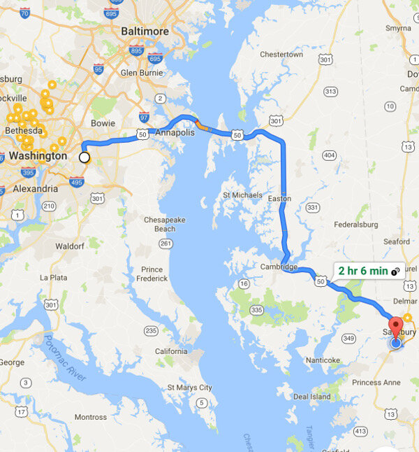
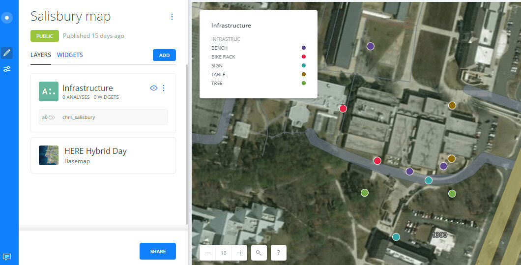
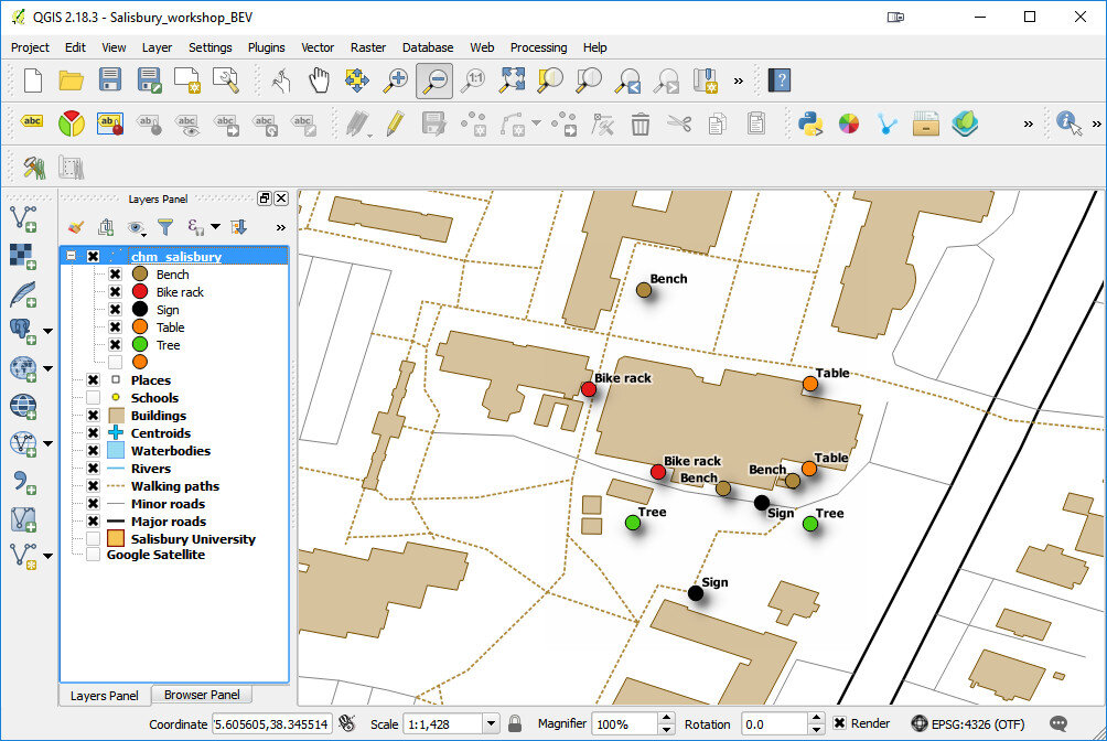
In the final two hours of the workshops attendees learned how to map the data they collected in both Carto and QGIS. We also had time for a brief discussion about how CHM could be used in their projects. There were a lot of ideas shared about how the technology could help community engagement.file-mar-02-9-27-09-amAfter the two PG County workshops, CHM traveled across the Chesapeake Bay bridge to Salisbury University on the eastern shore.file-mar-02-9-27-49-amv2The following morning we held a workshop geared towards social work students at Salisbury University. Attendees went through the CHM workflow and were introduced to Fulcrum, Carto and QGIS. Below is a map of data collected around the student center in Carto.2017-03-02_095000Salisbury University Data Collection in CartoThe workshop concluded with a short introduction to working with data in QGIS.2017-03-02_094159The next scheduled workshop for the Community Health Maps team will be at the Teaching Prevention 2017 Conference in Savannah, Georgia. That conference takes place from April 5-7th. If you are interested in learning this technology this workshop will be a great opportunity!
New Year Will Bring Updated Labs Including Lab Zero!

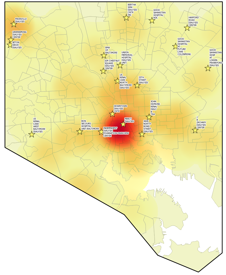
It has been 2 years since the Community Health Maps (CHM) lab exercises were first produced. Software changes quickly, and over the last two years the tools involved in the CHM workflow have undergone many changes. For example, this fall the pricing scheme for iForm changed. Though it is still a good product, this price increase puts it out of the category of low cost software. The companion site formhub.org no longer exists, making ODK Collect more difficult to work with. Fortunately Fulcrum is a fantastic alternative to those two data collection apps. QGIS has released 5 new versions and is now at version 2.18! CartoDb has been rebranded as Carto and has a new interface.ac3b0a08203e87505a823b0d8a0895d44489f916.pngAll these changes means it is time for all the lab exercises to be updated. Lab 1 will now be a single lab for both iOS and Android users with Fulcrum. Labs 2-5 will be updated to QGIS 2.18. Lab 6 will be updated to Carto's new interface. The set of companion videos will also be redone and updated.Many have worked through these labs and some provided feedback. This information is being used to improve the labs as they are updated. One new item will be Lab Zero. While the CHM workflow is intuitive, it has been suggested that more background information could be useful. Lab Zero will be a companion reference document to the CHM labs. It will contain: A) information on the background of the CHM project, B) software installation instructions , C) a glossary of terms, D) more thorough descriptions of some technical topics like coordinate reference systems, E) a description of how to interact with the QGIS community to get additional help, and F) a list of data resources. This work is in progress and will be ready this spring. Stay tuned!Baltimore DIabetes.png 
CHM Workshop at the National Tribal Forum in Spokane, WA

This week the Community Health Maps team is heading to Spokane, Washington to teach a workshop at the National Tribal Forum for Excellence in Community Health Practice! We are honored to participate and engage a new community of mappers.2016-08-29_161231It is a four hour workshop and by the end attendees will have:

  • Built their own data collection form in Fulcrum
  • Gone outside and collected some points
  • Made an online map of what they collected in Carto
  • Learned how to work with QGIS!

We'll report back on how it goes when we return. Stay tuned!

How Does Esri Software Fit into the CHM Workflow?

Community Health Maps (CHM) necessarily focuses on low cost and open source tools. This is because our goal is to find mapping tools that can be used by any community group, no matter the budget or resources. However, that doesn’t preclude people from using Esri software or other proprietary mapping tools too.2016-07-28_112719One benefit of using Fulcrum for data collection, and QGIS for analysis and cartography, is that they both support a wide range of common GIS formats. This means that the data you’ve created via these two platforms can be easily brought into Esri’s ArcGIS software. Similarly if you have data you have created with Esri tools they can be brought into QGIS or Carto. This feature is known as 'interoperability' and QGIS is highly interoperable. For example, QGIS can work with shapefiles, Esri personal and file geodatabases, KML and over 100 other formats!From the outset we knew there were many scenarios for mapping software being used in public health and community organizations.  For instance, there are larger organizations who are already using tools such as Esri’s ArcMap, ArcGIS Pro or ArcGIS Online. With this scenario there are still several reasons the CHM mapping tools could be useful.

  • It might be that the organization doesn’t have enough Esri licenses for everyone in the office who’s interested in doing mapping work. In this case Fulcrum, QGIS or Carto could be used to fill the need.
  • An organization may find that their Esri license doesn’t give them access to certain tools they need. They could use comparable tools in QGIS to fill the need, without having to pay extra license fees just for one or two extra tools.
  • There may be smaller affiliated satellite groups that don’t share the same access to the software. In this case, these groups could use CHM suggested tools. Because of good interoperability they would then be able to provide data back to the central hub, where they could be incorporated seamlessly with the rest of the organizations data.
  • There may be certain tasks that are easier and faster to do in one piece of software and others that are easier in another. For example, I use both ArcGIS and QGIS daily to do different things. Many beginners also find QGIS to be more intuitive. GIS is simply a tool and by incorporating QGIS you are giving yourself a bigger toolbox.

If you are in an organization using another software package don’t worry. The tools we are promoting as part of this project can be integrated quite seamlessly with your current tools. It doesn’t have to be Coke or Pepsi, or Ford or Chevy. You can have both!

Community Health Maps Workshop

Regular followers of the Community Health Maps (CHM) blog will know that the National Library of Medicine and its partners Center for Public Service Communications (CPSC) and Bird’s Eye View GIS have worked for several years in support of NLM’s mission to improve health information literacy, with a particular focus working with underserved communities. While access to quality health information is frequently a focus of attention, the ability to visualize data and information -- to better understand and portray their significance to the community -- has received less attention. This is in part because the availability of affordable GIS platforms and data collection and visualization applications is relatively recent. Historically, the cost to procure platforms and applications, to train users and to sustain operations has been prohibitive for communities and community-based organizations whose health budgets are already strained. This recognition has prompted CPSC, with NLM support, to develop the Community Health Mapping initiative.Our premise has been that community-based and minority health organizations are in a better position to serve their populations when they are able to collect and maintain their own data, rather than -- or at least in addition too -- having to rely solely on national/state agencies or majority-institution partners to provide data to them.The approach we have pursued involves using relatively low cost tablets and smartphone platforms, combined with the selection of low/no-cost applications that run on these platforms, allowing novice users and users with little budget resource to map their communities. Introducing such workflows to community-based and minority public health professionals empowers users to collect, analyze, visualize and share their own spatial data. Importantly, these tools can also be used to share data collected using other programs, such as Esri’s ArcGIS and national- and state- derived databases such as CDC’s Behavioral Risk Factor Surveillance System, Public Use Data files from National Center for Health Statistics, etc.As documented on the CHM blog, to date the CHM initiative has supported pilot initiatives with:

We have also created a Community Health Mapping blog that you are exploring now, maintained by Bird’s Eye View, NLM’s and CPSC’s GIS partner in this project. Further, we have recently completed the development of a set of six online “labs”:

  1. Field Data Collection (iOS & Android),
  2. Bringing Field Data into QGIS,
  3. Combining Field Data with other Organizational Data,
  4. Basic Spatial Analysis,
  5. Cartography with QGIS
  6. Data Visualization with CartoDB.

These, too, are available through the CHM blog.With these experiences, the CHM Team approached the Robert Wood Johnson Foundation (RWJF) for its support of a national workshop so that we could share our approach more broadly than we have to this point. This has been our goal all along, pending testing of our workflow. We believe, and we have demonstrated that this low/no-cost workflow can enable community organizations and community-oriented health professionals to map local health status/conditions that have not been possible before and with quality, sharable results.On June 7th, 2016, and with funding from RWJF, the CHM workshop will bring together:

  • federal/state/local government representatives
  • related associations
  • members of academia
  • community health professionals
  • community activists
  • information specialists
  • information technologists from across the country

to share and discuss new ideas and methodologies for empowering community organizations serving vulnerable or underserved populations with low cost, intuitive mapping technology.The workshop agenda is below. Stay tuned to this blog for more about the workshop:


Community Health Maps WorkshopLister Hill AuditoriumNational Library of MedicineBethesda, MarylandJune 7-8, 2016

Co-sponsored by:National Library of MedicineRobert Wood Johnson FoundationHealth-Equity.orgCenter for Public Service Communications

June 7, 2016: Day 18:30 – 9:00         Registration9:00 – 9:30         Welcome and opening remarks

  • Betsy Humphreys, Acting Director, National Library of Medicine
  • John Scott, President Center for Public Service Communications/Health-Equity.Org
  • Michael Painter, Sr. Program Officer, Robert Wood Johnson Foundation

9:30 – 10:15     Importance of Community Access to GIS Mapping and other HIT ApplicationsB. Vindell Washington, MD, MHCM, FACEPPrincipal Deputy National CoordinatorOffice of the National Coordinator for Health Information TechnologyDepartment of Health and Human Services10:15 - 11:15     Community health mapping in a world awash with geographic data and toolsDr. John P WilsonProfessor and DirectorSpatial Sciences InstituteUSC Dana and David DornsifeCollege of Letters, Arts and SciencesUniversity of Southern California11:15 – 11:30    Break11:30 – 12:15     The landscape of mapping software, applications and databasesKurt Menke, GISPPresidentBird’s Eye ViewAlbuquerque, New Mexico12:15 – 1:30     Lunch1:30– 2:00     Introduction to the Community Health Maps (CHM) InitiativeJohn Scott and Kurt Menke2:00 – 3:15     CHM User Presentations

  • Deborah Williamson, Associate Dean for Practice, Medical Univ. of South Carolina
  • Bryan Heckman, Department of Psychiatry and Behavioral Sciences, MUSC
  • Derek Toth, Communities in Schools
  • Jennifer Rewolinski, Intern, National Library of Medicine

Panel discussion: Community Health Mappers field audience questions

  • Recommendations for mapping approaches to attendees work.
  • Recommendations for field data collection protocols etc.

3:15 – 3:45     Coffee/Tea Break3:45 – 4:30     GIS in the Community: applications for environmental healthJohn Balbus, M.D., M.P.H.Senior Advisor for Public HealthDirector, National Institute for Environmental Health Science-WHO                                            Collaborating Centre for Environmental Health SciencesNational Institutes of Health4:30 -- 6:00     ReceptionJune 8, 2016: Day 2 8:30 – 10:30     Workshop: Mapping with your smartphone

  • Attendees are guiding through the process of building a field data collection form with Fulcrum.
  • Each participant spends 30 minutes outside collecting data
  • Map data collected online with CartoDB

NOTE: All applications for this training should be loaded by participants to                                       their smartphones and/or tablets before coming to the workshop. Please refer                                         to instructions sent to you in advance via email 10:30 – 11:00     Break11:00 – 12:00      Workshop: An Introduction to Mapping with QGIS

  •  Attendees work with local data to learn the QGIS interface.

12:00             Adjournment

Announcement: Extreme Heat & Health Webinar

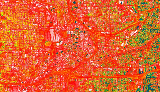
There will be a webinar next week entitled: Extreme Heat and Health: Creating Environmental Intelligence Through Science, Predictions, and Engagement. The specific date and time are: April 28th, 2016 from 4 - 5:30pm EDT. This will likely be an interesting webinar for many Community Health Mappers! Click this link to learn more.2016-04-22_101608

Field Data Collection with Fulcrum

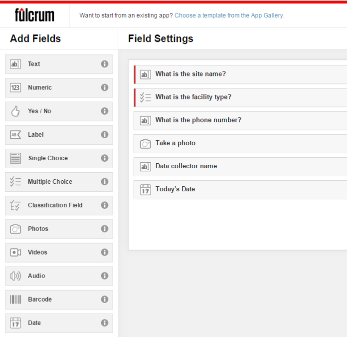
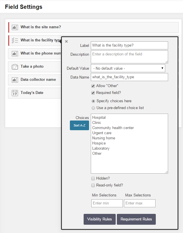
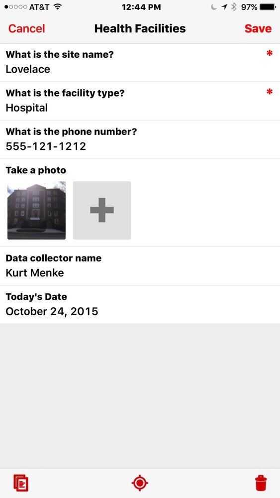
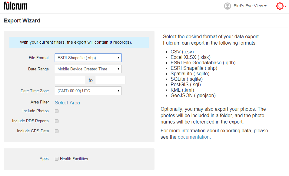
Fulcrum was reviewed in our initial survey of field data collection apps in 2012, and almost made the top three. In the last 3 years Fulcrum has improved and has become perhaps the most intuitive and useful data collection app we've evaluated period.It is available for both iOS and Android. It isn't free, but the subscription fee is affordable. It costs anywhere from $18 - $25 per month. The three pricing plans give you 10 - 30Gb of online storage, which is substantial. Fulcrum offers a free 30 day trial which includes all the functionality. You can use this option to test Fulcrum for your projects. In the following example, I will be using a health care facility data collection form to show how Fulcrum works.Fulcrum has the most intuitive data collection form builder of any app we've seen. When you design a form Fulcrum calls it an 'app'. Simply drag and drop from the Add Fields section to your 'app' to add questions (see figure below). Available data input types include text, numbers, date, single or multiple choice, photos, videos, and audio.  There are no tricks to collecting GPS locations as with iForm. Fulcrum collects locations automatically.A health care facility data collection form in Fulcrum.Once a field has been added simply set you parameters. The figure below shows the facility type question being edited. To do this simply click on a field, and fill out the details. It's so easy a 50 year old can do it!The health care facility type question parameters.The companion mobile app can be downloaded for free from the Apple Store or the Google Play Store. Once installed, login and your data collection app(s) will sync with your mobile device. The figure below shows the health care facilities data collection app on an iPhone. Answering the questions is intuitive. Once collected your data will be synced with your cloud account.Health Care Facilities data collection form on an iPhoneOnce back in the office, login to your account, select your data collection app, and choose Start Export Wizard. You will be taken to the page below. Choose your file format. A complete array of GIS formats is available including: shapefiles, geodatabases, KML, PostGIS and Spatialite.  Choose any other appropriate options and click Next to download your data.Fulcrum Data Export OptionsI highly recommend that everyone involved in Community Health Mapping evaluate Fulcrum. Along with iForm and ODK Collect is a CHM recommended data collection tool. There is a monthly subscription fee but it is low. It is the easiest and most flexible tool we've found. You can use the free 30 day trial period to see if it works for you.

Introduction

About This Blog

Welcome!  The goal of this blog is to provide information about low cost mapping tools that can be used by community organizations.  Perhaps you've seen the potential uses of mapping in public health, but are overwhelmed by the technology and/or simply too busy to pursue it.  We hope this blog will facilitate the use of GIS mapping for those that fall into this category.  We also hope to support those already engaged in mapping and enhance their community mapping initiatives, even if they may be using other tools.  The blog will be a mixture of mapping apps/software reviews, best practices, and the experiences of those who have successfully implemented a mapping workflow as part of their work. This is a collaborative effort between the National Library of Medicine, Center for Public Service Communications and Bird’s Eye View. Everything provided on this site is in the public domain and free of charge.  All training materials developed in 2013 are available here ([embed]http://communityhealthmaps.nlm.nih.gov/resources/[/embed]).

Background

The goal of the project was to assess currently available tools for collecting and visualizing public health trends via maps and spatial data.  Focus was given to tools that allow a simple workflow from field data collection to storage, and display of mapped data.  The target audience was community organizations engaged in information collection about the health of their communities for which mapping tools would be helpful.  It was with the understanding that these groups often operate without the resources to have an Esri ArcGIS license, and a full time GIS specialist on staff. Rather than focusing on the use of expensive GPS receivers, we envision the use of smart phones and tablets for these reasons:—

  • —  Most community-based organizations already have them!
  • —  Many know how to use them
  • —  They're intuitive
  • —  They're portable
  • —  They come with an on board GPS receiver (iPhone 5 uses GPS + GLONASS)
  • —  Have on board cameras
  • —  Can connect to wireless networks
  • —  Access to the internet
  • —  Email is available
  • —  “There's an app for that!”

SmartPhones and Tablets vs. GPS ReceiversThe 2012 software review included: a) apps for Apple iPad/iPhones and Android devices, b) websites serving out useful public domain health related data, c) open source desktop tools for analyzing data and integrating field data with existing organizational data, and d) cloud solutions allowing user data to be uploaded and mapped. BEV wrote a final report with a final recommendation for a complete workflow from field data collection through web presentation.

Pilot Projects

During the spring and summer of 2013 the tools selected from the assessment were introduced successfully in three test locales: 1) Urban Indian Health Institute, Seattle, Washington, 2) Papa Ola Lokahi / The Native Hawaiian and the Indigenous Health Office of Public Health Studies, University of Hawai'i Manoa, both in Honolulu, Hawai’i, and 3) The Nature Conservancy of Hawai'i, also located in Honolulu, Hawai’i. Each site developed project ideas during the winter of 2012/13. BEV developed custom training materials for each site, since each was assigned a different mobile data collection app. This allowed us to receive feedback on the three leading mobile data collection apps recommended in our 2012 review. Training sessions followed at each site in April 2013. The training focused on introducing participants to the entire workflow recommended for their project, from field data collection through data sharing and visualization. Follow up support was the provided throughout the summer and fall of 2013. All three organizations had good experiences with their projects. One study looked at noise pollution. As such an iPhone app was used to collect decibel readings at sites along with photos, and GPS coordinates. Another project working towards a resource guide of native health care facilities. The third evaluated the use of tablets in collecting native medicinal plant data. Each will be highlighted in this blog in the coming months. Stay tuned! The blog will be updated regularly so check back. Feel free to contact me with questions and feel free to comment on posts. I hope to generate some good conversation along the way.