Last week Community Health Maps traveled to Boulder, Colorado to teach a pre-conference workshop at Rising Voices 7. The theme was Converging Voices: Building relationships and practices for intercultural science. The conference was hosted by the National Center for Atmospheric Research (NCAR). The workshop was well attended with about two dozen participants representing numerous AI/AN tribes and other organizations. These workshop was part of the Community Health Maps project and was funded by the National Library of Medicine (funding for the workshop was provided under a sub-award from the National Library of Medicine to ICF International).The goal of Rising Voices is to "advance science through collaborations". Participants learn how indigenous and western scientific knowledge systems can compliment one another and advance our understanding of important issues in our communities. The focus is on climate.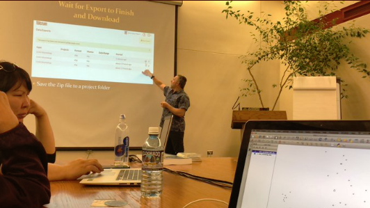 At three hours the workshop was slightly shorter than normal. This allowed us to focus on field data collection with Fulcrum and web mapping with Carto. With a few minutes to spare Kurt Menke shared QGIS. Since he didn't have time to really demonstrate the use of QGIS he focused on the open source aspect. As an open source project, QGIS is both GIS software and a community. As such it aligns with the ethics many communities try to foster at Rising Voices.
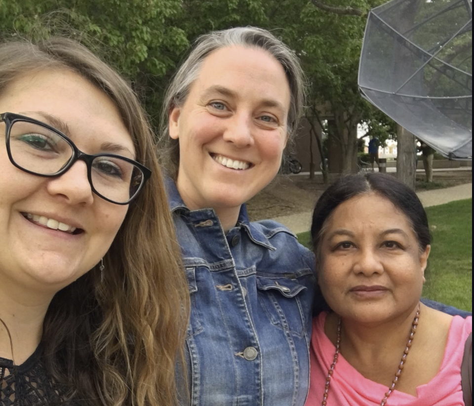
Discover QGIS 3.x - A Workbook for Classroom or Independent Study
Today Discover QGIS 3.x was published by Locate Press. Authored by Community Health Mapper Kurt Menke, this is an update of the original title, using QGIS v3.6 and covering spatial analysis, data management, and cartography. It is designed to teach mapping and GIS using QGIS. As such it begins with basics. It is a comprehensive up-to-date workbook built for both the classroom and professionals looking to build their skills.It is designed to take advantage of the latest QGIS features, and will guide you in improving your maps and analysis.The book is a complete resource and includes:
- Lab exercises
- Challenge exercises
- All data, discussion questions, and solutions
What's new in this edition:
- Updated to QGIS 3.6
- Fifteen new exercises
- A new section, Advanced Data Visualization, covering:
- Blending modes
- Live layer effects
- Geometry generators
- Rendering Points
- Time Manager
- Native 3D
- Mesh data
- Appendices covering:
- Keyboard shortcuts
- Useful Plugins
- Getting involved
To see what's included in the book, download the Table of Contents (PDF). Discover QGIS 3.x is available in color as an ebook or paper back.
The Basics of Using MapBox Studio for Web Mapping
MapBox is a very popular web mapping platform used by many social networking apps and news outlets. It includes a very powerful set of tools and comes with a modest pricing scheme. The amount you pay depends on the web traffic your site receives, for many this will be next to free. As such this can be a great alternative way to publish interactive maps.
Uploading Data
If you have collected data using Fulcrum you will want to export that as a GeoJSON file.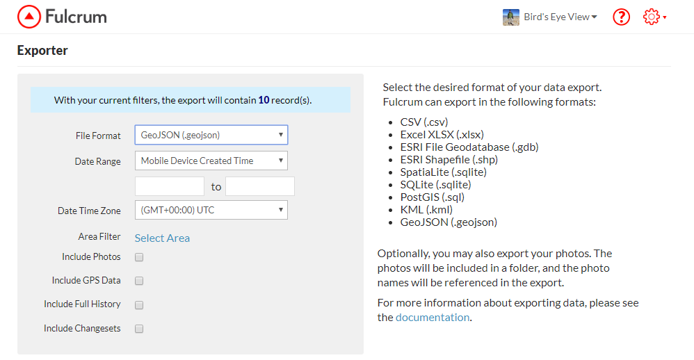 To start you can create a free account at https://www.mapbox.com/. Once logged in click on the Products menu, choose Studio. From there click the Get started link. From your Studio dashboard click on Datasets.
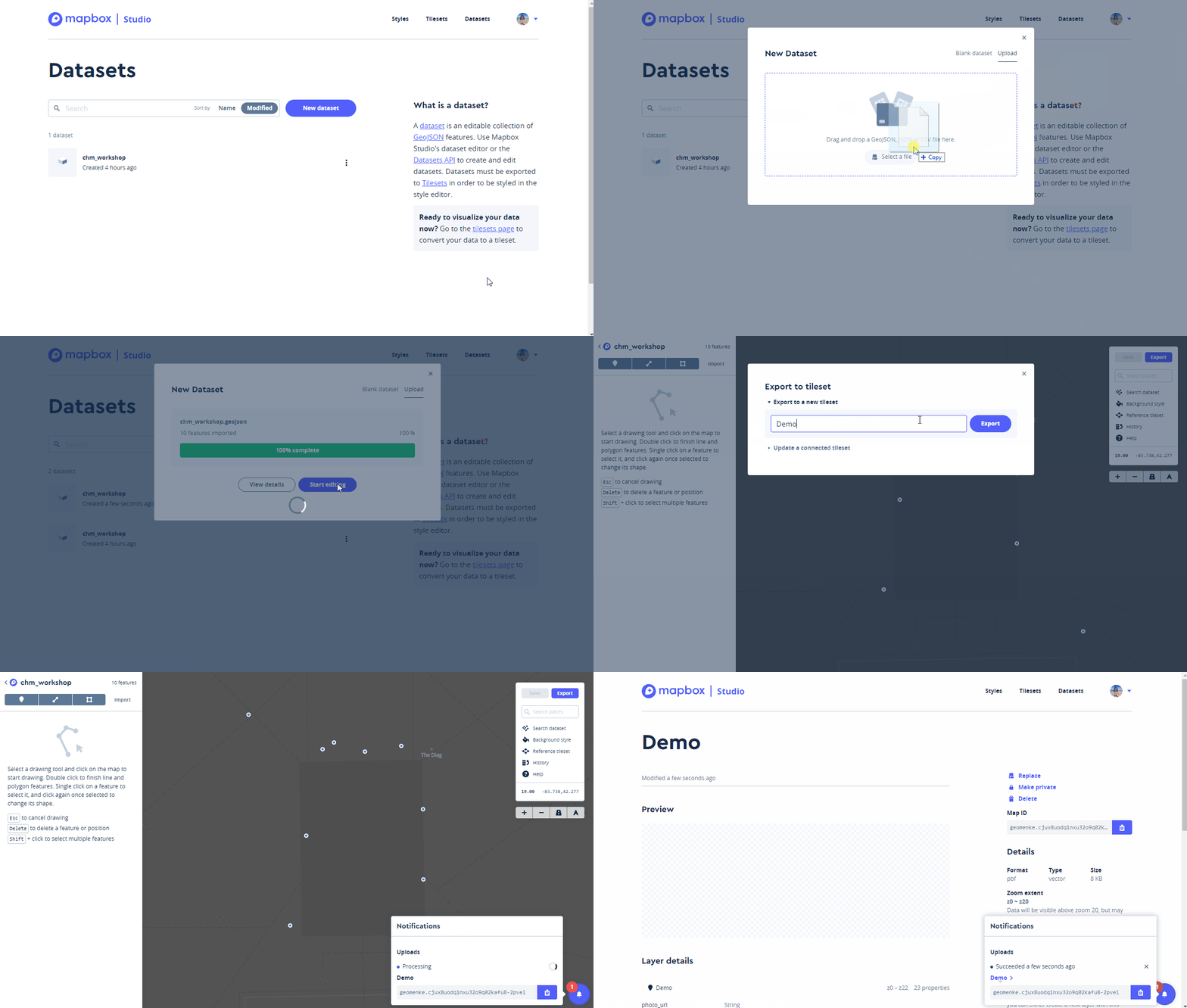
- Click the New Dataset button
- Select Upload
- Drag your GeoJSON file onto the form and click Confirm and Create
- After it has finished uploading click Start editing. The data editor will open and your points will be displayed on a dark basemap. Next you will export your data to something called a tileset. Web maps are composed of tiles for each zoom level. During this next step MapBox will generate all the map tiles for your dataset.
- Click the Export button and select Export to a new tileset.
- Name your tileset and click Export.
- It will process your data. When it has finished click on the dataset name to return to your Datasets on your Studio dashboard.
Creating a Style
Now that you have uploaded your data you will learn about map Styles. Click on the Styles link on the top row of your dashboard.
- Click the New style button
- Choose an existing style such as Basic Template and click the Create button.
- The style template will open. You can rename it from Basic Template to something more meaningful. Here the style has been renamed to Demo.
- Next search for your area of interest in the white box to the right. In the example below I have searched for Ann Arbor, Michigan and then zoomed in a little closer to the data collection area.
- You can customize the styling for any and all of the layers that make up this template. Here I am darkening the brown used for buildings a bit. To do this I clicked on Buildings and changed the color with the color widget.
- Once you have made the changes you desire click the Publish button. Click Publish again and you have created your own basemap style.
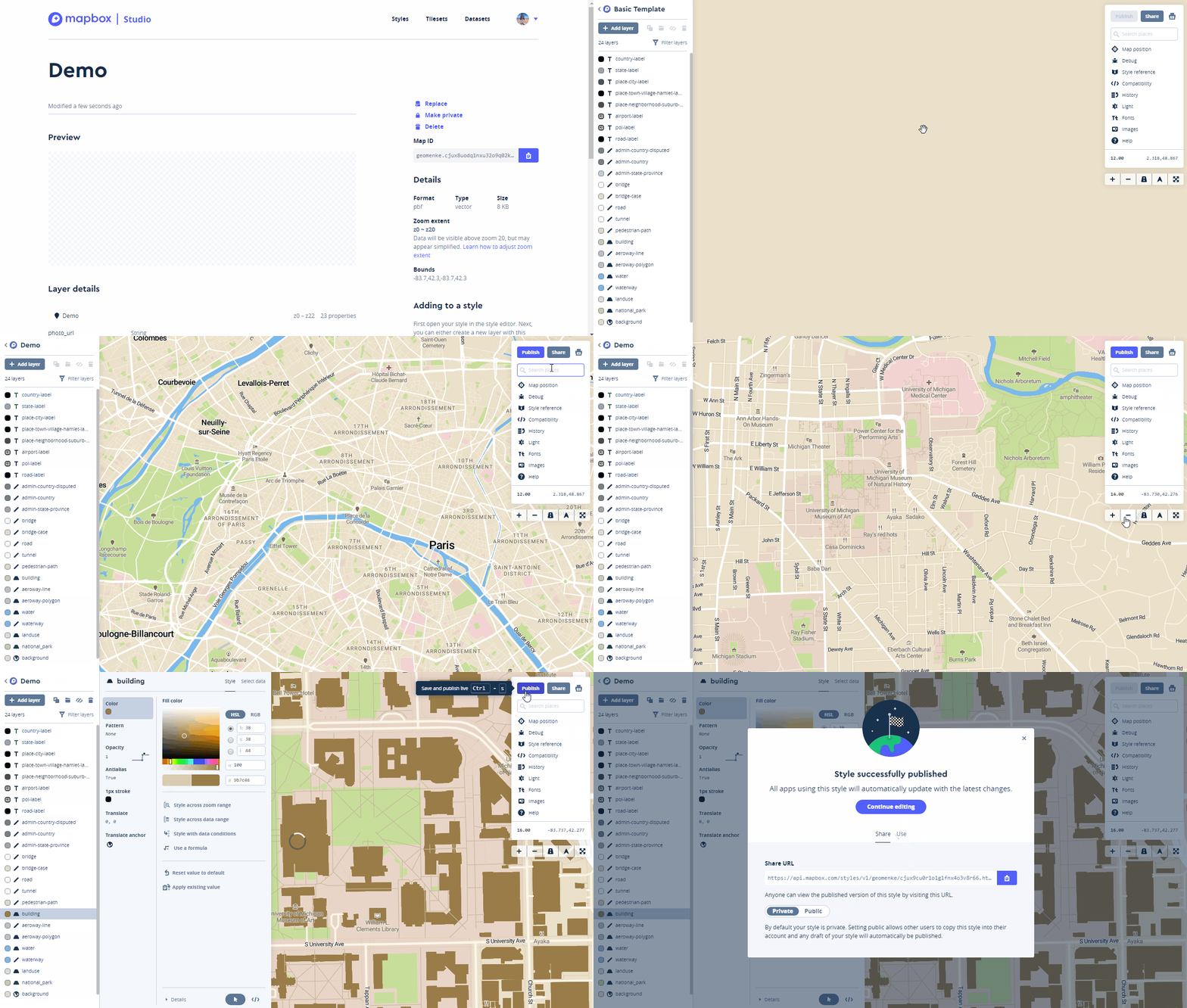
Adding a Layer to Your Map
Now you can add your tileset to your map style. Click the Add Layer button and choose the tileset you created. 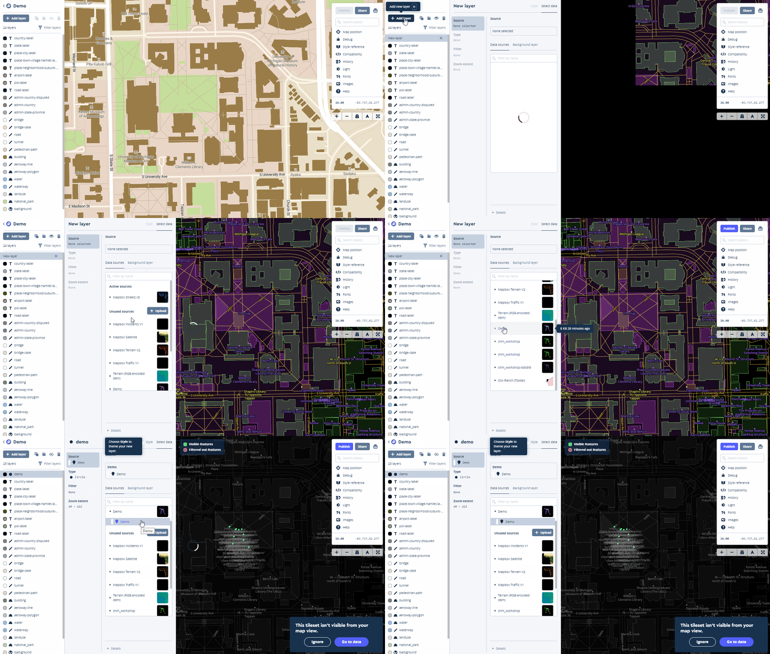
Styling Points
Once the layer has been added click on the Style tab of the layer. Next you will learn to give each type of Infrastructure it's own point color.
- Select the Color component
- Click on Style with data conditions
- The popup box for Choose a data field window opens. In this case the field is named Infrastructure so I begin typing Inf to more quickly locate the field. When you have found the field containing the categories for mapping, select it.
- A Set values for box window opens. Select the first value e.g., Bench. The Data field will now read: Data field Infrastructure is Bench. Select the color for that item.
- In the Set values for box window select the next item e.g., Sign and assign a color.
- Continue until you have assigned colors to each value.
 Creating pop up windows takes a little more work. You can read the MapBox tutorial for that here.
Publishing a Map
- When you are ready to share your map click the Publish button.
- In the window that opens click Publish again and you Style will be published again and a url to your map will be provided.
- You can also change the permissions here, and if you do you will receive a Success message.
- When finished close the window.
- Then click the Share button. You are given a url on the Share tab and a code snippet on the Use tab. The code snippet can be copied and pasted into a website to embed your map.
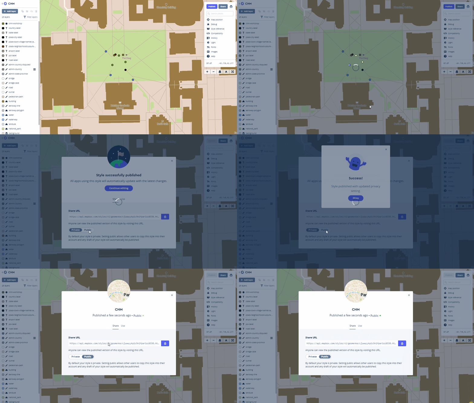 This is just a basic primer for getting started with MapBox Studio. There is a lot you can do with this platform. You can find more tutorials here.
Community Health Maps in Michigan: Four Workshops in Four Days in Four Cities!
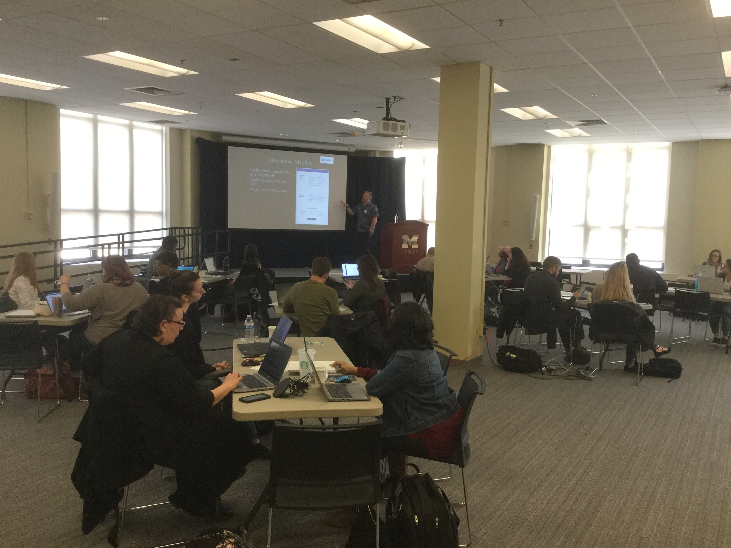
This past week Kurt Menke traveled to Michigan and taught four Community Health Maps workshops for the University of Michigan. These were organized by the University of Michigan Libraries and were done in four days on four different campuses: Ann Arbor, Flint, Detroit Center and Dearborn. These workshops were part of the Community Health Maps project and were funded by the National Library of Medicine (funding for the workshops was provided under a sub-award from the National Library of Medicine to ICF International).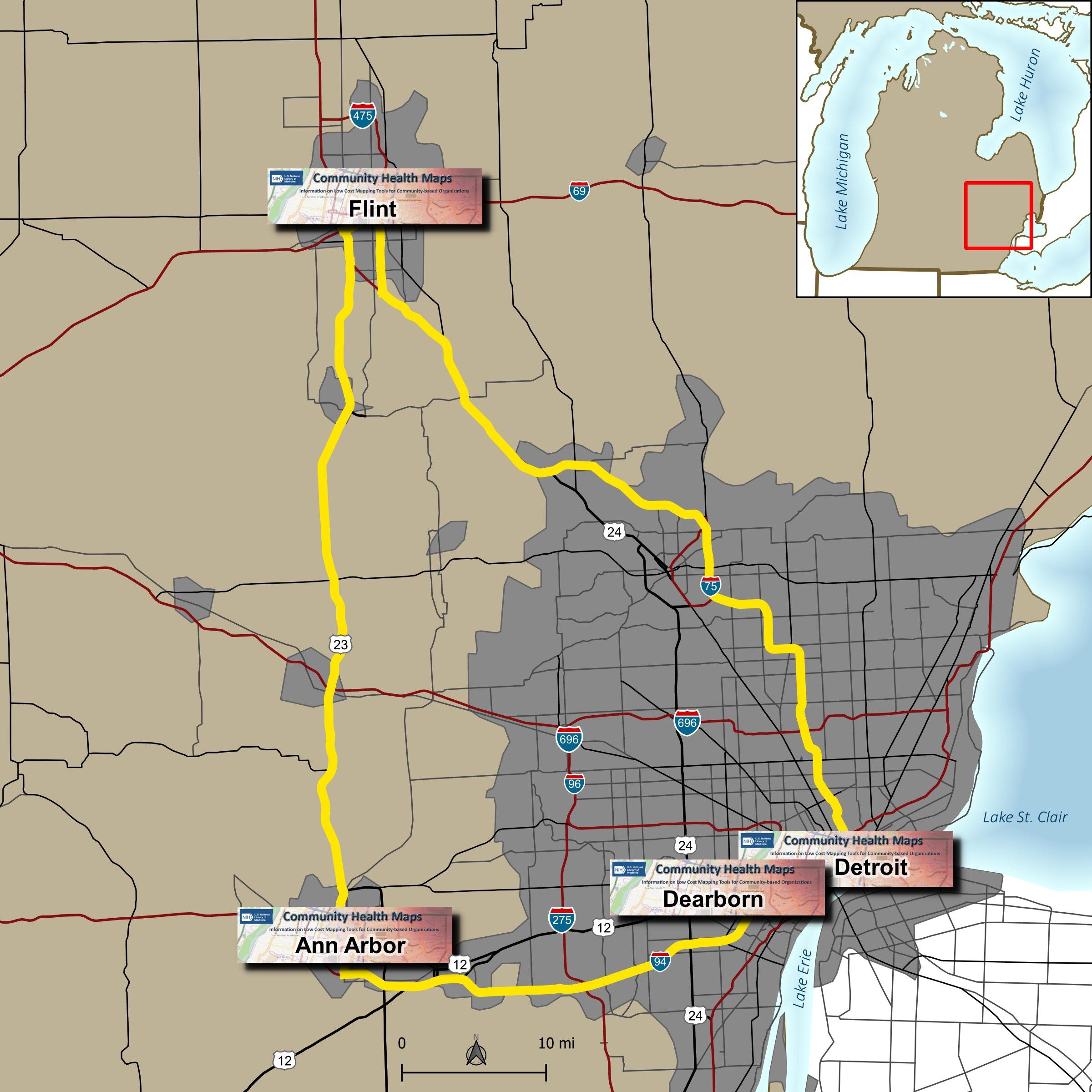 Due to great outreach by the University of Michigan team of - Tyler Nix, Marisa Conte, Alexa Rivera, Justin Schell, Sara McDonnell, Troy Rosencrants, Kui-Bin Im and Claudia Walters - the workshops had great attendance and ran like clockwork.The first was held at the University of Michigan - Ann Arbor at the Hatcher Graduate Library. Twenty eight people attended. The audience was mainly a mix of faculty and representatives of local public health/community organizations with a few students. The final hour was reserved for group discussion and Justin Schell did a fantastic job moderating. Ideas for mapping park safety and identifying underserved populations were discussed as projects where mapping could help.
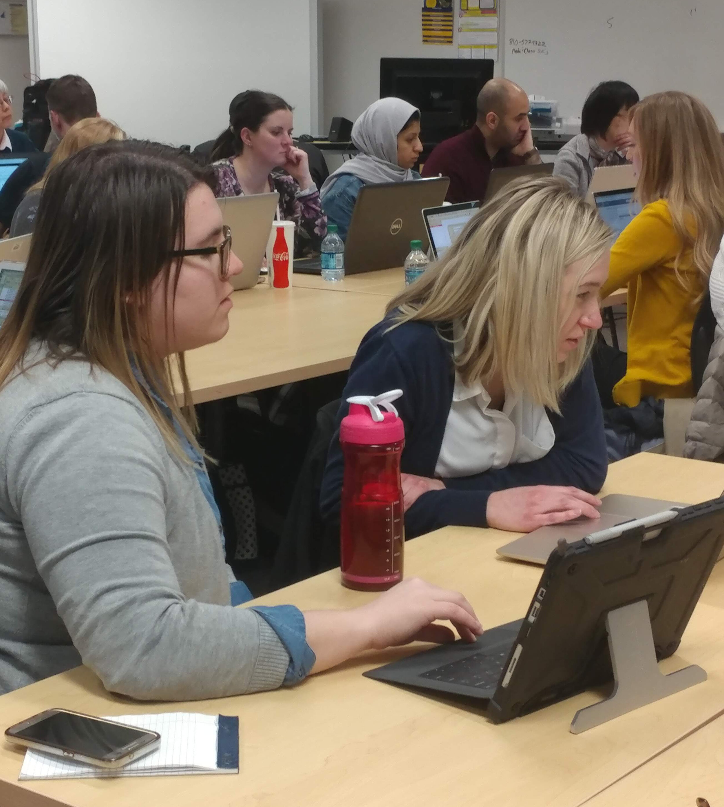
 The second was held the following day at the UM Flint. We started in the University Center Happenings Room and moved to Thompson Library for the afternoon QGIS session. Forty five people came out for this second training, quite a bit more than we expected. This included some walk-ins and late registrants. In addition to faculty and students there were quite a few representatives from local county health departments and non-profits.
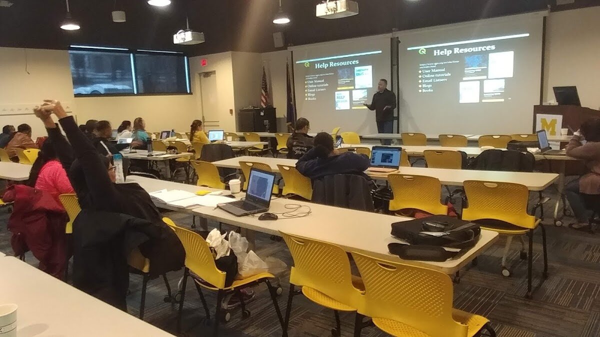
 The third was held at the UM Detroit Center on April 4th. Thirty people registered for this workshop. This was probably the most diverse group including some UM faculty, plus Wayne State faculty, county public health staff (including some as far away as Saginaw County) and non-profit public health workers.
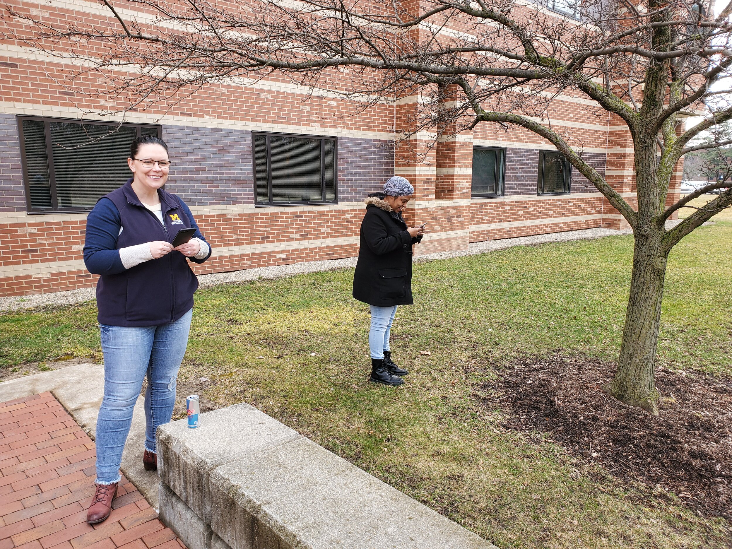
 The fourth was held at UM Dearborn on April 5th. This was the smallest of the four with 20 registrants. However, this allowed us to get a little farther into the capabilities of QGIS.
 One of the most helpful components was a web page Marisa Conte set up for the workshops. It initially had all the important details for each workshop, including driving directions, links to the slides and workshop data. This alone set a new standard for workshop outreach and organization. During the discussion on the first day she began adding url's for sites containing useful data and other resources identified during the afternoon discussion. During the week this evolved into what is now a fantastic resource for everyone who attended. This will be helpful to anyone implementing CHM related projects or those who weren't able to attend.For the week 123 people were trained in Community Health Maps! This is a record that may never be broken. However what came out of the week more than the numbers, is the incredible potential for projects that can make a real difference in these communities. I'm looking forward to working more with everyone I met. Thanks again to UM Michigan for organizing such a successful series of workshops.
QGIS 3.6 Noosa Released!
This past weekend QGIS 3.6 Noosa was released as the next stable release. You can visit the QGIS download site to find installers for Windows, Mac and Linux. At the same time QGIS 3.4 Madeira became the latest long-term release. This means that version 3.4 will be supported for a calendar year with bug fixes. This is now the version you should install and work with for the next year.
 If you have not yet worked with the new 3.x line you can look at the visual changelogs here: Version 3.0 - Version 3.2 - Version 3.4. In general the QGIS 3.x line is a major upgrade from 2.x. I encourage you to install it and make a map!
Mapping Field Photos in QGIS
We are on the eve of another QGIS release. Version 3.6 will be released any day now. This will mark an important milestone in QGIS development. QGIS 3.4 will become the first long-term release for the 3.x line. With 3.6 will come one specific change pertinent to this topic: the Raster Image Marker. Consider this post a small preview of what you can expect with v3.6!In the typical CHM workshop attendees are shown how to use Fulcrum to download data collection points. These include photos. It is also possible to quickly and easily map any geotagged photo from your smartphone using just QGIS. For this example, I am using some photos I took yesterday during a hike with my iPhone.
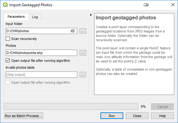
- Using the Processing Toolbox, search for and open the Import Geotagged Photos tool and set it up as shown in below, pointing the tool to the folder containing your photos and naming the output point file.
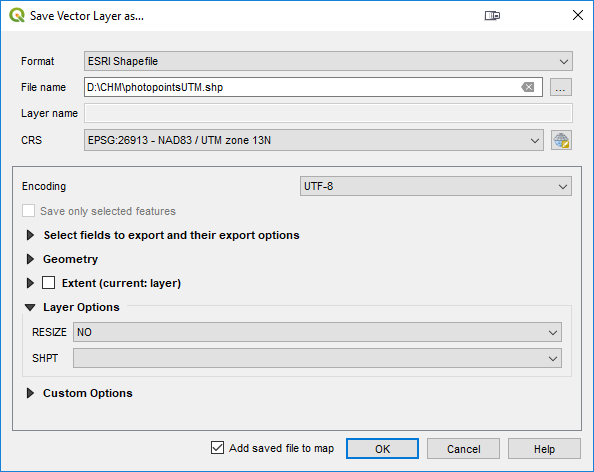
- The data are in geographic coordinates (latitude and longitude). It will be helpful to project the photopoints to a Cartesian coordinate system such as UTM or State Plane. To do this right-click on the photopoints layer in the Layers Panel and choose Export --> Save As from the context menu.
- In the Save Vector Layer As window save a new copy of the layer. If you need help determining which coordinate system to use feel free to reach out to Kurt Menke (kurt at birdseyeviewgis.com). He is happy to help!
- Now you have a couple interesting ways to visualize these points. First you can generate something called a Wedge Buffer. These are pie shaped polygons that you can set up to represent the field-of-view of the photograph.

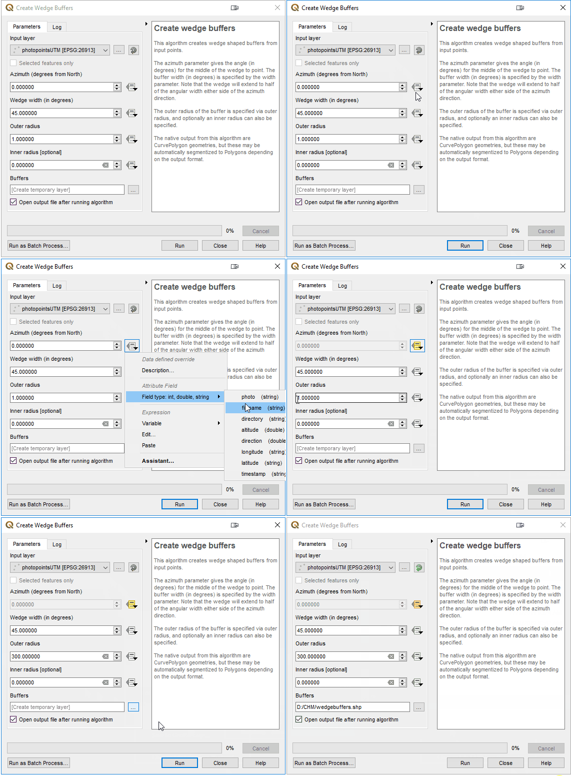
- Search the Processing Toolbox for the Create Wedge Buffers tool. The Input Layer will be the reprojected photopoints. The Buffers output can be a shapefile in your photos folder. The real trick is using what is known as a Data Defined Override. In QGIS you can use values in attribute columns or expressions for tool inputs instead of putting in a single typed value. In the animation below, a Data Defined Override is being used for the Azimuth parameter. This determines which way the wedge will be pointed. The Import Geotagged Photos tool extracts more than just photo location. It also extracts direction, altitude etc. Here the Azimuth parameter is simply being pointed to the direction attribute column and this orients the wedge in the direction the photo was taken! The only other parameter to set is the Outer Radius. This determines how long the wedge will be. Here it is being set to 300 meters.
- Now there are both photo locations as points, and wedge buffers showing the field-of-view!
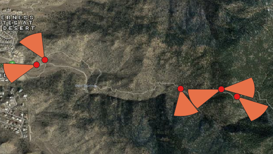
- Next let's improve the default symbology for the wedge buffers using a Shapeburst fill. You will open the Layer Styling Panel (F7) and set the wedge buffers as the target layer. Next select the Simple Fill component and switch the Symbol layer type from Simple fill to Shapeburst fill. You can then set the two colors to use. Here I am using red and transparent. You can then set a distance for the effect and play with other settings like Blur strength.

- Finally you will learn a feature that will be released with QGIS 3.6: Raster Image Markers. Here the target layer is the photopoints layer. The Symbol layer type is being switched from Simple fill to Raster image marker. Then the Data Defined Override for the image is being set to the photo field, and the Rotation parameter is being set to the rotation field!

- Now the photos have been mapped. Their field-of-view is being represented by a wedge buffer, and the photo itself is added to the map with a Raster image marker!
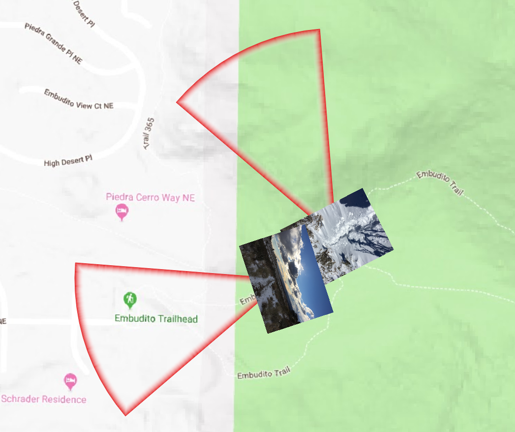
Stay tuned for more tips on mapping and updates about this latest QGIS release.
A Preview of Coming Attractions
2019 is off to a fast start with the Community Health Maps program!The QGIS portion of the CHM labs found on the Resources page are being updated. Look for these in the next several weeks. These were last updated in 2017. In one month a new long-term release of QGIS will be released: QGIS 3.6. This will be the first long-term release of the 3.x line. If you have not yet switched over to QGIS 3.x, March will be the time to do so. At this time 2.x line will be officially retired. You can revisit last years blog about what's new in QGIS 3 to see the sort of features now available. I will be posting an post next month about what you need to know about QGIS 3.6, as well as an announcement when the new training materials have been completed.There are a series of QGIS workshops scheduled for the spring:April 2 - University of Michigan Ann ArborApril 3 - University of Michigan FlintApril 4 - University of Michigan Detroit CenterApril 5 - University of Michigan DearbornMay 14 - Rising Voices 7 - Converging Voices: Building relationships and practices for intercultural science. - Boulder ColoradoJune 3-7 - ASTHO Climate and Health SummitJune 17-21 - ASTHO CHM and Vector Borne Disease WorkshopHappy Mapping! I hope to see you in the new year!
A Year End Thank You to John Scott
Earlier this fall John Scott retired after serving as a consultant and advisor to the National Library of Medicine for more than 20 years. Community Health Maps was born from his inspiration and he was the driving force behind the program. In his retirement the program will continue with his long-time partner Kurt Menke (kurt@birdseyeviewgis.com) and NLM staff. John will still participate in select CHM activities and be an advocate for the program. Thanks to the solid foundation he laid, the program is thriving. An online tutorial was recently unveiled which provides continuing education credit (CE)., including through the Medical Library Association (MLA, http://www.medlib-ed.org/products/1847/community-health-maps), and/or a certificate of completion. There are also several CHM workshops planned for 2019.To honor John Scott we are re-posting an interview with him from April of 2017. Happy New Year to all the Community Health Mappers! We hope to see you in the new year.*********************************************************************************April 13, 2017Interviewer: Kurt Menke, GISPWhat is your background?My professional experience has been in two areas: disaster risk reduction and reducing health disparities. In 1990 I formed the Center for Public Service Communications. Since then I have provided guidance and expertise to individuals, communities and public sector organizations. I help them apply telecommunications and information technologies to reduce health disparities, improve health services to underservedand disenfranchised individuals and communities and to improve the collection and sharing of scientific, technical and community knowledge. The end goal is to reduce human vulnerability to natural hazards. I’ve been a consultant and advisor to the National Library of Medicine for more than 20 years.Through the years, I’ve realized that my skills seem best suited to working with change agents. These are individuals and organizations whose missions focus on enhancing capacities and improving access to technologies that enable positive change at the community level. I guess the tag line says it best, the mission of CPSC is: “Empowering competent enthusiastic people to do good things.” That’s my story and I’m stickin’ to it.You’re the original architect of CHM, what was your inspiration? Well, Kurt, I would say that we, together, have been architects of CHM, with a long-term commitment and guidance from the National Library of Medicine. As you will remember, it was back in 2003 that we met. I had organized a meeting of the National Congress of American Indians President’s Task Force on Health Information and Technology in Honolulu, Hawai’i, hosted by the Native Hawaiian health organization Papa Ola Lokahi.At that meeting, you gave a presentation on work you were doing with the National Indian Council on Aging. At that moment, it was obvious to me that mapping would be a great tool for underserved community-oriented environmental health advocacy groups and public health agencies. It could help them engage with community residents and empower them to collect, maintain and visualize their own data, rather than relying solely on national or state agencies, or majority-institution partners to provide data to them. It took us a while to settle on our current course but the ride was interesting and the result was, I think, worth waiting for.Why do you think CHM has been so successful?While access to quality health information is frequently a focus of attention in efforts to reduce health disparities in underserved communities, the ability to visualize spatial data and information has received less attention. This is in part because the historic scarcity of affordable and intuitive data collection and mapping applications. Additionally, the cost to train users, and sustain operations, has been prohibitive for communities and community-oriented organizations whose health budgets are already strained. I think we’ve found a model, with the Community Health Maps workflow, that addresses these historical challenges.Without equal access to GIS tools, communities might have access to completed maps, but they cannot actively participate in, much less create and be responsible for their own initiatives. I think CHM has been successful because the approach we have envisioned enables that access, and CHM users thus far have appreciated the freedom they have, to explore ideas and to create hypotheses that they have not had access to until now.What sets CHM apart from other public health mapping initiatives?I think what sets CHM apart from other public health mapping initiatives is that our approach involves using relatively low cost tablets and smartphones – technology that has become ubiquitous and with which users are comfortable -- combined with a selection of low/no-cost applications for data collection and visualization. With these tools, data can then be analyzed and presented without purchasing expensive software licenses. These tools allow expert and novice users, with little budget resource, to implement mapping workflows. Introducing such workflows to community-oriented public health professionals empowers users to collect, analyze, display and share their own spatial data. Importantly, many of these tools can also be used to share data collected using other programs, such as ESRI’s ArcGIS and national/state- derived databases such as CDC’s Behavioral Risk Factor Surveillance System and Public Use Data files from National Center for Health Statistics.Where would you like to see the project go from here?What we have developed is essentially available at no or very little monetary cost. I don’t want to underestimate or undervalue the labor and intellectual time that is required to learn how to use the tools. But we believe that organizations and individuals who work to improve the quality of life in underserved communities will see the benefit of using the CHM resource as a worthwhile commitment of time.The National Library of Medicine has been a great partner and continues to plan an integral part in planning the course for CHM. Through NLM’s outreach efforts we have several successful pilot projects that readers of this blog will be familiar with. Through these continued efforts of sharing the tools through NLMs network of libraries I hope the use of CHM will grow. My hope is also that more academic health schools will introduce the CHM into their teaching and research programs as have the University of Washington and the Medical University of South Carolina, two of our partners. I’d also call to the attention of your readers the labs that you have developed and are available on this blog. My hope is that they will encourage prospective CHM users to try the workflow at their own pace.
QGIS 3.4 Released!
On November 2nd QGIS 3.4 'Madeira' was released. It is the first long-term release in the new 3.x platform. To install it you can visit the QGIS Download page. Installers are ready for Windows, Max OSX and Linux.QGIS VERSIONSRemember QGIS always has two main versions available. There is the long-term release, which is the most stable because it is supported for one calendar year. In addition there is always a latest release. QGIS 3.4 falls into this former category.QGIS 3.4This is a great time to update your version of QGIS. Especially if you are still using the 2.x line. QGIS 3.x is fast, stable and feature rich. If you are still a 2.x user there is a huge list of new features and useful changes. At this point most of the popular plugins have been migrated over from 2.x to 3.x. The chart below shows the steady migration and growth of 3.x plugins. You can review the visual changelog for this version here. You can also find the changelogs for versions 3.0 and 3.2.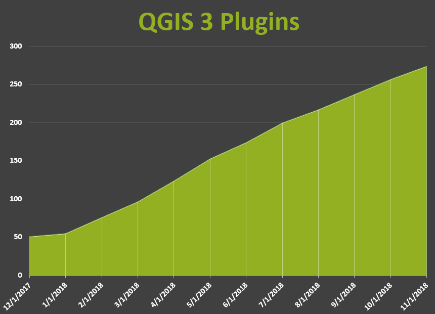
Try Out the New Community Health Maps (CHM) Online Tutorial!
By Colette HochsteinA Community Health Maps (CHM) online tutorial is now available. It is a free, self-paced online course from the National Library of Medicine (NLM), which provides guidance on using low cost mapping tools to collect, analyze, and visualize mapping data.Community Health Maps seeks to empower communities and individuals by helping them collect and map health-related data. The CHM tutorial helps users build a plan to collect data, create forms to capture data points, and use mobile devices to collect data. The CHM tutorial can also aid in creating online and printable maps that can be customized to meet the needs of specific populations and stakeholders.The tutorial covers how to create a basic workflow for collecting and mapping field data via step-by-step instructions on how to (1) develop a data collection form, (2) collect field data according to the data collection plan, (3) create online dynamic maps of the data collected, and (4) create static offline publishable maps of field data using desktop software.As a bonus, this course provides continuing education credit (CE), including through the Medical Library Association (MLA, http://www.medlib-ed.org/products/1847/community-health-maps), and/or a certificate of completion. For continuing education credits and/or a certificate of completion, please enroll in the course on the free Learning Management System (LMS).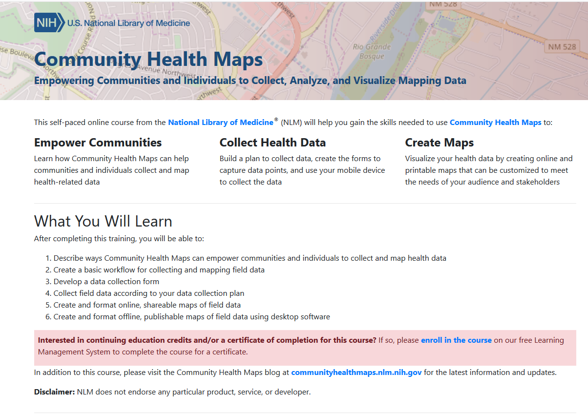 If you are new to Community Health Maps, and are not sure how this mapping workflow can benefit you and your organization, you can search this blog for case studies. In particular you may want to look at the selected case studies linked to below. Read about how students and professionals have used Community Health Maps:
- Mapping South Florida's King Tides
- GIS as an Educational Tool at MUSC
- Exploring Accessibility and Sustainability at the University of Maryland School of Public Health
- Association for Prevention and Teaching Research Conference (APTR)

