By Colette Hochstein (NLM)On October 12th, 2017, the National Library of Medicine Disaster Information Management Research Center (DIMRC) collaborated with Community Health Maps (CHM) to host a webinar focused on using mapping tools during disasters. The meeting was attended by 128 professionals, including first responders and receivers, emergency planners, and public health librarians, many of whom are involved, directly and indirectly, with disaster relief efforts.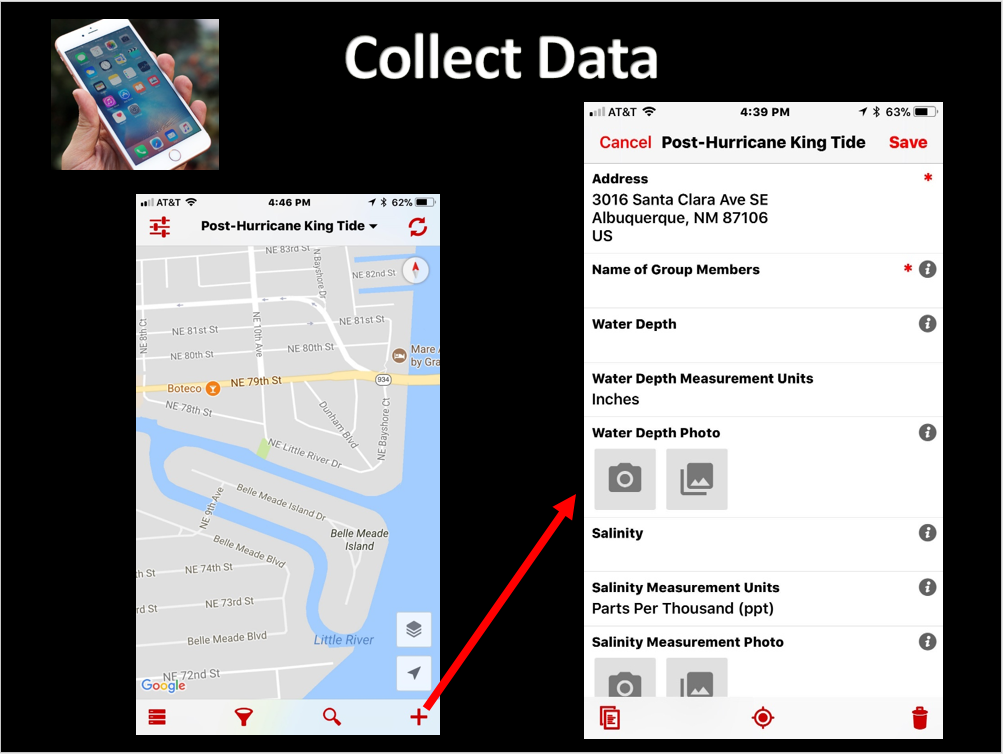 DIMRC provides access to health information resources and technology for disaster preparedness, response, and recovery; CHM provides users with information and training on low-cost mapping tools that can be used to collect data related to health hazards in communities, including during disasters. Many community-based organizations can better serve their constituents when they are able to collect and maintain their own data; CHM seeks to provide them with the training and tools needed to carry out cost effective and scalable mapping.After the basic premise of CHM was explained to webinar attendees, several case studies illustrating the different applications of CHM were detailed. One took place in Seattle, Washington and centered on mapping noise pollution in different neighborhoods. The primary focus of this case study was to provide useful insight into the public health concern of noise pollution, which has been linked to various health conditions. Other goals included offering recommendations on the scalability of the Urban Indian Health Organization (UIHO) network and measuring and testing the usability of the CHM GPS/GIS workflow.Another study described how CHM was used to map “King Tides” in Miami, Florida, and was CHM’s first opportunity to work in the field with users of its workflow. The goal was to communicate health risks associated with the 2017 King Tides during their highest activity, and to demonstrate how the flooding affects local communities. It was also a good test case of successfully using the tools in challenging field conditions.Overall, the webinar provided the audience with information on the resources offered by CHM and demonstrated how different populations and communities, such as communities affected by disasters, can use CHM to collect and interpret their own data. You can watch the webinar by clicking on this link.
Students teach students during University of Maryland CHM presentation
On September 28, 2017, Community Health Maps (CHM) was presented to the Community Health class at the University of Maryland School of Public Health in College Park. The session was provided by Julian Argoti, research assistant at the National Library of Medicine (NLM), and three University of Maryland Public Health interns completing their capstone project at the NLM. The primary goal was to expose the students to the resource and to help them explore how it might be used in their research.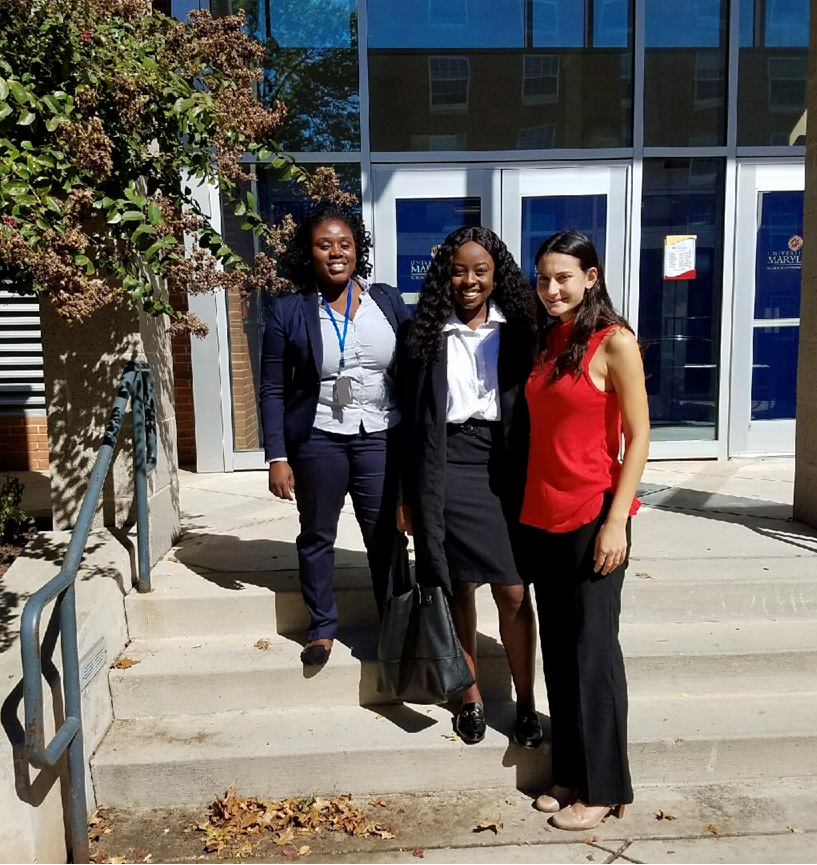 The presentation took place within a 95-minute class period with 53 students. The presenters introduced the CHM blog and briefly touched on using Geographic Information Systems (GIS)/spatial analysis to address a public health concerns, as English physician John Snow did in 1854 by mapping the source of a cholera outbreak in Soho, London, and as a former NLM intern did by mapping local curb ramps to help those with mobility issues cross streets safely.
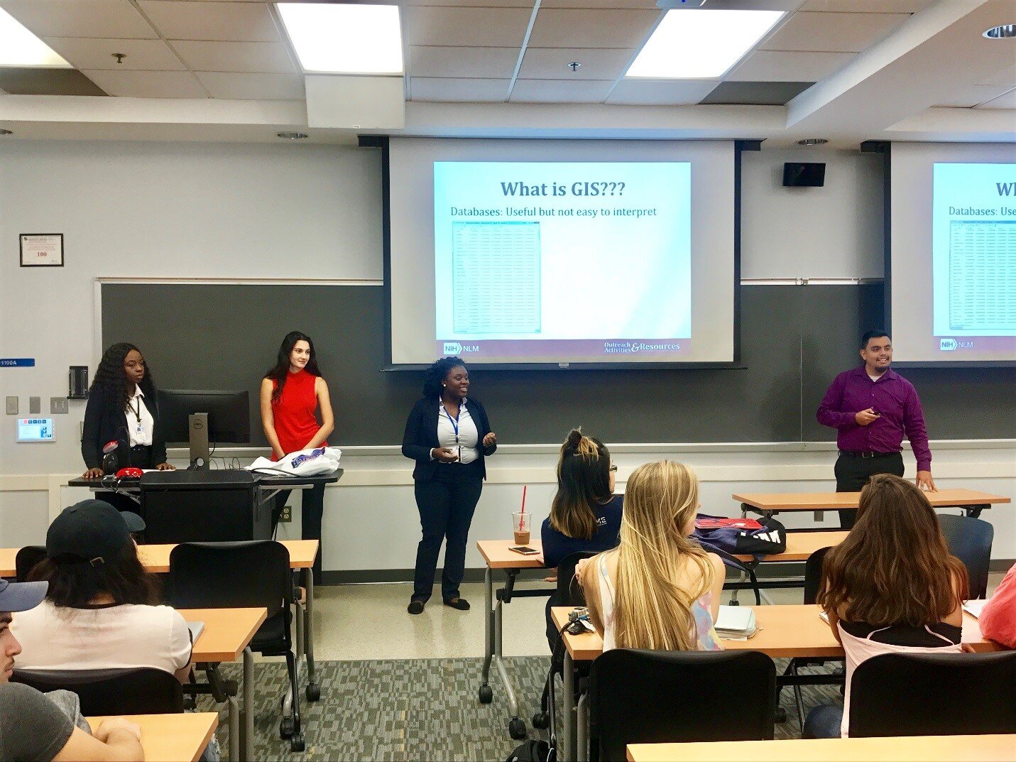 The students then completed a hands-on data collection exercise. They were introduced to Fulcrum, a low cost tool that allows users to build custom data collection forms for use on iOS or Android devices. Next, they left the classroom to collect data in real time, from the locations of trashcans and water fountains inside buildings to the positions of benches and signs outside them.The session ended with the students exploring a series of exercises designed to help them through the entire CHM workflow, from field data collection to online data presentation. A post-class survey indicated that most participants felt they could use CHM in upcoming assignments.
Mapping South Florida's King Tides
By John C. Scott - Center for Public Service Communications
Community Health Maps (CHM) recently joined forces with community based organizations and residents in North Miami, and Florida International University faculty to map health risks associated with the 2017 King Tides, September 19th and 20th and again on October 7th , the time of the highest of the inundations.
Several communities in Miami experienced predictable tidal flooding during the highest tides of the year. The Shorecrest community is among them. Sampling of the flood waters during previous King Tides has established that they contain elevated concentrations of bacteria. The aim of this project was to prepare residents of the community to record and map data that will help them plan their daily activities to protect their health, and give them tools to communicate with the city and county about their environmental health risks.
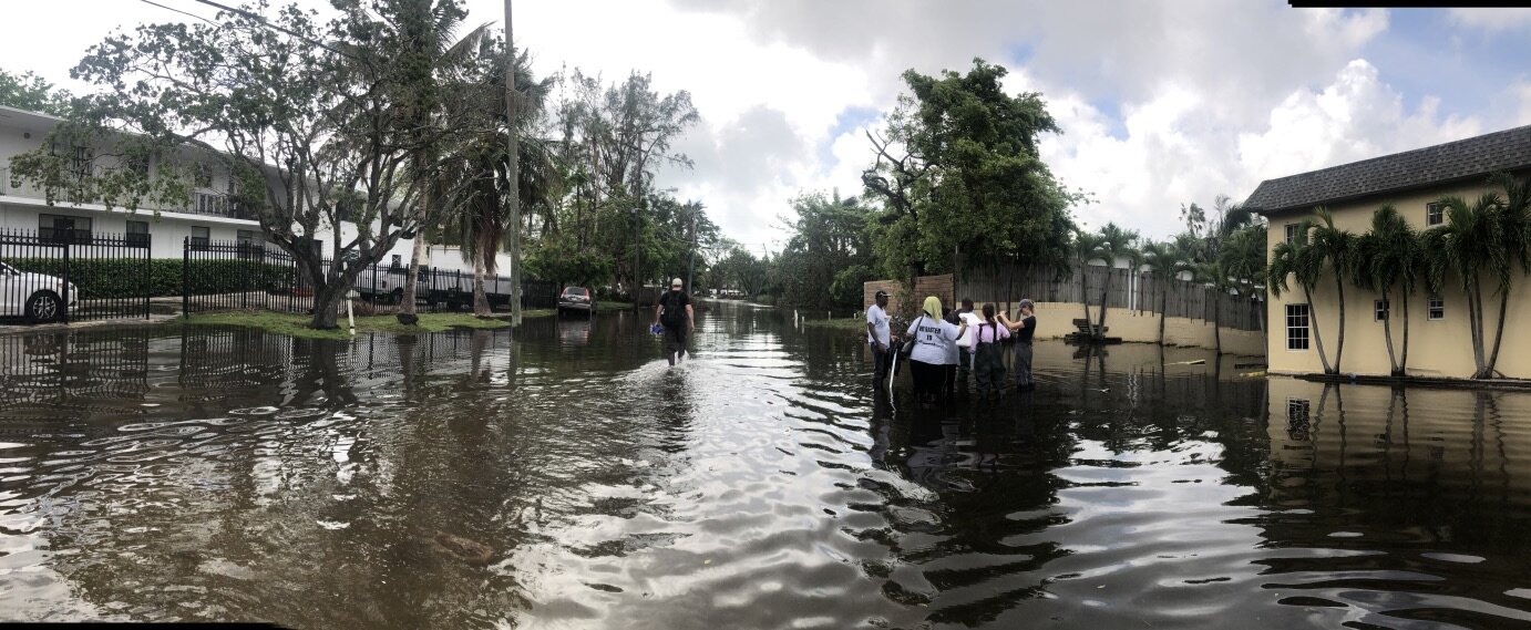
King Tides flood the streets of the Shorecrest neighborhood while community members collect data.
Complicating the task of collecting data in the community was Hurricane Irma which hit South Florida only a week before the September measurements, causing dislocation of residents, power outages and other disruptions that resulted in the decision not to tax neighborhood residents by expecting them to learn the CHM workflow and map hazards in the community.
For the CHM/King Tides mapping project, community members were trained on the CHM workflow before collecting and mapping environmental health data during the King Tides in the Shorecrest community of Miami. A physical tool box containing needed technology, sampling equipment, key contact information, and protocols for community engagement in data collection during King Tides was created by Jan Booher of Unitarian Universalist Justice Florida and Drs. Tiffany Troxler and Susan Jacobson of Florida International University Wetland Ecosystems Research Lab and School of Communications, respectively. Based on the initial data collection and mapping effort with the Fall 2017 tides, a community report will be generated in collaboration with community leaders to be shared with residents and decision-makers in the community and with appropriate members of City of Miami and Miami-Dade County staffs.
For those of you who are new to Community Health Maps, the initiative was founded on the premise that community-based organizations, environmental health advocacy groups, public health agencies are in a better position to serve their constituents when they can collect and maintain their own data, rather than relying solely on national, state or city agencies, or majority-institution partners to provide data to them.
The CHM approach involves using relatively low cost tablets and smartphone platforms, combined with a selection of low/no-cost applications that run on them, to collect data in order to better understand health status or health risks to the community and support decision-making leading to appropriate allocation of resources to improve health conditions and prevent or mitigate risk. Using the CHM workflow, those data can then be analyzed, shared and presented using low cost/open source software. These tools allow expert and novice users, with little budget resource, to implement mapping workflows.
A common way in which prospective users have learned the CHM workflow is through our CHM Training Workshops. The CHM workshop presents an opportunity to learn and discuss new ideas and methodologies, which will empower community organizations, teachers, and students serving vulnerable or underserved populations with low cost, intuitive mapping technology. During the workshops, we also share experiences where the CHM workflow has helped MPH programs and other academic health centers and community-focused organizations visualize their data and better understand and portray their significance to the community.
The Florida King Tides was a more ambitious project than usual for CHM. While most of the work of the CHM team consists of training and building capacity of communities to map and better-understand their health risk to environmental factors, this was our first opportunity to work in the field with users of the workflow. Together with the core CHM team of NLM, Center for Public Service Communications and Bird’s Eye View, CHM teamed with Unitarian Universalist Justice Florida (UUJF) and it’s The Rising Together project, which works residents in vulnerable communities in coastal Florida about how to prepare for and react to the public health effects of climate change. Through its association with UUJF, the Community Health Maps team also trained and worked with Quaker Earthcare Witness, New Florida Majority, and Florida International University’s Wetland Ecosystems Research Lab and School of Communication and Journalism.
Map made in QGIS of the September King tide data collection showing flood water salinity levels.
It is our vision that data collected by neighborhood residents about conditions affecting environmental health can be visualized via CHM, together with databases available from city, county, state and federal governments to, as one example, identify potential predictable impact of future king tides so that public transportation and school walking routes can be modified to avoid health risks.
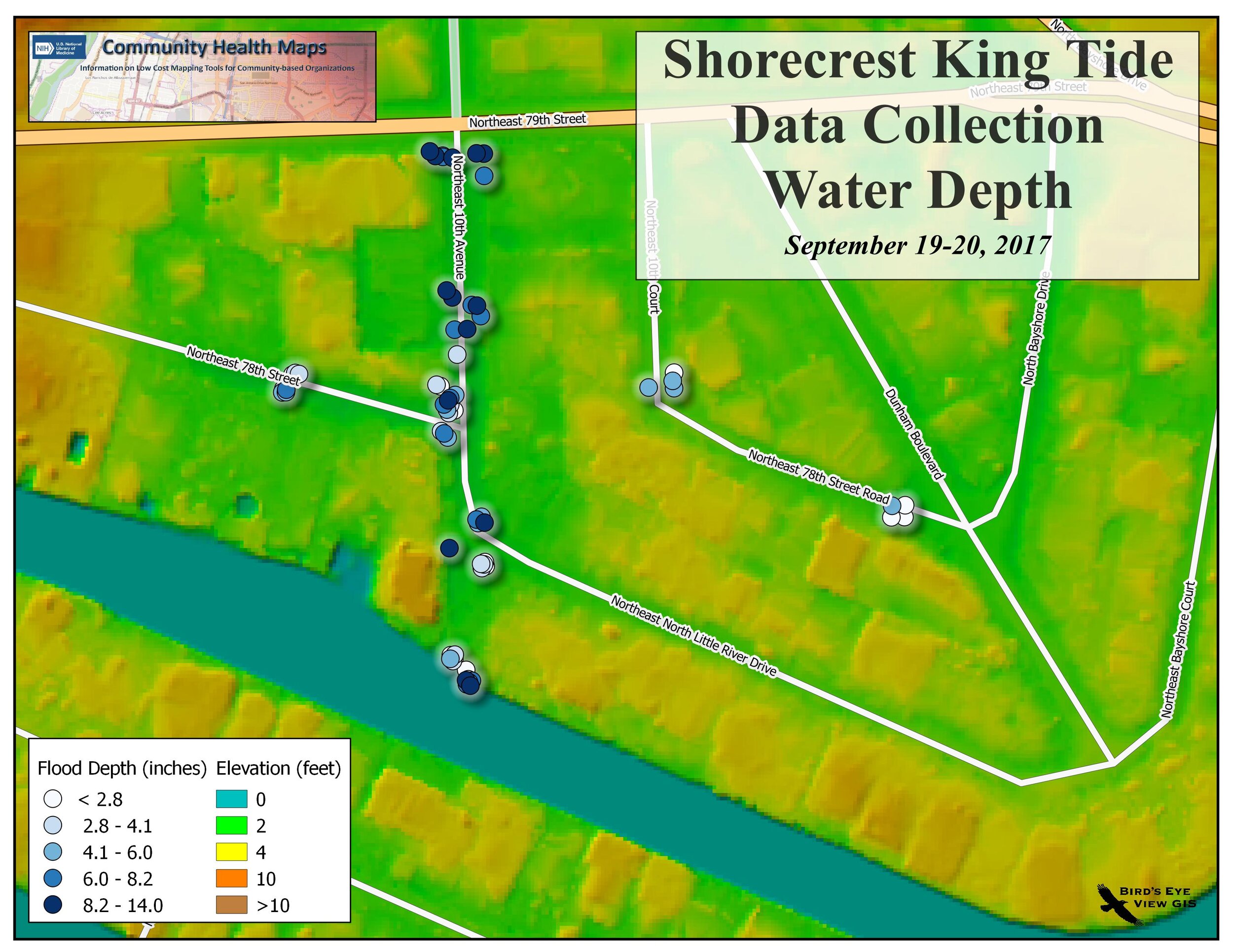
Map showing water depth in comparison to elevation above sea level
While collecting data for risk maps a Miami Herald reporter stopped by the Shorecrest neighborhood where we were working. Here's his story about our initiative.
A Busy Summer with a QGIS Conference in Denmark and FOSS4G in Boston
This summer Kurt Menke first attended the 3rd Annual QGIS User Conference, Hackfest and Developer meeting in Denmark. From there he traveled to Boston to attend the Free and Open Source for Geospatial (FOSS4G) International Conference. 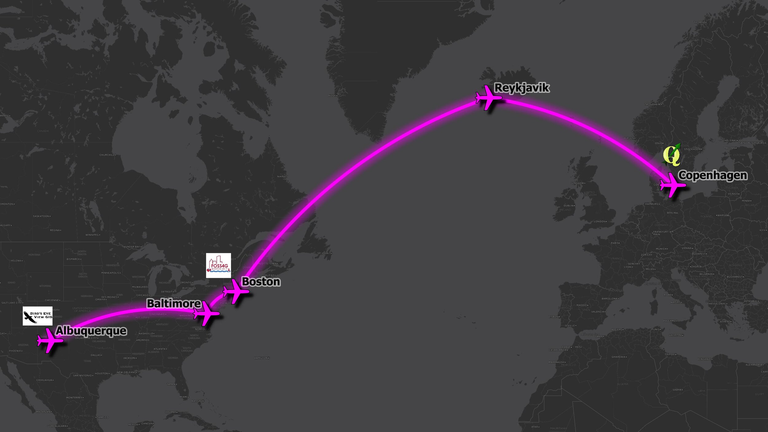 The QGIS conference was small and intimate and a lot of new information was shared by the developers about the future of QGIS.
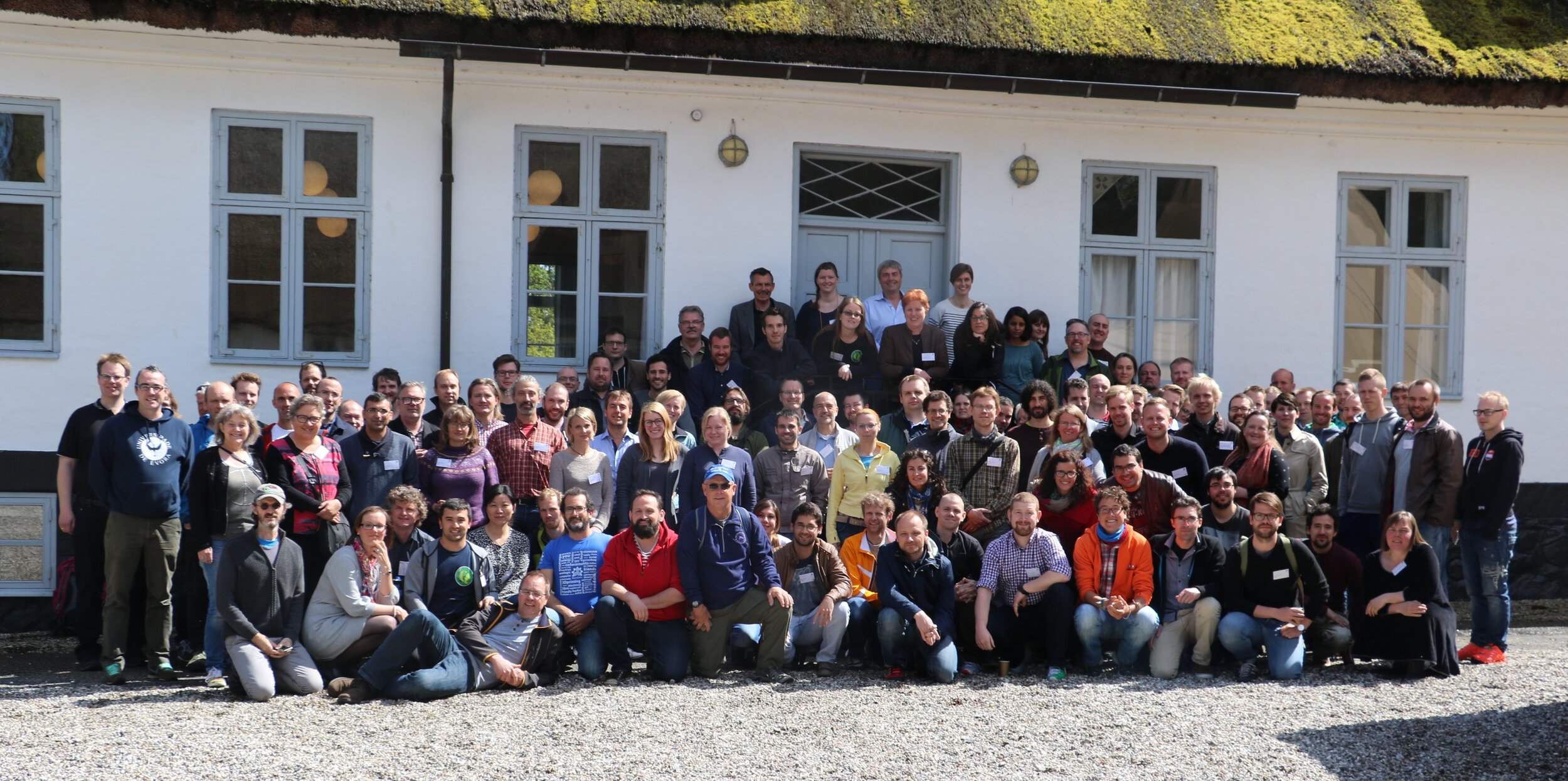 There was so much presented that this will be a separate future blog post. While there Kurt conducted a full day workshop on Data Visualization and Cartography in QGIS.
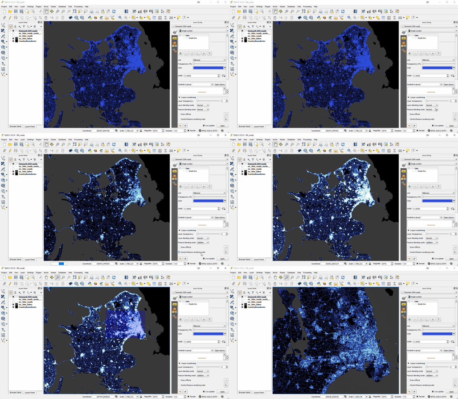
 He shared many of the new sophisticated and powerful data styling tools now found in QGIS including: 2.5D, 3D, Live Layer Effects, Inverted Polygon Shapeburst Fills, Blending Modes, and some plugins such as Time Manager. Perhaps this could be a workshop shared with CHM partners at a future date? Some examples are shown below:
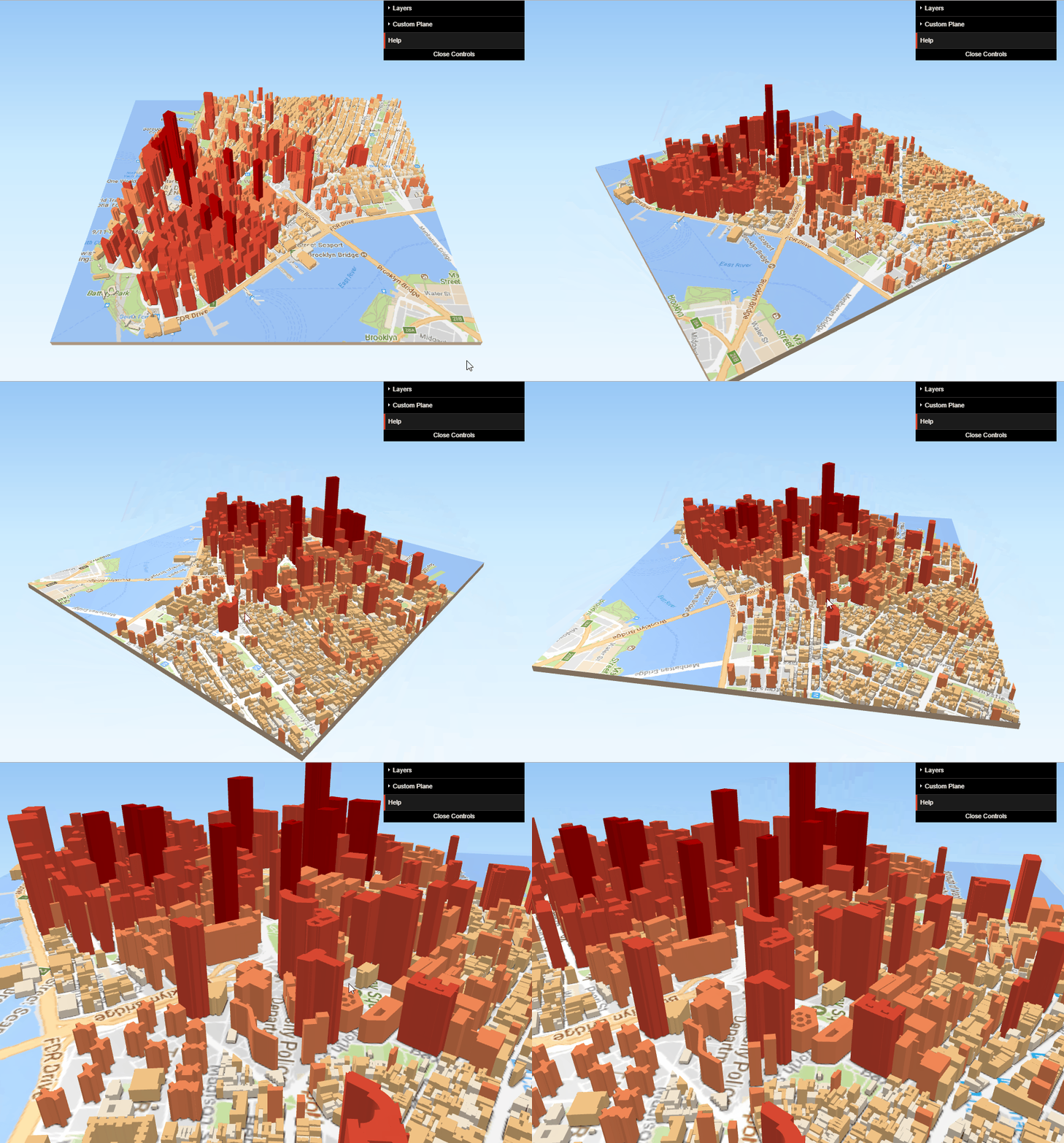
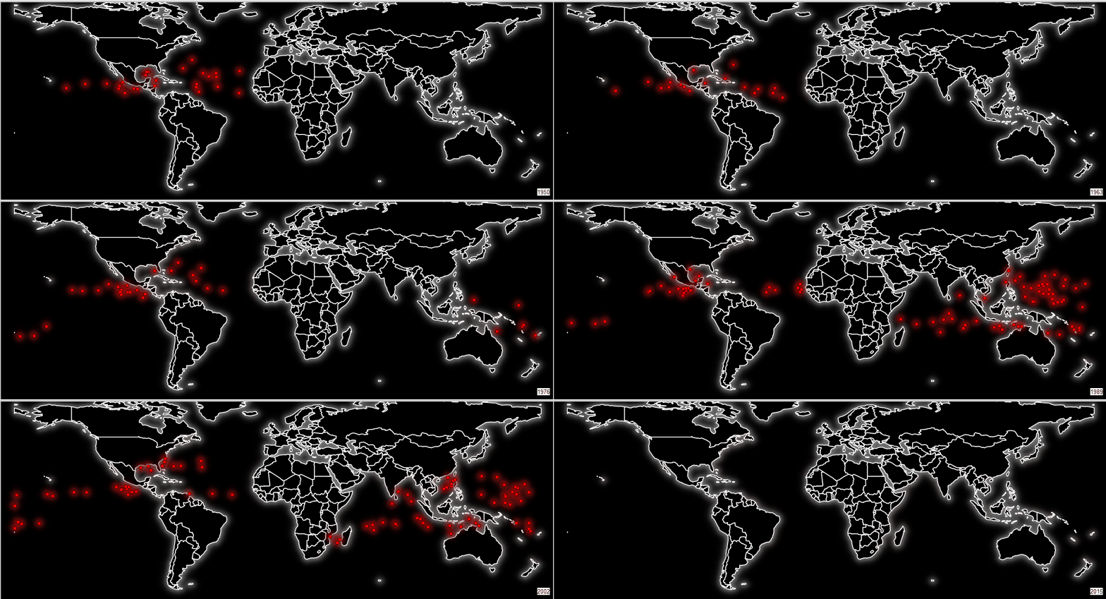 In Boston Kurt presented the Community Health Maps project. The talk was well attended and there was a lot of interest. Fulcrum was a sponsor of the conference, and Kurt was able to meet with several of the Fulcrum representatives. While there he learned about Fulcrum Community. This is a new initiative designed to help humanitarian agencies, non-profits, NGOs, or Government entities. To begin you need to request a Fulcrum Community account. One important caveat is that data collected via a Fulcrum Community account is anonymized, free, and open to all by default. It is essentially an initiative that will help in larger crowd sourcing efforts. More details will be forthcoming as Kurt explores this and how it may apply to Community Health Mappers.This month (September), Community Health Maps will be travelling to the University of Connecticut (Community Medicine and Health Care) and to Miami to teach workshops. The workshop at the University of Connecticut will be to a large diverse audience. The Miami workshops will be focused on showing community members how to map damage and issues related to King Tides.Stay tuned for blog posts on: 1) the future of QGIS, 2) Fulcrum Community, 3) experiences in Connecticut and 4) Miami.
CHM Lab Exercises Updated!
One of the most valuable resources for Community Health Mappers remains the series of lab exercises created two years ago. Our workshops, while effective, are short and only scratch the surface of what you can do with mapping tools. They are basically a quick start guide to Community Health Mapping. The labs however, can be used as a resource to help you build your skills once you've taken the first steps towards mapping your community.The technology changes rapidly. QGIS produces a new stable version every 4 months. Annually QGIS also produces a long-term release. Carto and Fulcrum also update their tools on a regular basis. This mean the lab exercises need to be updated to keep pace.The good news is that this spring the labs were all updated and expanded. There is some foundational knowledge needed to really take the next step after a workshop. The current revised set of labs includes Lab 0: A Community Health Map Introduction and Reference. This lab has background on the Community Health Maps project and the workflow. It also contains a Glossary of GIS terms, and several appendices covering: A) available software, B) data sources and C) everything you need to know to better understand coordinate systems and projection.The remaining labs are as follows:Lab 1 covers field data collection and has been updated to work with Fulcrum. This has allowed us to unify the exercise into one document for both iOS and Android users.Lab 2 shows you how to bring your field data into QGIS. This includes a tour of the QGIS interface, and how to map coordinate data stored in a spreadsheet.Lab 3 is named Combining Field Data with other Organizational Data. It shows you how to work with coordinate systems in QGIS. It also covers how to join tabular data to the attribute table of a GIS layer. This is a step that often has to be done to merge socioeconomic data from the U.S. Census to census geography such as tracts or block groups. It concludes with a lesson on address geocoding. This is the process you use to produce points from addresses.Lab 4 shows you how to do some basic spatial analysis. You learn how to clip data to your study area, measure proximity, query your data to select features and calculate areas/ density.In Lab 5 you learn how to use some of the great data visualization techniques found in only in QGIS. The lab then walks you through how to compose a map. Along the way you learn some data styling tricks and how to use the Print Composer.The series concludes with Lab 6 Data Visualization with Carto. Carto underwent a major update and rebranding since the first edition of these labs were created. You can use this exercise to see how to work with the new Carto Builder interface and tools to create an online map of your results. It covers uploading your data, styling and sharing your map with others.The four labs that deal with QGIS have been updated to include some exciting new features that have been added to QGIS in the last year. Links to the lab data are included. So head to the Resources page and build your Community Health Mapping skills!
Community Health Maps Presenting at FOSS4G
This years international conference on Free and Open Source Software for Geospatial (FOSS4G) is in Boston from August 14-19th. Community Health Maps (CHM) will be presenting a talk covering the CHM program along with some case studies. Come and join us! It is a fantastic venue for people of all skill levels. There are usually around 1,000 in attendance. There are keynote speakers, paper sessions, and workshops. Many are suited for beginners while some are targeted at "power" users. Not only can catch up with the latest CHM news, you can also learn a lot about Fulcrum, QGIS, Carto and other useful mapping tools, and what people are doing with them. In fact there is a co-located event hosted by Fulcrum called Fulcrum Live. This is an all day event (Tuesday August 15th) and is free for conference attendees. It will be a great learning opportunity.We hope to see you there. If you have any news on your mapping projects, please share it with Kurt or John. Perhaps we can include some slides highlighting your work at the conference!
Where To Look for Data
One of the initial stumbling blocks for Community Health Mappers post-workshop, is where to look for data. There is a lot of data available online. Most municipalities, counties and states will have some sort of GIS data portal. These are sites where publicly available mapping data can be downloaded and are best found with an internet search. Those are simply too numerous to list. However, the list below is a good starting point for commonly used national GIS datasets.OpenStreetMap: https://www.openstreetmap.org/ Metro Extracts: https://mapzen.com/data/metro-extracts/ National Extracts: http://download.gisgraphy.com/ GeoFabrik Continental Extracts: http://download.geofabrik.de/index.htmlQuickOSM QGIS PluginNational Map: http://viewer.nationalmap.gov/basic/Includes the following:
- Boundaries
- Elevation
- Topo Maps
- Hydrography
- Imagery
- Named Places
- Land Cover
U.S. Census TIGER Boundaries and Roads:https://www.census.gov/geo/maps-data/data/tiger.htmlCensus TIGER Boundaries
- State boundaries
- County boundaries
- Census Tracts
- Census Block Groups
- Census Blocks
U.S. Census Socioeconomic Data: American Fact Finder: http://factfinder2.census.gov/Includes data from both the Census 2010 and Census 2000 as well as, American Community Survey (ACS) data.Use the Advanced Search to build selections for a specific topic in a specific geographic location.Geospatial Data Gateway (USDS Natural Resources Conservation Service)https://datagateway.nrcs.usda.gov/GDGHome_StatusMaps.aspx
- Census geography
- Climate / Precipitation
- Elevation
- Hydrology (rivers and streams)
- Land Use/Land Cover
- Aerial Photography/Imagery
- Soils
Data.gov: Portal for the U.S. Government’s open data, some tabular, some geospatialCenters for Disease Control and Prevention (CDC) National Center for Health Statistics http://www.cdc.gov/nchs/hus/index.htm CDC Geo-Spatial Resources page: https://www.cdc.gov/gis/resources.htmNational Library of Medicine TOXMAP: Data from the EPA’s Toxic Release Inventory and Superfund programshttp://toxmap.nlm.nih.gov/toxmap/ NLM’s list of Data, Tools and Statistics:https://www.nlm.nih.gov/hsrinfo/datasites.htmlBig Cities Health Inventory Data: https://bchi.bigcitieshealth.org/
Remembering a Community Health Maps Milestone
By John Scott (CPSC)In June 2016, a Community Health Maps (CHM) symposium was convened by the Center for Public Service Communications and Health-Equity.Org. It was hosted by the National Library of Medicine and held at Lister Hall on the grounds of the National Institutes of Health campus in Bethesda, Maryland.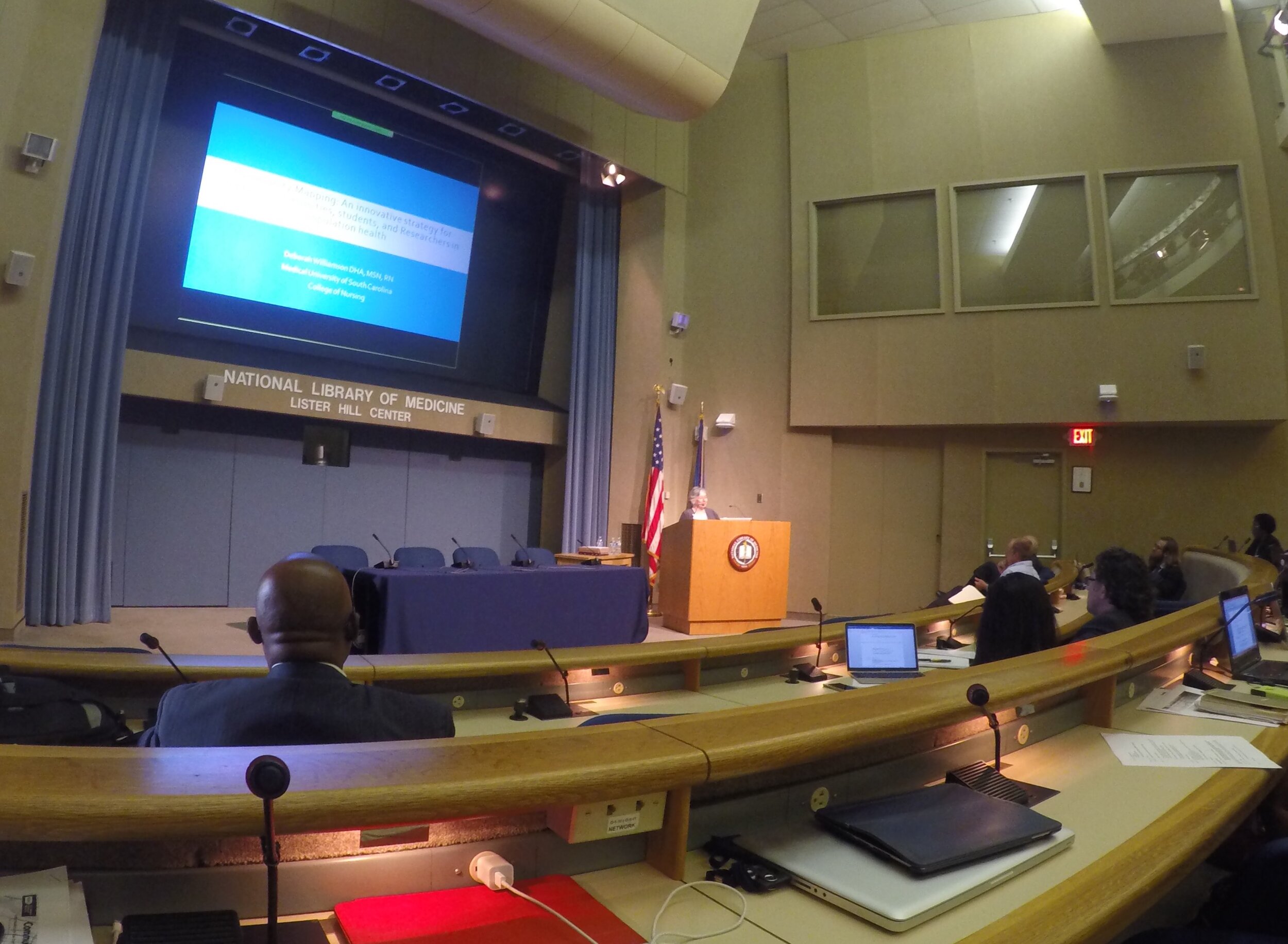 The relevance of the CHM initiative to NLM’s mission has to do with improving the ability of community-oriented organizations (and researchers and other public health professionals) to collect, organize and visualize data and other health information to better-understand health conditions and support decision-making for resource allocation. While access to quality health information is frequently a focus of attention, the ability to visualize data and information -- to better understand and portray their significance to the community -- has received less attention. This is in part because the availability of affordable GIS platforms and data collection and visualization applications is relatively recent. Historically, the cost to procure platforms and applications, to train users and to sustain operations has been prohibitive for communities and community-based organizations whose health budgets are already strained.The purpose of the workshop, therefore was to share the CHM workflow with community-based and minority health organizations so that they would be in a better position to serve their populations by knowing how to collect and maintain their own data, rather than -- or at least in addition to -- having to rely solely on national/state agencies or majority-institution partners to provide data to them.Participating were seventy-six community-oriented health professionals who were drawn from throughout the country. The workshop was made possible with funding by the Robert Wood Johnson Foundation. During the workshop several Community Health Mapping pilot projects were highlighted, including:
- Obesity research at the University of Hawai’i School of Medicine’s Department of Native Hawaiian Health
- Research on noise pollution at the Seattle Indian Health Board/Urban Indian Health Institute
- Projects including a youth initiative measuring community water quality
- Smoking cessation
- Access to health care by migrant workers
- Building a zika awareness curriculum at the Medical University of South Carolina
- University of Washington School of Public Health graduate student capstone projects featuring the CHM workflow.
- Mapping Curb Ramp Accessibility around a Silver Spring, MD Assisted Living Facility
- Visualizing an Intervention for Tobacco Control
- Teens Map Environmental Health of Their Community (Sea Islands, South Carolina)
Kurt Menke, of Bird’s Eye View GIS, and CHM partner, also offered training in the use of CHM tools in five parts:
- Introduction to Community Health Maps
- Learn to use Fulcrum to build a data collection form
- Exercise using data collection form to collect data around the conference center
- Mapping data collected during previous exercise online in Carto
- Brief introduction to mapping the data in QGIS
Learning Objectives for the training session were:
- Describe the Community Health Maps workflow which includes low-cost and open resources for community mapping and data visualization.
- Create a data collection tool on a mobile device that can be used to collect community data.
- Learn how to map data collected online in and on the desktop.
Workshop participants were also introduced to the recently developed set of six online “labs”:
- Field Data Collection
- Bringing Field Data into QGIS
- Combining Field Data with other Organizational Data
- Basic Spatial Analysis
- Cartography with QGIS
- Data Visualization with Carto
These labs are now available on the Community Health Maps Resources page. Other highlights of the workshop include a keynote presentation by Dr. John P Wilson, Professor and Director of the Spatial Sciences Institute at USC Dana and David Dornsife College of Letters, Arts and Sciences, University of Southern California. His talk was titled, "Community Health Mapping: In a World Awash with Geographic Data and Tools." His presentation can be downloaded here as a PDF (3.86Mb).
 Also presenting was John Balbus, M.D., M.P.H., Senior Advisor for Public Health and Director of the National Institute for Environmental Health Science-WHO Collaborating Centre for Environmental Health Sciences at the National Institutes of Health. His presentation was "From the Pump Handle to Hazardous Waste: Mapping Environmental Health and Justice." It can be downloaded here as a PDF (3.48Mb)
An Interview with John Scott
Interviewer: Kurt Menke, GISPWhat is your background?My professional experience has been in two areas: disaster risk reduction and reducing health disparities. In 1990 I formed the Center for Public Service Communications. Since then I have provided guidance and expertise to individuals, communities and public sector organizations. I help them apply telecommunications and information technologies to reduce health disparities, improve health services to underservedand disenfranchised individuals and communities and to improve the collection and sharing of scientific, technical and community knowledge. The end goal is to reduce human vulnerability to natural hazards. I’ve been a consultant and advisor to the National Library of Medicine for more than 20 years.Through the years, I’ve realized that my skills seem best suited to working with change agents. These are individuals and organizations whose missions focus on enhancing capacities and improving access to technologies that enable positive change at the community level. I guess the tag line says it best, the mission of CPSC is: “Empowering competent enthusiastic people to do good things.” That’s my story and I’m stickin’ to it.You’re the original architect of CHM, what was your inspiration? Well, Kurt, I would say that we, together, have been architects of CHM, with a long-term commitment and guidance from the National Library of Medicine. As you will remember, it was back in 2003 that we met. I had organized a meeting of the National Congress of American Indians President’s Task Force on Health Information and Technology in Honolulu, Hawai’i, hosted by the Native Hawaiian health organization Papa Ola Lokahi.At that meeting, you gave a presentation on work you were doing with the National Indian Council on Aging. At that moment, it was obvious to me that mapping would be a great tool for underserved community-oriented environmental health advocacy groups and public health agencies. It could help them engage with community residents and empower them to collect, maintain and visualize their own data, rather than relying solely on national or state agencies, or majority-institution partners to provide data to them. It took us a while to settle on our current course but the ride was interesting and the result was, I think, worth waiting for.Why do you think CHM has been so successful?While access to quality health information is frequently a focus of attention in efforts to reduce health disparities in underserved communities, the ability to visualize spatial data and information has received less attention. This is in part because the historic scarcity of affordable and intuitive data collection and mapping applications. Additionally, the cost to train users, and sustain operations, has been prohibitive for communities and community-oriented organizations whose health budgets are already strained. I think we’ve found a model, with the Community Health Maps workflow, that addresses these historical challenges.Without equal access to GIS tools, communities might have access to completed maps, but they cannot actively participate in, much less create and be responsible for their own initiatives. I think CHM has been successful because the approach we have envisioned enables that access, and CHM users thus far have appreciated the freedom they have, to explore ideas and to create hypotheses that they have not had access to until now.What sets CHM apart from other public health mapping initiatives?I think what sets CHM apart from other public health mapping initiatives is that our approach involves using relatively low cost tablets and smartphones – technology that has become ubiquitous and with which users are comfortable -- combined with a selection of low/no-cost applications for data collection and visualization. With these tools, data can then be analyzed and presented without purchasing expensive software licenses. These tools allow expert and novice users, with little budget resource, to implement mapping workflows. Introducing such workflows to community-oriented public health professionals empowers users to collect, analyze, display and share their own spatial data. Importantly, many of these tools can also be used to share data collected using other programs, such as ESRI’s ArcGIS and national/state- derived databases such as CDC’s Behavioral Risk Factor Surveillance System and Public Use Data files from National Center for Health Statistics.Where would you like to see the project go from here?What we have developed is essentially available at no or very little monetary cost. I don’t want to underestimate or undervalue the labor and intellectual time that is required to learn how to use the tools. But we believe that organizations and individuals who work to improve the quality of life in underserved communities will see the benefit of using the CHM resource as a worthwhile commitment of time.The National Library of Medicine has been a great partner and continues to plan an integral part in planning the course for CHM. Through NLM’s outreach efforts we have several successful pilot projects that readers of this blog will be familiar with. Through these continued efforts of sharing the tools through NLMs network of libraries I hope the use of CHM will grow. My hope is also that more academic health schools will introduce the CHM into their teaching and research programs as have the University of Washington and the Medical University of South Carolina, two of our partners. I’d also call to the attention of your readers the labs that you have developed and are available on this blog. My hope is that they will encourage prospective CHM users to try the workflow at their own pace.
Catch Community Health Maps at the Association for Prevention and Teaching Research Conference (APTR) in Savannah next week!
Last year Community Health Maps was invited to present at the Association for Prevention and Teaching Research (APTR) Conference in Albuquerque, NM. We brought two students from the University of Washington Department of Community Oriented Public Health, and two students from the Medical University of South Carolina, to present their capstone project posters.[gallery ids="290,292" type="rectangular"]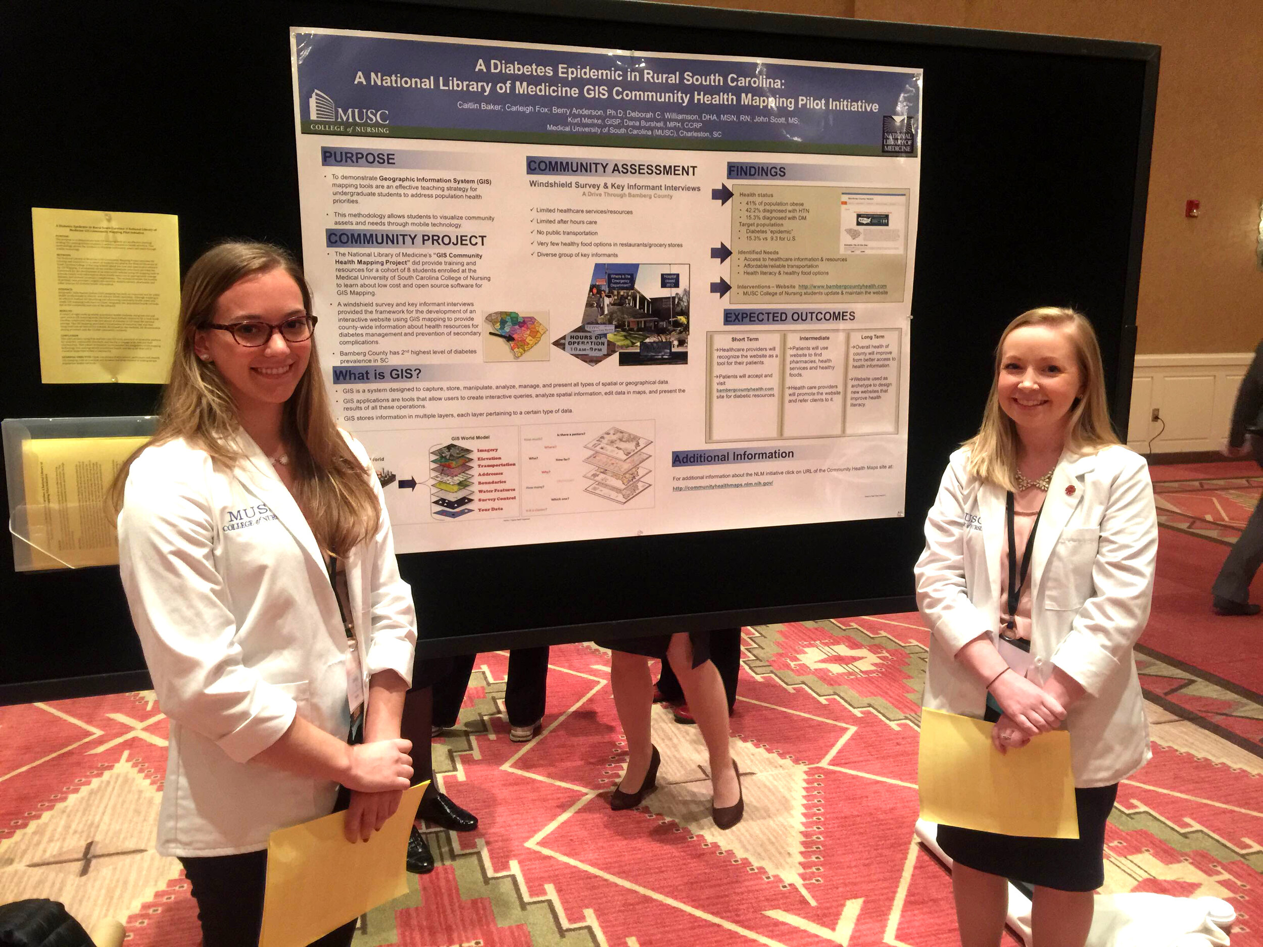 Myself, John Scott, Dr. Williamson and Dana Burshell also combined to create a CHM panel. The panel discussion session was packed and to our collective surprise we heard "oohs" and "ahhs" as we showed some of the mapping tools live. We were approached by some of the organizers about teaching a workshop the following year.
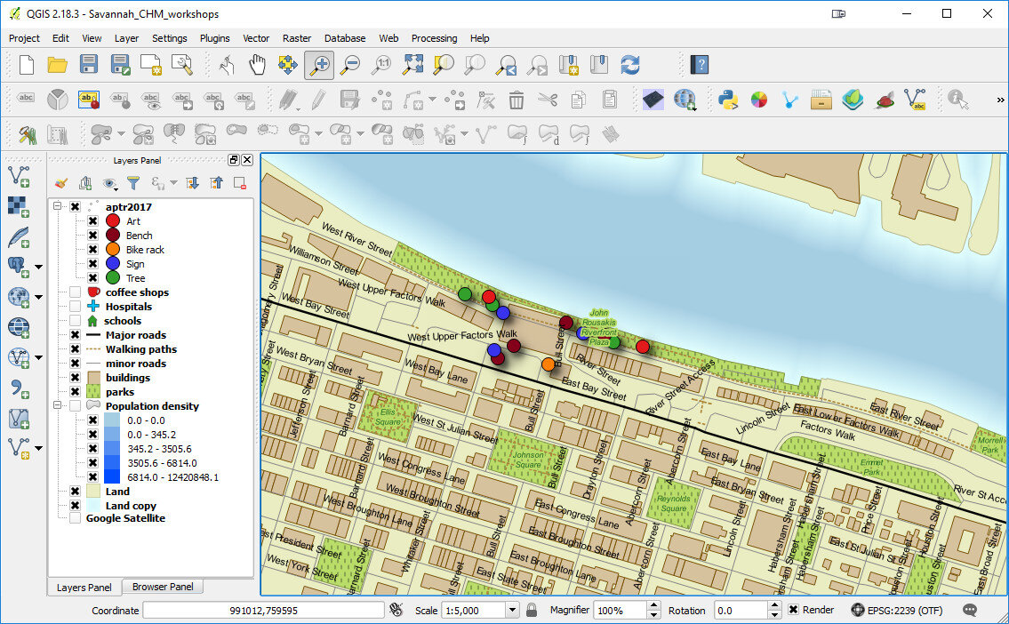
 That brings us to this years conference in Savannah Georgia. We will again have a panel session which will both provide an overview of the project, and highlight recent successes. The panel will be on Thursday April 6th at 3pm.On Friday morning we will teach a 4 hour CHM workshop. This is a hands-on training session where you will learn how to incorporate the Community Health Mapping (CHM) workflow into your research and training programs. You will:
- Learn how to use Fulcrum to create a data collection form
- Go outside with your smartphone/tablet to collect some data around the conference center
- Map the collected data in Carto
- Work with the data in QGIS
 We hope to see you there!


