The Second Vector Borne Disease Surveillance Workshop
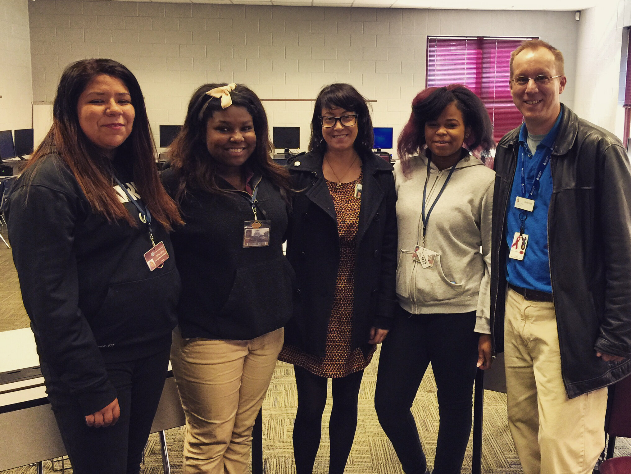
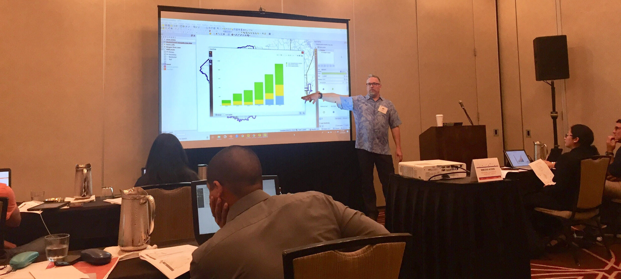
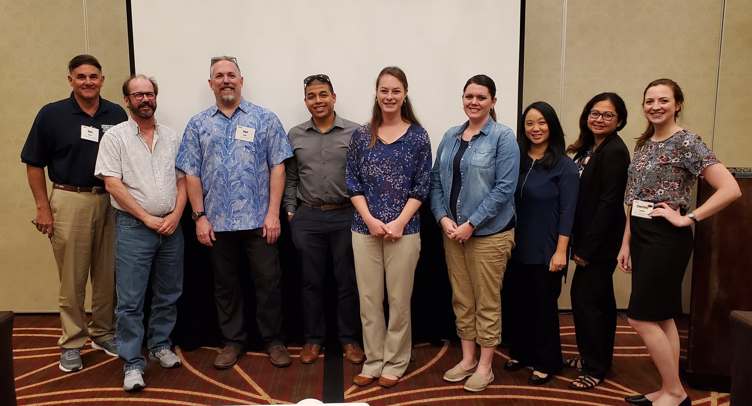
On June 18 & 19, 2019, eight state based health officials took the second Vector Borne Disease Surveillance workshop in Providence, Rhode Island. This was the second of two 2-day workshops aimed specifically at tackling the spread of diseases like Dengue fever, West Nile and Zika viruses. As with the first one, this was a Community Health Maps training specifically designed to demonstrate how to collect and work with geographic data related to vector borne diseases, i.e. those that are transmitted to humans via other animals such as mosquitoes. Attendees represented health departments in: Colorado, Georgia, Kansas, Louisiana, Mississippi, New Mexico, Virginia and Guam.Again this workshop was a team effort. The training was organized by the Association of State and Territorial Health Officials (ASTHO). Participants attendance was funded by CDC’s National Center for Emerging and Zoonotic Infectious Diseases. Travel for the trainers was funded by the National Library of Medicine, (funding for the workshop is provided under a sub-award from the National Library of Medicine to ICF International). This particular CHM workshop was taught in conjunction with ASTHO’s State Environmental Health Directors (SEHD) Peer Network Annual Meeting.After an introduction to the Community Health Maps project - it's origins, workflow and examples of past projects - participants learned to create a data collection form and use their smartphones to map features (trees, signs, benches etc...) around the conference site using Fulcrum.For the remainder of the first day, the group took the data they collected earlier and imported into QGIS. In this section they became familiar with QGIS and how to symbolize layers and make a print map. In addition to the data collected on site, we worked with mosquito data acquired courtesy of Dr. Chris Barker covering Madera County, CA. The data included mosquito trap results over five years, virus testing, mosquito biting complaints, storm drains, parcel boundaries, roads and a hypothetical case of Dengue fever.The second day focused on generating vector borne disease surveillance products. The participants:A) generated trend graphs of mosquito populations through time via the QGIS Data Plotly plugin,
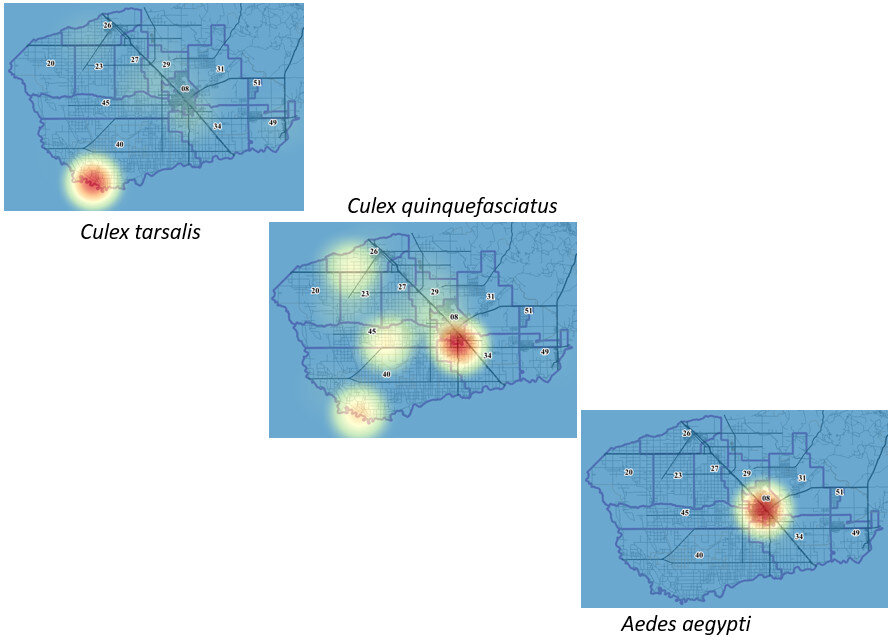
 B) generated heatmaps of mosquito populations,
 C) calculated the minimum infection rate per year for West Nile and St. Louis Encephalitis viruses,
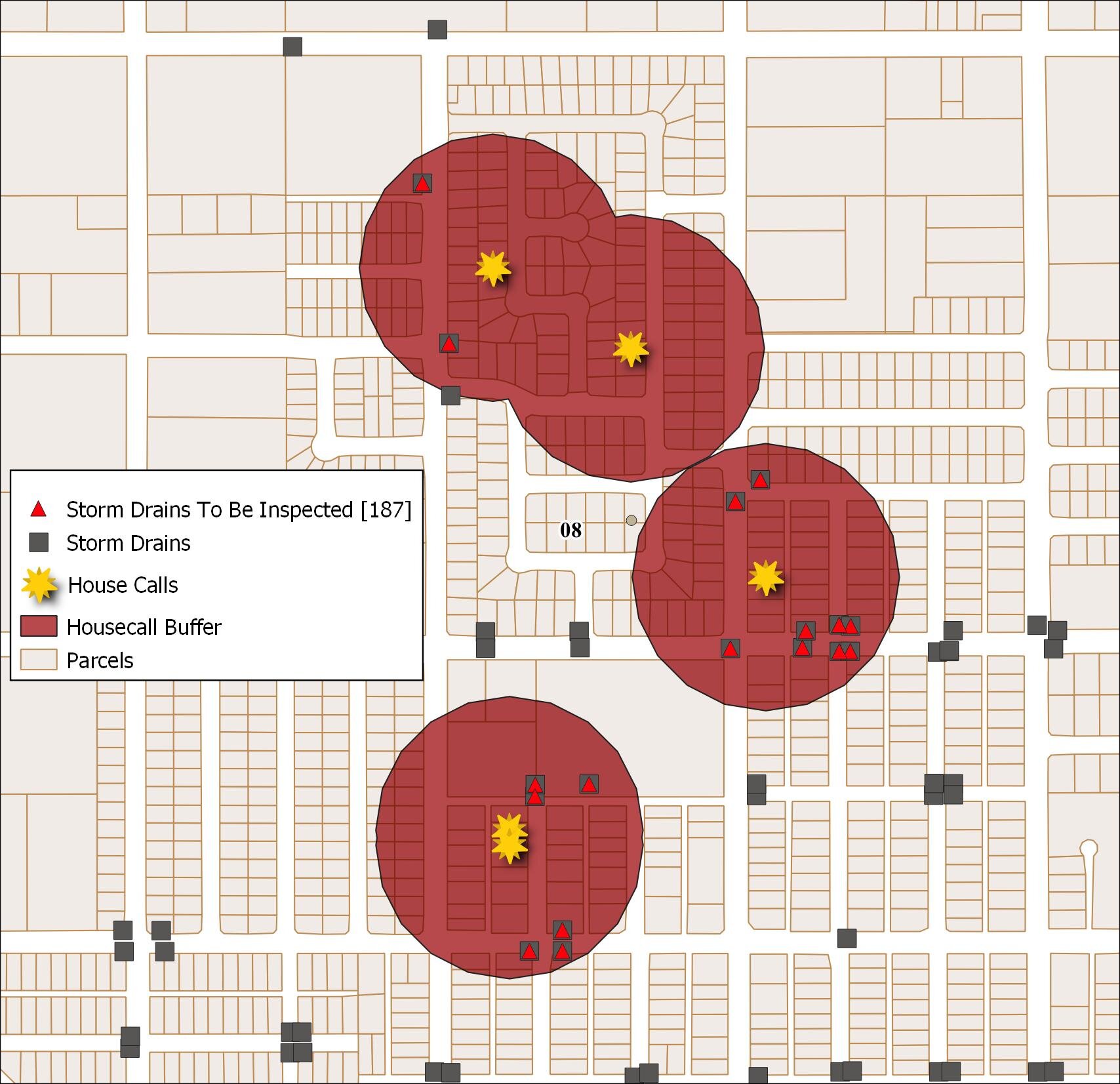
 D) identified potential mosquito sources to be inspected (storm drains) using a combination of a buffer operation (done against mosquito complaints with the distance the species is known to be able to travel) and select by location against storm drains,
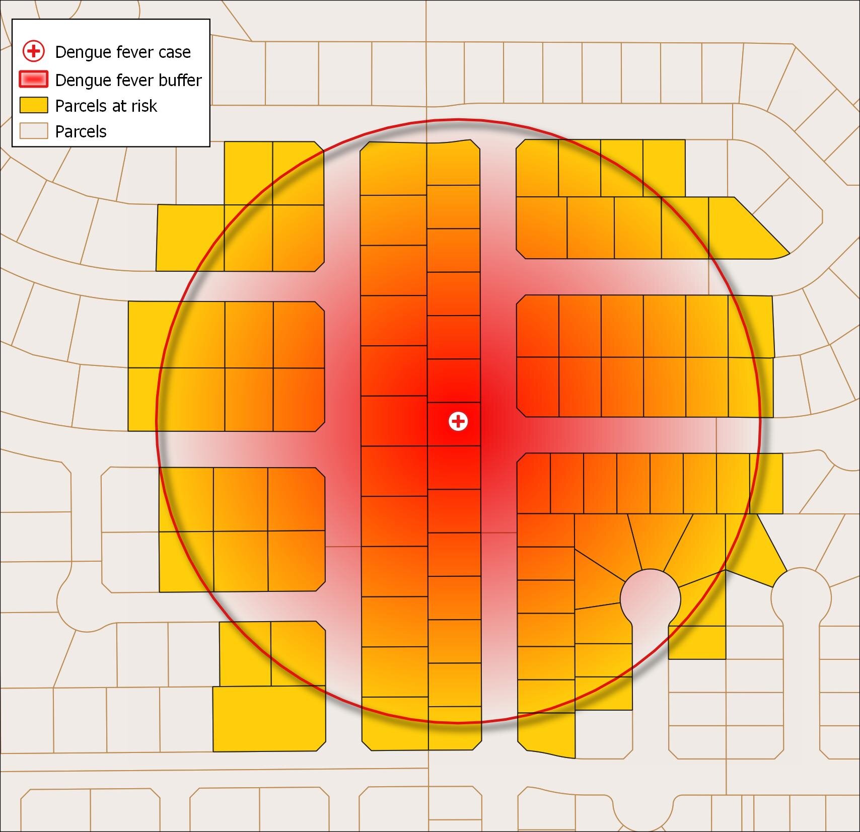
 E) identified parcels at risk due to their proximity to a fictional outbreak of Dengue Fever,
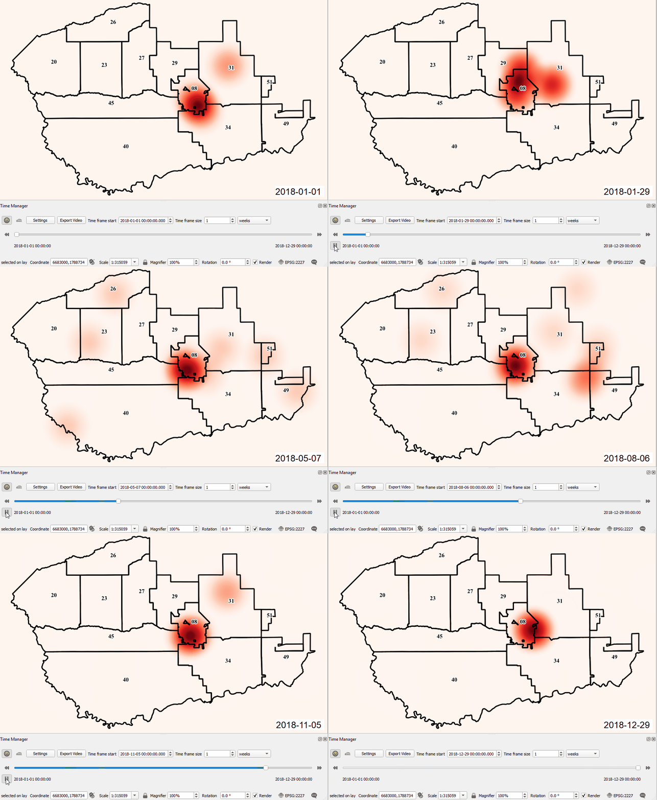
 and F) learned to animate temporal data using the QGIS Time Manager plugin. Here the mosquito population (heatmap) is being animated weekly for the year 2018 with mosquito management zones be displayed.
 All participants received official QGIS certificates for their participation.These workshop materials will part of the suite of https://communityhealthmaps.nlm.nih.gov/resources/ available through the Community Health Maps program in the near future.If you are interested in having this taught for you or your colleagues contact Kurt Menke (kurt@birdseyeviewgis.com)


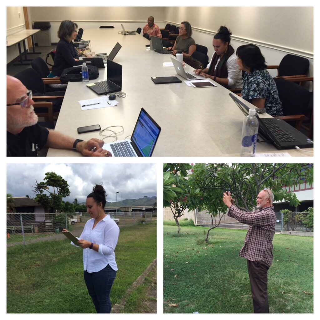
 This event was organized by the Northwest Portland Area Indian Health Board and supported by the Robert Wood Johnson Foundation. We weren't certain who or how many would attend, and I expect attendees weren't entirely sure what Community Health Mapping was all about either. However, it turned out to be a very engaged group representing tribes from many regions of the country. Within a few hours everyone was able to:
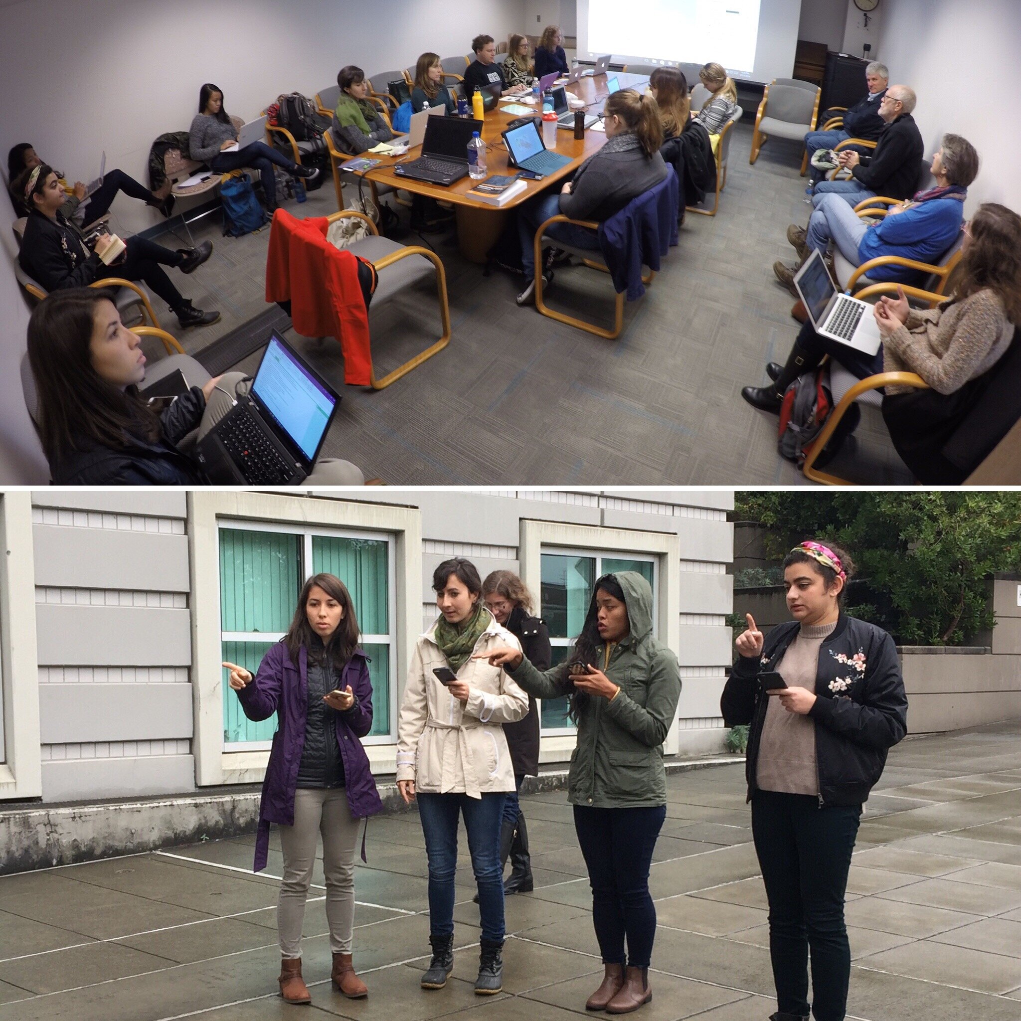
 After a brief break we headed to Seattle, Washington, again there were two separate storms including, the remnants of Typhoon Songda, bearing down on the region threatening to disrupt power and services! Again fortunately the storms didn't make a direct hit on the area and the workshop proceeded on schedule.We went to train students in the capstone course of the Community Oriented Public Health Practice Program at the University of Washington. This is our second year supporting this program. The first year was a huge success with two students attending the
  In the near future we will be offering an updated set of Community Health Mapping
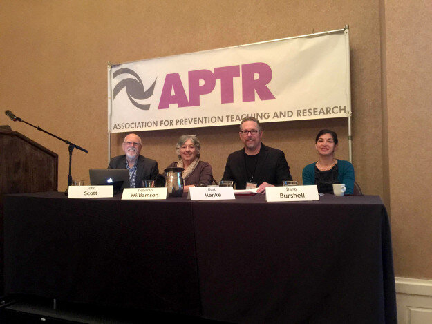
 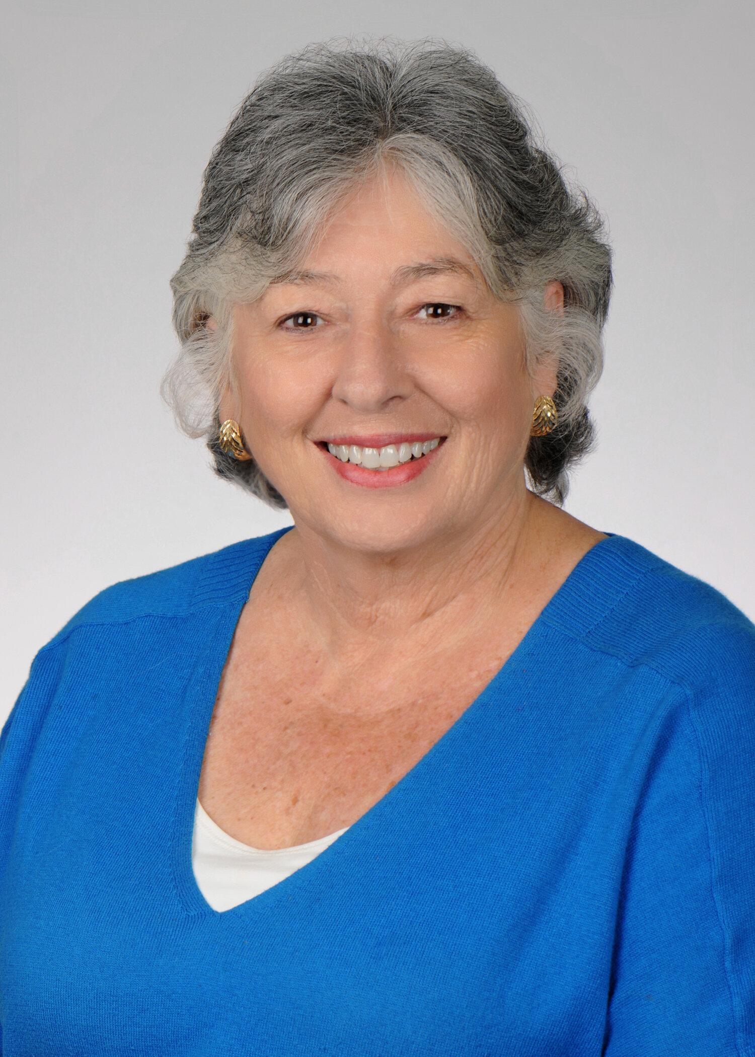 Dr. Williamson believes that, “GIS has the potential to substantially increase community engagement and is truly a concept of the neighborhood taking control of their data.” She notes that while researchers might study a community, that a community’s input is essential to understanding the cultural and environmental context surrounding health issues: “GIS mapping puts the community members on more of a level playing field with their research partners.” GIS can empower and educate community members to identify their key issues, to become a part of an analysis, and to provide solutions. When communities are given the opportunity to map their own health, discovery, and awareness, positive changes can result. When a community feels it has more of a say through engagement with GIS, or communication with a map, intervention is more likely to be effective.For the past three semesters, Dr. Williamson has used GIS in her own classroom as a capstone project for population health students. They, “find it fun and can take it with them into other settings, it fits into the world of new technology, and it takes people to the next step of looking at health issues.” Mapping offers a different way to help students visualize Social Determinants of Health and to make the connection between what population health is, and the factors that promote or deter it.
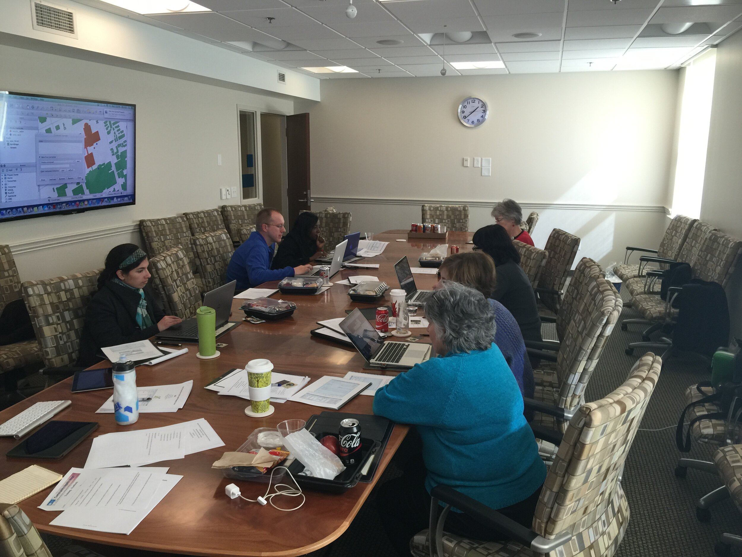
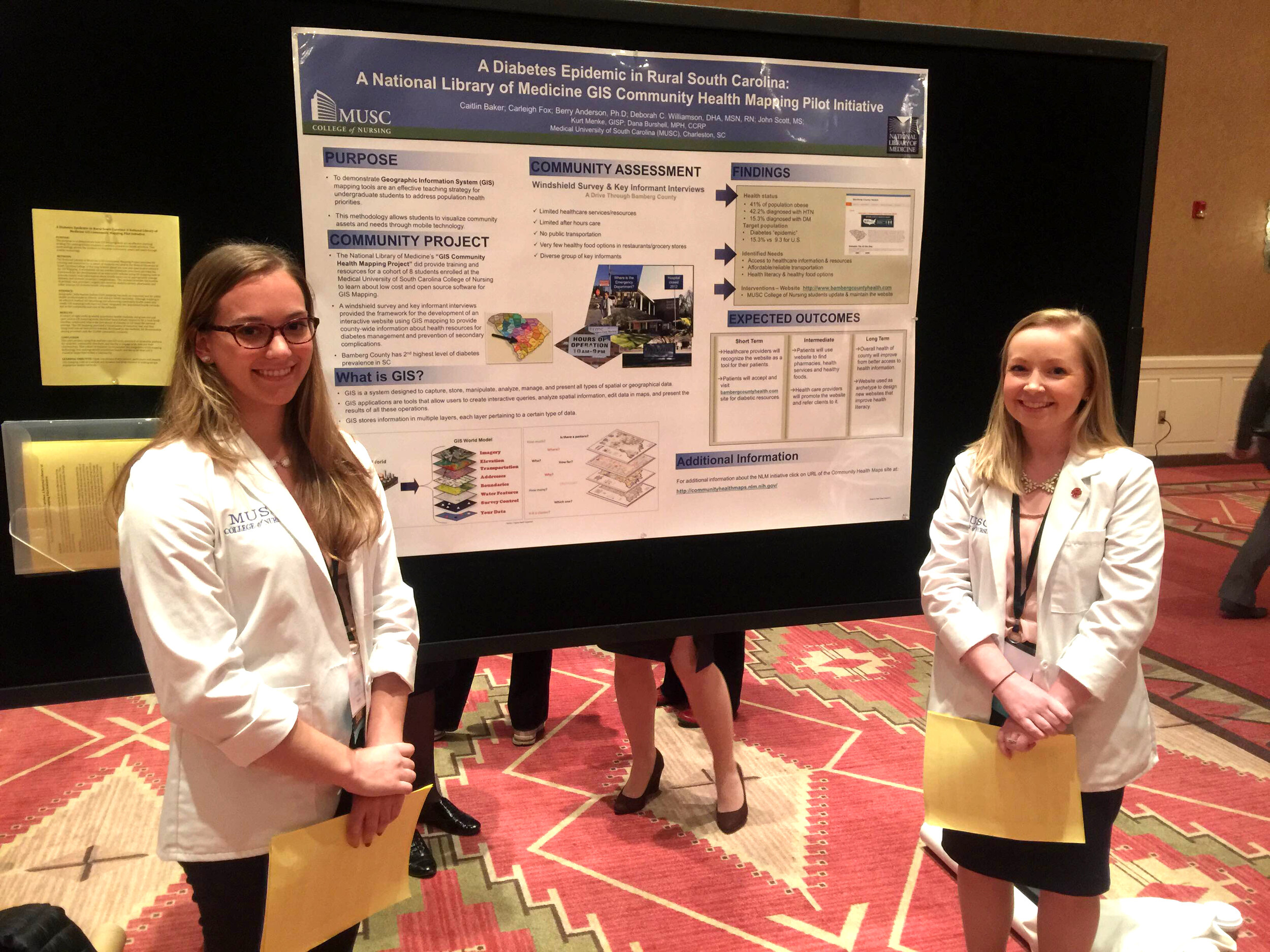 Finally, Dr. Williamson sees GIS as bi-directional: it supports visualizing gaps and assets while also providing the ability to disseminate and build on information via intervention programs to improve health outcomes and strengthen communities. GIS is also broadly applicable to almost any discipline and easily used by those with little expertise. “Presenting raw data to a community or students doesn’t mean a lot,” Dr. Williamson comments, “but when that same data is aggregated visually it instantly communicates a message to any audience.” GIS is clearly suitable as an effective educational tool in the classroom and in communities.CHM thanks Dr. Williamson for her continued collaboration and time spent advancing the CHM program through use of the CHM tools at MUSC. CHM values our partnership with MUSC and hope that the future is as mutually beneficial as the past few years.Field data collection for the CHM workflow bridges the divide between learning in a classroom and experiencing conditions in a community. For the capstone project, students use
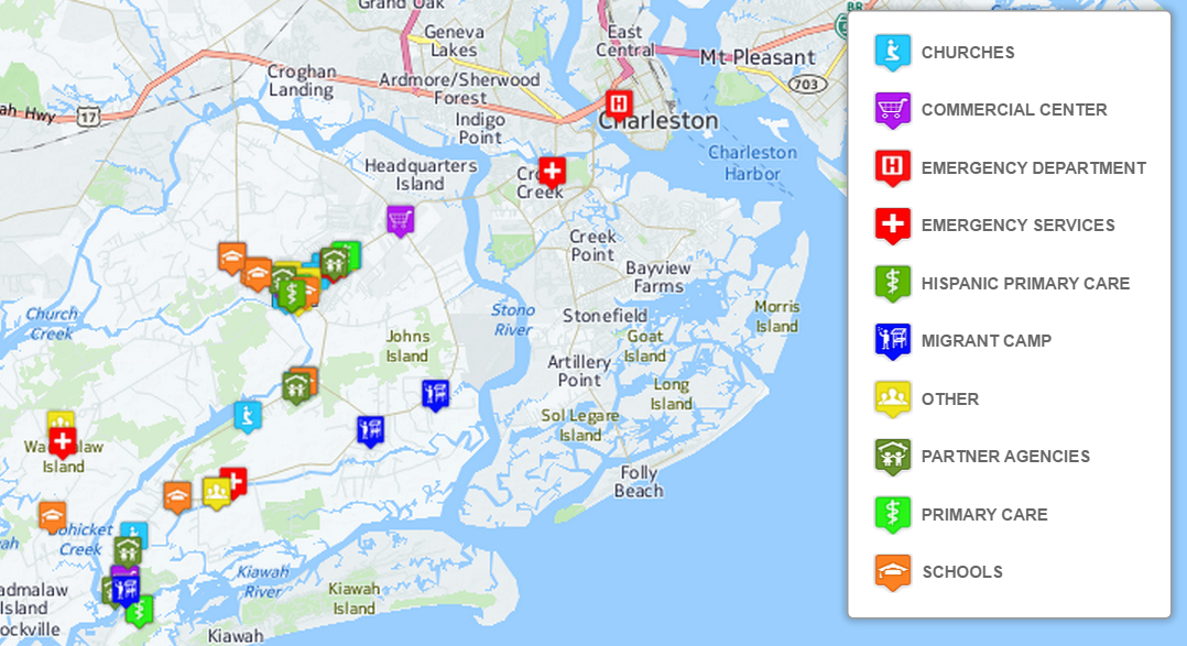



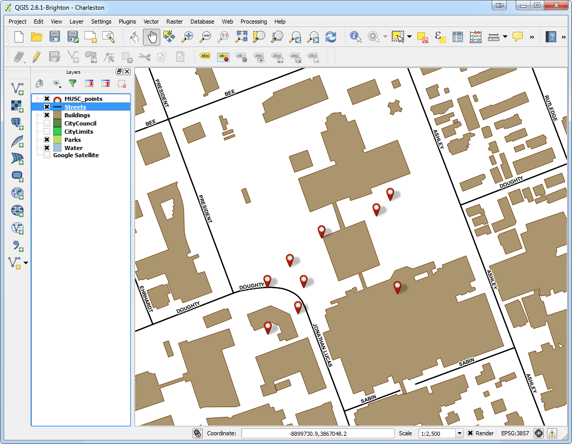
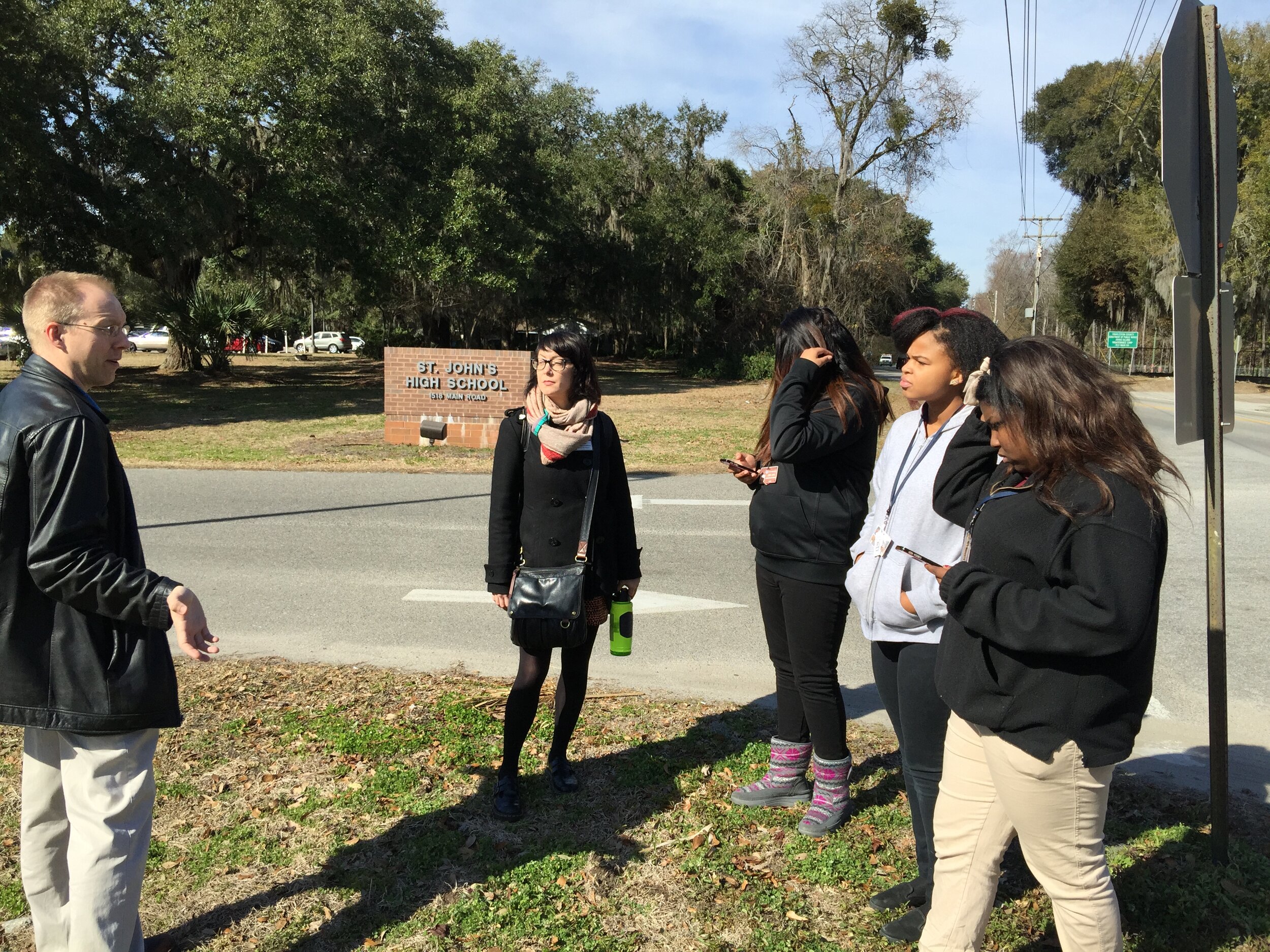 Afterwards we went back inside and showed them how to upload the points into CartoDB and make a map. The figure below shows the results of 45 minutes worth of work! Click on the map to open the live version.