In October 2013, the Seattle Indian Health Board’s (SIHB’s) Urban Indian Health Institute (UIHI) completed a noise pollution pilot study. The goals of this project were: 1) to evaluate the feasibility of community data collection and analysis via a low cost GPS/GIS workflow, and 2) to offer recommendations on the feasibility and next steps for scalability to the larger Urban Indian Health Organization (UIHO) network. The collected data could additionally illustrate community health needs when merged with health or other contextual data for analysis, but these analyses were not the primary focus of this pilot. We chose to look at noise pollution because it is an environmental health concern that has been linked to a variety of health conditions in both occupational and community studies and it is easy to measure with portable devices.For field data collection, we used an iPad Mini with the GISPro and Decibel 10th apps. For mapping and spatial analysis, we used the open source desktop GIS software QGIS (www.qgis.org). While GISPro is a paid iPad app, the other programs are free. Data collection participants were staff recruited from the SIHB’s administrative, clinical and UIHI departments. We selected participants from this pool because they are representative of the staff at UIHOs who likely have limited experience with data collection and GIS. UIHI project staff trained seven participants in the iPad workflow and data collection process. This workflow consisted of five steps: 1) collect noise data with Decibel 10th, 2) export noise data via email, 3) take a site picture, 4) collect GIS data with GISPro and 5) export that GIS data. When the volunteer participants were finished with data collection, project staff compiled and analyzed the data using QGIS and Stata. Data were merged with socioeconomic indicators from the American Community Survey by zip code. Participating staff were asked for their feedback about their experience and the usability of the tools.
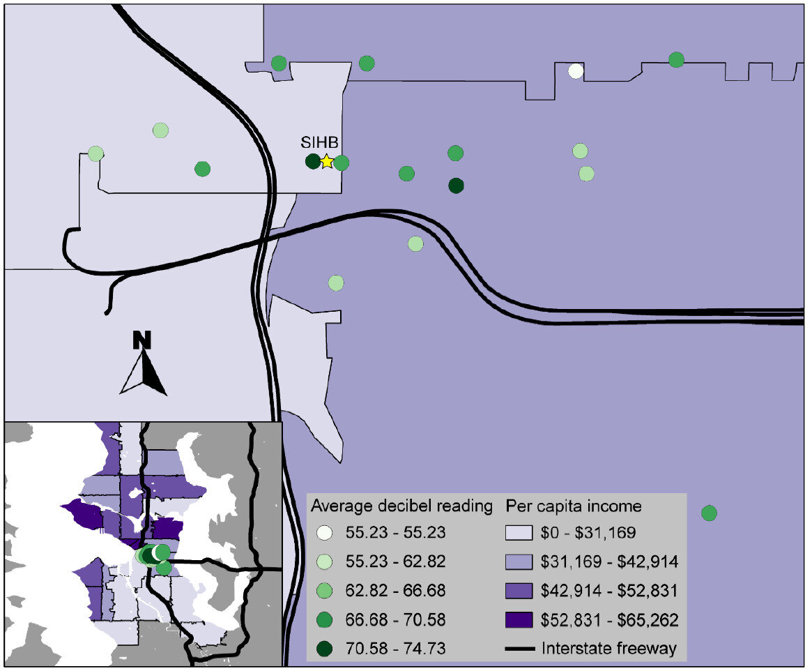 That feedback, combined with the experience of project staff, suggested that the GIS software tools were user-friendly and highly effective. Thus, they are likely to be attractive to organizations with limited technology budgets. However, some of the other resources necessary for this project (i.e. the GISPro mapping app, the iPad and general GIS software expertise) are expensive and may be limitations for many UIHOs. In the future, the UIHI would like to use these tools to better understand the health of the community, as well as assist UIHOs in conducting similar projects in their service area.For more information about this project, view the project brief at http://www.uihi.org/wp-content/uploads/2014/08/GIS-Project-Brief_20140604.pdf.The UIHI is a division of the SIHB and is one of 12 Indian Health Service tribal epidemiology centers (TECs). Unlike the other TECs that focus on geography-specific tribal populations, the UIHI is national in scope, focusing on American Indians and Alaska Natives (AI/ANs) living in urban areas. The UIHI supports the efforts of Urban Indian Health Organizations (UIHOs) nationally, as they serve the health and social support needs of their urban AI/AN communities.The Center for Public Service Communications and the National Library of Medicine provided funding for the UIHI to complete this project.
Display and Share Your Maps Online via GIS Cloud
The third step in the workflow (outlined in the Introduction) is to share your maps online via GIS Cloud. This is an online mapping platform. You can sign up for a free account, upload your data, and share your maps with others. The maps will be dynamic, meaning you can do things like pan and zoom, turn layers on and off and identify features.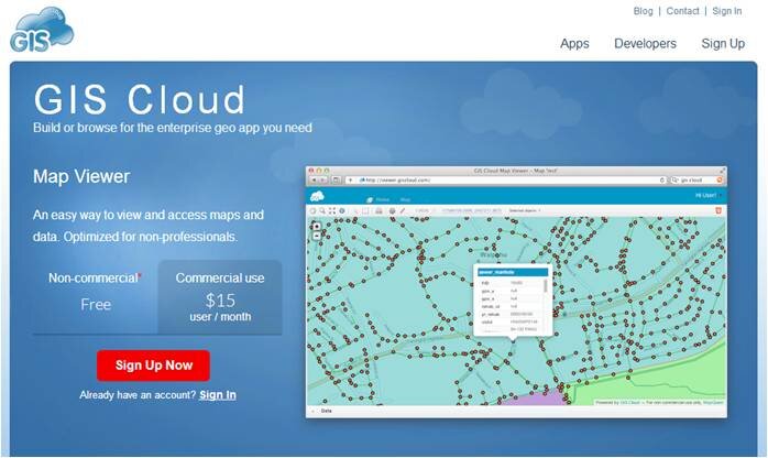 PricingYour free account comes with a Map Viewer and Map Editor and gives you 100Mb of space in your cloud account. If you require more space you can upgrade to Premium subscription which offers 1 Gb of space. Premium accounts cost $55/month.Data UploadGIS Cloud accepts all common GIS file formats and the data upload section is very intuitive. You can zip all your data and just upload the zip file and GIS Cloud will take care of the rest. You can even drag and drop files anywhere in the browser and they will upload to your account. Once uploaded it offers a nice range of options for symbolizing your data.
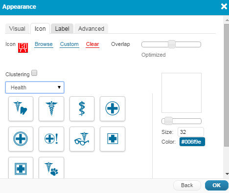 Map EditorHere you have a variety of tools available including those for data editing, feature selection, basic analysis, table joins, geocoding addresses. It even has a database manager. You can create new layers in your cloud account and edit them here. With the analysis tools you can compute areas, measure proximity of one feature to another, buffer a layer by a certain distance, and create density maps.
 Map ViewerHere your data can be viewed against basemaps such as Google and OpenStreetMap. Your map can also be shared and published. There are several ways to share your maps. The two easiest methods are to provide the link to your map, or embed the dynamic map in a web page. Clicking the Share and Publish button opens the window below. Here you are provided the url to your map viewer and the javascript for embedding the map into a webpage. I would have embedded a dynamic map here, however, WordPress does not allow bloggers to post JavaScript on WordPress.org blogs. You can also share your map with other GIS Cloud users by Publishing the map. Click on the image below to open up the ENHIP Schools in a GIS Cloud Map Viewer window.
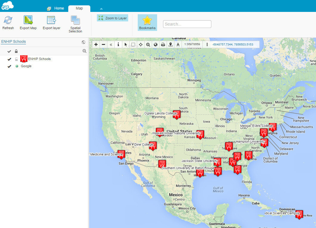 ResourcesOur Resources page has a GIS Cloud document that covers uploading data, styling data and sharing a map.There are additional online mapping platforms such as CartoDB and MangoMaps. We found GIS Cloud to be the best combination of being intuitive yet powerful. However, all three options have free licensing levels. So you can try them yourself and decide which works best for you. These other options will be covered in future posts. Happy mapping!
Map and Analyze Field Data with QGIS
After community field data collection, the next step typically involves bringing the data into a desktop GIS. This is the middle step in the workflow outlined in the Introduction. Here the data can be viewed against basemaps such as Google or OpenStreetMap, and combined with other organizational data. This is where analyses can be conducted. Presentation quality maps can also be generated in this step.The software we found to be the best fit is QGIS. This is an open source desktop GIS software. It has many strengths:
- It can consume many kinds of data, including all the data that would come out of the field data collection apps.
- It is both intuitive and robust.
- It has a large suite of geoprocessing tools for analyzing data.
- It will run on Windows, Mac, or Linux.
- It is free to download and install.
- It is well documented.
- There is a large user community.
- New functionality is being continuously added. New stable versions are being released every 4 months!
QGIS Browser:QGIS has two main applications: QGIS Browser and QGIS Desktop. Browser allows you to preview your GIS data. It is similar to Windows Explorer, or Mac Finder, but is designed to work with GIS data. It has a File Tree, a main Display Window, Database Connections and Display Tabs (See figure below). It allows you to view basic information about a GIS layer and preview both the spatial features and the attributes. Data can be dragged and dropped from QGIS Browser to QGIS Desktop. QGIS Desktop:Desktop is the program for conducting analyses and making maps. It comes with tools for editing and manipulating GIS data. The main interface is similar to well known proprietary GIS packages with a Table of Contents along the left side. This shows your data layers and the symbol applied to them. The majority of the space is taken up with the Map Window (See figure below). Buttons along the left side allow you to add data to a map. Buttons along the top allow you to pan and zoom into the map. There are additional editing and data analysis tools available from menus.
 With QGIS Desktop you can perform analyses such as calculating distances to resources, characterizing communities with socioeconomic data from the U.S. Census (NOTE: you will need to obtain data from the U.S. Census to do this), or generate new data like density surfaces. The sky is the limit.QGIS Desktop also comes with a Print Composer (See figure below). This opens in a separate window and allows you to craft a publication quality map. Common map elements such as a title, legend, scale bar, north arrow, logos, and text can be added. The final map can be exported in a variety of common image formats such as: jpg, png or tif. Maps can also be exported as pdf's. If you want to do additional design work in a program like InkScape or Adobe Illustrator the maps can also be exported as svg files.
 Resources:While fairly intuitive, GIS work can still be rather complicated and full of jargon. There is a learning curve involved. To help with this we have resources that explain how to install QGIS and bring in data from the three recommended field data collection apps.For more complete GIS training with QGIS there is the newly created FOSS4G Academy. This is a five course curriculum teaching GIS principles via QGIS. The material is available for free here: http://foss4geo.org/. The courses include:
- GST 101 – Introduction to Geospatial Technology
- GST 102 – Spatial Analysis
- GST 103 – Data Acquisition and Management
- GST 104 – Cartography
- GST 105 – Remote Sensing
QGIS also comes with thorough documentation.Download it today and try it out!
Field Data Collection
The workflow covered in the Introduction included three phases: 1) Field Data Collection, 2) Desktop Analysis, and 3) Data Visualization. Here we'll discuss phase 1.We encourage the use of smart phones and tablets for data collection for these reasons:
- Most already have them!
- Many know how to use them
- They're intuitive
- They're portable
- Come with an on board GPS receiver (iPhone 5 uses GPS + GLONASS)
- Have on board cameras
- Can connect to wireless networks
- Access to the internet
- Email is available
- There's an app for that!
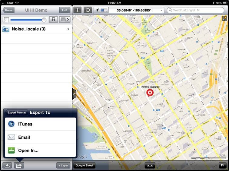
Equally as important they are accurate enough for most public health community mapping needs. For a discussion on their accuracy read this post.There are a myriad of data collection apps available. Part of choosing one comes down to the operating system you are using. We'll cover the three best apps we found for iOS and Android. Our full report and individual user step by step user manuals for each can be found here.iOS (Apple iPhones and iPads)The two best data collection apps for Apples iOS are EpiCollect and GIS Pro. They both allow you to customize the data attributes you collect. One big difference is that EPI Collect is free and GIS Pro, at $299, is the most expensive piece of software we considered in our workflow. However, with that price tag comes a lot of great intuitive functionality.EpiCollect (available for both iOS and Android)To get started with EpiCollect you install the app on your device via Apple's App Store. You then visit the EpiCollect website and set up a project. Simply give the project a name and design your data collection form. The form can be set up with a variety of attribute columns. For example, feature type, name, description and photo. For most users it takes a practice run to get used to the workflow to set up a data collection form. The second time it goes very smoothly. The project can then be uploaded, via your email address, to your iOS EpiCollect app. Examples of the data collection screen are shown below. On the left is the home screen, on the right is the data collection screen.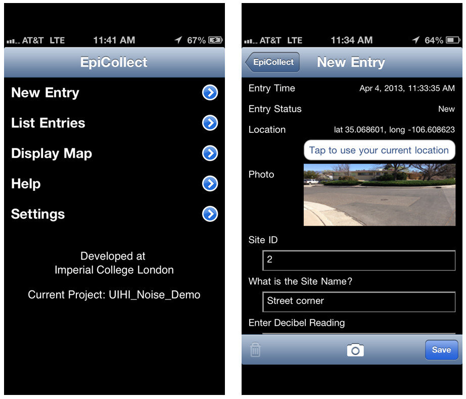 After data collection, you can sync the mobile app with the website. The data can then be viewed both on the mobile app or on the website. The website also allows for the spatial data to be exported as either an XML or CSV file. Data collected by EpiCollect is limited to point locations. The data can then be brought into a desktop GIS such as QGIS. This will be covered in a future blog post.GIS ProGIS Pro is essentially a lightweight GIS application for iOS. Once purchased a user can have the app on both an iPhone and an iPad. However, each unique user needs their own license. As with EpiCollect, the user can set up custom data collection fields. One additional feature here is that users can collect point, line or polygon (area) data sets within the same project. The data can also be exported in a shapefile format which is then ready to be used by any desktop GIS package. GISPro also allows for sharing of GIS layers. With this feature a team of data collectors can all be working off of the same GIS layer. This is a valuable feature. With the high cost does come great functionality compared to EpiCollect. This was determined to be part of the best workflow and is reviewed more thoroughly in the final report.
 AndroidIn addition to EpiCollect, the other great app for Android devices is OpenData Kit, known as ODK Collect. The app is free. It is even more intuitive and makes project management even easier than EpiCollect.To get started you will use a companion website called FormHub. Simply sign up for a free account and design your form. Here your data collection form is designed in MS Excel, and a template Excel file makes generating your first form easy. Once designed upload your form and sync your device to your account and you are ready to collect data. On the device the data collection form presents itself as a series of pages for each question.
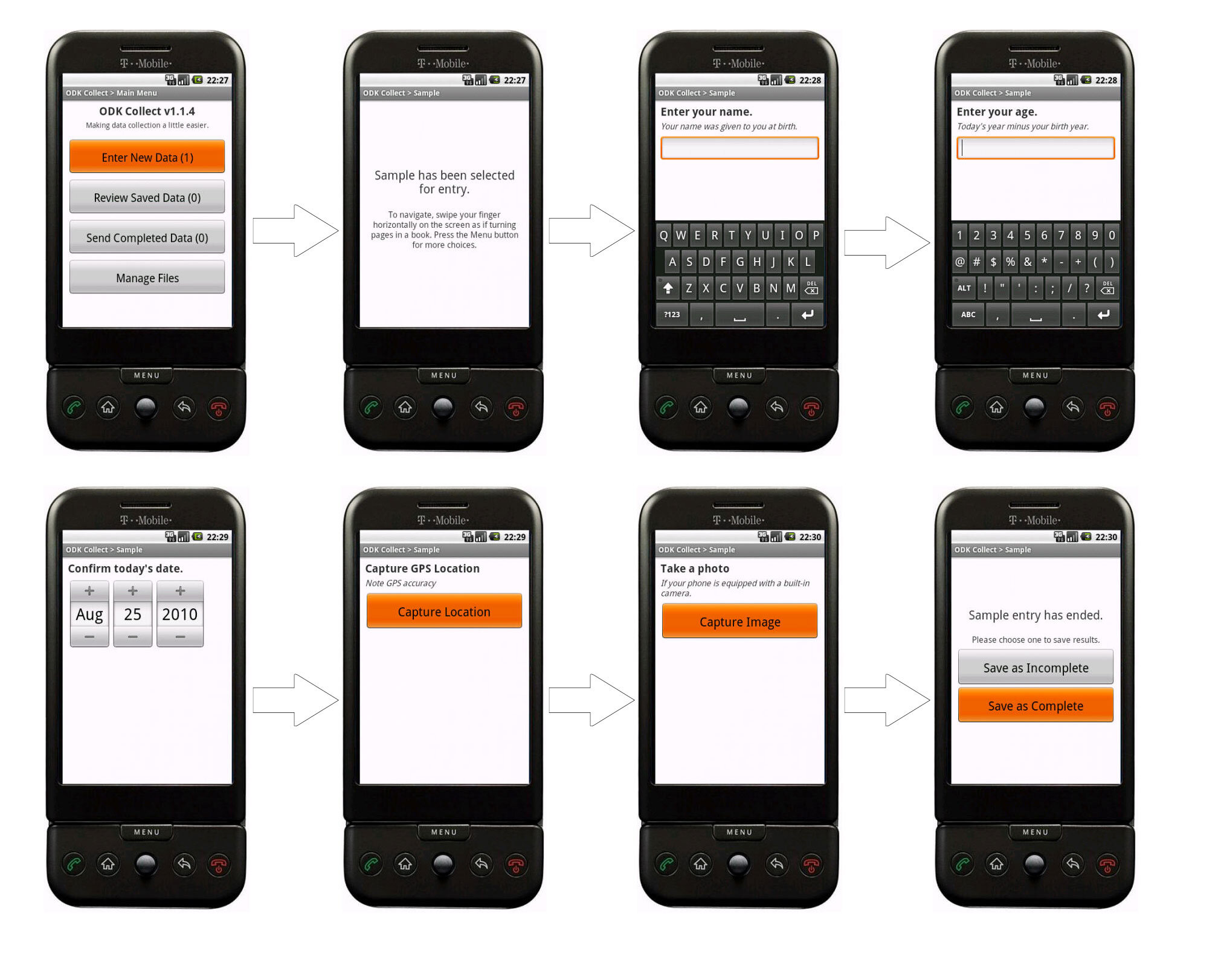 When you are back in range of a network simply sync the app with your account. The data will then be available for download from the website in several formats.SummaryThese are the best apps we found out of dozens reviewed. All three were successfully tested in 2013 by our partners were found to work well. For additional reading download the full report . Step by step user manuals for each can be found here.
FOSS4G Academy Launched
For the first time there is a complete GIS curriculum based on free and open source (FOSS4G) software! Better yet the material are freely available to everyone. The curriculum consists of five courses:
- GST 101 - Introduction to Geospatial Technology
- GST 102 - Spatial Analysis
- GST 103 - Data Acquisition and Management
- GST 104 - Cartography
- GST 105 - Remote Sensing
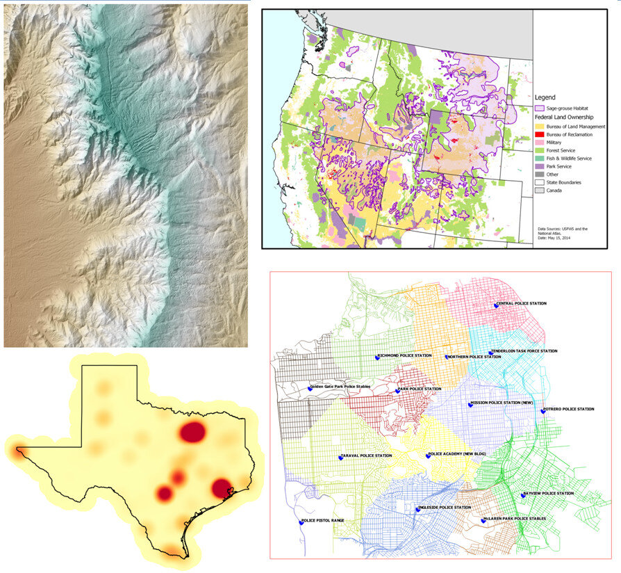 The courses were developed via the National Information Security and Geospatial Technologies Consortium (NISGTC), under the leadership of Phil Davis (Del Mar College). Kurt Menke (Bird's Eye View), and Dr. Richard Smith (Texas A & M - Corpus Christi), authored the material which includes: theory, lecture, labs, data and task oriented video tutorials for each lab exercise.The courses are aligned with the Department of Labors Geospatial Technology Competency Model (GTCM). The GTCM was published in 2010 and will be revised in 2015. It describes the complete set of knowledge, skills, and abilities required by GIS professionals. It is designed around a hierarchical tiered model of knowledge and promotes use of open source technology.
 QGIS is the featured software for all courses. When appropriate other FOSS software's are also included such as GRASS and InkScape.The vast majority of US based colleges and universities use a single vendor's proprietary GIS software, making this series of courses very unique. In fact it is the first national attempt at a completely open source GIS curriculum. By their very nature of open source software, there is no marketing engine promoting them. This has slowed the adoption and overall use of open source GIS. One hope is that this material will entice people to learn about the same low cost mapping workflows that the Community Health Maps program is promoting.The targeted audience is broad and includes:
- Secondary school educators and students
- Two and four year college educators and students
- Students in need of GIS skills
- Workers seeking to broaden technology skills
- Anyone desiring QGIS and open source knowledge and skills
The courses are available online at the FOSS4G Academy. Over 2,500 students have already enrolled for these courses demonstrating how in demand these materials are. Visit the FOSS4G Academy now and explore the material!
Community Health Maps Presenting at FOSS4G in Portland - September 2014
Kurt Menke will be presenting the Community Health Mapping project in Portland next month at FOSS4G. FOSS4G stands for Free and Open Source for Geospatial. It is the international open source GIS conference. If you are nearby, or able to travel, it will be a great opportunity to learn more about the project including the workflow and how several groups have implemented it. The conference has eight concurrent tracks beginning Wednesday September 10th and ending on Friday September 12th. Conference talks will cover both new mapping technology and applications. The mapping technology will cover data collection, desktop analysis, cartography and web mapping. Over 1,000 attendees are expected. Mr. Menke's talk is scheduled for 1:00pm on Wednesday September 10th. Hope to see you there.
How Accurate is the GPS on my Smart Phone? (Part 2)
In Part 1, I introduced the three parts of the hybrid locational system used by tablets and smart phones. Now I'll discuss each individually.Assisted-GPS (A-GPS)A-GPS is by far the most accurate of the three systems on your phone. A-GPS operates a little differently than the typical handheld GPS receiver. The assistance is provided by the cellular network. When connected to a cellular network the smart phone will download data about the GPS satellite constellation. This allows the phone to lock in on a position much more quickly than it could otherwise. The GPS functionality of a smart phone can still be used if the cellular network is unavailable. However, when disconnected from a network your phone will take several minutes to hone in on your location, versus just seconds when the network is available.The A-GPS receivers on iPhones have steadily improved from the iPhone 3 to the iPhone 5. In addition to the U.S. DOD GPS system, the Russians have a satellite navigation system called GLONASS. The newest smart phones (e.g., iPhone 4S and iPhone 5) now have GPS chips that use both satellite systems giving increased accuracy! Europe, India and China are also developing satellite navigation systems and in the not too distant future GPS receivers may be able to use several systems simultaneously and become even more accurate.WiFi and Network PositioningFor any GPS to work the antennae needs a clear view of the sky. Users of smart phones will frequently be in "urban canyons" or indoors. This is where WiFi and cellular network positioning become necessary. Both of these methods are used by smart phones as indoor positioning systems. The phone will use a hybrid approach, using all three methods to locate you. These other two technologies aren't nearly as accurate as A-GPS, but can still locate you sufficiently to find the closest vanilla latte!Generally WiFi positioning is more accurate than cellular network positioning. It uses wireless access points and measures the intensity of the received signal from one or more networks to find the position. Interestingly it doesn't require your device to be WiFi enabled to work.Cellular network positioning triangulates your position based off of nearby cell phone towers. Phone companies have precise locations for their cell towers, which when combined with signal strength can be used to approximate your location. Both of these techniques are dependent on overlapping signals from either access points and cellular towers. Therefore they're more accurate in urban settings.So What's It All Mean?From numerous tests the typical GPS receiver will achieve an accuracy of 1-5 meters. Unfortunately assisted-GPS accuracies have not been studied nearly as thoroughly as typical GPS receivers. The best studies to date are those by Dr. Paul Zandbergen at the University of New Mexico. In 2009 he published findings showing that an iPhone 3 had an average accuracy of 8 meters. In that study the error never exceeded 30 meters. Below are the results of his 2009 study including all three locational systems.
- 3G iPhone w/ A-GPS ~ 8 meters
- 3G iPhone w/ wifi ~ 74 meters
- 3G iPhone w/ Cellular positioning ~ 600 meters
Numerous anecdotal studies indicate that the iPhone 4S/5 has become more accurate. In 2011 Dr. Zandbergen tested several Android smart phones. Here he found the accuracies to be slightly better than the 2009 study. They ranged from 5-8 meters. It is likely that the iPhone 4S/5 is within this range as well. It can also be assumed that iPads and other Android tablets will be comparable.Other Options for Increasing AccuracyThere are several third party external GPS receivers that connect to the smart phone via Bluetooth. For example, the Dual 150S can be used to increase accuracy in more remote locations. It can be worn like a wrist watch, placed on a car dash or strapped to a backpack. It will provide 2.5 meter accuracy and only costs $100. SummaryIf getting within 5-8 meters meets your data requirements smart phones and tablets are a great way to go. If you need greater accuracy you can combine an external Bluetooth GPS receiver with your device and get that accuracy down to the 2-3 meter range. If you require more accuracy than that you will need to invest in a mapping grade GPS receiver.
How Accurate is the GPS on my Smartphone? (Part 1)
Historically field data collection was a daunting task reserved for geographic information specialists (GIS) professionals, and the technical savvy crowd. This was largely due to the learning curve involved in operating mapping grade Global Positioning System (GPS) receivers. However, smart phones and tablets have changed that. They offer an amazing array of functionality in a portable, intuitive and ever more familiar interface. Think about all the technology packaged into one of these little devices:
- GPS
- Camera
- Network connection (3G, 4G, WiFi…)
- Internet
- Apps
They're actually better than the Tricorders we used to see on StarTrek! They have a slimmer profile, probably weigh a lot less, have touch screens, bigger displays and can be used with thousands of available apps. One big question when considering smart phones or tablets for field data collection is, "How accurate are they?" A related question that must be answered is, "What kind of accuracy will meet the needs of my project?" You need to answer both of these questions to determine whether or not this technology will work for you. Usually survey grade GPS accuracies (sub meter or sub centimeter) aren't necessary for public health mapping. Getting within 10 meters is more than adequate to map facility locations, patient addresses, potential sources of disease or wellness. How Does GPS Work?The Global Positioning System (GPS) is a U.S. Department of Defense (DOD) system. It utilizes a constellation of 24 satellites orbiting the earth at an altitude of 12,000 miles. GPS devices compute your position by determining the distance between the GPS receiver and a minimum of 4 GPS satellites. The satellites transmit radio signals to the GPS receivers, allowing the calculations to occur. Initially GPS was established as a military guidance system, and I doubt anyone foresaw the popular use it has today.The iPhone has been equipped with an onboard GPS since the iPhone 3, and Android phones became GPS enabled at about the same time. Typically people use GPS to find restaurants and street directions. However, there's no reason these same devices can't be used for public health data collection!More About Smart Phone Locational Services Smart phones in fact use more than GPS to locate you. They employ a hybrid locational system combining three separate technologies:
- Assisted GPS (A-GPS)
- WiFi positioning
- Cellular network positioning.
These three technologies are used in combination as they are available. A-GPS is the most accurate of the three, and cellular positioning the least accurate. The figure below shows an example of the accuracy of each of these locational services.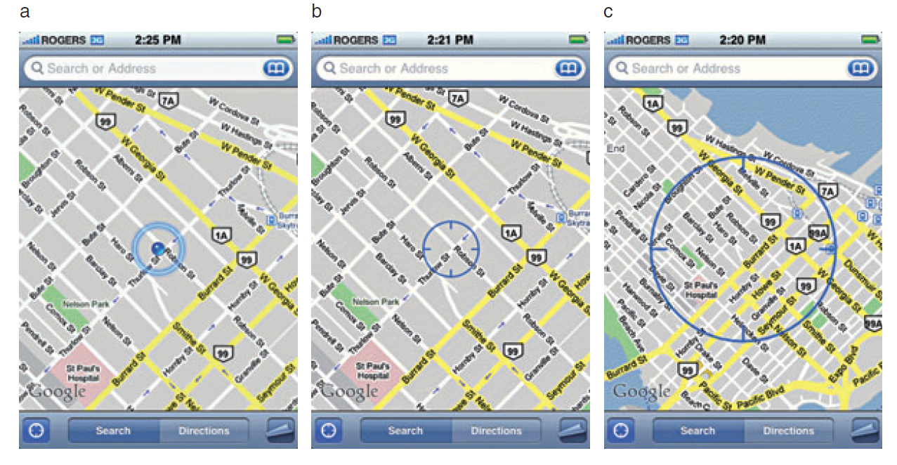 GPS AccuracyThere are a number of factors that affect accuracy no matter what GPS receiver is being used. The GPS radio signals encounter differing conditions while travelling through the atmosphere, causing signal delays, and therefore affecting accuracy. The geometry of the satellites being used will also vary. The GPS will have a wider array of satellites to choose from if you're out in the middle of a big field, versus being on 6th Avenue in Manhattan. You will get better positions if the satellites you're locked onto aren't clustered in one part of the sky. Therefore the more sky view you have, the more accurate your GPS will be. In addition to blocking your view of the sky, urban canyons can also cause multipath effects, where the GPS signal bounces off of buildings or other objects reducing accuracy.In part 2, I'll discuss each of the three pieces of the hybrid locational system individually, and discuss exactly what kind of accuracy you can expect to achieve.
Introduction
About This Blog
Welcome! The goal of this blog is to provide information about low cost mapping tools that can be used by community organizations. Perhaps you've seen the potential uses of mapping in public health, but are overwhelmed by the technology and/or simply too busy to pursue it. We hope this blog will facilitate the use of GIS mapping for those that fall into this category. We also hope to support those already engaged in mapping and enhance their community mapping initiatives, even if they may be using other tools. The blog will be a mixture of mapping apps/software reviews, best practices, and the experiences of those who have successfully implemented a mapping workflow as part of their work. This is a collaborative effort between the National Library of Medicine, Center for Public Service Communications and Bird’s Eye View. Everything provided on this site is in the public domain and free of charge. All training materials developed in 2013 are available here ([embed]http://communityhealthmaps.nlm.nih.gov/resources/[/embed]).
Background
The goal of the project was to assess currently available tools for collecting and visualizing public health trends via maps and spatial data. Focus was given to tools that allow a simple workflow from field data collection to storage, and display of mapped data. The target audience was community organizations engaged in information collection about the health of their communities for which mapping tools would be helpful. It was with the understanding that these groups often operate without the resources to have an Esri ArcGIS license, and a full time GIS specialist on staff. Rather than focusing on the use of expensive GPS receivers, we envision the use of smart phones and tablets for these reasons:
- Most community-based organizations already have them!
- Many know how to use them
- They're intuitive
- They're portable
- They come with an on board GPS receiver (iPhone 5 uses GPS + GLONASS)
- Have on board cameras
- Can connect to wireless networks
- Access to the internet
- Email is available
- “There's an app for that!”
 The 2012 software review included: a) apps for Apple iPad/iPhones and Android devices, b) websites serving out useful public domain health related data, c) open source desktop tools for analyzing data and integrating field data with existing organizational data, and d) cloud solutions allowing user data to be uploaded and mapped. BEV wrote a final report with a final recommendation for a complete workflow from field data collection through web presentation.
Pilot Projects
During the spring and summer of 2013 the tools selected from the assessment were introduced successfully in three test locales: 1) Urban Indian Health Institute, Seattle, Washington, 2) Papa Ola Lokahi / The Native Hawaiian and the Indigenous Health Office of Public Health Studies, University of Hawai'i Manoa, both in Honolulu, Hawai’i, and 3) The Nature Conservancy of Hawai'i, also located in Honolulu, Hawai’i. Each site developed project ideas during the winter of 2012/13. BEV developed custom training materials for each site, since each was assigned a different mobile data collection app. This allowed us to receive feedback on the three leading mobile data collection apps recommended in our 2012 review. Training sessions followed at each site in April 2013. The training focused on introducing participants to the entire workflow recommended for their project, from field data collection through data sharing and visualization. Follow up support was the provided throughout the summer and fall of 2013. All three organizations had good experiences with their projects. One study looked at noise pollution. As such an iPhone app was used to collect decibel readings at sites along with photos, and GPS coordinates. Another project working towards a resource guide of native health care facilities. The third evaluated the use of tablets in collecting native medicinal plant data. Each will be highlighted in this blog in the coming months. Stay tuned! The blog will be updated regularly so check back. Feel free to contact me with questions and feel free to comment on posts. I hope to generate some good conversation along the way.
