Submitted by Jenny Rewolinski, University of Maryland, B.S. Community Health 2016I just completed a spring internship with the National Library of Medicine (NLM). My goal was to demonstrate what a typical user of the Community Health Maps (CHM) blog might experience, while using the low cost resources it reviews to develop a mapping project with a public health focus. I read through the case studies on the CHM blog and used its labs to develop my project plan and to guide my related decisions.Because of my experience with elderly relatives and my background in public health, I centered my project on how the senior population of a nearby Assisted Living Facility might safely navigate local sidewalks. According to the 2014 American Community Survey, 23% of people over 65 have some sort ambulatory disability. With this in mind, I decided to map local curb ramps --sloped transitions between sidewalks and streets which function as accessibility enhancements to help those with mobility issues to cross streets safely.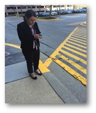 I used CHM Lab 1: Field Data Collection to learn how to design my own data collection form using iForm. My Curb Ramp form captured curb ramp location, conditions, and other observations such as seniors using the curb ramps, steep or damaged curb ramps, and a lack of sidewalks in the area. As discussed in a prior blog post, How Accurate is the GPS on my Smart Phone?, phone geolocation is usually accurate up to 8 meters. This was not precise enough for my curb ramp data, so I corrected for this on my form. Over the course of 8 hours spanning 2 days, and with 2 other interns I collected 103 existing curb ramps and locations where curb ramps might aid accessibility.
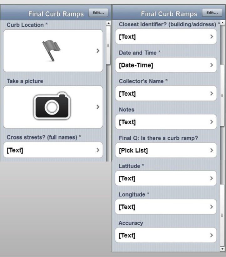 Next, I brought my iForm curb ramp data from my phone into the QGIS software by using instructions from CHM Lab 2: Bringing Field Data into QGIS. I also used CHM Labs 3: Combining Field Data with Other Organizational Data and CHM Lab 4: Basic Spatial Analysis to add data layers and to perform spatial analysis to finalize my map.
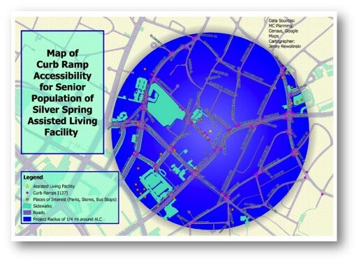 This is my project map! I completed construction of my map using CHM Lab 5: Cartography with QGIS. In addition to my curb ramp data points, I added data layers for sidewalks, roads, places of interest (such as grocery stores, restaurants, bus stops, theaters), and my Assisted Living Facility. My goal was to raise awareness of how accessibility can impact seniors’ sense of autonomy and empowerment, and their ability to exercise and to lead a healthier lifestyle. This map also provides recommendations for where more curb ramps should be placed based on observations during data collection. I plan to discuss this map and curb ramp recommendations with the city of Silver Spring and to create “safest route” guides for popular local destinations.
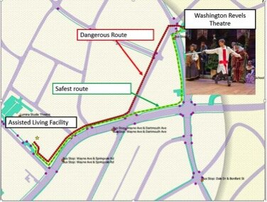 GIS has a huge potential to help us analyze health issues. When I began my project at NLM, I thought I would simply be mapping the location of curb ramps near a local Assisted Living Facility; however I discovered the significant need for more curb ramps as well as sidewalks around my project area.I believe the conclusions I was able to reach by using the low cost CHM resources CHM are accurate and workable. I came to NLM with little to no GIS knowledge yet I learned from the CHM GIS labs, collected curb ramp data points and created a map that may bring awareness to a public health issue. In doing so I believe my experience is typical of many CHM users.
Fulcrum Updates The App Designer
We introduced Fulcrum in a recent post and are very impressed with this tool. Recently Fulcrum updated their App Designer. Fields are now divided into categories from the most common and basic fields, to the most advanced. The groups of fields have also been color coded from green to red to make this arrangement more intuitive. The five categories are: Basic, Choice, Design, Media and Advanced. At the top are Basic fields which include Text, Numbers, Date etc. This reorganization makes finding fields and developing a form even faster.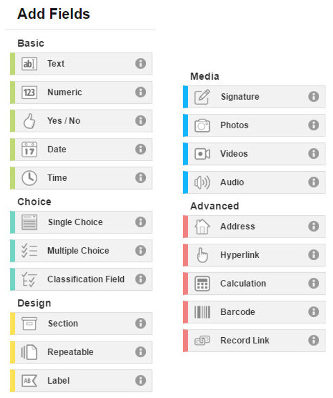 One category of interest is Design. These are fields that can be used to organize your data collection form. Sections allow you to divide your form into parts. For example, you could separate your main survey questions from your data collector metadata questions. The example App below has two sections: Main section and Data Collection Information.
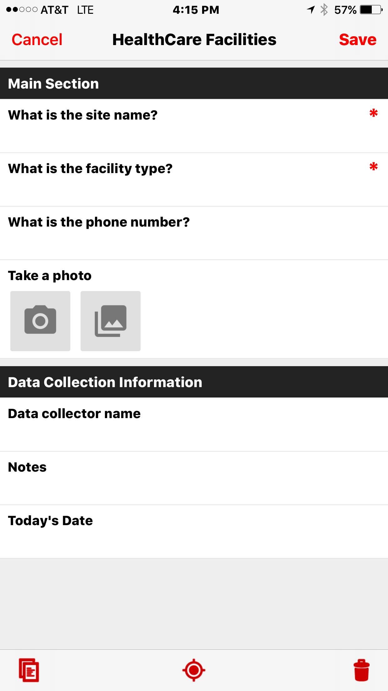
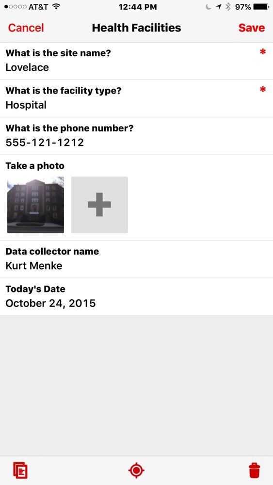
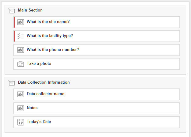 Organizing your questions like this can help data collectors complete the form, especially for form with a lot of questions. The screenshot below shows how the above form is rendered on a smartphone.
 In future posts we will give some helpful hints to working with Fulcrum including sharing forms, managing data and downloading data. Stay tuned!
Community Health Mapping: A New Year Review
To start the New Year I thought I’d begin with a review of Community Health Mapping (CHM). There are a lot of new project partners, and I thought it would be a good time to give a project overview. CHM is a collaborative effort between the National Library of Medicine, Center for Public Service Communications and Bird’s Eye View. The National Library of Medicine is funding the initiative.The overall goal is to empower community organizations serving vulnerable or underserved populations with low cost, intuitive mapping technology. Therefore we’ve been working with programs organizations who:
- Focus on vulnerable populations
- Frequently use and collect data
- Need effective, scalable & easy to use mapping tools
- Lack resources (i.e., for proprietary GIS training & software)
We have identified a suite of tools that allow you to collect custom field data, analyze that data, combine it with other spatial datasets, and generate both static maps and/or dynamic maps on the internet. This allows organizations to collect and work with their own data, and if appropriate, share it with others. CHM involves three components that meet all basic mapping needs:
- Field Data Collection
- Desktop Analysis and Cartography
- Internet Mapping
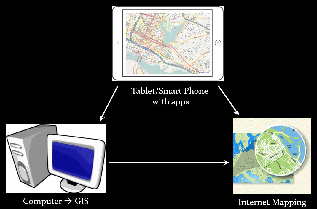 A given project may not require all three, however, collectively these components address the basic needs of all mapping projects.Field Data Collection:Rather than focusing on the use of expensive GPS receivers, we recommend the use of smart phones and tablets for these reasons:
- Most community-based organizations already have them!
- Many know how to use them
- They're intuitive
- They're portable
- They come with an on board GPS receiver (iPhone 5 uses GPS + GLONASS)
- Have on board cameras
- Can connect to wireless networks
- Access to the internet
- Email is available
- “There's an app for that!”
 Of course an important consideration is horizontal accuracy. You can read our blog post on that topic to see if mobile smart devices meet your project needs.When collecting data you need to be able to develop your own custom data collection form. The top three mobile apps we have found are:
- Fulcrum: Easiest to use - iOS & Android – low monthly subscription - http://www.fulcrumapp.com/
- iForm: Slightly steeper learning curve – iOS and Android – free account - https://www.iformbuilder.com/
- ODK Collect: Easy to use – Android only – free account - https://opendatakit.org/use/collect/
Desktop Analysis and Cartography:After community field data collection, the next step typically involves bringing the data into a desktop GIS. This is the middle step in the workflow. Here the data can be viewed against basemaps such as Google or OpenStreetMap, and combined with other organizational data. This is also where analyses (proximity, density etc.) can be conducted. Presentation quality maps can also be generated in this step.The software we found to be the best fit is QGIS. This is an open source desktop GIS software. It has many strengths:
- It can consume many kinds of data, including all the data that would come out of the field data collection apps.
- It is both intuitive and robust.
- It has a large suite of geoprocessing tools for analyzing data.
- It will run on Windows, Mac, or Linux.
- It is free to download and install.
- It is well documented.
- There is a large user community.
- New functionality is being continuously added. New stable versions are being released every 4 months!
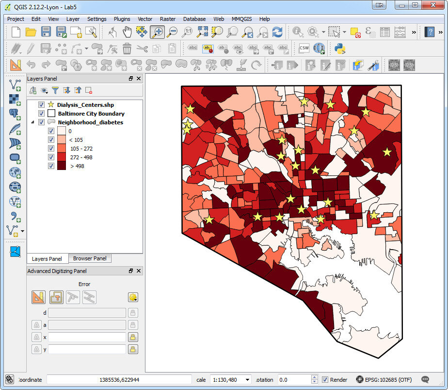 Web PresentationOften you may want to present an interactive map of your results. Interactive means the map reader can zoom in/out, pan the map and turn layers off and on. For this we recommend CartoDB.You can sign up for a free account, which gives you 50Mb of storage space. Data can be collected with a smart phone or tablet and brought directly into CartoDB. It is a very intuitive platform. You can literally drag and drop a spreadsheet onto the CartoDB page and have the data upload to your account. It will accept the most common geospatial file formats including: spreadsheets and comma delimited text files with addresses or coordinates, KML/KMZ, GPX, and shapefiles.CartoDB also has great documentation including:
- CartoDB Editor Documentation
- A comprehensive series of tutorials breaking tasks up into Basic, Medium and Advanced categories
- Tips and Tricks
- FAQ’s
 In ConclusionThis blog has a lot of resources including reviews of mapping technology and case studies. You might begin by clicking on some of the links in this entry. We are also working on a 6 lab CHM curriculum that interested parties will be able to use to hone their skills. Stay tuned for that!We are always looking for new partners and continuously work to support current project partners. If you are interested, or have questions please don't hesitate to contact John Scott (jscott at cpsc.com) or Kurt Menke (kurt at birdseyeviewgis.com). Most importantly get out and do some mapping in 2016!
Field Data Collection with Fulcrum
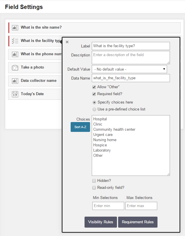
Fulcrum was reviewed in our initial survey of field data collection apps in 2012, and almost made the top three. In the last 3 years Fulcrum has improved and has become perhaps the most intuitive and useful data collection app we've evaluated period.It is available for both iOS and Android. It isn't free, but the subscription fee is affordable. It costs anywhere from $18 - $25 per month. The three pricing plans give you 10 - 30Gb of online storage, which is substantial. Fulcrum offers a free 30 day trial which includes all the functionality. You can use this option to test Fulcrum for your projects. In the following example, I will be using a health care facility data collection form to show how Fulcrum works.Fulcrum has the most intuitive data collection form builder of any app we've seen. When you design a form Fulcrum calls it an 'app'. Simply drag and drop from the Add Fields section to your 'app' to add questions (see figure below). Available data input types include text, numbers, date, single or multiple choice, photos, videos, and audio. There are no tricks to collecting GPS locations as with iForm. Fulcrum collects locations automatically.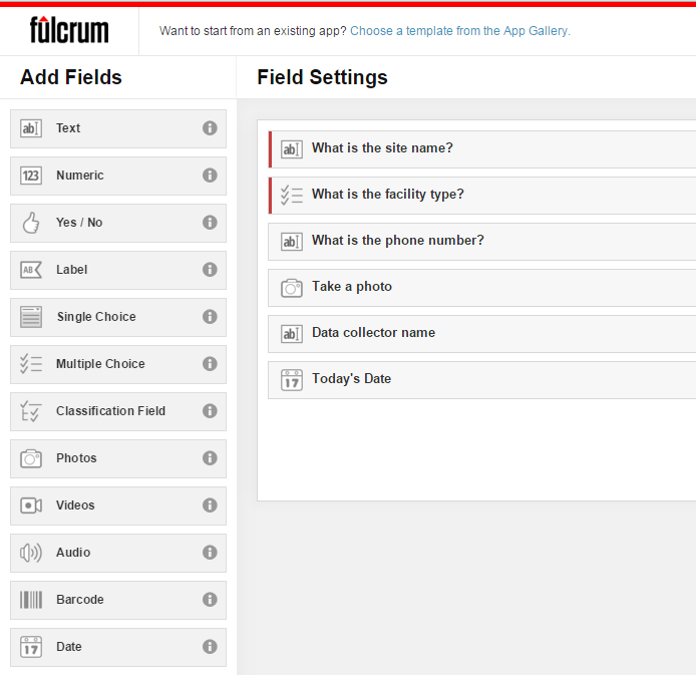 Once a field has been added simply set you parameters. The figure below shows the facility type question being edited. To do this simply click on a field, and fill out the details. It's so easy a 50 year old can do it!
 The companion mobile app can be downloaded for free from the Apple Store or the Google Play Store. Once installed, login and your data collection app(s) will sync with your mobile device. The figure below shows the health care facilities data collection app on an iPhone. Answering the questions is intuitive. Once collected your data will be synced with your cloud account.
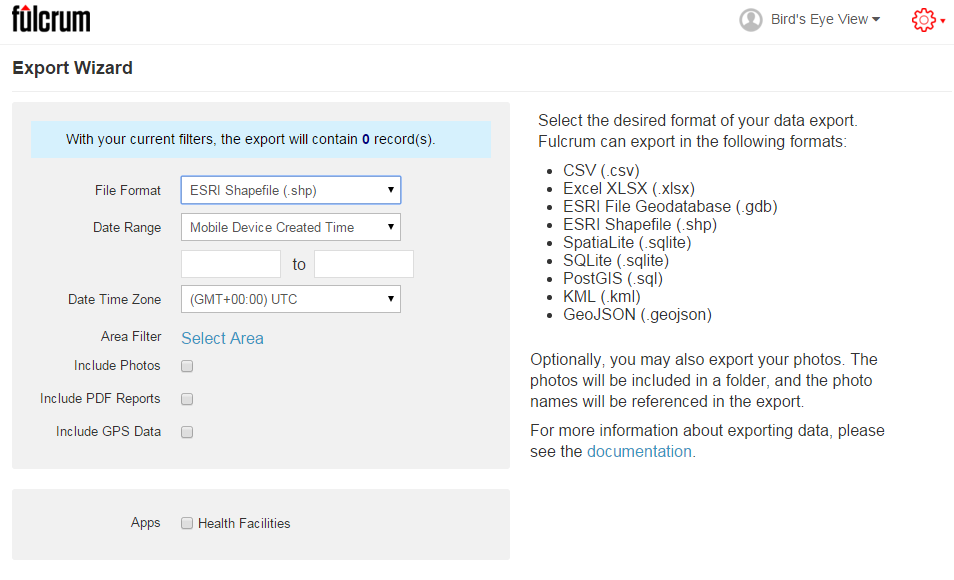
 Once back in the office, login to your account, select your data collection app, and choose Start Export Wizard. You will be taken to the page below. Choose your file format. A complete array of GIS formats is available including: shapefiles, geodatabases, KML, PostGIS and Spatialite. Choose any other appropriate options and click Next to download your data.
 I highly recommend that everyone involved in Community Health Mapping evaluate Fulcrum. Along with iForm and ODK Collect is a CHM recommended data collection tool. There is a monthly subscription fee but it is low. It is the easiest and most flexible tool we've found. You can use the free 30 day trial period to see if it works for you.
Wildly Successful Community Health Mapping Workshops at MUSC!
Community Health Maps (CHM) conducted it's largest and most successful workshops ever at the end of September at the Medical University of South Carolina (MUSC). The training at MUSC was divided into three workshops and a presentation. The attendees were a mix of professors, students and researchers, most of whom had little to no experience with GIS. Despite this fact, nearly everyone was able to collect data and make a map. This is a testament to the easy to use nature of the CHM workflow.It began Monday morning with the first workshop. This was an Intermediate Session for those Community Health Mappers who had been working on projects since the April CHM workshop. We spent two hours covering more advanced topics and answering project specific questions. Following that, Kurt Menke presented a CHM project overview at a brown bag lunch session to 30 attendees. Matt Jones closed this session with a 10 minute talk detailing how he used The Community Health Maps workflow this summer to map access to care on Johns Island.The second workshop was Monday afternoon. It was a two hour session covering field data collection with iForm, and mapping that data online with CartoDB. There were 55 attendees at this session, the vast majority of whom had no GIS experience. In just two hours all 55 attendees were able to collect field data and make a map in CartoDB!
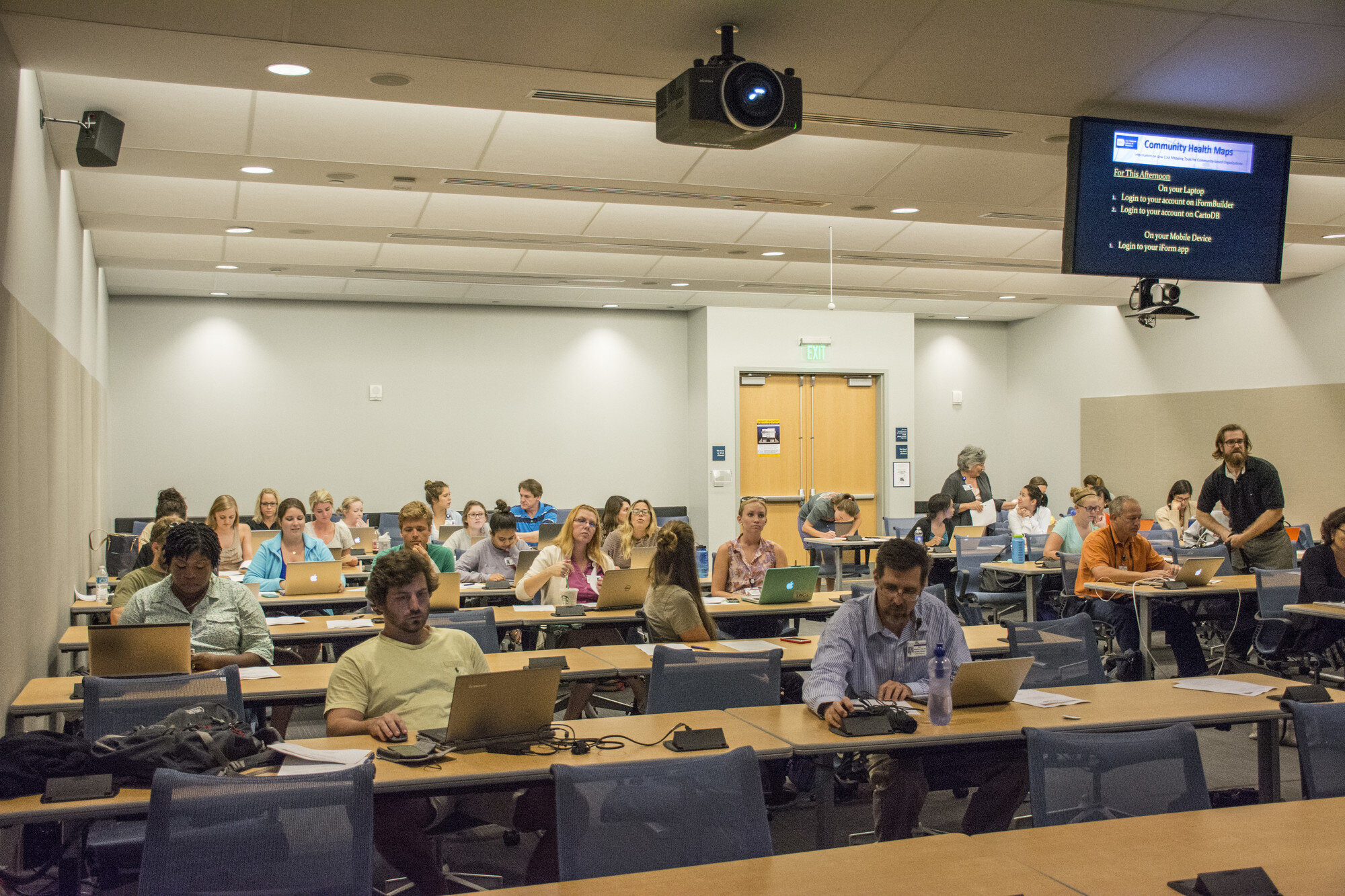 The final workshop on Tuesday was a 5 hour session covering the use of QGIS. The workshop consisted of a custom Charleston based QGIS exercise. Each of the 35 participants worked with a set of Charleston GIS data while learning the basic layout of QGIS. They learned how to add data, style it, and compose a map. The workshop ended with a discussion of each participants goals and project specific questions.
 In total almost 80 people attended one or more sections of the training! Thanks go out to Dr. Deborah Williamson for hosting the workshops, Dana Burshell for organizing the entire event and assisting during the workshops, and to Sarah Reynolds who was invaluable in providing Mac and QGIS support!
Teens Map Environmental Health of Their Community (Sea Islands, South Carolina)
By Guest Blogger: Derek Toth - Communities in Schools CharlestonThe Teen Health Leadership Program (THLP) is in their eight year of existence at St. John’s High School on Johns Island. The program gathers leaders of the school together and focuses on a health topic they feel is affecting their community and assists the community in understanding this topic through the use of media dissemination. In the past, topics included Autism, Cancer, Stress, Obesity and Alcohol and Drugs and This year, the students wanted to look at their community as a whole with a topic of Environmental Health.The THLP students wanted to see what makes their Sea Island community different. The Sea Islands are composed of John’s Island, Wadmalaw Island, Seabrook Island and Kiawah Island outside of Charleston, South Carolina. Students primarily come from John’s and Wadmalaw Islands. These islands are extremely different for many reasons. The students wanted to be able to translate these differences in a new form for the Teen Health Leadership Program. The students were presented with an opportunity to use the Community Health Mapping tools discussed on this blog, and some training made available from the National Library of Medicine. With GIS, the students can pin point differences within the islands for their community to see.(This January Kurt Menke conducted a Community Health Map training at the Medical University of South Carolina College of Nursing. Two teachers with Communities in Schools Charleston attended and the next afternoon Kurt Menke went to St. John's High School and showed the students how to map their campus with their iPhones.) 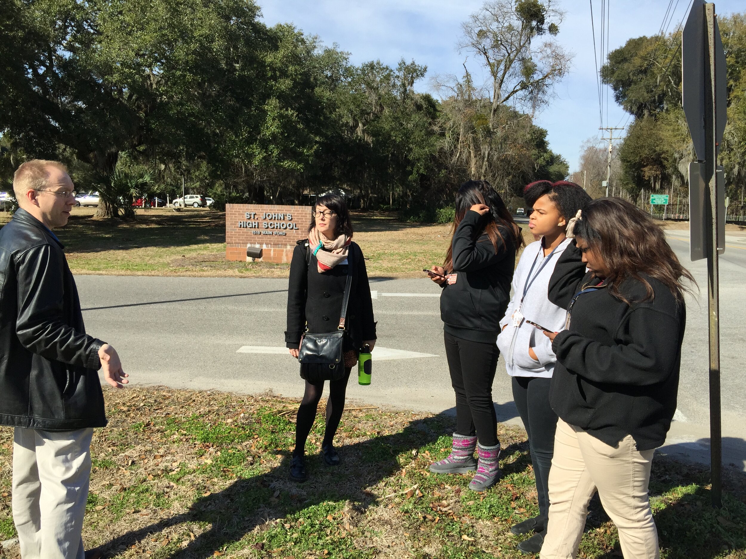 The students used smart phones, along with an app named iForm, to map points of interest with GPS. They collected well water locations, ground and city water sources, as well as, places in the community to purchase food. The food resources they mapped included farmers markets, produce stands, grocery stores and local farms. The students were able to indicate these points on a map. Google maps was used to create the final map.With the final map they were able to determine that people on Wadmalaw Island have less access to food and water than those on St. John's Island. For example, Wadmalaw Island is limited in places to buy produce or groceries, and has limited access to the farms that John’s Island has. Residents of Wadmalaw Island are on well water, and obtain their produce at the local grocery store on Johns Island, as opposed to driving to one of the many local farms.
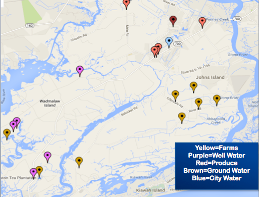 The final map was inserted into the Environmental Health project for the community to have a unique perspective of their Sea Island Community. Overall, the students felt that using their smart phones to map their community was easy to learn and fun. They were able to grasp the information quickly and seemed pleased with their results. The group feels it reached it’s goal of accomplishing a fresh look at the Sea Islands and felt it added to their presentation on Environmental Health.
Field Data Collection with iForm
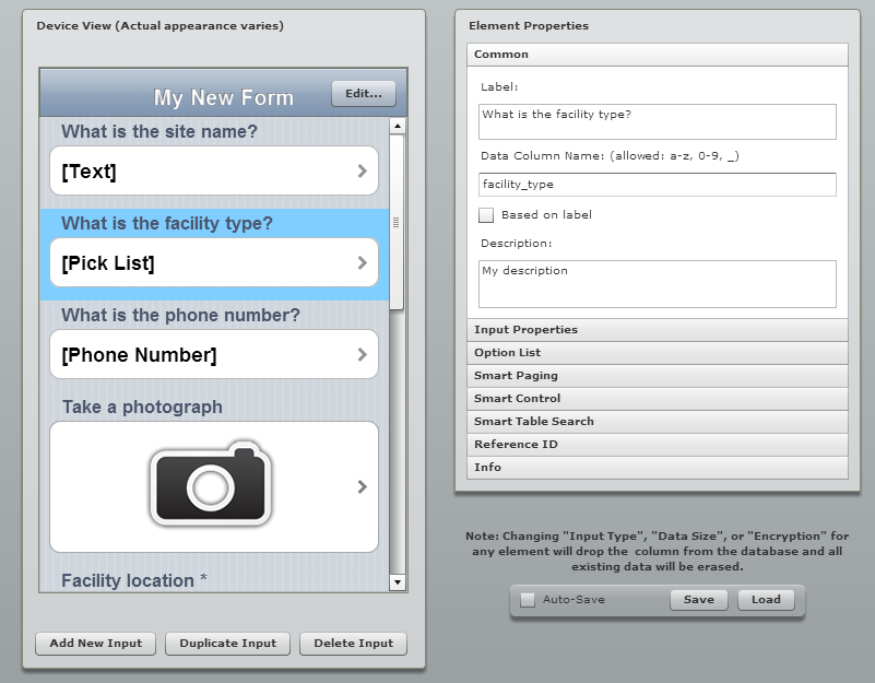
Unfortunately the most recent iOS system update rendered the EPI Collect app unusable. Apparently it is no longer being supported on the Apple platform. With this discovery, and a training in Charleston just around the corner, we set out to find a replacement. We searched for another free app for iPads and iPhones that allows you to develop your own data collection form. Fortunately we discovered iForm which turns out to be even easier to use, and more robust. (NOTE: It is also available for Android devices.) This app has a lot of similarities with ODK Collect which we recommend for Android users (ODK Collect is described in the Field Data Collection blog post). With iForm you create a free account on the companion iFormBuilder website. You use their online form builder to create your data collection form. The form builder has over 30 different types of data inputs to choose from! For example: text, number, date, time, pick list, phone number, location (GPS coordinates) and images (photographs). Individual data elements can be set up as questions for the data collectors such as: What is the name of the site?
 Once the form is developed you can begin to collect data.
- Open the app on your mobile device and login.
- Tap the Sync button and all the forms and records that are associated with your account will be downloaded to the device.
- Head out to your project site and collect data.
- At the first data collection site simply open the data collection form, answer each question, and click Done to save the information.
- Repeat at each site.
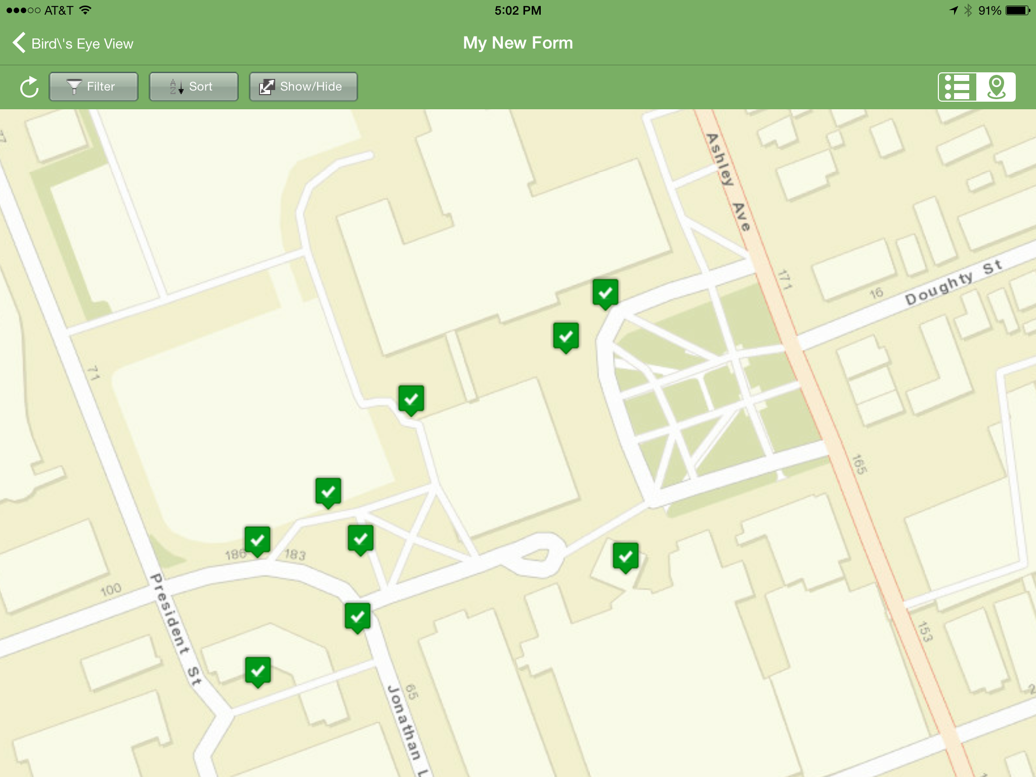
 If you are collecting data while in cellular coverage, the data will be synced to your iFormBuilder cloud account as you go. If you leave cellular coverage that is OK. The on-board GPS receiver on your mobile device will still allow you to collect your locations. Once you are back within cellular range you can Sync your data to your iFormBuilder cloud account. The data can be viewed on the mobile device in tabular or map format. Back in the office the data can be downloaded from the iFormBuilder site in several formats, the most useful of being an Excel spreadsheet. The data in the spreadsheet can then be brought in QGIS or CartoDB and mapped.
 iForm has some additional features that stream line data collection. You can link your iFormBuilder account to a DropBox or Box account. With this link established your data and photos will be uploaded to a DropBox folder automatically. There are also tools for assigning a form to different users. This allows you to develop one data collection form and share that among a team of data collectors.The free iFormBuilder account has some limits. You are limited to 10 forms and 100 records per form. However, you can log in to your account, export the data, and delete those online records and continue data collection.In summary, iForm is a powerful and intuitive free app for collecting community health data with iPhones, iPad, and Android devices.
Community Health Maps Conducts a Training in the South Carolina Lowcountry
Recently Kurt Menke headed to Charleston, South Carolina to train several groups how to map their communities. This region is also known as the 'lowcountry' due to the flat, low elevation geography. The training was hosted by the Medical University of South Carolina (MUSC) and included people from Communities in Schools - Charleston (CISC) and the MUSC College of Nursing.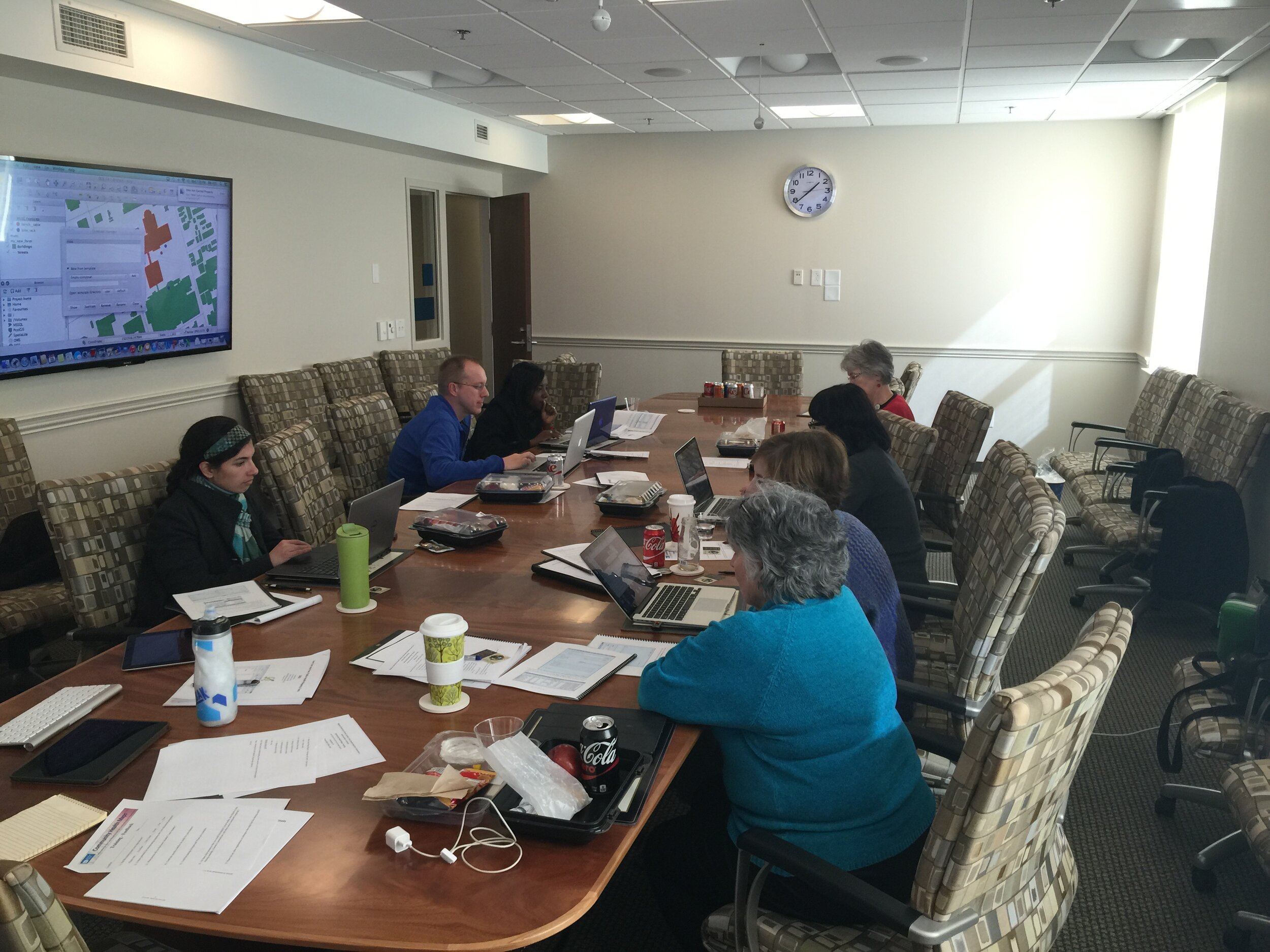 First everyone learned how collect GPS field data with iPads. For this we used a new app named iForm. This app was used in lieu of EPI Collect, which no longer supported on iOS. (The next blog post will cover iForm in more detail.) iForm is an app very similar to the Android app ODK Collect, allowing a custom data collection form to be developed. To practice we collected bike rack locations and seating areas around the MUSC campus. The afternoon was spent working with everyone's data. GPS data points were brought into QGIS and shown against some local Charleston GIS data layers.
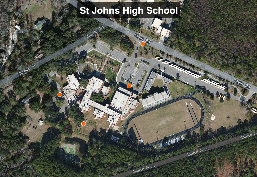
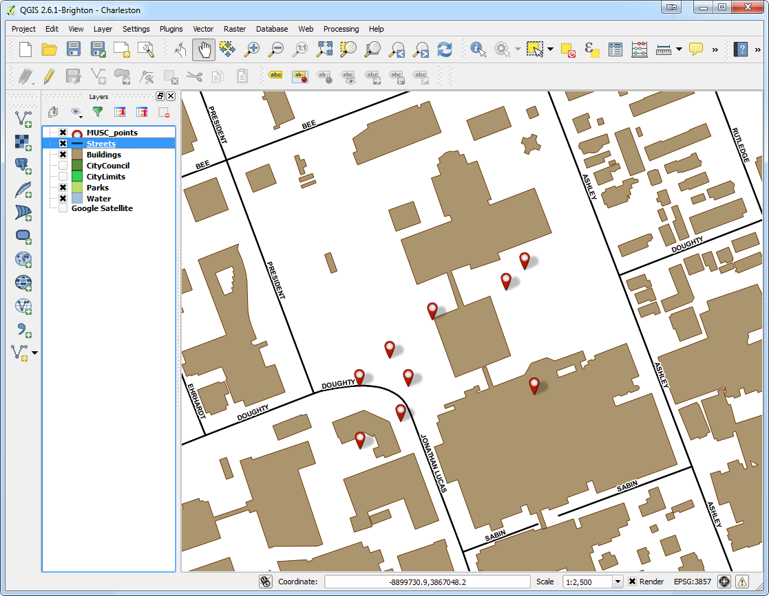 The points were also uploaded to CartoDB. CartoDB is another new component of the Community Health Mapping workflow. It has become more intuitive than GIS Cloud and worked really well. (Note: There will be a post on using CartoDB soon too.)The following day I visited CISC's Derek Toth and three of his students at St. John's High School on John's Island, SC. Over a working lunch Mr. Toth showed students how easy it is to collect GPS points with their iPhones. We collecting several points while walking around the campus.
 Afterwards we went back inside and showed them how to upload the points into CartoDB and make a map. The figure below shows the results of 45 minutes worth of work! Click on the map to open the live version.
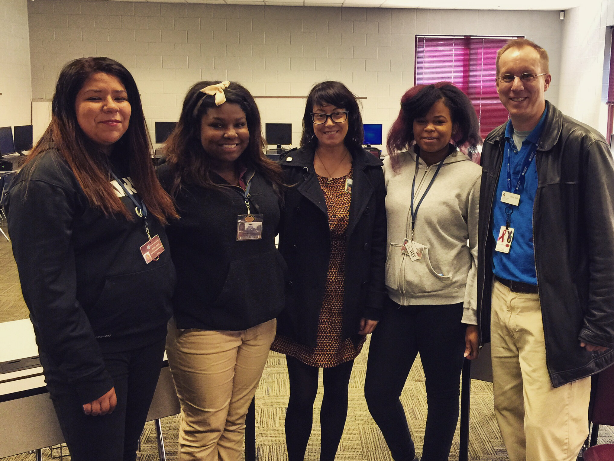
 This spring these three juniors will be leading the charge to map their island! They will be presenting their work to the National Library of Medicine later this spring. I look forward to seeing their work!
Technology + Youth = Change
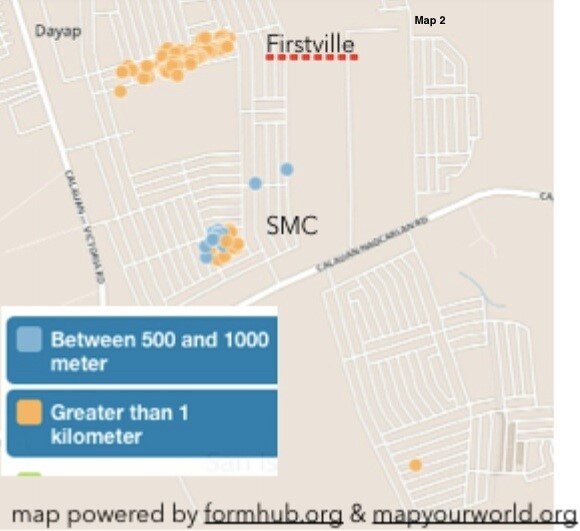
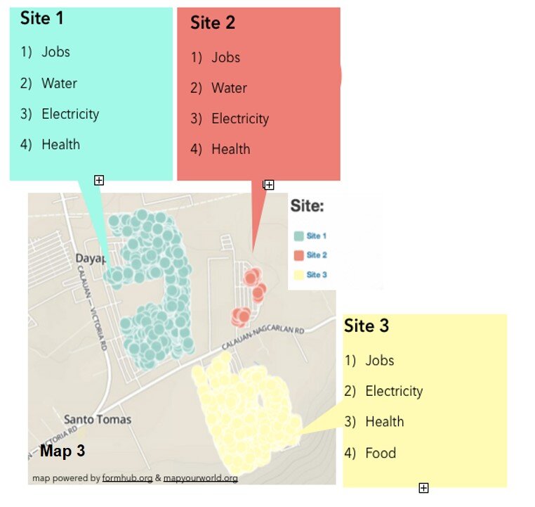
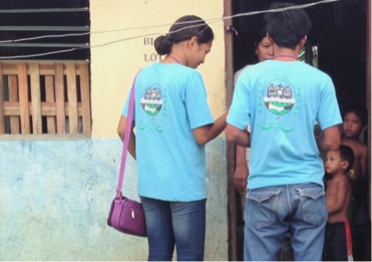
by Chad Noble-TabioloIt all started in May 2013 when I watched the documentary entitled Revolutionary Optimists on PBS’s Independent Lens. It showed how young people from a slum in Kolkata, India were able to map the deficient and unsafe water taps in their community, in order to plea with the government for more and safe drinking water lines. The film highlighted technology in an unconventional way. It showed GIS-technology as an innovative tool to mobilize youth for social change.This heralded the beginning of a partnership with Map Your World to develop a mapping project in the Philippines in the summer of 2013. Through coordination with domestic and international partners, the youth mapping program was implemented in Southville 7 — an impoverished and neglected slum community, about three-hours south of metro Manila. The issues faced in Southville 7 ranged from lack of access to jobs, water and electricity to food insecurity and child and maternity health; and because of a lack of response from both the government and non-governmental sectors, the project was aimed to raise awareness and demand change.In just a few weeks, a dozen phones were donated. Youth, ranging from 15 to 23 years old, were trained to go house-to-house to collect data. By the end of three months, 3000 families were surveyed and the needs of the community were mapped. Depicted below is Map 1, which shows the families who have direct access to water in their homes.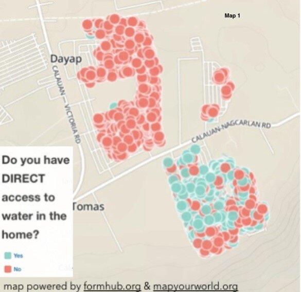 Because of the unequal distribution of resources, it was evident who had direct access to water and who did not. Map 2 shows those families who did not have direct access to water. These families had to walk more than 1 kilometer to a communal water tap.
 Lastly, Map 3, represents the top four needs according to the three different subdivisions or sites in Southville 7. Collectively these maps and data provide an opportunity for proper and adequate planning for public health infrastructure and needs.
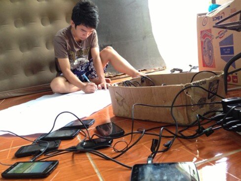
 The Android mobile phones used by the youth were powered by open-source applications for GPS-mapping and data collection. ODK Collect or Open Data Kit was the data collection tool utilized in the project. It can be found on the Android market. (NOTE: This tool is also described in the Community Health Mapping blog post on Field Data Collection). This tool is functional only after uploading a survey form that is created in Microsoft Excel and uploaded to the companion site www.formhub.org. The maps were created online with Map Your World, an online community mapping tool inspired by the Revolutionary Optimists documentary.
 In the end, the 30 youth involved in the mapping project were able to accomplish an endeavor that many people in their community had not expected. They were able to successfully map who in their community had access to water, electricity, jobs and vaccination for children under five years old, among others. They became leaders who are now equipped with leadership and technological skills that many in their community lack. They were empowered to raise awareness about the social injustices and health inequalities existing among them.
 The Southville 7’s mapping work was primarily a vehicle for instilling hope, and the use of GPS/mapping-technology offered an opportunity for the youth to be the voice for their community. According to one youth, “For me, mapping is like knowing. Knowing the problems, and how people are coping with them. Through the work we can open the eyes of the people, not only the things that can help them, but things that can help us all.”
Noise Pollution and Health in the Urban Environment: A Pilot Project
In October 2013, the Seattle Indian Health Board’s (SIHB’s) Urban Indian Health Institute (UIHI) completed a noise pollution pilot study. The goals of this project were: 1) to evaluate the feasibility of community data collection and analysis via a low cost GPS/GIS workflow, and 2) to offer recommendations on the feasibility and next steps for scalability to the larger Urban Indian Health Organization (UIHO) network. The collected data could additionally illustrate community health needs when merged with health or other contextual data for analysis, but these analyses were not the primary focus of this pilot. We chose to look at noise pollution because it is an environmental health concern that has been linked to a variety of health conditions in both occupational and community studies and it is easy to measure with portable devices.For field data collection, we used an iPad Mini with the GISPro and Decibel 10th apps. For mapping and spatial analysis, we used the open source desktop GIS software QGIS (www.qgis.org). While GISPro is a paid iPad app, the other programs are free. Data collection participants were staff recruited from the SIHB’s administrative, clinical and UIHI departments. We selected participants from this pool because they are representative of the staff at UIHOs who likely have limited experience with data collection and GIS. UIHI project staff trained seven participants in the iPad workflow and data collection process. This workflow consisted of five steps: 1) collect noise data with Decibel 10th, 2) export noise data via email, 3) take a site picture, 4) collect GIS data with GISPro and 5) export that GIS data. When the volunteer participants were finished with data collection, project staff compiled and analyzed the data using QGIS and Stata. Data were merged with socioeconomic indicators from the American Community Survey by zip code. Participating staff were asked for their feedback about their experience and the usability of the tools.
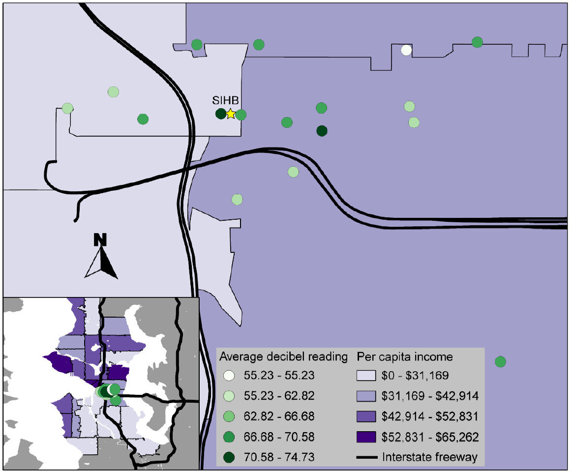 That feedback, combined with the experience of project staff, suggested that the GIS software tools were user-friendly and highly effective. Thus, they are likely to be attractive to organizations with limited technology budgets. However, some of the other resources necessary for this project (i.e. the GISPro mapping app, the iPad and general GIS software expertise) are expensive and may be limitations for many UIHOs. In the future, the UIHI would like to use these tools to better understand the health of the community, as well as assist UIHOs in conducting similar projects in their service area.For more information about this project, view the project brief at http://www.uihi.org/wp-content/uploads/2014/08/GIS-Project-Brief_20140604.pdf.The UIHI is a division of the SIHB and is one of 12 Indian Health Service tribal epidemiology centers (TECs). Unlike the other TECs that focus on geography-specific tribal populations, the UIHI is national in scope, focusing on American Indians and Alaska Natives (AI/ANs) living in urban areas. The UIHI supports the efforts of Urban Indian Health Organizations (UIHOs) nationally, as they serve the health and social support needs of their urban AI/AN communities.The Center for Public Service Communications and the National Library of Medicine provided funding for the UIHI to complete this project.
