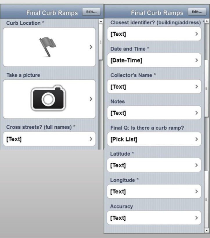
Submitted by Jenny Rewolinski, University of Maryland, B.S. Community Health 2016I just completed a spring internship with the National Library of Medicine (NLM). My goal was to demonstrate what a typical user of the Community Health Maps (CHM) blog might experience, while using the low cost resources it reviews to develop a mapping project with a public health focus. I read through the case studies on the CHM blog and used its labs to develop my project plan and to guide my related decisions.Because of my experience with elderly relatives and my background in public health, I centered my project on how the senior population of a nearby Assisted Living Facility might safely navigate local sidewalks. According to the 2014 American Community Survey, 23% of people over 65 have some sort ambulatory disability. With this in mind, I decided to map local curb ramps --sloped transitions between sidewalks and streets which function as accessibility enhancements to help those with mobility issues to cross streets safely.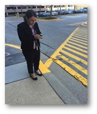 I used CHM Lab 1: Field Data Collection to learn how to design my own data collection form using iForm. My Curb Ramp form captured curb ramp location, conditions, and other observations such as seniors using the curb ramps, steep or damaged curb ramps, and a lack of sidewalks in the area. As discussed in a prior blog post, How Accurate is the GPS on my Smart Phone?, phone geolocation is usually accurate up to 8 meters. This was not precise enough for my curb ramp data, so I corrected for this on my form. Over the course of 8 hours spanning 2 days, and with 2 other interns I collected 103 existing curb ramps and locations where curb ramps might aid accessibility.
 Next, I brought my iForm curb ramp data from my phone into the QGIS software by using instructions from CHM Lab 2: Bringing Field Data into QGIS. I also used CHM Labs 3: Combining Field Data with Other Organizational Data and CHM Lab 4: Basic Spatial Analysis to add data layers and to perform spatial analysis to finalize my map.
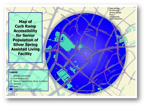 This is my project map! I completed construction of my map using CHM Lab 5: Cartography with QGIS. In addition to my curb ramp data points, I added data layers for sidewalks, roads, places of interest (such as grocery stores, restaurants, bus stops, theaters), and my Assisted Living Facility. My goal was to raise awareness of how accessibility can impact seniors’ sense of autonomy and empowerment, and their ability to exercise and to lead a healthier lifestyle. This map also provides recommendations for where more curb ramps should be placed based on observations during data collection. I plan to discuss this map and curb ramp recommendations with the city of Silver Spring and to create “safest route” guides for popular local destinations.
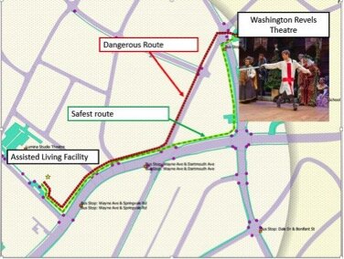 GIS has a huge potential to help us analyze health issues. When I began my project at NLM, I thought I would simply be mapping the location of curb ramps near a local Assisted Living Facility; however I discovered the significant need for more curb ramps as well as sidewalks around my project area.I believe the conclusions I was able to reach by using the low cost CHM resources CHM are accurate and workable. I came to NLM with little to no GIS knowledge yet I learned from the CHM GIS labs, collected curb ramp data points and created a map that may bring awareness to a public health issue. In doing so I believe my experience is typical of many CHM users.
Discover QGIS - A new QGIS workbook!
Two years ago, myself and several colleagues authored the GeoAcademy which is the first ever GIS curriculum based on a national standard – the U.S. Department of Labor’s Geospatial Competency Model (GTCM). The GTCM consists of the knowledge, skills and abilities needed to be a working GIS professional. Our team was honored with the 2015 GeoForAll Educator of the Year award for this effort. The GeoAcademy consists of 5 complete college courses.
- Introduction to Geospatial Technology Using QGIS
- Spatial Analysis Using QGIS
- Data Acquisition and Management Using QGIS
- Cartography Using QGIS and InkScape
- Remote Sensing Using QGIS and GRASS
This winter I converted the curriculum to fit into a convenient workbook format with Locate Press. The workbook is called Discover QGIS.As you may be aware, QGIS is evolving rapidly. A new version is released every 4 months! Due to this rapid development pace each spring a long-term release (LTR) is created. The LTR version is supported for a calendar year and is better for production environments. Originally written for QGIS 2.4, the GeoAcademy material in this workbook has been updated for use with QGIS 2.14 LTR. It therefore represents the most up-to-date version of the GeoAcademy curriculum. In addition to working with QGIS, it also includes exercises doing analysis tasks with the powerful GRASS GIS software, both alone and via the GRASS QGIS plugin. The cartography section includes exercises with InkScape. Here you'll learn how to begin a map in QGIS and use InkScape to finish a publication quality map.At the moment the digital version of the workbook is available as a Preview Edition for only $24.99. Purchasing this preview entitles you to the full version when it is released. There are just a few formatting issues to resolve.This book will be a great resource for Community Health Mappers wanting to build their skills. The 470 page workbook comes with exercise data, challenge exercises and solution files!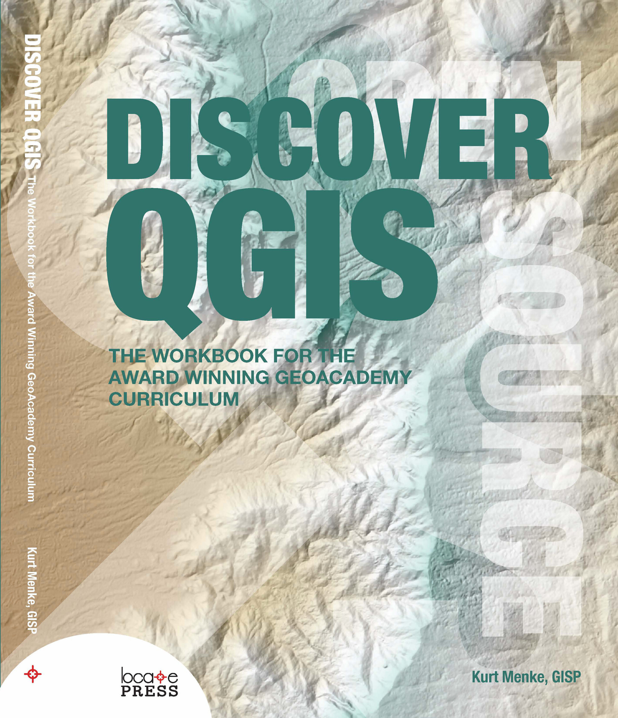
Community Health Maps Workshop
Regular followers of the Community Health Maps (CHM) blog will know that the National Library of Medicine and its partners Center for Public Service Communications (CPSC) and Bird’s Eye View GIS have worked for several years in support of NLM’s mission to improve health information literacy, with a particular focus working with underserved communities. While access to quality health information is frequently a focus of attention, the ability to visualize data and information -- to better understand and portray their significance to the community -- has received less attention. This is in part because the availability of affordable GIS platforms and data collection and visualization applications is relatively recent. Historically, the cost to procure platforms and applications, to train users and to sustain operations has been prohibitive for communities and community-based organizations whose health budgets are already strained. This recognition has prompted CPSC, with NLM support, to develop the Community Health Mapping initiative.Our premise has been that community-based and minority health organizations are in a better position to serve their populations when they are able to collect and maintain their own data, rather than -- or at least in addition too -- having to rely solely on national/state agencies or majority-institution partners to provide data to them.The approach we have pursued involves using relatively low cost tablets and smartphone platforms, combined with the selection of low/no-cost applications that run on these platforms, allowing novice users and users with little budget resource to map their communities. Introducing such workflows to community-based and minority public health professionals empowers users to collect, analyze, visualize and share their own spatial data. Importantly, these tools can also be used to share data collected using other programs, such as Esri’s ArcGIS and national- and state- derived databases such as CDC’s Behavioral Risk Factor Surveillance System, Public Use Data files from National Center for Health Statistics, etc.As documented on the CHM blog, to date the CHM initiative has supported pilot initiatives with:
- The University of Hawai’i School of Medicine’s Department of Native Hawaiian Health
- The Seattle Indian Health Board and the Urban Indian Health Institute
- The Medical University of South Carolina
- Tuskegee University
- Washington State Department of Health and University of Washington public health graduate students working on Capstone projects featuring our workflow.
We have also created a Community Health Mapping blog that you are exploring now, maintained by Bird’s Eye View, NLM’s and CPSC’s GIS partner in this project. Further, we have recently completed the development of a set of six online “labs”:
- Field Data Collection (iOS & Android),
- Bringing Field Data into QGIS,
- Combining Field Data with other Organizational Data,
- Basic Spatial Analysis,
- Cartography with QGIS
- Data Visualization with CartoDB.
These, too, are available through the CHM blog.With these experiences, the CHM Team approached the Robert Wood Johnson Foundation (RWJF) for its support of a national workshop so that we could share our approach more broadly than we have to this point. This has been our goal all along, pending testing of our workflow. We believe, and we have demonstrated that this low/no-cost workflow can enable community organizations and community-oriented health professionals to map local health status/conditions that have not been possible before and with quality, sharable results.On June 7th, 2016, and with funding from RWJF, the CHM workshop will bring together:
- federal/state/local government representatives
- related associations
- members of academia
- community health professionals
- community activists
- information specialists
- information technologists from across the country
to share and discuss new ideas and methodologies for empowering community organizations serving vulnerable or underserved populations with low cost, intuitive mapping technology.The workshop agenda is below. Stay tuned to this blog for more about the workshop:
Community Health Maps WorkshopLister Hill AuditoriumNational Library of MedicineBethesda, MarylandJune 7-8, 2016
Co-sponsored by:National Library of MedicineRobert Wood Johnson FoundationHealth-Equity.orgCenter for Public Service Communications
June 7, 2016: Day 18:30 – 9:00 Registration9:00 – 9:30 Welcome and opening remarks
- Betsy Humphreys, Acting Director, National Library of Medicine
- John Scott, President Center for Public Service Communications/Health-Equity.Org
- Michael Painter, Sr. Program Officer, Robert Wood Johnson Foundation
9:30 – 10:15 Importance of Community Access to GIS Mapping and other HIT ApplicationsB. Vindell Washington, MD, MHCM, FACEPPrincipal Deputy National CoordinatorOffice of the National Coordinator for Health Information TechnologyDepartment of Health and Human Services10:15 - 11:15 Community health mapping in a world awash with geographic data and toolsDr. John P WilsonProfessor and DirectorSpatial Sciences InstituteUSC Dana and David DornsifeCollege of Letters, Arts and SciencesUniversity of Southern California11:15 – 11:30 Break11:30 – 12:15 The landscape of mapping software, applications and databasesKurt Menke, GISPPresidentBird’s Eye ViewAlbuquerque, New Mexico12:15 – 1:30 Lunch1:30– 2:00 Introduction to the Community Health Maps (CHM) InitiativeJohn Scott and Kurt Menke2:00 – 3:15 CHM User Presentations
- Deborah Williamson, Associate Dean for Practice, Medical Univ. of South Carolina
- Bryan Heckman, Department of Psychiatry and Behavioral Sciences, MUSC
- Derek Toth, Communities in Schools
- Jennifer Rewolinski, Intern, National Library of Medicine
Panel discussion: Community Health Mappers field audience questions
- Recommendations for mapping approaches to attendees work.
- Recommendations for field data collection protocols etc.
3:15 – 3:45 Coffee/Tea Break3:45 – 4:30 GIS in the Community: applications for environmental healthJohn Balbus, M.D., M.P.H.Senior Advisor for Public HealthDirector, National Institute for Environmental Health Science-WHO Collaborating Centre for Environmental Health SciencesNational Institutes of Health4:30 -- 6:00 ReceptionJune 8, 2016: Day 2 8:30 – 10:30 Workshop: Mapping with your smartphone
- Attendees are guiding through the process of building a field data collection form with Fulcrum.
- Each participant spends 30 minutes outside collecting data
- Map data collected online with CartoDB
NOTE: All applications for this training should be loaded by participants to their smartphones and/or tablets before coming to the workshop. Please refer to instructions sent to you in advance via email 10:30 – 11:00 Break11:00 – 12:00 Workshop: An Introduction to Mapping with QGIS
- Attendees work with local data to learn the QGIS interface.
12:00 Adjournment
Announcement: Extreme Heat & Health Webinar
There will be a webinar next week entitled: Extreme Heat and Health: Creating Environmental Intelligence Through Science, Predictions, and Engagement. The specific date and time are: April 28th, 2016 from 4 - 5:30pm EDT. This will likely be an interesting webinar for many Community Health Mappers! Click this link to learn more.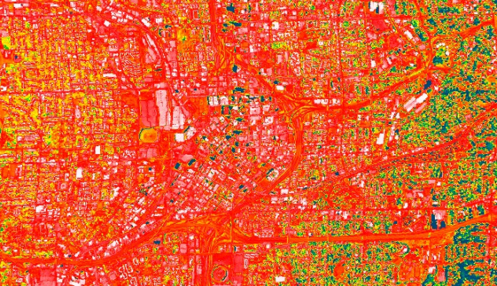
APTR: Teaching Prevention - Albuquerque, NM
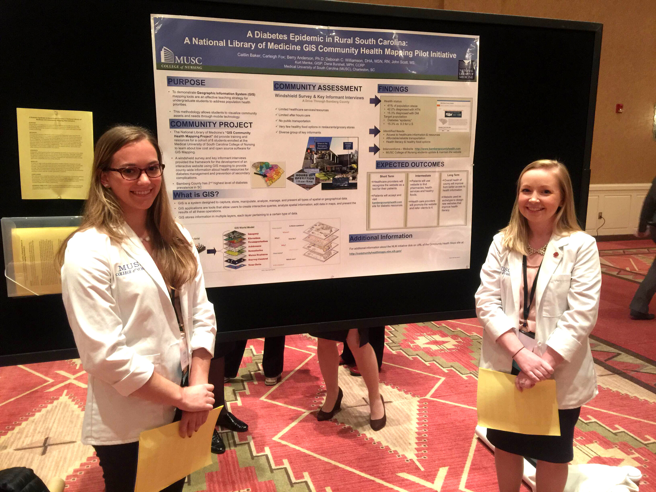
Community Health Mappers had a strong presence at the recent APTR Teaching Prevention conference held in Albuquerque, New Mexico last week. The theme of the conference was Preparing Students to Address Emerging Issues, and four students presented work incorporating the CHM mapping protocol. Medical University of South Carolina (MUSC) College of Nursing students Caitlin Baker and Carleigh Fox presented a poster on their project "A Diabetes Epidemic in Rural South Carolina." They used mobile devices to conduct a windshield survey of a rural South Carolina community to better understand the diabetes epidemic.
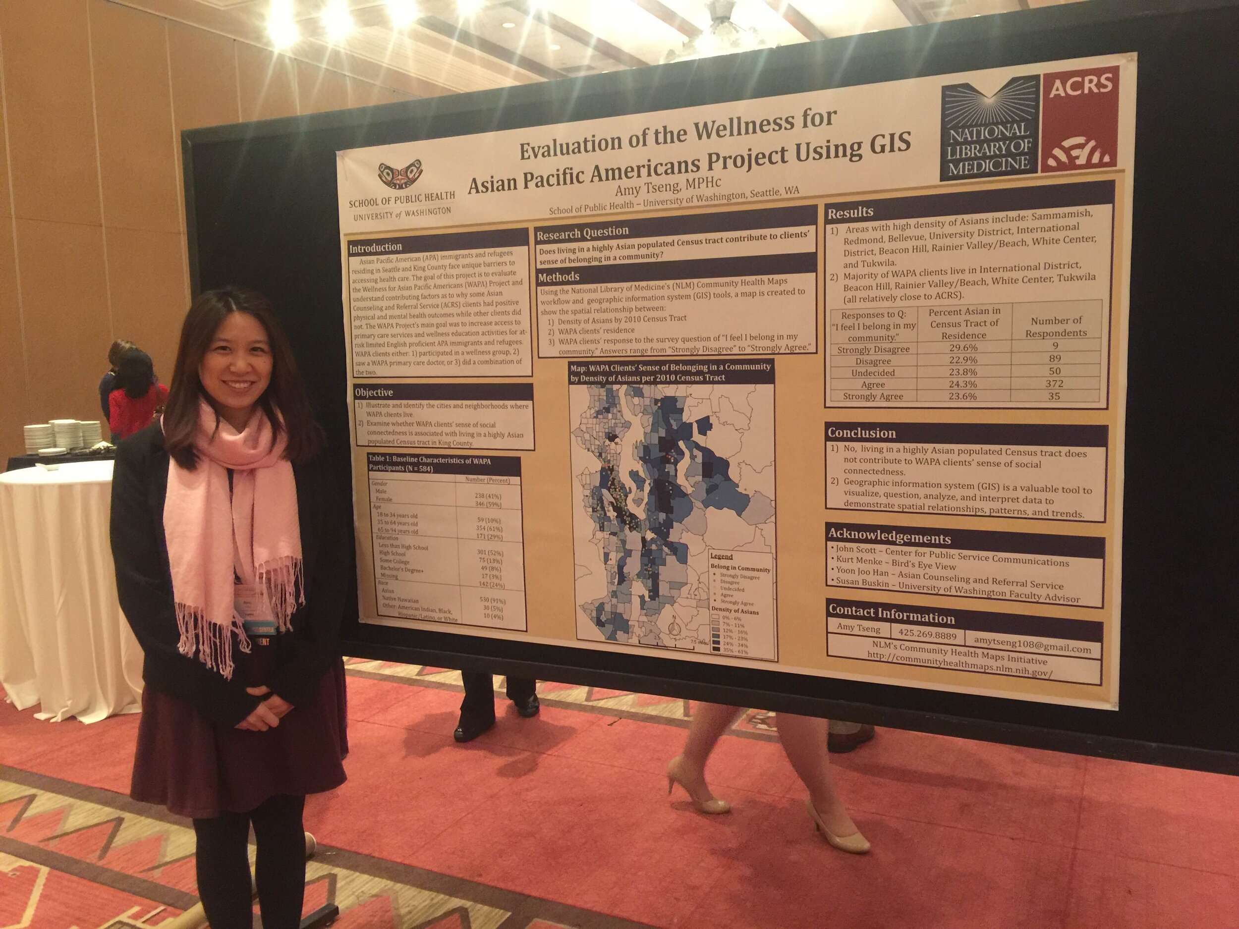
 Amy Tseng, a student at the University of Washington's School of Public Health, presented a poster outlining her project, "Evaluating of the Wellness for Asian Pacific Americans Using GIS." This is her capstone project in the Community Oriented Public Health Practice program . One question she is attempting to answer is whether there is a relationship between having a sense of community and the density of Asian Pacific Americans in a given neighborhood. She is utilizing QGIS and Fulcrum to help answer this question.
 Christina Yantsides, also in the School of Public Health at the University of Washington, presented her capstone project, "Bicycle Injuries and Fatalities: A GIS Mapping Project" in both a the Sunday afternoon lightning session, and the Sunday evening poster session. She is using QGIS to help identify clusters of bicycle accidents in Seattle and gain a better understanding of the causal factors.
 The final morning of the conference myself, John Scott, Dr. Deborah Williamson (MUSC) and Dana Burshell (MUSC) presented the "National Library of Medicine (NLM) Community Health Mapping Project." Often conference attendees are tired by the final morning. However, we were excited to present to a standing room only crowd of about 75 attendees! Collectively we introduced the project and the National Library of Medicine, and went on to show how successfully the project has been implemented from Hawai'i to South Carolina. I heard several audible gasps from the audience as we presented examples. This caused me reflect on the fact that mapping and GIS is simply what I do all day long, however, to many it is still a new and exciting tool. We finished with a quick live demo of downloading data from Fulcrum and uploading it into CartoDB to show how quick and easy it is.
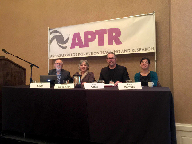 Collectively it was a very successful demonstration of how Community Health Mapping can be used by community organizations, educators and students. APTR was a very interesting conference and a great fit for Community Health Mapping. Several conference organizers suggested we teach a Community Health Mapping workshop at next years conference! Looks like we will be back!
White House Announces the Opportunity Project
This week the White House announced the Opportunity Project. It is an open data initiative geared towards empowering communities with data and tools to improve economic mobility. Open data is the data equivalent of open source software. It is licensed so that it is freely available to use by anyone.The main page for the project can be found here: http://opportunity.census.gov/.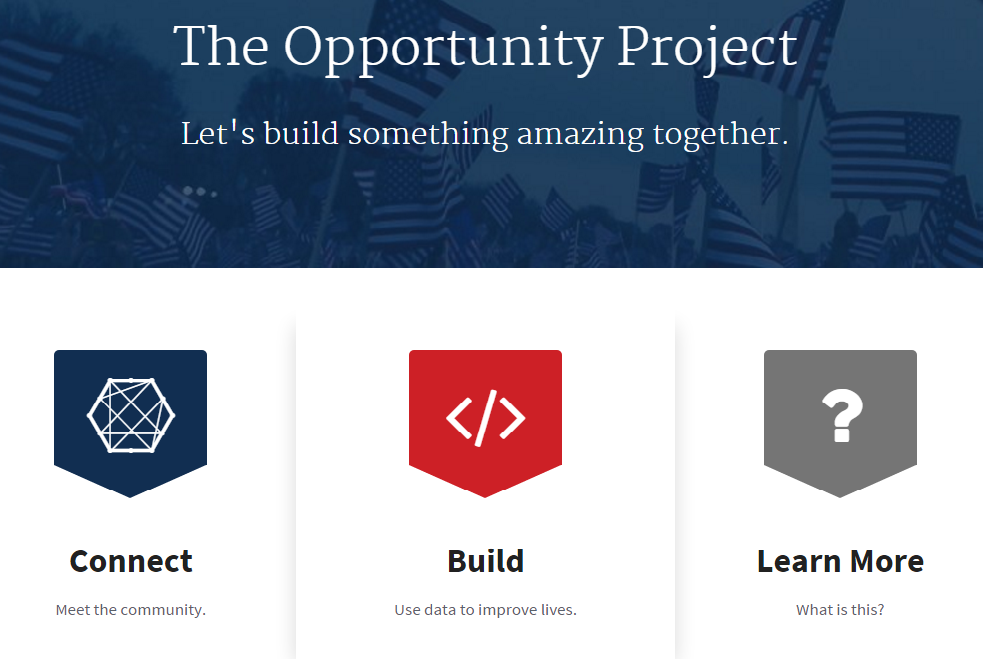 It includes links to sources of open data and online tools built on open data, ,many of them map based. This looks to be a great resource for Community Health Mappers!
A New Version of QGIS v2.14 Has Been Released!
Currently a new version of QGIS is released every four months! To help users deal with this rapid development pace, the version put out each spring is designated as a long-term release (LTR). This means it will be supported for one calendar year. After that, new stable versions continue to be posted quarterly and any bug fixes associated with those quarterly versions are applied to the LTR. The LTR is recommended for production environments. It has a slower release cycle, and receives regular bug fixes throughout the year. Monday February 29th QGIS 2.14, the next LTR was released. It is nicknamed 'Essen' after the town in Germany where a recent developer meeting was held. Essen has a lot of new features. You can visit the Visual Changelog to read about all the new features in detail. You can also see who developed and sponsored each new feature. Community Health Mappers might be especially interested in these new features:
- the new 2.5 D renderer which allows you to extrude features into space.
- improved labeling
- better control over map elements in the Print Composer
- an improved Processing Toolbox
- the new widget you get by right clicking on a layer in the Layers Panel and choosing Style. It allows you to change the color for a symbol without having to open a single dialog box!
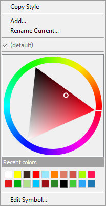 If you are using QGIS you should visit the download page and install the latest version! Note that the Mac installer takes a little longer to assemble and may not be available for several more days.Happy GIS'ing!
Fulcrum Updates The App Designer
We introduced Fulcrum in a recent post and are very impressed with this tool. Recently Fulcrum updated their App Designer. Fields are now divided into categories from the most common and basic fields, to the most advanced. The groups of fields have also been color coded from green to red to make this arrangement more intuitive. The five categories are: Basic, Choice, Design, Media and Advanced. At the top are Basic fields which include Text, Numbers, Date etc. This reorganization makes finding fields and developing a form even faster.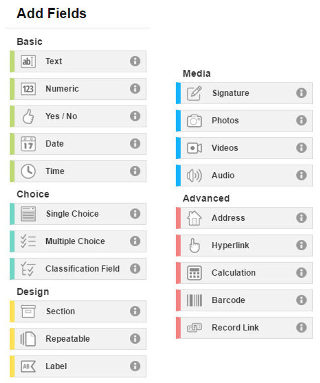 One category of interest is Design. These are fields that can be used to organize your data collection form. Sections allow you to divide your form into parts. For example, you could separate your main survey questions from your data collector metadata questions. The example App below has two sections: Main section and Data Collection Information.
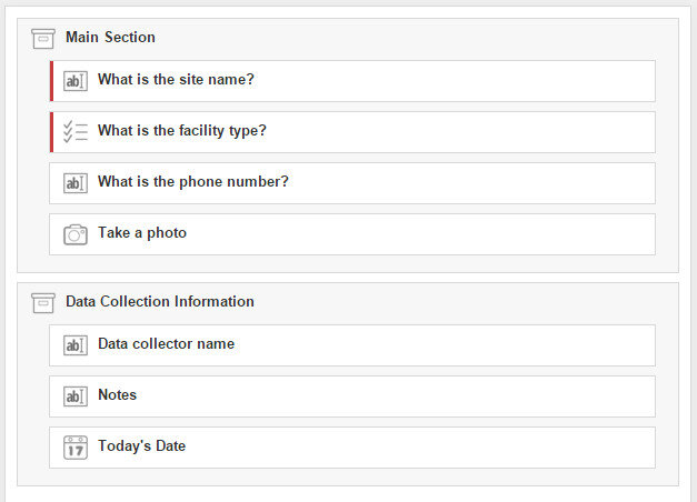 Organizing your questions like this can help data collectors complete the form, especially for form with a lot of questions. The screenshot below shows how the above form is rendered on a smartphone.
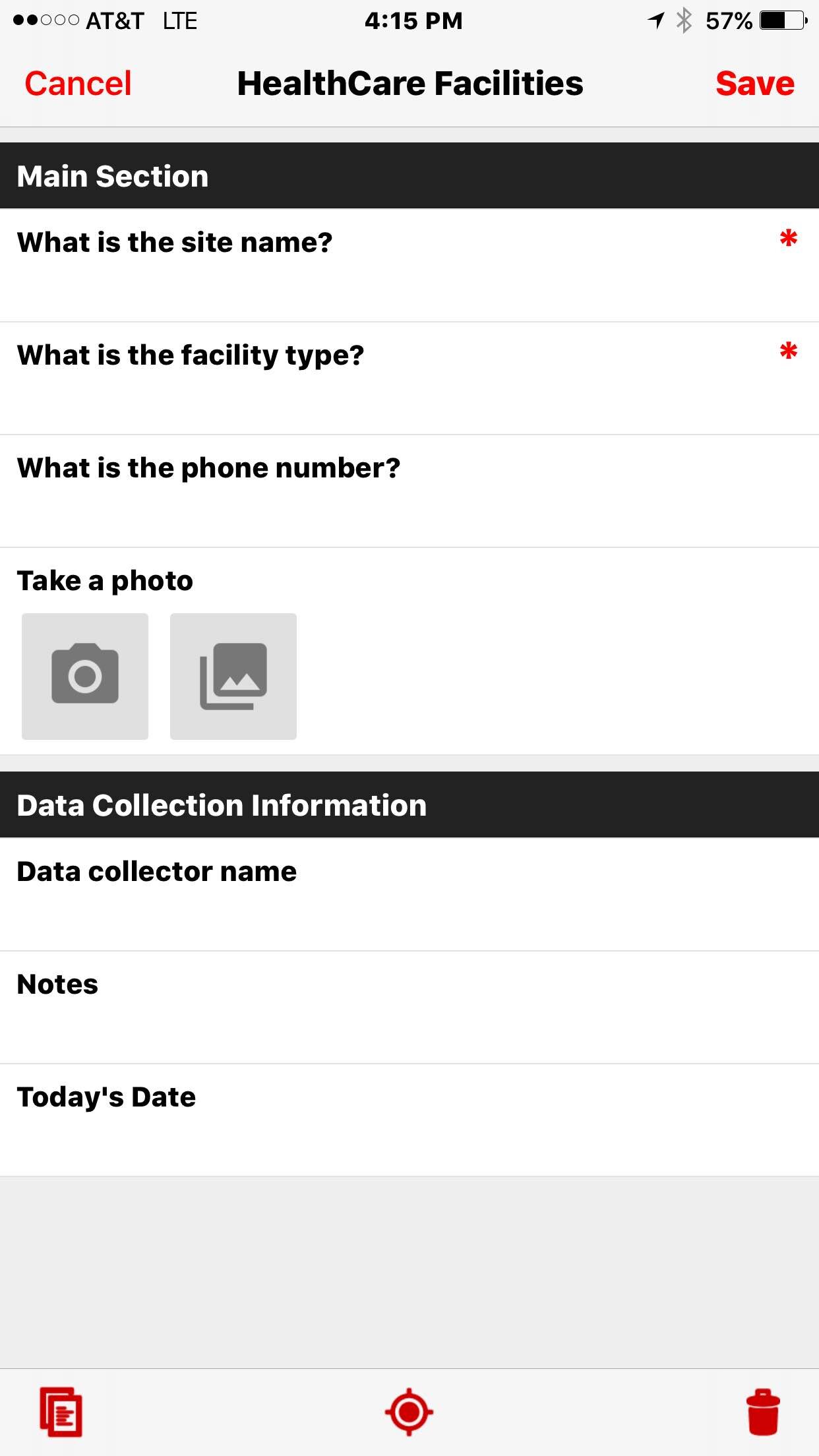 In future posts we will give some helpful hints to working with Fulcrum including sharing forms, managing data and downloading data. Stay tuned!
Community Health Mapping: A New Year Review
To start the New Year I thought I’d begin with a review of Community Health Mapping (CHM). There are a lot of new project partners, and I thought it would be a good time to give a project overview. CHM is a collaborative effort between the National Library of Medicine, Center for Public Service Communications and Bird’s Eye View. The National Library of Medicine is funding the initiative.The overall goal is to empower community organizations serving vulnerable or underserved populations with low cost, intuitive mapping technology. Therefore we’ve been working with programs organizations who:
- Focus on vulnerable populations
- Frequently use and collect data
- Need effective, scalable & easy to use mapping tools
- Lack resources (i.e., for proprietary GIS training & software)
We have identified a suite of tools that allow you to collect custom field data, analyze that data, combine it with other spatial datasets, and generate both static maps and/or dynamic maps on the internet. This allows organizations to collect and work with their own data, and if appropriate, share it with others. CHM involves three components that meet all basic mapping needs:
- Field Data Collection
- Desktop Analysis and Cartography
- Internet Mapping
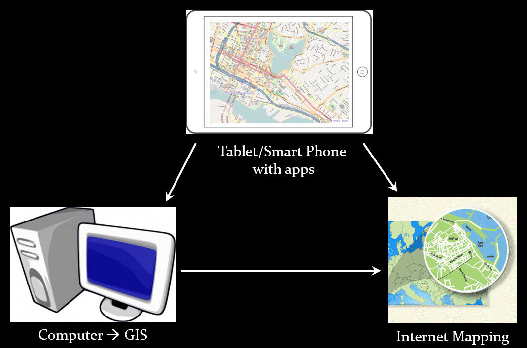 A given project may not require all three, however, collectively these components address the basic needs of all mapping projects.Field Data Collection:Rather than focusing on the use of expensive GPS receivers, we recommend the use of smart phones and tablets for these reasons:
- Most community-based organizations already have them!
- Many know how to use them
- They're intuitive
- They're portable
- They come with an on board GPS receiver (iPhone 5 uses GPS + GLONASS)
- Have on board cameras
- Can connect to wireless networks
- Access to the internet
- Email is available
- “There's an app for that!”
 Of course an important consideration is horizontal accuracy. You can read our blog post on that topic to see if mobile smart devices meet your project needs.When collecting data you need to be able to develop your own custom data collection form. The top three mobile apps we have found are:
- Fulcrum: Easiest to use - iOS & Android – low monthly subscription - http://www.fulcrumapp.com/
- iForm: Slightly steeper learning curve – iOS and Android – free account - https://www.iformbuilder.com/
- ODK Collect: Easy to use – Android only – free account - https://opendatakit.org/use/collect/
Desktop Analysis and Cartography:After community field data collection, the next step typically involves bringing the data into a desktop GIS. This is the middle step in the workflow. Here the data can be viewed against basemaps such as Google or OpenStreetMap, and combined with other organizational data. This is also where analyses (proximity, density etc.) can be conducted. Presentation quality maps can also be generated in this step.The software we found to be the best fit is QGIS. This is an open source desktop GIS software. It has many strengths:
- It can consume many kinds of data, including all the data that would come out of the field data collection apps.
- It is both intuitive and robust.
- It has a large suite of geoprocessing tools for analyzing data.
- It will run on Windows, Mac, or Linux.
- It is free to download and install.
- It is well documented.
- There is a large user community.
- New functionality is being continuously added. New stable versions are being released every 4 months!
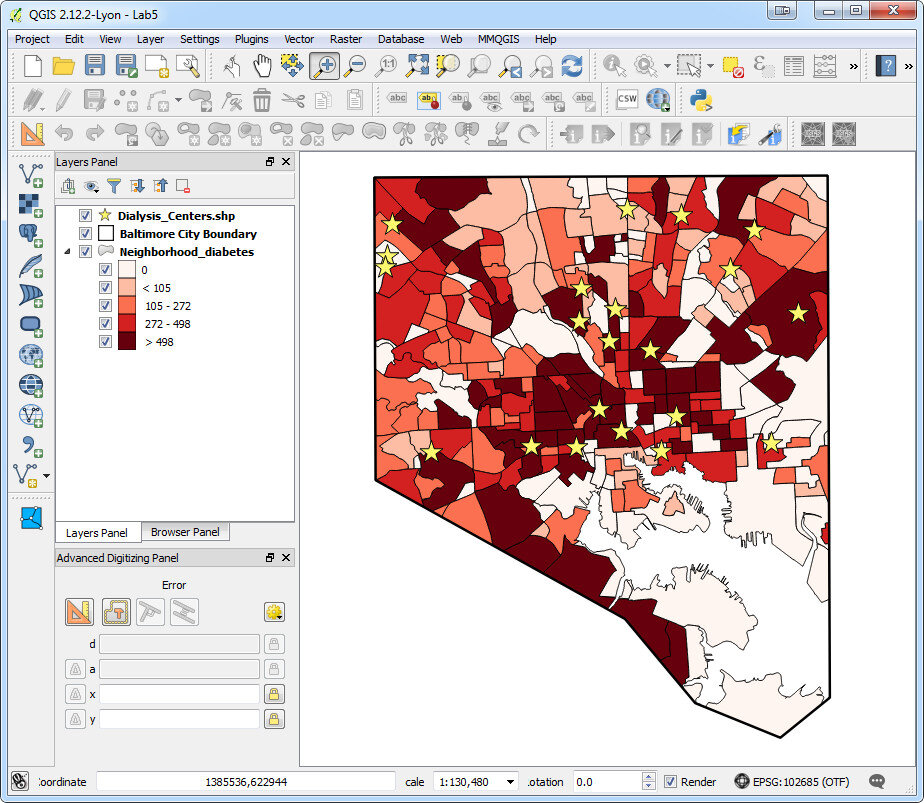 Web PresentationOften you may want to present an interactive map of your results. Interactive means the map reader can zoom in/out, pan the map and turn layers off and on. For this we recommend CartoDB.You can sign up for a free account, which gives you 50Mb of storage space. Data can be collected with a smart phone or tablet and brought directly into CartoDB. It is a very intuitive platform. You can literally drag and drop a spreadsheet onto the CartoDB page and have the data upload to your account. It will accept the most common geospatial file formats including: spreadsheets and comma delimited text files with addresses or coordinates, KML/KMZ, GPX, and shapefiles.CartoDB also has great documentation including:
- CartoDB Editor Documentation
- A comprehensive series of tutorials breaking tasks up into Basic, Medium and Advanced categories
- Tips and Tricks
- FAQ’s
 In ConclusionThis blog has a lot of resources including reviews of mapping technology and case studies. You might begin by clicking on some of the links in this entry. We are also working on a 6 lab CHM curriculum that interested parties will be able to use to hone their skills. Stay tuned for that!We are always looking for new partners and continuously work to support current project partners. If you are interested, or have questions please don't hesitate to contact John Scott (jscott at cpsc.com) or Kurt Menke (kurt at birdseyeviewgis.com). Most importantly get out and do some mapping in 2016!
Field Data Collection with Fulcrum
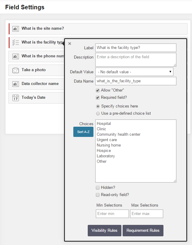
Fulcrum was reviewed in our initial survey of field data collection apps in 2012, and almost made the top three. In the last 3 years Fulcrum has improved and has become perhaps the most intuitive and useful data collection app we've evaluated period.It is available for both iOS and Android. It isn't free, but the subscription fee is affordable. It costs anywhere from $18 - $25 per month. The three pricing plans give you 10 - 30Gb of online storage, which is substantial. Fulcrum offers a free 30 day trial which includes all the functionality. You can use this option to test Fulcrum for your projects. In the following example, I will be using a health care facility data collection form to show how Fulcrum works.Fulcrum has the most intuitive data collection form builder of any app we've seen. When you design a form Fulcrum calls it an 'app'. Simply drag and drop from the Add Fields section to your 'app' to add questions (see figure below). Available data input types include text, numbers, date, single or multiple choice, photos, videos, and audio. There are no tricks to collecting GPS locations as with iForm. Fulcrum collects locations automatically.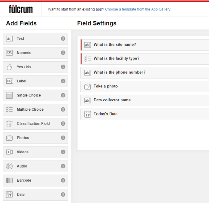 Once a field has been added simply set you parameters. The figure below shows the facility type question being edited. To do this simply click on a field, and fill out the details. It's so easy a 50 year old can do it!
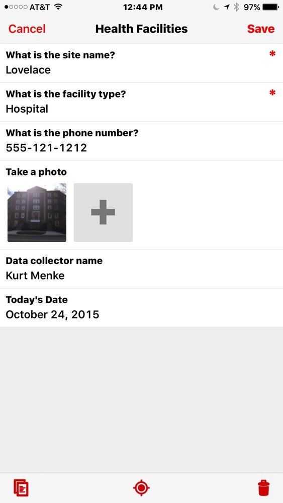
 The companion mobile app can be downloaded for free from the Apple Store or the Google Play Store. Once installed, login and your data collection app(s) will sync with your mobile device. The figure below shows the health care facilities data collection app on an iPhone. Answering the questions is intuitive. Once collected your data will be synced with your cloud account.
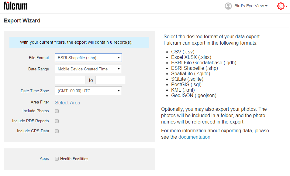
 Once back in the office, login to your account, select your data collection app, and choose Start Export Wizard. You will be taken to the page below. Choose your file format. A complete array of GIS formats is available including: shapefiles, geodatabases, KML, PostGIS and Spatialite. Choose any other appropriate options and click Next to download your data.
 I highly recommend that everyone involved in Community Health Mapping evaluate Fulcrum. Along with iForm and ODK Collect is a CHM recommended data collection tool. There is a monthly subscription fee but it is low. It is the easiest and most flexible tool we've found. You can use the free 30 day trial period to see if it works for you.

