One of the most valuable resources for Community Health Mappers remains the series of lab exercises created two years ago. Our workshops, while effective, are short and only scratch the surface of what you can do with mapping tools. They are basically a quick start guide to Community Health Mapping. The labs however, can be used as a resource to help you build your skills once you've taken the first steps towards mapping your community.The technology changes rapidly. QGIS produces a new stable version every 4 months. Annually QGIS also produces a long-term release. Carto and Fulcrum also update their tools on a regular basis. This mean the lab exercises need to be updated to keep pace.The good news is that this spring the labs were all updated and expanded. There is some foundational knowledge needed to really take the next step after a workshop. The current revised set of labs includes Lab 0: A Community Health Map Introduction and Reference. This lab has background on the Community Health Maps project and the workflow. It also contains a Glossary of GIS terms, and several appendices covering: A) available software, B) data sources and C) everything you need to know to better understand coordinate systems and projection.The remaining labs are as follows:Lab 1 covers field data collection and has been updated to work with Fulcrum. This has allowed us to unify the exercise into one document for both iOS and Android users.Lab 2 shows you how to bring your field data into QGIS. This includes a tour of the QGIS interface, and how to map coordinate data stored in a spreadsheet.Lab 3 is named Combining Field Data with other Organizational Data. It shows you how to work with coordinate systems in QGIS. It also covers how to join tabular data to the attribute table of a GIS layer. This is a step that often has to be done to merge socioeconomic data from the U.S. Census to census geography such as tracts or block groups. It concludes with a lesson on address geocoding. This is the process you use to produce points from addresses.Lab 4 shows you how to do some basic spatial analysis. You learn how to clip data to your study area, measure proximity, query your data to select features and calculate areas/ density.In Lab 5 you learn how to use some of the great data visualization techniques found in only in QGIS. The lab then walks you through how to compose a map. Along the way you learn some data styling tricks and how to use the Print Composer.The series concludes with Lab 6 Data Visualization with Carto. Carto underwent a major update and rebranding since the first edition of these labs were created. You can use this exercise to see how to work with the new Carto Builder interface and tools to create an online map of your results. It covers uploading your data, styling and sharing your map with others.The four labs that deal with QGIS have been updated to include some exciting new features that have been added to QGIS in the last year. Links to the lab data are included. So head to the Resources page and build your Community Health Mapping skills!
CHM Conducts Three Workshops in Maryland
Last week Kurt Menke traveled to Maryland. Two workshops were held at the Prince Georges County Department of Social Services for people working on homeless issues. All attendees were novices to mapping technology. However, in the first hour they all built a data collection form in Fulcrum and went outside to collect some data around the building.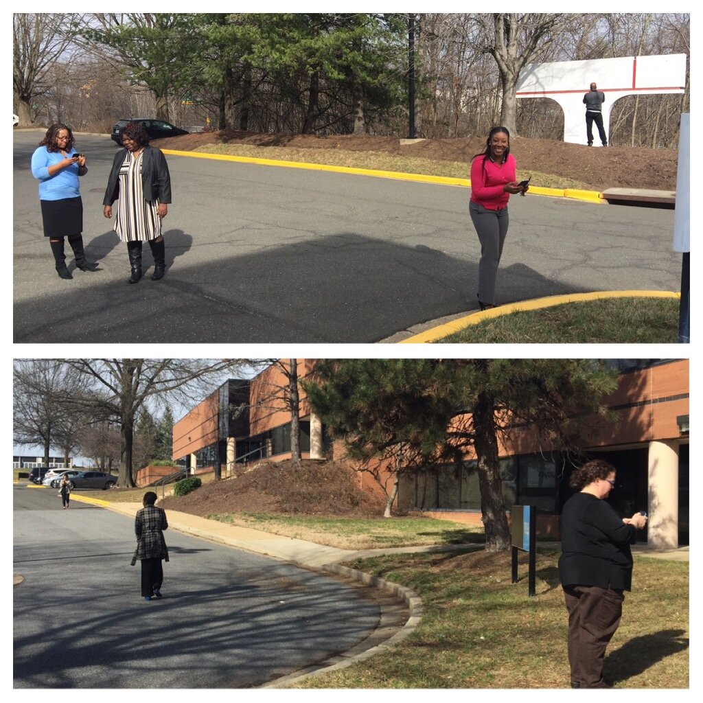 The attendees represented a variety of organizations including many working with YouthREACH Maryland. REACH is an acronym standing for Reach out, Engage, Assist, & Count to end Homelessness. It is an effort to obtain accurate, detailed information on the number, characteristics, and needs of unaccompanied homeless youth in Maryland. Other organizations represented at these workshops included:
- Maryland's Commitment to Veterans
- Maryland Department of Planning
- Prince Georges Community College
- St Ann's Center for Children, Youth, and Familes
- Maryland Multicultural Youth Center
- So Others Can Keep Striving (S.O.C.K.S)
- Sasha Bruce Youthwork
- Lifestyles of Maryland.
In the final two hours of the workshops attendees learned how to map the data they collected in both Carto and QGIS. We also had time for a brief discussion about how CHM could be used in their projects. There were a lot of ideas shared about how the technology could help community engagement.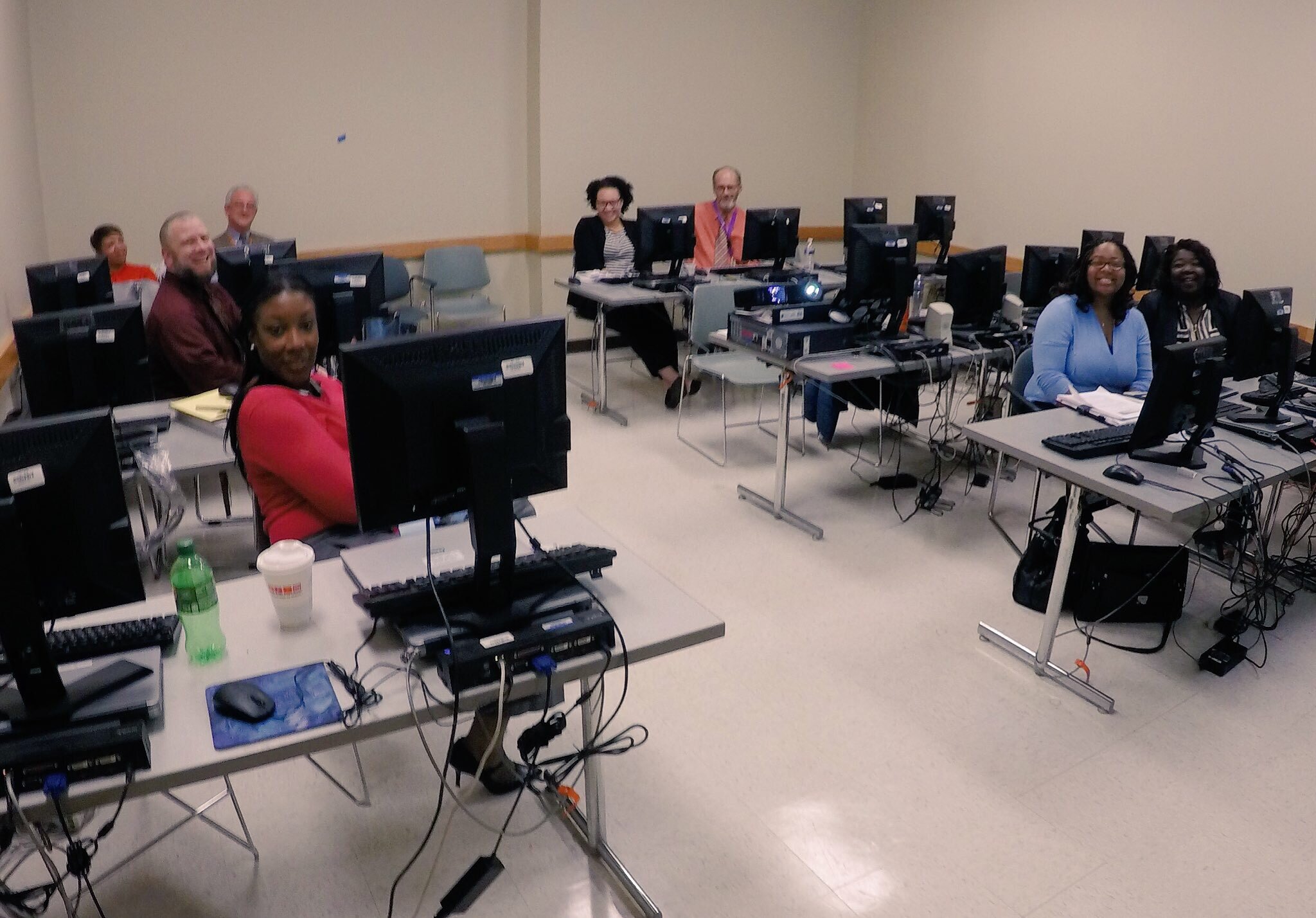 After the two PG County workshops, CHM traveled across the Chesapeake Bay bridge to Salisbury University on the eastern shore.
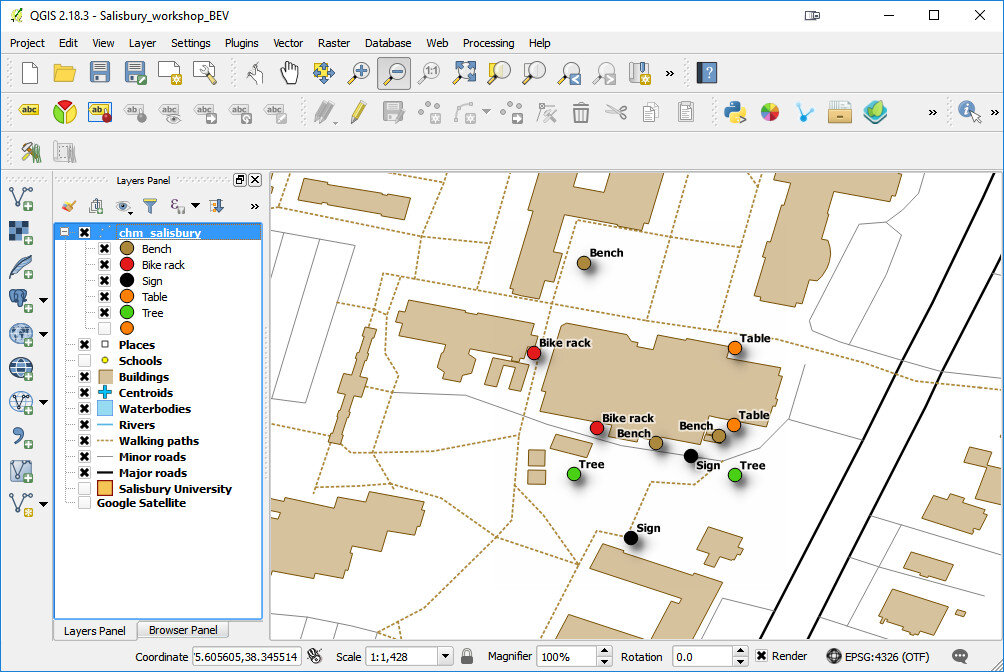
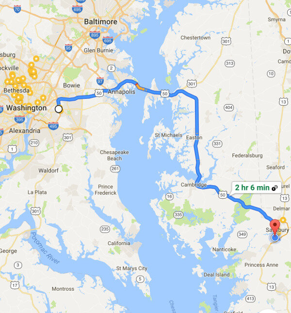 The following morning we held a workshop geared towards social work students at Salisbury University. Attendees went through the CHM workflow and were introduced to Fulcrum, Carto and QGIS. Below is a map of data collected around the student center in Carto.
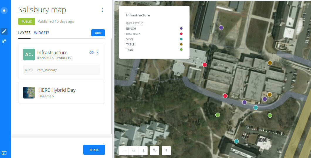 Salisbury University Data Collection in CartoThe workshop concluded with a short introduction to working with data in QGIS.
 The next scheduled workshop for the Community Health Maps team will be at the Teaching Prevention 2017 Conference in Savannah, Georgia. That conference takes place from April 5-7th. If you are interested in learning this technology this workshop will be a great opportunity!
GIS as an Educational Tool at MUSC
Submitted by Jennifer RewolinskiDr. Deborah Williamson is an Associate Professor in the College of Nursing at the Medical University of South Carolina (MUSC), Charleston. Dr. Williamson, Community Health Maps (CHM) and MUSC have partnered in providing training that integrates GIS and CHM tools for a high school Teen Health Leadership Program. Dr. Williamson has worked with both community members and students. Dr. Williamson believes that, “GIS has the potential to substantially increase community engagement and is truly a concept of the neighborhood taking control of their data.” She notes that while researchers might study a community, that a community’s input is essential to understanding the cultural and environmental context surrounding health issues: “GIS mapping puts the community members on more of a level playing field with their research partners.” GIS can empower and educate community members to identify their key issues, to become a part of an analysis, and to provide solutions. When communities are given the opportunity to map their own health, discovery, and awareness, positive changes can result. When a community feels it has more of a say through engagement with GIS, or communication with a map, intervention is more likely to be effective.For the past three semesters, Dr. Williamson has used GIS in her own classroom as a capstone project for population health students. They, “find it fun and can take it with them into other settings, it fits into the world of new technology, and it takes people to the next step of looking at health issues.” Mapping offers a different way to help students visualize Social Determinants of Health and to make the connection between what population health is, and the factors that promote or deter it.
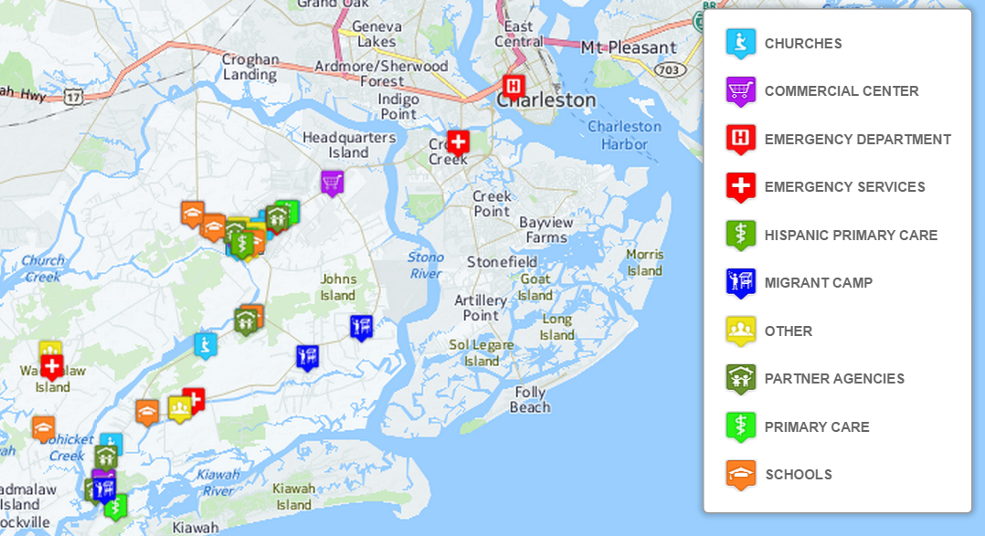
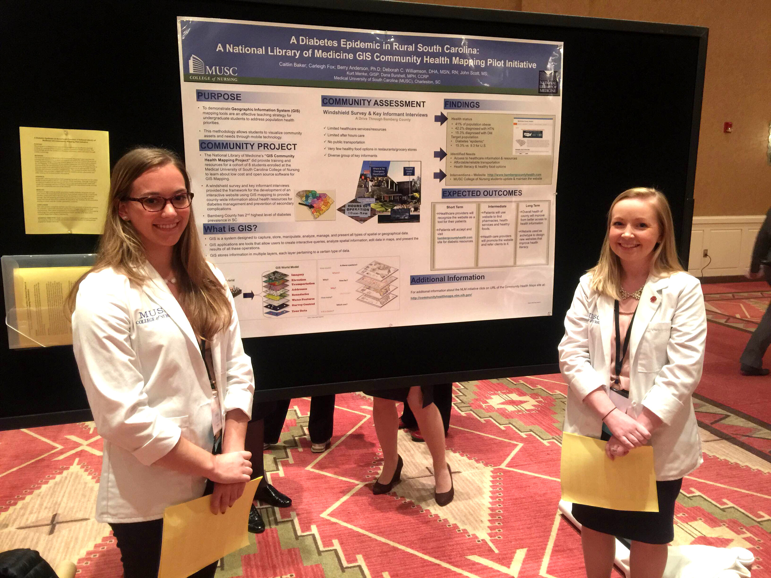 Finally, Dr. Williamson sees GIS as bi-directional: it supports visualizing gaps and assets while also providing the ability to disseminate and build on information via intervention programs to improve health outcomes and strengthen communities. GIS is also broadly applicable to almost any discipline and easily used by those with little expertise. “Presenting raw data to a community or students doesn’t mean a lot,” Dr. Williamson comments, “but when that same data is aggregated visually it instantly communicates a message to any audience.” GIS is clearly suitable as an effective educational tool in the classroom and in communities.CHM thanks Dr. Williamson for her continued collaboration and time spent advancing the CHM program through use of the CHM tools at MUSC. CHM values our partnership with MUSC and hope that the future is as mutually beneficial as the past few years.Field data collection for the CHM workflow bridges the divide between learning in a classroom and experiencing conditions in a community. For the capstone project, students use CHM labs and parts of the CHM workflow, including phone data collection with iForm or Fulcrum, integration of the data into QGIS, and presenting the data with Carto or Google Maps. Dr. Williamson’s students often upload their data from iForm to Google Maps because of its familiarity and easy access.One student project involved identifying migrant camps as a community in need, and assessing the community through surveys and key informant interviews. When the data showed that migrant workers often lack knowledge of health information and access to healthcare services, students mapped locations of migrant camps near Charleston, SC in relation to urgent care facilities and shared the data with the migrant outreach workers from a local community health center. Later, an intervention was developed to provide hands on CPR and first aid instruction to 60 workers. This project displays successful application of CHM tools in an educational and community context resulting in an intervention that may offer real change.
Mapping Curb Ramp Accessibility around a Silver Spring, MD Assisted Living Facility
Submitted by Jenny Rewolinski, University of Maryland, B.S. Community Health 2016I just completed a spring internship with the National Library of Medicine (NLM). My goal was to demonstrate what a typical user of the Community Health Maps (CHM) blog might experience, while using the low cost resources it reviews to develop a mapping project with a public health focus. I read through the case studies on the CHM blog and used its labs to develop my project plan and to guide my related decisions.Because of my experience with elderly relatives and my background in public health, I centered my project on how the senior population of a nearby Assisted Living Facility might safely navigate local sidewalks. According to the 2014 American Community Survey, 23% of people over 65 have some sort ambulatory disability. With this in mind, I decided to map local curb ramps --sloped transitions between sidewalks and streets which function as accessibility enhancements to help those with mobility issues to cross streets safely.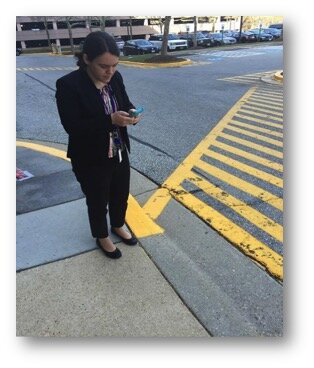 I used CHM Lab 1: Field Data Collection to learn how to design my own data collection form using iForm. My Curb Ramp form captured curb ramp location, conditions, and other observations such as seniors using the curb ramps, steep or damaged curb ramps, and a lack of sidewalks in the area. As discussed in a prior blog post, How Accurate is the GPS on my Smart Phone?, phone geolocation is usually accurate up to 8 meters. This was not precise enough for my curb ramp data, so I corrected for this on my form. Over the course of 8 hours spanning 2 days, and with 2 other interns I collected 103 existing curb ramps and locations where curb ramps might aid accessibility.
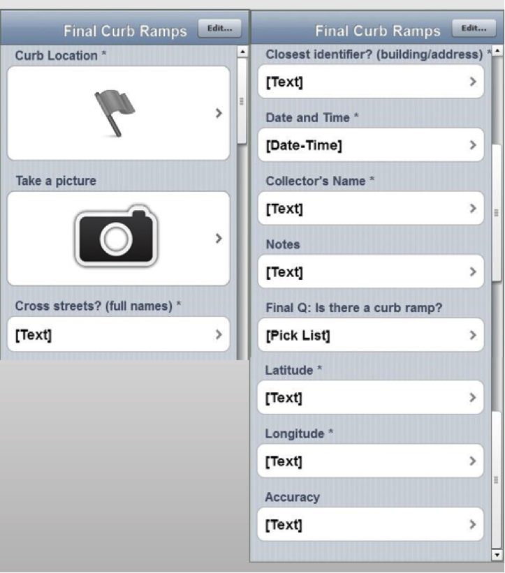 Next, I brought my iForm curb ramp data from my phone into the QGIS software by using instructions from CHM Lab 2: Bringing Field Data into QGIS. I also used CHM Labs 3: Combining Field Data with Other Organizational Data and CHM Lab 4: Basic Spatial Analysis to add data layers and to perform spatial analysis to finalize my map.
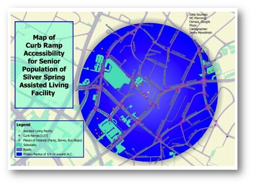 This is my project map! I completed construction of my map using CHM Lab 5: Cartography with QGIS. In addition to my curb ramp data points, I added data layers for sidewalks, roads, places of interest (such as grocery stores, restaurants, bus stops, theaters), and my Assisted Living Facility. My goal was to raise awareness of how accessibility can impact seniors’ sense of autonomy and empowerment, and their ability to exercise and to lead a healthier lifestyle. This map also provides recommendations for where more curb ramps should be placed based on observations during data collection. I plan to discuss this map and curb ramp recommendations with the city of Silver Spring and to create “safest route” guides for popular local destinations.
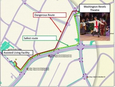 GIS has a huge potential to help us analyze health issues. When I began my project at NLM, I thought I would simply be mapping the location of curb ramps near a local Assisted Living Facility; however I discovered the significant need for more curb ramps as well as sidewalks around my project area.I believe the conclusions I was able to reach by using the low cost CHM resources CHM are accurate and workable. I came to NLM with little to no GIS knowledge yet I learned from the CHM GIS labs, collected curb ramp data points and created a map that may bring awareness to a public health issue. In doing so I believe my experience is typical of many CHM users.
If I can do it, you can too!
Community Health Mapping: A New Year Review
To start the New Year I thought I’d begin with a review of Community Health Mapping (CHM). There are a lot of new project partners, and I thought it would be a good time to give a project overview. CHM is a collaborative effort between the National Library of Medicine, Center for Public Service Communications and Bird’s Eye View. The National Library of Medicine is funding the initiative.The overall goal is to empower community organizations serving vulnerable or underserved populations with low cost, intuitive mapping technology. Therefore we’ve been working with programs organizations who:
- Focus on vulnerable populations
- Frequently use and collect data
- Need effective, scalable & easy to use mapping tools
- Lack resources (i.e., for proprietary GIS training & software)
We have identified a suite of tools that allow you to collect custom field data, analyze that data, combine it with other spatial datasets, and generate both static maps and/or dynamic maps on the internet. This allows organizations to collect and work with their own data, and if appropriate, share it with others. CHM involves three components that meet all basic mapping needs:
- Field Data Collection
- Desktop Analysis and Cartography
- Internet Mapping
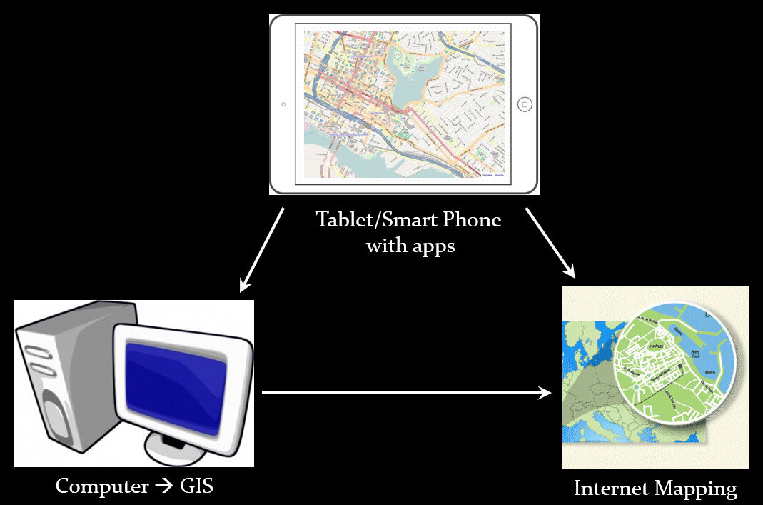 A given project may not require all three, however, collectively these components address the basic needs of all mapping projects.Field Data Collection:Rather than focusing on the use of expensive GPS receivers, we recommend the use of smart phones and tablets for these reasons:
- Most community-based organizations already have them!
- Many know how to use them
- They're intuitive
- They're portable
- They come with an on board GPS receiver (iPhone 5 uses GPS + GLONASS)
- Have on board cameras
- Can connect to wireless networks
- Access to the internet
- Email is available
- “There's an app for that!”
 Of course an important consideration is horizontal accuracy. You can read our blog post on that topic to see if mobile smart devices meet your project needs.When collecting data you need to be able to develop your own custom data collection form. The top three mobile apps we have found are:
- Fulcrum: Easiest to use - iOS & Android – low monthly subscription - http://www.fulcrumapp.com/
- iForm: Slightly steeper learning curve – iOS and Android – free account - https://www.iformbuilder.com/
- ODK Collect: Easy to use – Android only – free account - https://opendatakit.org/use/collect/
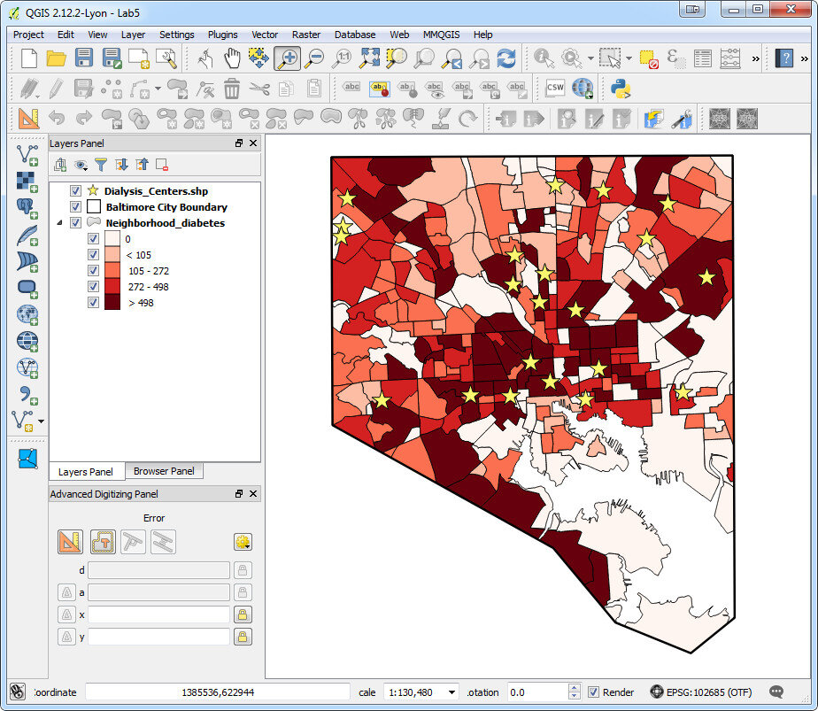
Desktop Analysis and Cartography:After community field data collection, the next step typically involves bringing the data into a desktop GIS. This is the middle step in the workflow. Here the data can be viewed against basemaps such as Google or OpenStreetMap, and combined with other organizational data. This is also where analyses (proximity, density etc.) can be conducted. Presentation quality maps can also be generated in this step.The software we found to be the best fit is QGIS. This is an open source desktop GIS software. It has many strengths:
- It can consume many kinds of data, including all the data that would come out of the field data collection apps.
- It is both intuitive and robust.
- It has a large suite of geoprocessing tools for analyzing data.
- It will run on Windows, Mac, or Linux.
- It is free to download and install.
- It is well documented.
- There is a large user community.
- New functionality is being continuously added. New stable versions are being released every 4 months!
 Web PresentationOften you may want to present an interactive map of your results. Interactive means the map reader can zoom in/out, pan the map and turn layers off and on. For this we recommend CartoDB.You can sign up for a free account, which gives you 50Mb of storage space. Data can be collected with a smart phone or tablet and brought directly into CartoDB. It is a very intuitive platform. You can literally drag and drop a spreadsheet onto the CartoDB page and have the data upload to your account. It will accept the most common geospatial file formats including: spreadsheets and comma delimited text files with addresses or coordinates, KML/KMZ, GPX, and shapefiles.CartoDB also has great documentation including:
- CartoDB Editor Documentation
- A comprehensive series of tutorials breaking tasks up into Basic, Medium and Advanced categories
- Tips and Tricks
- FAQ’s
 In ConclusionThis blog has a lot of resources including reviews of mapping technology and case studies. You might begin by clicking on some of the links in this entry. We are also working on a 6 lab CHM curriculum that interested parties will be able to use to hone their skills. Stay tuned for that!We are always looking for new partners and continuously work to support current project partners. If you are interested, or have questions please don't hesitate to contact John Scott (jscott at cpsc.com) or Kurt Menke (kurt at birdseyeviewgis.com). Most importantly get out and do some mapping in 2016!
Wildly Successful Community Health Mapping Workshops at MUSC!
Community Health Maps (CHM) conducted it's largest and most successful workshops ever at the end of September at the Medical University of South Carolina (MUSC). The training at MUSC was divided into three workshops and a presentation. The attendees were a mix of professors, students and researchers, most of whom had little to no experience with GIS. Despite this fact, nearly everyone was able to collect data and make a map. This is a testament to the easy to use nature of the CHM workflow.It began Monday morning with the first workshop. This was an Intermediate Session for those Community Health Mappers who had been working on projects since the April CHM workshop. We spent two hours covering more advanced topics and answering project specific questions. Following that, Kurt Menke presented a CHM project overview at a brown bag lunch session to 30 attendees. Matt Jones closed this session with a 10 minute talk detailing how he used The Community Health Maps workflow this summer to map access to care on Johns Island.The second workshop was Monday afternoon. It was a two hour session covering field data collection with iForm, and mapping that data online with CartoDB. There were 55 attendees at this session, the vast majority of whom had no GIS experience. In just two hours all 55 attendees were able to collect field data and make a map in CartoDB!
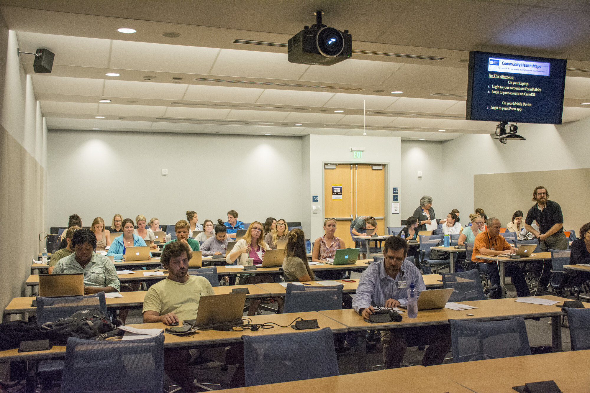 The final workshop on Tuesday was a 5 hour session covering the use of QGIS. The workshop consisted of a custom Charleston based QGIS exercise. Each of the 35 participants worked with a set of Charleston GIS data while learning the basic layout of QGIS. They learned how to add data, style it, and compose a map. The workshop ended with a discussion of each participants goals and project specific questions.
 In total almost 80 people attended one or more sections of the training! Thanks go out to Dr. Deborah Williamson for hosting the workshops, Dana Burshell for organizing the entire event and assisting during the workshops, and to Sarah Reynolds who was invaluable in providing Mac and QGIS support!
Tableau Public for Data Visualizations
Tableau Public is free software that can help users publish interactive data visualizations to the internet. This software is another great option for data visualization along with GIS Cloud or CartoDB. It has powerful charting and graphing tools, and also allows you to map data and display that data against several online datasets and basemaps.No plug-ins or programming skills are required, just a browser with JavaScript enabled. Tableau Public uses a simple drag and drop process that anyone can learn. You can work with either the free Tableau Desktop app, or Tableau Online the free cloud based server. Either way you can save your work to the Tableau Public Web servers, which are accessible by everyone on the Internet. One important note about this is that any data you publish is accessible to everyone on the internet.People see and understand data, reports and dashboards faster with visual analytics technology, which can help uncover key trends, relationships, patterns, and outliers that might otherwise be a challenge to find. Tableau Public can be used to pare down information to its simplest form by stripping away the less important data.The software can connect to Microsoft Excel, Microsoft Access, and multiple text file formats. It has a limit of 1,000,000 rows of data allowed in any single file. Your organization may use up to 50 megabytes of space.Tableau Public projects can be shared by emailing a link or by embedding the work in a blog, wiki, or website. Clicking on an emailed link will open a browser page with the view loaded. If embedded onto a page, anyone who visits the page will see the live interactive view. The following shows the use of Tableau Public in two health related studies.Public Health Case StudiesTo visualize the specific social problem of teen pregnancy over time, Tableau Public was used by the Wisconsin Council on Children and Families to show the decline in births to teen mothers in Wisconsin over recent years. The data depicts racial disparities in teen births in Wisconsin as well as differences in birth rates between older and younger teens. The online link to the data visualizations created with Tableau Public for this study can be found here: http://tblsft.com/public/gallery/teen-pregnancy-declinesThe figure below is a screenshot of one of the data visualizations from this study. Data visualizations are interactive. Here the white popup window is showing data from a specific place on the line graph. Such visualizations may help communities address and manage such issues as health problems associated with prematurity and poor academic performance of children of teen parents.Data can also be mapped by geographic coordinates, city, state, county, and zip code. The visualization below deals with Medicare Costs and combines a map with a chart showing trends in the data.
 Other data visualization examples created with Tableau Public can be found in the Gallery:http://www.tableausoftware.com/public/galleryOther Tableau Public Resources can be found here:https://public.tableau.com/s/resources
